第 1 章 CSS 和 Documents
第 1 章 CSS 和 Documents
Cascading Style Sheets (CSS) is a powerful tool that transforms the presentation of a document or a collection of documents, and it has spread to nearly every corner of the web and into many ostensibly non-web environments. For example, Gecko-based browsers use CSS to affect the presentation of the browser chrome itself, many RSS clients let you apply CSS to feeds and feed entries, and some instant message clients use CSS to format chat windows. Aspects of CSS can be found in the syntax used by JavaScript frameworks, and even in JavaScript itself. It’s everywhere!
层叠样式表(Cascading Style Sheets, CSS)是一种强大的工具,它可以转换文档或文档集合的格式,而且它已经扩展到 web 的几乎每个角落,并进入许多表面上没有 web 的环境。例如,基于 gecko 的浏览器使用 CSS 来影响浏览器 chrome 本身的表现,许多 RSS 客户端允许您将 CSS 应用于提要和提要条目,一些即时消息客户端使用 CSS 来格式化聊天窗口。CSS 的各个方面可以在 JavaScript 框架使用的语法中找到,甚至在 JavaScript 本身中也可以找到。到处都是!
1.1 A Brief History of (Web) Style
CSS was first proposed in 1994, just as the web was beginning to really catch on. At the time, browsers gave all sorts of styling power to the user—the presentation preferences in Mosaic, for example, permitted all manner of font family, size, and color to be defined by the user on a per-element basis. None of this was available to document authors; all they could do was mark a piece of content as a paragraph, as a heading of some level, as preformatted text, or one of a handful of other element types. If a user configured his browser to make all level-one headings tiny and pink and all level-six headings huge and red, well, that was his lookout.
CSS 最初是在 1994 年提出的,当时 web 刚刚开始流行。当时,浏览器为用户提供了各种样式设置功能——例如,Mosaic 中的表示首选项允许用户在每个元素的基础上定义各种字体、大小和颜色。这些对文档作者都是不可用的;他们所能做的就是将一段内容标记为段落、某个级别的标题、预先格式化的文本或少数其他元素类型之一。如果一个用户配置他的浏览器使所有一级的标题都是小的和粉红色的,而所有六级的标题都是大的和红色的,那么,这就是他的问题了。
It was into this milieu that CSS was introduced. Its goal was to provide a simple, declarative styling language that was flexible for authors and, most importantly, provided styling power to authors and users alike. By means of the “cascade,” these styles could be combined and prioritized so that both authors and readers had a say—though readers always had the last say.
CSS 就是在这种环境中引入的。它的目标是提供一种简单的、声明式的样式语言,这种语言对作者来说是灵活的,最重要的是,它为作者和用户都提供了样式功能。通过“级联”的方式,这些风格可以被组合在一起并按优先级排列,这样作者和读者都有发言权——尽管读者总是拥有最后的发言权。
Work quickly advanced, and by late 1996, CSS1 was finished. While the newly established CSS Working Group moved forward with CSS2, browsers struggled to implement CSS1 in an interoperable way. Although each piece of CSS was fairly simple on its own, the combination of those pieces created some surprisingly complex behaviors. There were also some unfortunate missteps in early implementations, such as the infamous discrepancy in box model implementations. These problems threatened to derail CSS altogether, but fortunately some clever proposals were implemented, and browsers began to harmonize. Within a few years, thanks to increasing interoperability and high-profile developments such as the CSS-based redesign of Wired magazine and the CSS Zen Garden, CSS began to catch on.
工作进展迅速,到 1996 年年底,CSS1 已经完成。当新成立的 CSS 工作组推进 CSS2 时,浏览器却难以以互操作的方式实现 CSS1。尽管每个 CSS 片段本身相当简单,但是这些片段的组合创建了一些令人惊讶的复杂行为。在早期的实现中也有一些不幸的失误,比如 box 模型实现中臭名昭著的差异。这些问题威胁着 CSS 的发展,但幸运的是,一些聪明的建议得以实施,浏览器开始协调起来。在几年之内,由于增强的互操作性和引人注目的发展,例如基于 CSS 的 Wired 杂志的重新设计和 CSS Zen Garden, CSS 开始流行起来。
Before all that happened, though, the CSS Working Group had finalized the CSS2 specification in early 1998. Once CSS2 was finished, work immediately began on CSS3, as well as a clarified version of CSS2 called CSS2.1. In keeping with the spirit of the times, CSS3 was constructed as a series of (theoretically) standalone modules instead of a single monolithic specification. This approach reflected the then-active XHTML specification, which was split into modules for similar reasons.
然而,在这一切发生之前,CSS 工作组已经在 1998 年初确定了 CSS2 规范。CSS2 完成后,立即开始 CSS3 的工作,并将 CSS2 的一个明确版本称为 CSS2.1。为了顺应时代精神,CSS3 被构建为一系列(理论上)独立的模块,而不是单一的单一规范。这种方法反映了当时处于活动状态的 XHTML 规范,出于类似的原因,该规范被划分为多个模块。
The rationale for modularizing CSS3 was that each module could be worked on at its own pace, and particularly critical (or popular) modules could be advanced along the W3C’s progress track without being held up by others. Indeed, this has turned out to be the case. By early 2012, three CSS3 modules (along with CSS1 and CSS 2.1) had reached full Recommendation status—CSS Color Level 3, CSS Namespaces, and Selectors Level 3. At that same time, seven modules were at Candidate Recommenda‐tion status, and several dozen others were in various stages of Working Draft-ness. Under the old approach, colors, selectors, and namespaces would have had to wait for every other part of the specification to be done or cut before they could be part of a completed specification. Thanks to modularization, they didn’t have to wait.
模块化 CSS3 的基本原理是,每个模块都可以按照自己的速度工作,而且特别重要的(或流行的)模块可以按照 W3C 的进度前进,而不会受到其他模块的阻碍。事实上,事实就是如此。到 2012 年初,三个 CSS3 模块(以及 CSS1 和 CSS 2.1)已经达到了完全推荐状态——CSS 颜色级别 3、CSS 名称空间和选择器级别 3。与此同时,有 7 个模块处于候选推荐状态,其他几十个模块处于不同的工作草拟阶段。在旧的方法下,颜色、选择器和名称空间必须等到规范的其他部分完成或删除之后才能成为完整规范的一部分。由于模块化,他们不必等待。
The flip side of that advantage is that it’s hard to speak of a single “CSS3 specification.” There isn’t any such thing, nor can there be. Even if every other CSS module had reached level 3 by, say, late 2016 (they didn’t), there was already a Selectors Level 4 in process. Would we then speak of it as CSS4? What about all the “CSS3” features still coming into play? Or Grid Layout, which had not then even reached Level 1?
这种优势的另一面是,很难谈论一个“CSS3 规范”。“没有这种东西,也不可能有。即使其他所有的 CSS 模块在 2016 年末达到了第 3 级(他们没有),已经有了第 4 级的选择器。我们会把它称为 CSS4 吗?还有哪些“CSS3”特性仍在发挥作用?或者网格布局,甚至还没有达到一级?
So while we can’t really point to a single tome and say, “There is CSS3,” we can talk of features by the module name under which they are introduced. The flexibility modules permit more than makes up for the semantic awkwardness they sometimes create. (If you want something approximating a single monolithic specification, the CSS Working Group publishes yearly “Snapshot” documents.)
因此,虽然我们不能指着一本大部头说“有 CSS3”,但我们可以通过介绍这些功能的模块名称来谈论它们。这些灵活性模块不仅弥补了它们有时造成的语义上的尴尬。(如果你想要一个近似于单一规范的东西,CSS 工作组每年都会发布“快照”文档。)
With that established, we’re almost ready to start understanding CSS. First though, we must go over markup.
有了这些,我们就可以开始理解 CSS 了。不过,我们必须先检查一下标记。
1.2 Elements
Elements are the basis of document structure. In HTML, the most common elements are easily recognizable, such as p, table, span, a, and div. Every single element in a document plays a part in its presentation.
元素是文档结构的基础。在 HTML 中,最常见的元素很容易识别,如
p,table,span,a, 和div。文档中的每个元素都在其表示中起作用。
1.2.1 Replaced and Nonreplaced Elements
Although CSS depends on elements, not all elements are created equally. For example, images and paragraphs are not the same type of element, nor are span and div. In CSS, elements generally take two forms: replaced and nonreplaced.
虽然 CSS 依赖于元素,但并不是所有的元素都是平等创建的。例如,图像和段落不是同一类型的元素,
spananddiv也不是。在 CSS 中,元素通常有两种形式:替换和非替换。
Replaced elements
Replaced elements are those where the element’s content is replaced by something that is not directly represented by document content. Probably the most familiar HTML example is the img element, which is replaced by an image file external to the document itself. In fact, img has no actual content, as you can see in this simple example:
被替换的元素是那些元素的内容被文档内容没有直接表示的内容所替换的元素。最熟悉的 HTML 示例可能是 img 元素,它被文档本身外部的图像文件所取代。事实上,img 并没有实际的内容,你可以在这个简单的例子中看到:
<img src="howdy.gif" />This markup fragment contains only an element name and an attribute. The element presents nothing unless you point it to some external content (in this case, an image specified by the src attribute). If you point to a valid image file, the image will be placed in the document. If not, it will either display nothing or the browser will show a “broken image” placeholder.
这个标记片段只包含一个元素名和一个属性。元素不会显示任何内容,除非您将其指向某些外部内容(在本例中,是由 src 属性指定的图像)。如果您指向一个有效的图像文件,则图像将被放置在文档中。如果没有,它将不显示任何内容,或者浏览器将显示一个“损坏的图像”占位符。
Similarly, the input element is also replaced—by a radio button, checkbox, or text input box, depending on its type.
类似地,input 元素也可以替换为单选按钮、复选框或文本输入框,这取决于它的类型。
Nonreplaced elements
The majority of HTML elements are nonreplaced elements. This means that their content is presented by the user agent (generally a browser) inside a box generated by the element itself. For example, <span>hi there</span> is a nonreplaced element, and the text “hi there” will be displayed by the user agent. This is true of paragraphs, headings, table cells, lists, and almost everything else in HTML.
大多数 HTML 元素是不可替换的元素。这意味着它们的内容由用户代理(通常是浏览器)在元素本身生成的框中显示。例如,
<span>hi there</span>是一个不可替换的元素,文本“hi there”将由用户代理显示。这适用于 HTML 中的段落、标题、表格单元格、列表和几乎所有其他内容。
1.2.2 Element Display Roles
In addition to replaced and nonreplaced elements, CSS uses two other basic types of elements: block-level and inline-level. There are many more display types, but these are the most basic, and the types to which most if not all other display types refer. The block and inline types will be familiar to authors who have spent time with HTML markup and its display in web browsers. The elements are illustrated in Figure 1-1.
除了替换和非替换元素外,CSS 还使用了其他两种基本类型的元素:块级和行内级。还有更多的显示类型,但这些是最基本的,也是大多数(如果不是所有)其他显示类型所引用的类型。对于那些花时间研究 HTML 标记及其在 web 浏览器中的显示的作者来说,块类型和内联类型是很熟悉的。这些元素如图 1-1 所示。
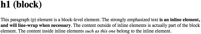
图 1-1: Block- and inline-level elements in an HTML document
Block-level elements
Block-level elements generate an element box that (by default) fills its parent element’s content area and cannot have other elements at its sides. In other words, it generates “breaks” before and after the element box. The most familiar block elements from HTML are p and div. Replaced elements can be block-level elements, but usually they are not.
块级元素生成一个元素框,该元素框(默认情况下)填充其父元素的内容区域,并且不能在其两侧有其他元素。换句话说,它在元素框之前和之后生成“break”。HTML 中最常见的块元素是 p 和 div。被替换的元素可以是块级别的元素,但通常不是。
List items are a special case of block-level elements. In addition to behaving in a manner consistent with other block elements, they generate a marker—typically a bullet for unordered lists and a number for ordered lists—that is “attached” to the element box. Except for the presence of this marker, list items are in all other ways identical to other block elements.
列表项是块级元素的特殊情况。除了以与其他块元素一致的方式工作外,它们还生成一个标记(通常是无序列表的项目符号和有序列表的数字),该标记被“附加”到元素框中。除了此标记之外,列表项在其他所有方面都与其他块元素相同。
Inline-level elements
Inline-level elements generate an element box within a line of text and do not break up the flow of that line. The best inline element example is the a element in HTML. Other candidates are strong and em. These elements do not generate a “break” before or after themselves, so they can appear within the content of another element without disrupting its display.
内联级元素在一行文本中生成一个元素框,并且不会破坏该行的流。最好的内联元素示例是 HTML 中的 a 元素。这些元素不会在它们自己之前或之后生成“break”,因此它们可以出现在另一个元素的内容中,而不会中断它的显示。
Note that while the names “block” and “inline” share a great deal in common with block- and inline-level elements in HTML, there is an important difference. In HTML, block-level elements cannot descend from inline-level elements. In CSS, there is no restriction on how display roles can be nested within each other. To see how this works, let’s consider a CSS property, display.
请注意,虽然“块”和“内联”的名称与 HTML 中的块级和内联级元素有很多相同之处,但它们之间有一个重要的区别。在 HTML 中,块级元素不能从内联级元素派生。在 CSS 中,对于显示角色之间如何嵌套没有限制。为了了解它是如何工作的,让我们考虑一个 CSS 属性 display。
To see how this works, let’s consider a CSS property, display.
为了了解它是如何工作的,让我们考虑一个 CSS 属性 display。
//
You may have noticed that there are a lot of values, only three of which I’ve even come close to mentioning: block, inline, and list-item. Most of these values will be dealt with elsewhere in the book; for example, grid and inline-grid will be covered in a separate chapter about grid layout, and the table-related values are all covered in a chapter on CSS table layout.
你可能已经注意到了这里有许多取值,只有其中三个是我提到过的:
block、inline和list-item。这些取值的大部分会在本书其他部分介绍;例如grid和inline-grid涵盖在介绍栅格布局的独立的一章,跟表格相关的值都包含在介绍 CSS 表格布局的章节中。
For now, let’s just concentrate on block and inline. Consider the following markup:
现在我们把注意力放在
block和inline上,看下面的代码:
<body>
  <p>This is a paragraph with <em>an inline element</em> within it.</p>
</body>
Here we have two block elements (body and p) and an inline element (em). According to the HTML specification, em can descend from p, but the reverse is not true. Typically, the HTML hierarchy works out so that inlines descend from blocks, but not the other way around.
这里有两个块级元素(
body和p)和一个行内元素(em)。根据 HTML 规范,em可以作为p的后代,但反过来则不行。通常 HTML 的层级结构允许行内元素作为块级元素的后代,而不是相反。
CSS, on the other hand, has no such restrictions. You can leave the markup as it is but change the display roles of the two elements like this:
CSS 则没有这样的限制,你可以保持现有的标签结构,然后修改这两个元素的显示角色:
p {
  display: inline;
}
em {
  display: block;
}
This causes the elements to generate a block box inside an inline box. This is perfectly legal and violates no part of CSS. You would, however, have a problem if you tried to reverse the nesting of the elements in HTML:
这使得元素在一个行内框里面生成了一个块级框,这在 CSS 中是完全合法的,不会破坏任何规范。但是,如果你想在 HTML 中使用相反的嵌套结构,那就有会问题了,像这样:
<em><p>This is a paragraph improperly enclosed by an inline element.</p></em>No matter what you do to the display roles via CSS, this is not legal in HTML.
不管你如何使用 CSS 来修改它们的显示角色,这在 HTML 中都是不合法的。
While changing the display roles of elements can be useful in HTML documents, it becomes downright critical for XML documents. An XML document is unlikely to have any inherent display roles, so it’s up to the author to define them. For example, you might wonder how to lay out the following snippet of XML:
修改元素的显示角色在 HTML 文档中很有用,它对 XML 文档也至关重要。XML 文档一般没有默认的显示角色,而完全依赖文档开发者去定义它们。例如,如果你想要展示下面的 XML 片段:
<book>
  <maintitle>Cascading Style Sheets: The Definitive Guide</maintitle>
  <subtitle>Third Edition</subtitle>
  <author>Eric A. Meyer</author>
  <publisher>O'Reilly and Associates</publisher>
  <pubdate>November 2006</pubdate>
  <isbn type="print">978-0-596-52733-4</isbn>
</book>
<book>
  <maintitle>CSS Pocket Reference</maintitle>
  <subtitle>Third Edition</subtitle>
  <author>Eric A. Meyer</author>
  <publisher>O'Reilly and Associates</publisher>
  <pubdate>October 2007</pubdate>
  <isbn type="print">978-0-596-51505-8</isbn>
</book>
Since the default value of display is inline, the content would be rendered as inline text by default, as illustrated in Figure 1-2. This isn’t a terribly useful display.
因为
display属性的默认值是inline,所以这块内容会默认被显示为行内文本,就像图 2 所示的那样。这样的排版不太有用。

图 1-2: Default display of an XML document
You can define the basics of the layout with display:
你可以用
display来定义文档的基本板式:
book,
maintitle,
subtitle,
author,
isbn {
  display: block;
}
publisher,
pubdate {
  display: inline;
}
We’ve now set five of the seven elements to be block and two to be inline. This means each of the block elements will be treated much as div is treated in HTML, and the two inlines will be treated in a manner similar to span.
这样把 7 种元素中的 5 个设置成块级元素,2 个设置成行内元素。块级元素会被像 HTML 中的
div那样处理,两个行内元素会被类似span那样处理。
This fundamental ability to affect display roles makes CSS highly useful in a variety of situations. We could take the preceding rules as a starting point, add a few other styles for greater visual impact, and get the result shown in Figure 1-3.
因为这种设置显示角色的基本能力,CSS 在各种场景下都非常有用。你可以从上面的规则开始,添加一些更具视觉效果的样式,然后得到像图 3 这样的显示效果。
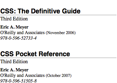
图 1-3: Styled display of an XML document
Before learning how to write CSS in detail, we need to look at how one can associate CSS with a document. After all, without tying the two together, there’s no way for the CSS to affect the document. We’ll explore this in an HTML setting since it’s the most familiar.
在详细学习如何编写 CSS 之前,我们先要看一下如何关联 CSS 和文档,毕竟,如果不把它们结合在一起,CSS 是无法对文档起作用的。我们从最熟悉的 HTML 设置开始。
1.3 Bringing CSS and HTML Together
I’ve mentioned that HTML documents have an inherent structure, and that’s a point worth repeating. In fact, that’s part of the problem with web pages of old: too many of us forgot that documents are supposed to have an internal structure, which is altogether different than a visual structure. In our rush to create the coolest-looking pages on the web, we bent, warped, and generally ignored the idea that pages should contain information with some structural meaning.
我提到过 HTML 文档存在一个固有结构,这一点值得重复一下。实际上有个旧网页开发遗留的问题:我们太多人忘记了文档是应该有一个内在结构的,这与视觉上的结构是完全不同的。我们急于在 Web 上创建看起来最酷的网页,我们改造转换、修饰装点,全然忽视了页面应该包含具有一些结构意义的信息。
That structure is an inherent part of the relationship between HTML and CSS; without it, there couldn’t be a relationship at all. To understand it better, let’s look at an example HTML document and break it down by pieces:
这种结构是 HTML 和 CSS 之间关系所固有的组成部分,没有它,关系就不会存在。为了更好地理解这种结构,我们把下面这个示例的 HTML 文档拆解来看:
<html>
  <head>
    <title>Eric's World of Waffles</title>
    <meta http-equiv="content-type" content="text/html; charset=utf-8" />
    <link rel="stylesheet" type="text/css" href="sheet1.css" media="all" />
    <style type="text/css">
      /* These are my styles! Yay! */
      @import url(sheet2.css);
    </style>
  </head>
  <body>
    <h1>Waffles!</h1>
    <p style="color: gray;">
      The most wonderful of all breakfast foods is the waffle—a ridged and
      cratered slab of home-cooked, fluffy goodness that makes every child's
      heart soar with joy. And they're so easy to make! Just a simple
      waffle-maker and some batter, and you're ready for a morning of aromatic
      ecstasy!
    </p>
  </body>
</html>
The result of this markup and the applied styles is shown in Figure 1-4.
代码的处理结果及应用的样式的如图 4 所示。
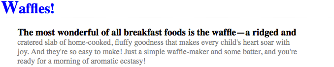
图 1-4: A simple document
Now, let’s examine the various ways this document connects to CSS.
现在我们来看文档关联 CSS 的几种方式。
1.3.1 The link Tag
First, consider the use of the link tag:
<link rel="stylesheet" type="text/css" href="sheet1.css" media="all" />The link tag is a little-regarded but nonetheless perfectly valid tag that has been hanging around the HTML specification for years, just waiting to be put to good use. Its basic purpose is to allow HTML authors to associate other documents with the document containing the link tag. CSS uses it to link stylesheets to the document; in Figure 1-5, a stylesheet called sheet1.css is linked to the document.
link标签是一个有些被忽视的标签,但它是在 HTML 规范中存在了许多年的合法标签,一直在等着被善加利用。它最初的目的是允许 HTML 开发者把包含链接标签的文档与其他文档关联起来。CSS 使用Link标签把样式表链接到文档中,如图 5,一个名为sheet1.css的样式表被连接到文档。
These stylesheets, which are not part of the HTML document but are still used by it, are referred to as external stylesheets. This is because they’re stylesheets that are external to the HTML document. (Go figure.)
这些样式表不是 HTML 文档的一部分但仍被应用于文档中,它们被称为外部样式表,因为它们存在于 HTML 文档的外部(看图)。
To successfully load an external stylesheet, link must be placed inside the head element but may not be placed inside any other element. This will cause the web browser to locate and load the stylesheet and use whatever styles it contains to render the HTML document in the manner shown in Figure 1-5. Also shown in Figure 1-5 is the loading of the external sheet2.css via the @import declaration. Imports must be placed at the beginning of the stylesheet that contains them, but they are otherwise unconstrained.
要成功加载外部样式表,
link必须放在head元素中,但不能放在任何其他元素中。这将导致 web 浏览器定位和加载样式表,并使用它包含的任何样式以图 1-5 所示的方式呈现 HTML 文档。图 1-5 还显示了外部sheet2.css的加载情况。通过@import 声明。导入必须放在包含它们的样式表的开头,但在其他方面不受约束。
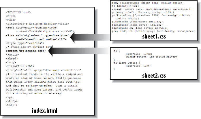
图 1-5: A representation of how external stylesheets are applied to documents
And what is the format of an external stylesheet? It’s a list of rules, just like those we saw in the previous section and in the example HTML document; but in this case, the rules are saved into their own file. Just remember that no HTML or any other markup language can be included in the stylesheet—only style rules. Here are the contents of an external stylesheet:
那么外部样式表是什么样的格式呢?和我们在前面章节中和在示例 HTML 文档中看到的那些样式一样,外部样式也是简单的规则列表,但是这些规则存储在自己的文件里面。要记住,HTML 和其它任何标记语言都不能放进样式表中——它只能包含样式规则。一个外部样式表的内容是这样的:
h1 {
  color: red;
}
h2 {
  color: maroon;
  background: white;
}
h3 {
  color: white;
  background: black;
  font: medium Helvetica;
}
That’s all there is to it—no HTML markup or comments at all, just plain-and-simple style declarations. These are saved into a plain-text file and are usually given an extension of .css, as in sheet1.css.
这就是它的全部内容——没有 HTML 标记或者注释,只有干净简单的样式声明。它们被存储在纯文本文件中,通常用
.css作为后缀,例如sheet1.css。

An external stylesheet cannot contain any document markup at all, only CSS rules and CSS comments, both of which are explained later in the chapter. The presence of markup in an external stylesheet can cause some or all of it to be ignored.
The filename extension is not required, but some older browsers won’t recognize the file as containing a stylesheet unless it actually ends with .css, even if you do include the correct type of text/css in the link element. In fact, some web servers won’t hand over a file as text/css unless its filename ends with .css, though that can usually be fixed by changing the server’s configuration files.
Attributes
For the rest of the link tag, the attributes and values are fairly straightforward. rel stands for “relation,” and in this case, the relation is stylesheet. The attribute type is always set to text/css. This value describes the type of data that will be loaded using the link tag. That way, the web browser knows that the stylesheet is a CSS stylesheet, a fact that will determine how the browser deals with the data it imports. After all, there may be other style languages used in the future, so it’s important to declare hich language you’re using.
对于 link 标记的其余部分,属性和值非常简单。rel 代表“关系”,在本例中,关系是样式表。属性类型总是设置为 text/css。此值描述将使用链接标记加载的数据类型。这样,web 浏览器就知道样式表是一个 CSS 样式表,这将决定浏览器如何处理它导入的数据。毕竟,将来可能还会使用其他样式语言,所以声明您正在使用的 hich 语言是很重要的。
Next, we find the href attribute. The value of this attribute is the URL of your style‐sheet. This URL can be either absolute or relative, depending on what works for you. In our example, the URL is relative. It just as easily could have been something like http://meyerweb.com/sheet1.css.
接下来,我们找到 href 属性。这个属性的值是你的样式表的 URL。这个 URL 可以是绝对的,也可以是相对的,这取决于什么适合您。在我们的示例中,URL 是相对的。它也可以是类似于http://meyerweb.com/sheet1.css这样的东西。
Finally, we have a media attribute. The value of this attribute is one or more media descriptors, which are rules regarding media types and the features of those media, with each rule separated by a comma. Thus, for example, you can use a linked style‐sheet in both screen and projection media:
最后,我们有一个媒体属性。此属性的值是一个或多个媒体描述符,它们是关于媒体类型和这些媒体特性的规则,每个规则由逗号分隔。因此,例如,你可以在屏幕和投影媒体中使用链接样式表:
<link
  rel="stylesheet"
  type="text/css"
  href="visual-sheet.css"
  media="screen, projection"
/>
Media descriptors can get quite complicated, and are explained in detail later in the chapter. For now, we’ll stick with the basic media types shown.
Note that there can be more than one linked stylesheet associated with a document.
In these cases, only those link tags with a rel of stylesheet will be used in the initial display of the document. Thus, if you wanted to link two stylesheets named basic.css and splash.css, it would look like this:
<link rel="stylesheet" type="text/css" href="basic.css" />
<link rel="stylesheet" type="text/css" href="splash.css" />
This will cause the browser to load both stylesheets, combine the rules from each, and apply them all to the document. For example:
<link rel="stylesheet" type="text/css" href="basic.css" />
<link rel="stylesheet" type="text/css" href="splash.css" />
<p class="a1">
  This paragraph will be gray only if styles from the stylesheet 'basic.css' are
  applied.
</p>
<p class="b1">
  This paragraph will be gray only if styles from the stylesheet 'splash.css'
  are applied.
</p>
The one attribute that is not in this example markup, but could be, is the title attribute. This attribute is not often used, but it could become important in the future and, if used improperly, can have unexpected effects. Why? We will explore that in the next section.
The one attribute that is not in this example markup, but could be, is the title attribute. This attribute is not often used, but it could become important in the future and, if used improperly, can have unexpected effects. Why? We will explore that in the next section.
Alternate stylesheets
It’s also possible to define alternate stylesheets. These are defined by making the value of the rel attribute alternate stylesheet, and they are used in document presentation only if selected by the user.
还可以定义其他样式表。通过使 rel 属性的值成为备选样式表来定义它们,并且只有在用户选择时才在文档表示中使用它们。
Should a browser be able to use alternate stylesheets, it will use the values of the link element’s title attributes to generate a list of style alternatives. So you could write the following:
如果浏览器能够使用替代样式表,它将使用 link 元素的 title 属性的值来生成样式替代列表。你可以这样写:
<link rel="stylesheet" type="text/css" href="sheet1.css" title="Default" />
<link
  rel="alternate stylesheet"
  type="text/css"
  href="bigtext.css"
  title="Big Text"
/>
<link
  rel="alternate stylesheet"
  type="text/css"
  href="zany.css"
  title="Crazy colors!"
/>
Users could then pick the style they want to use, and the browser would switch from the first one, labeled “Default” in this case, to whichever the user picked. Figure 1-6 shows one way in which this selection mechanism might be accomplished (and in fact was, early in the resurgence of CSS).
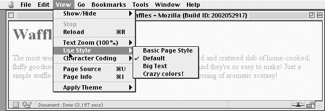
图 1-6: A browser offering alternate stylesheet selection

As of late 2016, alternate stylesheets were supported in most Gecko-based browsers like Firefox, and in Opera. They could be supported in the Internet Explorer family through the use of JavaScript but are not natively supported by those browsers. The WebKit family did not support selecting alternate stylesheets. Compare this to the age of the browser shown in Figure 1-6--it’s almost shocking.
It is also possible to group alternate stylesheets together by giving them the same title value. Thus, you make it possible for the user to pick a different presentation for your site in both screen and print media:
<link
  rel="stylesheet"
  type="text/css"
  href="sheet1.css"
  title="Default"
  media="screen"
/>
<link
  rel="stylesheet"
  type="text/css"
  href="print-sheet1.css"
  title="Default"
  media="print"
/>
<link
  rel="alternate stylesheet"
  type="text/css"
  href="bigtext.css"
  title="Big Text"
  media="screen"
/>
<link
  rel="alternate stylesheet"
  type="text/css"
  href="print-bigtext.css"
  title="Big Text"
  media="print"
/>
If a user selects “Big Text” from the alternate stylesheet selection mechanism in a conforming user agent, then bigtext.css will be used to style the document in the screen medium, and print-bigtext.css will be used in the print medium. Neither sheet1.css nor print-sheet1.css will be used in any medium.
Why is that? Because if you give a link with a rel of stylesheet a title, then you are designating that stylesheet as a preferred stylesheet. This means that its use is preferred to alternate stylesheets, and it will be used when the document is first displayed. Once you select an alternate stylesheet, however, the preferred stylesheet will not be used. Furthermore, if you designate a number of stylesheets as preferred, then all but one of them will be ignored. Consider the following code example:
<link
  rel="stylesheet"
  type="text/css"
  href="sheet1.css"
  title="Default Layout"
/>
<link
  rel="stylesheet"
  type="text/css"
  href="sheet2.css"
  title="Default Text Sizes"
/>
<link
  rel="stylesheet"
  type="text/css"
  href="sheet3.css"
  title="Default Colors"
/>
All three link elements now refer to preferred stylesheets, thanks to the presence of a title attribute on all three, but only one of them will actually be used in that manner. The other two will be ignored completely. Which two? There’s no way to be certain, as HTML doesn’t provide a method of determining which preferred stylesheets should be ignored and which should be used.
If you don’t give a stylesheet a title, then it becomes a persistent stylesheet and is always used in the display of the document. Often, this is exactly what an author wants.
1.3.2 The style Element
The style element is one way to include a stylesheet, and it appears in the document itself:
<style type="text/css">
  ...;
</style>
style should always use the attribute type; in the case of a CSS document, the correct value is "text/css", just as it was with the link element.
The style element should always start with <style type="text/css">, as shown in the preceding example. This is followed by one or more styles and is finished with a closing </style> tag. It is also possible to give the style element a media attribute, which functions in the same manner as previously discussed for linked stylesheets. The styles between the opening and closing style tags are referred to as the document stylesheet or the embedded stylesheet (because this kind of stylesheet is embedded within the document). It will contain many of the styles that will apply to the document, but it can also contain multiple links to external stylesheets using the @import directive.
1.3.3 The @import Directive
Now we’ll discuss the stuff that is found inside the style tag. First, we have something very similar to link: the @import directive:
@import url(sheet2.css);Just like link, @import can be used to direct the web browser to load an external stylesheet and use its styles in the rendering of the HTML document. The only major difference is in the syntax and placement of the command. As you can see, @import is found inside the style container. It must be placed before the other CSS rules or it won’t work at all. Consider this example:
<style type="text/css">
  @import url(styles.css); /* @import comes first */
  h1 {
    color: gray;
  }
</style>
Like link, there can be more than one @import statement in a document. Unlike link, however, the stylesheets of every @import directive will be loaded and used; there is no way to designate alternate stylesheets with @import. So, given the following markup:
@import url(sheet2.css);
@import url(blueworld.css);
@import url(zany.css);
all three external stylesheets will be loaded, and all of their style rules will be used in the display of the document.
As with link, you can restrict imported stylesheets to one or more media by providing media descriptors after the stylesheet’s URL:
@import url(sheet2.css) all;
@import url(blueworld.css) screen;
@import url(zany.css) projection, print;
As noted in “The link Tag” on page 8, media descriptors can get quite complicated, and are explained in detail in Chapter 20, Media-Dependent Styles.
@import can be highly useful if you have an external stylesheet that needs to use the styles found in other external stylesheets. Since external stylesheets cannot contain any document markup, the link element can’t be used—but @import can. Therefore, you might have an external stylesheet that contains the following:
@import url(http://example.org/library/layout.css);
@import url(basic-text.css);
@import url(printer.css) print;
body {
  color: red;
}
h1 {
  color: blue;
}
Well, maybe not those exact styles, but hopefully you get the idea. Note the use of both absolute and relative URLs in the previous example. Either URL form can be used, just as with link.
Note also that the @import directives appear at the beginning of the stylesheet, as they did in the example document. CSS requires the @import directive to come before any other rules in a stylesheet. An @import that comes after other rules (e.g., body {color: red;}) will be ignored by conforming user agents.
Older versions of Internet Explorer for Windows do not ignore any @import directive, even those that come after other rules. Since other browsers do ignore improperly placed @import directives, it is easy to mistakenly place the @import directive incorrectly and thus alter the display in other browsers.
1.3.4 HTTP Linking
There is another, far more obscure way to associate CSS with a document: you can link the two via HTTP headers.
Under Apache, this can be accomplished by adding a reference to the CSS file in a .htaccess file. For example:
Header add Link "</ui/testing.css>;rel=stylesheet;type=text/css"This will cause supporting browsers to associate the referenced stylesheet with any documents served from under that .htaccess file. The browser will then treat it as if it were a linked stylesheet. Alternatively, and probably more efficiently, you can add an equivalent rule to the server’s httpd.conf file:
<Directory /path/to/ /public/html/directory>
Header add Link "</ui/testing.css>;rel=stylesheet;type=text/css"
</Directory>
The effect is exactly the same in supporting browsers. The only difference is in where you declare the linking.
You probably noticed the use of the term “supporting browsers.” As of late 2017, the widely used browsers that support HTTP linking of stylesheets are the Firefox family and Opera. That restricts this technique mostly to development environments based on one of those browsers. In that situation, you can use HTTP linking on the test server to mark when you’re on the development site as opposed to the public site. It’s also an interesting way to hide styles from the WebKit and Internet Explorer families, assuming you have a reason to do so.
There are equivalents to this technique in common scripting languages such as PHP and IIS, both of which allow the author to emit HTTP headers. It’s also possible to use such languages to explicitly write a link element into the document based on the server offering up the document. This is a more robust approach in terms of browser support: every browser supports the link element.
1.3.5 Inline Styles
For cases where you want to just assign a few styles to one individual element, without the need for embedded or external stylesheets, employ the HTML attribute style to set an inline style:
<p style="color: gray;">
  The most wonderful of all breakfast foods is the waffle—a ridged and cratered
  slab of home-cooked, fluffy goodness...
</p>
The style attribute can be associated with any HTML tag whatsoever, except for those tags that are found outside of body (head or title, for instance).
The syntax of a style attribute is fairly ordinary. In fact, it looks very much like the declarations found in the style container, except here the curly braces are replaced by double quotation marks. So <p style="color: maroon; background: yellow;"> will set the text color to be maroon and the background to be yellow for that paragraph only. No other part of the document will be affected by this declaration.
Note that you can only place a declaration block, not an entire stylesheet, inside an inline style attribute. Therefore, you can’t put an @import into a style attribute, nor can you include any complete rules. The only thing you can put into the value of a style attribute is what might go between the curly braces of a rule.
Use of the style attribute is not generally recommended. Indeed, it is very unlikely to appear in XML languages other than HTML. Many of the primary advantages of CSS—the ability to organize centralized styles that control an entire document’s appearance or the appearance of all documents on a web server—are negated when you place styles into a style attribute. In many ways, inline styles are not much better than the font tag, although they do have a good deal more flexibility in terms of what visual effects they can apply
1.4 Stylesheet Contents
So after all of that, what about the actual contents of the stylesheets? You know, stuff like this:
h1 {
  color: maroon;
}
body {
  background: yellow;
}
Styles such as these comprise the bulk of any embedded stylesheet—simple and complex, short and long. Rarely will you have a document where the style element does not contain any rules, although it’s possible to have a simple list of @import declarations with no actual rules like those shown in the previous example. Before we get going on the rest of the book, there are a few top-level things to cover regarding what can or can’t go into a stylesheet.
1.4.1 Markup
There is no markup in stylesheets. This might seem obvious, but you’d be surprised. The one exception is HTML comment markup, which is permitted inside style elements for historical reasons:
<style type="text/css">
  <!--
  h1 {color: maroon;}
  body {background: yellow;}
  -->
</style>
That’s it.
1.4.2 Rule Structure
To illustrate the concept of rules in more detail, let’s break down the structure.
Each rule has two fundamental parts: the selector and the declaration block. The declaration block is composed of one or more declarations, and each declaration is a pairing of a property and a value. Every stylesheet is made up of a series of rules. Figure 1-7 shows the parts of a rule.
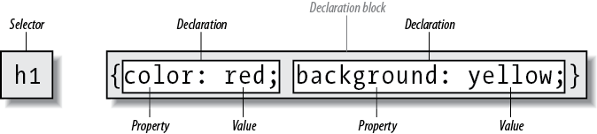
图 1-7: The structure of a rule
The selector, shown on the left side of the rule, defines which piece of the document will be affected. In Figure 1-7, h1 elements are selected. If the selector were p, then all p (paragraph) elements would be selected.
The right side of the rule contains the declaration block, which is made up of one or more declarations. Each declaration is a combination of a CSS property and a value of that property. In Figure 1-7, the declaration block contains two declarations. The first states that this rule will cause parts of the document to have a color of red, and the second states that part of the document will have a background of yellow. So, all of the h1 elements in the document (defined by the selector) will be styled in red text with a yellow background.
1.4.3 Vendor prefixing
Sometimes you’ll see pieces of CSS with dashes and labels in front of them, like this: -o-border-image. These are called vendor prefixes, and are a way for browser vendors to mark properties, values, or other bits of CSS as being experimental or proprietary (or both). As of late 2016, there were a few vendor prefixes in the wild, with the most common being shown in Table 1-1.
| Prefix | Vendor |
|---|---|
| -epub- | International Digital Publishing Forum ePub format |
| -moz- | Mozilla-based browsers (e.g., Firefox) |
| -ms- | Microsoft Internet Explorer |
| -o- | Opera-based browsers |
| -webkit- | Webkit-based browsers (e.g., safari and Chrome) |
As Table 1-1 implies, the generally accepted format of a vendor prefix is a dash, a label, and a dash, although a few prefixes erroneously omit the first dash.
The uses and abuses of vendor prefixes are long, tortuous, and beyond the scope of this book. Suffice to say that they started out as a way for vendors to test out new features, thus helping speed interoperability without worrying about being locked into legacy behaviors that were incompatible with other browsers. This avoided a whole class of problems that nearly strangled CSS in its infancy. Unfortunately, prefixed properties were then publicly deployed by web authors and ended up causing a whole new class of problems.
As of late 2016, vendor prefixes are a dwindling breed, with old prefixed properties and values being slowly removed from browser implementations. It’s entirely possible that you’ll never write prefixed CSS, but you may encounter it in the wild, or inherit it in a legacy codebase.
1.4.4 Whitespace Handling
CSS is basically insensitive to whitespace between rules, and largely insensitive to whitespace within rules, although there are a few exceptions.
In general, CSS treats whitespace just like HTML does: any sequence of whitespace characters is collapsed to a single space for parsing purposes. Thus, you can format the hypothetical rainbow rule in the following ways:
rainbow: infrared red orange yellow green blue indigo violet ultraviolet;
rainbow: infrared red orange yellow green blue indigo violet ultraviolet;
rainbow: infrared red orange yellow green blue indigo violet ultraviolet;
…as well as any other separation patterns you can think up. The only restriction is that the separating characters be whitespace: an empty space, a tab, or a newline, alone or in combination, as many as you like.
Similarly, you can format series of rules with whitespace in any fashion you like. These are just five of an effectively infinite number of possibilities:
html {
  color: black;
}
body {
  background: white;
}
p {
  color: gray;
}
h2 {
  color: silver;
}
ol {
  color: silver;
}
As you can see from the first rule, whitespace can be largely omitted. Indeed, this is usually the case with minified CSS, which is CSS that’s had every last possible bit of extraneous whitespace removed. The rules after the first two use progressively more extravagant amounts of whitespace until, in the last rule, pretty much everything that can be separated onto its own line has been.
All of these approaches are valid, so you should pick the formatting that makes the most sense—that is, is easiest to read—in your eyes, and stick with it. There are some places where the presence of whitespace is actually required. The most common example is when separating a list of keywords in a value, as in the hypothetical rainbow examples. Those must always be whitespace-separated.
1.4.5 CSS Comments
CSS does allow for comments. These are very similar to C/C++ comments in that
they are surrounded by /* and */:
/* This is a CSS1 comment */Comments can span multiple lines, just as in C++:
/* This is a CSS1 comment, and it
can be several lines long without
any problem whatsoever. */
It’s important to remember that CSS comments cannot be nested. So, for example,
this would not be correct:
/_ This is a comment, in which we find
another comment, which is WRONG
/* Another comment */
and back to the first comment _/
One way to create “nested” comments accidentally is to temporarily comment out a large block of a stylesheet that already contains a comment. Since CSS doesn’t permit nested comments, the “outside” comment will end where the “inside” comment ends.
Unfortunately, there is no “rest of the line” comment pattern such as // or # (the latter of which is reserved for ID selectors anyway). The only comment pattern in CSS is /* _/. Therefore, if you wish to place comments on the same line as markup, then you need to be careful about how you place them. For example, this is the correct way to do it:
h1 {
  color: gray;
} /* This CSS comment is several lines */
h2 {
  color: silver;
} /* long, but since it is alongside */
p {
  color: white;
} /* actual styles, each line needs to */
pre {
  color: gray;
} /* be wrapped in comment markers. */
Given this example, if each line isn’t marked off, then most of the stylesheet will become part of the comment and thus will not work:
h1 {
  color: gray;
} /* This CSS comment is several lines
h2 {color: silver;} long, but since it is not wrapped
p {color: white;} in comment markers, the last three
pre {color: gray;} styles are part of the comment. */
In this example, only the first rule (h1 {color: gray;}) will be applied to the document. The rest of the rules, as part of the comment, are ignored by the browser’s rendering engine.
CSS comments are treated by the CSS parser as if they do not exist at all, and so do not count as whitespace for parsing purposes. This means you can put them into the middle of rules—even right inside declarations!
1.5 Media Queries
With media queries, an author can define the media environment in which a given stylesheet is used by the browser. In the past, this was handled by setting media types via the media attribute on the link element, on a style element, or in the media descriptor of an @import or @media declaration. Media queries take this concept several steps further by allowing authors to choose stylesheets based on the features of a given media type, using what are called media descriptors.
1.5.1 Usage
Media queries can be employed in the following places:
- The media attribute of a link element
- The media attribute of a style element
- The media descriptor portion of an @import declaration
- The media descriptor portion of an @media declaration Queries can range from simple media types to complicated combinations of media types and features.
1.5.2 Simple Media Queries
Let’s look at some simple media blocks before covering all of the possibilities of media queries. Suppose we want some differing styles for situations where the styles are shown in a projection setting, such as a slide show. Here are two very simple bits of CSS:
h1 {
  color: maroon;
}
@media projection {
  body {
    background: yellow;
  }
}
In this example, h1 elements will be colored maroon in all media, but the body element will get a yellow background only in a projection medium.
You can have as many @media blocks as you like in a given stylesheet, each with its own set of media descriptors (see later in this chapter for details). You could even encapsulate all of your rules in an @media block if you chose, like this:
@media all {
  h1 {
    color: maroon;
  }
  body {
    background: yellow;
  }
}
However, since this is exactly the same as if you stripped off the first and last line shown, there isn’t a whole lot of point to doing so.
The indentation shown in this section was solely for purposes of clarity. You do not have to indent the rules found inside an @media block, but you’re welcome to do so if it makes your CSS easier for you to read.
1.5.3 Media Types
The place where we saw projection and all in those examples is where media queries are set. These queries rely on a combination of terms that describe the type of media to be considered, as well as descriptions of the media’s parameters (e.g., resolution or display height), to determine when blocks of CSS should be applied.
The most basic form of media queries are media types, which first appeared in CSS2. These are simple labels for different kinds of media:
all
Use in all presentational media.print
Use when printing the document for sighted users and also when displaying a print preview of the document.screen
Use when presenting the document in a screen medium like a desktop computer monitor. All web browsers running on such systems are screen-medium user agents.
As of this writing, a couple of browsers also support projection, which allows a document to be presented as a slideshow. Several mobile-device browsers support the handheld type, but not in consistent ways.
Multiple media types can be specified using a comma-separated list. The following four examples are all equivalent ways of applying a stylesheet (or a block of rules) in both screen and print media:
<link type="text/css" href="frobozz.css" media="screen, print" />
<style type="text/css" media="screen, print">
  ...;
</style>
@import url(frobozz.css) screen, print;
@media screen, print {
...;
}Things get interesting when you add feature-specific descriptors, such as values that describe the resolution or color depth of a given medium, to these media types.
1.5.4 Media Descriptors
The placement of media queries will be very familiar to any author who has ever set a media type on a link element or an @import declaration. Here are two essentially equivalent ways of applying an external stylesheet when rendering the document on a color printer:
<link
  href="print-color.css"
  type="text/css"
  media="print and (color)"
  rel="stylesheet"
/>
@import url(print-color.css) print and (color);Anywhere a media type can be used, a media query can be used. This means that, following on the examples of the previous section, it is possible to list more than one query in a comma-separated list:
<link
  href="print-color.css"
  type="text/css"
  media="print and (color), screen and (color-depth: 8)"
  rel="stylesheet"
/>
@import url(print-color.css) print and (color), screen and (color-depth: 8);In any situation where even one of the media queries evaluates to “true,” the associated stylesheet is applied. Thus, given the previous @import, print-color.css will be applied if rendering to a color printer or to a sufficiently colorful screen environment. If printing on a black-and-white printer, both queries will evaluate to “false”, and print-color.css will not be applied to the document. The same holds true in any screen medium, and so on.
在任何情况下,即使其中一个媒体查询的结果是“true”,也会应用相关联的样式表。因此,给定前面的@import,如果将其呈现到彩色打印机或彩色屏幕环境中,将应用 print-color.css。如果在黑白打印机上打印,两个查询都将计算为“false”,并且 print-color.css 将不应用于文档。这同样适用于任何屏幕媒体,等等。
Each media descriptor is composed of a media type and one or more listed media features, with each media feature descriptor enclosed in parentheses. If no media type is provided, then it is assumed to be all, which makes the following two examples equivalent:
每个媒体描述符由一个媒体类型和一个或多个列出的媒体特性组成,每个媒体特性描述符括在括号中。如果没有提供媒体类型,则假设为 all,这使得下面两个例子等价:
@media all and (min-resolution: 96dpi) {
  ...;
}
@media (min-resolution: 96dpi) {
  ...;
}
Generally speaking, a media feature descriptor is formatted like a property-value pair in CSS. There are a few differences, most notably that some features can be specified without an accompanying value. Thus, for example, any color-based medium will be matched using (color), whereas any color medium using a 16-bit color depth is matched using (color: 16). In effect, the use of a descriptor without a value is a true/false test for that descriptor: (color) means “is this medium in color?”
一般来说,媒体特性描述符的格式类似于 CSS 中的属性-值对。有一些不同之处,最明显的是一些特性可以在没有附加值的情况下指定。因此,例如,任何基于颜色的媒体将使用(color)进行匹配,而任何使用 16 位颜色深度的媒体将使用(color: 16)进行匹配。实际上,使用没有值的描述符是对描述符的真/假测试:(颜色)表示“该媒体是彩色的吗?”
Multiple feature descriptors can be linked with the and logical keyword. In fact, there are two logical keywords in media queries:
多个特征描述符可以与 and logical 关键字链接。事实上,在媒体查询中有两个逻辑关键字:
and
Links together two or more media features in such a way that all of them must be true for the query to be true. For example, (color) and (orientation: land scape) and (min-device-width: 800px) means that all three conditions must be satisfied: if the media environment has color, is in landscape orientation, and the device’s display is at least 800 pixels wide, then the stylesheet is used.
将两个或多个媒体特性链接在一起,使所有特性都为真,查询才为真。例如,(color)和(朝向:landscape)和(min-device-width: 800px)意味着必须满足所有三个条件:如果媒体环境有颜色,处于横向方向,并且设备的显示宽度至少为 800 像素,则使用样式表。
not
Negates the entire query such that if all of the conditions are true, then the stylesheet is not applied. For example, not (color) and (orientation: landscape) and (min-device-width: 800px) means that if the three conditions are satisfied, the statement is negated. Thus, if the media environment has color, is in landscape orientation, and the device’s display is at least 800 pixels wide, then the stylesheet is not used. In all other cases, it will be used.
否定整个查询,如果所有条件都为真,则不应用样式表。例如,not (color)和(orientation: landscape)和(min-device-width: 800px)表示如果满足这三个条件,则语句被否定。因此,如果媒体环境有颜色,是横向的,并且设备的显示宽度至少为 800 像素,那么样式表将不被使用。在所有其他情况下,都将使用它。
Note that the not keyword can only be used at the beginning of a media query. It is not legal to write something like (color) and not (min-device-width: 800px). In such cases, the query will be ignored. Note also that browsers too old to understand media queries will always skip a stylesheet whose media descriptor starts with not. There is no OR keyword for use in media queries. Instead, the commas that separate a list of queries serve the function of an OR—screen, print means “apply if the media is screen or print.” Instead of screen and (max-color: 2) or (monochrome), which is invalid and thus ignored, you should write screen and (max-color: 2), screen and (monochrome).
注意,not 关键字只能在媒体查询的开头使用。像(color)和(min-device-width: 800px)这样的代码是不合法的。在这种情况下,查询将被忽略。还要注意的是,那些太老而不能理解媒体查询的浏览器总是会跳过一个以 not 开头的样式表。没有用于媒体查询的 OR 关键字。相反,分隔查询列表的逗号具有 or - screen 的功能,print 表示“如果媒体是 screen 或 print,则应用”。你应该写 screen 和(max-color: 2)或(monochrome),而不是 screen 和(max-color: 2)或(monochrome),这是无效的,因此被忽略了。
There is one more keyword, only, which is designed to create deliberate backward incompatibility (yes, really):
还有一个关键字 only,它被设计成故意向后不兼容(是的,真的):
only
Used to hide a stylesheet from browsers too old to understand media queries. For example, to apply a stylesheet in all media, but only in those browsers that understand media queries, you write something like @import url(new.css) only all. In browsers that do understand media queries, the only keyword is ignored and the stylesheet is applied. In browsers that do not understand media queries, the only keyword creates an apparent media type of only all, which is not valid. Thus, the stylesheet is not applied in such browsers. Note that the only keyword can only be used at the beginning of a media query.
1.5.5 Media Feature Descriptors and Value Types
So far we’ve seen a number of media feature descriptors in the examples, but not a complete list. Following is a list of all possible descriptors (current as of late 2017):
- width
- min-width
- max-width
- device-width
- min-device-width
- max-device-width
- height
- min-height
- max-height
- device-height
- min-device-height
- max-device-height
- aspect-ratio
- min-aspect-ratio
- max-aspect-ratio
- device-aspectratio
- min-device-aspectratio
- max-device-aspectratio
- color
- min-color
- max-color
- color-index
- min-color-index
- max-color-index
- monochrome
- min-monochrome
- max-monochrome
- resolution
- min-resolution
- max-resolution
- orientation
- scan
- grid
In addition, two new value types were added:
<ratio><resolution>
A complete description of these descriptors and values, and how to use them, can be found in Chapter 20.
1.6 Feature Queries
Between 2015 and 2016, CSS gained the ability to apply blocks of CSS when certain CSS property-value combinations were supported by the user agent. These are known as feature queries.
They’re very similar to media queries in structure. Consider a situation where you want to only apply color to element if color is a supported property. (Which it certainly should be!) That would look like this:
@supports (color: black) {
  body {
    color: black;
  }
  h1 {
    color: purple;
  }
  h2 {
    color: navy;
  }
}
That says, in effect, “If you recognize and can do something with the property-value combination color: black, apply these styles. Otherwise, skip these styles.” In user agents that don’t understand @supports, the entire block is skipped over.
Feature queries are a perfect way to progressively enhance your styles. For example, suppose you want to add some grid layout to your existing float-and-inline-block layout. You can keep the old layout scheme, and then later in the stylesheet include a block like this:
@supports (display: grid) {
  section#main {
    display: grid;
  }
  /* styles to switch off old layout positioning */
  /* grid layout styles */
}
This block of styles will be applied in browsers that understand grid display, overriding the old styles that governed page layout, and then applying the styles needed to make things work in a grid-based future. Browsers too old to understand grid layout will most likely also be too old to understand @supports, so they’ll skip the whole block entirely, as if it had never been there.
Feature queries can be embedded inside each other, and indeed can be embedded inside media queries, as well as vice versa. You could write screen and print styles based on flexible-box layout, and wrap those media blocks in an @supports (display: flex) block:
@supports (display: flex) {
  @media screen {
    /* screen flexbox styles go here */
  }
  @media print {
    /* print flexbox styles go here */
  }
}
Conversely, you could add @supports() blocks inside various responsive-design media query blocks:
@media screen and (max-width: 30em) {
  @supports (display: flex) {
    /* small-screen flexbox styles go here */
  }
}
@media screen and (min-width: 30em) {
  @supports (display: flex) {
    /* large-screen flexbox styles go here */
  }
}
How you organize these blocks is really up to you.
As with media queries, feature queries also permit logical operators. Suppose we want to apply styles only if a user agent supports both grid layout and CSS shapes. Here’s how that might go:
@supports (display: grid) and (shape-outside: circle()) {
  /* grid-and-shape styles go here */
}
This is essentially equivalent to writing the following:
这基本上相当于写以下内容:
@supports (display: grid) {
  @supports (shape-outside: circle()) {
    /* grid-and-shape styles go here */
  }
}
However, there’s more than “and” operations available. CSS Shapes (covered in detail in Chapter 10) are a good example of why “or” is useful, because for a long time WebKit only supported CSS shapes via vendor-prefixed properties. So if you want to use shapes, you can use a feature query like this:
但是,除了“和”操作之外,还有更多可用的操作。CSS 形状(在第 10 章中详细介绍)是一个很好的例子,说明为什么“或”是有用的,因为长期以来 WebKit 只通过供应商前缀属性支持 CSS 形状。因此,如果你想使用形状,你可以使用这样的功能查询:
@supports (shape-outside: circle()) or (-webkit-shape-outside: circle()) {
  /* shape styles go here */
}
You’d still have to make sure to use both prefixed and unprefixed versions of the shape properties, but this would let you add support for those properties backward in the WebKit release line while supporting other browsers that also support shapes, but not via prefixed properties.
您仍然需要确保同时使用带前缀和不带前缀的形状属性,但是这将允许您在 WebKit 发布行中向后添加对这些属性的支持,同时支持其他也支持形状的浏览器,但不是通过带前缀的属性。
All this is incredibly handy because there are situations where you might want to apply different properties than those you’re testing. So, to go back to grid layout for a second, you might want to change the margins and so forth on your layout elements when grid is in use. Here’s a simplified version of that approach:
所有这些都非常方便,因为在某些情况下,您可能希望应用不同于测试的属性。因此,要回到网格布局,您可能需要在使用网格时更改布局元素的页边距等。下面是这种方法的一个简化版本:
div#main {
  overflow: hidden;
}
div.column {
  float: left;
  margin-right: 1em;
}
div.column:last-child {
  margin-right: 0;
}
@supports (display: grid) {
  div#main {
    display: grid;
    grid-gap: 1em 0;
    overflow: visible;
  }
  div#main div.column {
    margin: 0;
  }
}
It’s possible to use negation as well. For example, you could apply the following styles in situations where grid layout is not supported:
也可以使用否定。例如,你可以在不支持网格布局的情况下应用以下样式:
@supports not (display: grid) {
  /* grid-not-supported styles go here */
}
You can combine your logical operators into a single query, but parentheses are required to keep the logic straight. Suppose we want a set of styles to be applied when color is supported, and when one of either grid or flexible box layout is supported. That’s written like this:
您可以将逻辑运算符组合成单个查询,但是需要使用括号来保持逻辑的正确性。假设我们希望在支持颜色时应用一组样式,在支持网格或灵活的框布局时应用一组样式。它是这样写的:
@supports (color: black) and ((display: flex) or (display: grid)) {
  /* styles go here */
}
Notice how there’s another set of parentheses around the “or” part of the logic, enclosing the grid and flex tests. Those extra parentheses are required. Without them, the entire expression will fail, and the styles inside the block will be skipped. In other words, don’t do this:
请注意,在逻辑的“或”部分周围还有一组括号,用于封装网格和 flex 测试。需要那些额外的括号。没有它们,整个表达式将失败,块内的样式将被跳过。换句话说,不要这样做:
@supports (color: black) and (display: flex) or (display: grid) {Finally, you might wonder why both a property and value are required in feature query tests. After all, if you’re using shapes, all you need to test for is shape-outside, right? It’s because a browser can easily support a property without supporting all its values. Grid layout is a perfect example for this. Suppose you could test for grid support like this:
最后,您可能想知道为什么特性查询测试需要属性和值。毕竟,如果你使用的是形状,你需要测试的只是外形,对吧?这是因为浏览器可以很容易地支持一个属性,而不需要支持它的所有值。网格布局就是一个完美的例子。假设你可以像这样测试网格支持:
@supports (display) {
  /* grid styles go here */
}
Well, even Internet Explorer 4 supported display. Any browser that understands @supports will certainly understand display and many of its values—but maybe not grid. That’s why property and value are always tested in feature queries.
甚至 Internet Explorer 4 也支持显示。任何理解@supports 的浏览器肯定都能理解 display 和它的许多值——但可能不是 grid。这就是为什么属性和值总是在特性查询中测试的原因。
Remember that these are feature queries, not correctness queries. A browser can understand the feature you’re testing for, but implement it with bugs. So you’re not getting an assurance from the browser that it supports something correctly. All a positive featurequery result means is that the browser understands what you’ve said and makes some sort of attempt to support it.
1.7 Summary
With CSS, it is possible to completely change the way elements are presented by a user agent. This can be executed at a basic level with the display property, and in a different way by associating stylesheets with a document. The user will never know whether this is done via an external or embedded stylesheet, or even with an inline style. The real importance of external stylesheets is the way in which they allow authors to put all of a site’s presentation information in one place, and point all of the documents to that place. This not only makes site updates and maintenance a breeze, but it helps to save bandwidth, since all of the presentation is removed from documents. With @supports(), it’s even possible to do some basic progressive enhancement in native CSS.
使用 CSS,完全改变用户代理显示元素的方式是可能的。这可以通过 display 属性在基本级别上执行,也可以通过将样式表与文档关联的不同方式执行。用户永远不会知道这是通过外部样式表还是嵌入式样式表,甚至是内联样式表来完成的。外部样式表的真正重要性在于,它允许作者将站点的所有表示信息放在一个地方,并将所有文档指向那个地方。这不仅使站点更新和维护变得轻而易举,而且还有助于节省带宽,因为所有的表示都从文档中删除了。使用@supports(),甚至可以在原生 CSS 中进行一些基本的渐进式增强。
To make the most of the power of CSS, authors need to know how to associate a set of styles with the elements in a document. To fully understand how CSS can do all of this, authors need a firm grasp of the way CSS selects pieces of a document for styling, which is the subject of the next chapter.
为了充分利用 CSS 的强大功能,作者需要知道如何将一组样式与文档中的元素关联起来。要完全理解 CSS 是如何做到这一切的,作者需要掌握 CSS 选择文档片段进行样式化的方法,这是下一章的主题。