第 13 章 网格布局 Grid Layout
第 13 章 网格布局 Grid Layout
For as long as CSS has existed—which is, believe it or not, two decades now—it’s had a layout-shaped hole at its center. We’ve bent other features to the purposes of layout, most notably float and clear, and generally hacked our way around that hole. Flexbox layout helped to fill it, but flexbox is really meant for only specific use cases, like navigation bars (navbars).
自从 CSS 存在以来——信不信由你,它已经存在了 20 年了——它的中心就有一个布图形状的洞。我们已经将其他的功能调整为布局的目的,最明显的是“浮动”和“清除”,通常我们会绕过这个漏洞。Flexbox 布局有助于填充它,但 Flexbox 实际上只针对特定的用例,比如导航栏(navbar)。
Grid layout, by contrast, is a generalized layout system. With its emphasis on rows and columns, it might at first feel like a return to table layout—and in certain ways that’s not too far off—but there is far, far more to grid layout than table layout. Grid allows pieces of the design to be laid out independently of their document source order, and even overlap pieces of the layout, if that’s your wish. There are powerfully flexible methods for defining repeating patterns of grid lines, attaching elements to those grid lines, and more. You can nest grids inside grids, or for that matter, attach tables or flexbox containers to a grid. And much, much more.
相比之下,网格布局是一个广义的布局系统。它的重点放在行和列上,乍一看可能感觉像是回到了表的布局—在某些方面也不是太遥远—但是网格布局远比表布局重要得多。网格允许设计的各个部分独立于它们的文档源顺序进行布局,如果您愿意,甚至可以重叠布局的各个部分。有非常灵活的方法可以定义网格线的重复模式,将元素附加到这些网格线,等等。您可以在网格中嵌套网格,或者在网格上附加表格或 flexbox 容器。还有更多更多。
In short, grid layout is the layout system we’ve long waited for. There’s a lot to learn, and perhaps even more to unlearn, as we leave behind the clever hacks and workarounds that have gotten us through the past 20 years.
简而言之,网格布局是我们期待已久的布局系统。我们有很多东西要学,也许还有更多东西要忘记,因为我们抛弃了过去 20 年帮助我们度过难关的聪明的技巧和变通方法。
13.1 Creating a Grid Container
The first step to creating a grid is defining a grid container. This is much like a containing block in positioning, or a flex container in flexible-box layout: a grid container is an element that defines a grid formatting context for its contents.
创建网格的第一步是定义一个“网格容器”。这很像一个定位中的包含块,或者一个灵活盒布局中的 flex 容器:网格容器是一个元素,它为其内容定义了一个“网格格式化上下文”。
At this very basic level, grid layout is actually quite reminiscent of flexbox. For example, the child elements of a grid container become grid items, just as the child elements of a flex container become flex items. The children of those child elements do not become grid elements—although any grid item can itself be made a grid container, and thus have its child elements become grid items to the nested grid. It’s possible to nest grids inside grids, until it’s grids all the way down. (Grid layout also has a separate concept of subgrids that is distinct from nesting grid containers, but we’ll get to that later.)
在这个非常基础的层次上,网格布局实际上很容易让人联想到 flexbox。例如,网格容器的子元素成为“网格项”,就像伸缩容器的子元素成为伸缩项一样。这些子元素的子元素不会成为网格元素—尽管任何网格项目本身都可以成为网格容器,从而使其子元素成为嵌套网格的网格项目。在网格中嵌套网格是可能的,直到网格一直向下。(网格布局还有一个独立的“子网格”概念,与嵌套网格容器不同,但我们将在稍后讨论这个问题。)
There are two kinds of grids: regular grids and inline grids. These are created with special values for the display property: grid and inline-grid. The first generates a block-level box, and the second an inline-level box. The difference is illustrated in Figure 13-1.
有两种网格:“规则”网格和“内联”网格。这些是用“显示”属性的特殊值创建的:“网格”和“内联网格”。第一个生成块级别的框,第二个生成内联级别的框。图 13-1 显示了这种差异。
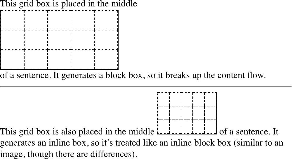
图 13-1: Grids and inline grids
These are very similar to the block and inline-block values for display. Most grids you create are likely to be block-level, though the ability to create inline grids is always there.
这些非常类似于“显示”的“块”和“内联块”的值。您创建的大多数网格很可能是块级的,尽管总是有创建内联网格的能力。
Although display: grid creates a block-level grid, the specification is careful to explicitly state that “grid containers are not block containers.” What this means is that although the grid box participates in layout much as a block container does, there are a number of differences between them.
尽管“display: grid”创建了一个块级别的网格,但该规范谨慎地明确声明“网格容器不是块级别的容器”。这意味着虽然网格盒参与布局就像一个块容器,但它们之间有许多不同之处。
First off, floated elements do not intrude into the grid container. What this means in practice is that a grid will not slide under a floated element, as a block container will do. See Figure 13-2 for a demonstration of the difference.
首先,被浮动的元素不会侵入网格容器。这在实践中意味着网格不会像块容器那样在浮动元素下滑动。参见图 13-2,以演示这种差异。
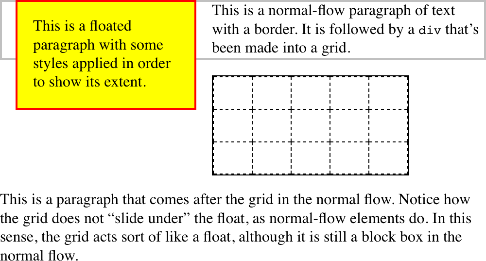
图 13-2: Floats interact differently with blocks and grids
Furthermore, the margins of a grid container do not collapse with the margins of its descendants. Again, this is distinct from block boxes, whose margins do (by default) collapse with descendants. For example, the first list item in an ordered list may have a top margin, but this margin will collapse with the list element’s top margin. The top margin of a grid item will never collapse with the top margin of its grid container. Figure 13-3 illustrates the difference.
此外,网格容器的边缘不会随其后代的边缘一起折叠。同样,这与块盒不同,块盒的页边距(默认情况下)会随着后代而折叠。例如,有序列表中的第一个列表项可能有一个顶部空白,但是这个空白会随着列表元素的顶部空白一起折叠。网格项的顶部边缘将“永不”随其网格容器的顶部边缘一起折叠。图 13-3 说明了其中的区别。
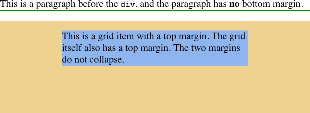
图 13-3: Margin collapsing and the lack thereof
There are a few CSS properties and features that do not apply to grid containers and grid items; specifically:
有一些 CSS 属性和特性并不适用于网格容器和网格项;具体地说:
- All
columnproperties (e.g.,column-count,columns, etc.) are ignored when applied to a grid container. - The
::first-lineand::first-letterpseudo-elements do not apply to grid containers and are ignored. floatandclearare effectively ignored for grid items (though not grid containers). Despite this, thefloatproperty still helps determine the computed value of thedisplayproperty for children of a grid container, because thedisplayvalue of the grid items is resolvedbeforethey’re made into grid items.- The
vertical-alignproperty has no effect on grid items, though it may affect the content inside the grid item. (There are other, more powerful ways to align grid items, so don’t worry.)
- 当应用到网格容器时,所有' column '属性(例如' column-count ', ' columns '等)将被忽略。
- '
首字母'伪元素不应用于网格容器,并被忽略。 - ' float '和' clear '对于网格项来说实际上是被忽略的(虽然不是网格容器)。尽管如此,' float '属性仍然有助于确定网格容器的子元素的' display '属性的计算值,因为网格项的' display '值在'它们被放入网格项之前'被解析'。
- '垂直对齐'属性对网格项目没有影响,虽然它可能会影响网格项目内的内容。(还有其他更强大的对齐网格项的方法,所以不要担心。)
Lastly, if a grid container’s declared display value is inline-grid and the element is either floated or absolutely positioned, the computed value of display becomes grid (thus dropping inline-grid).
最后,如果一个网格容器声明的“display”值是“inline-grid”,并且元素要么是浮动的,要么是绝对定位的,那么“display”的计算值就是“grid”(因此去掉了“inline-grid”)。
Once you’ve defined a grid container, the next step is to set up the grid within. Before we explore how that works, though, it’s necessary to cover some terminology.
定义了网格容器之后,下一步是在其中设置网格。不过,在探讨它是如何工作的之前,有必要介绍一些术语。
13.2 Basic Grid Terminology
We’ve already talked about grid containers and grid items, but let’s define them in a bit more detail. As was said before, a grid container is a box that establishes a gridformatting context; that is, an area in which a grid is created and elements are laid out according the rules of grid layout instead of block layout. You can think of it the way an element set to display: table creates a table-formatting context within it. Given the grid-like nature of tables, this comparison is fairly apt, though be sure not to make the assumption that grids are just tables in another form. Grids are far more powerful than tables ever were.
我们已经讨论了网格容器和网格项,但是让我们更详细地定义它们。如前所述,网格容器是用于建立网格格式上下文的框;也就是说,创建网格并根据网格布局规则而不是块布局布局元素的区域。您可以将其视为设置为“display: table”的元素在其中创建表格格式上下文。考虑到表的网格性质,这种比较是非常恰当的,但是不要假设网格只是另一种形式的表。网格比表要强大得多。
A grid item is a thing that participates in grid layout within a grid-formatting context. This is usually a child element of a grid container, but it can also be the anonymous (that is, not contained within an element) bits of text that are part of an element’s content. Consider the following, which has the result shown in Figure 13-4:
“网格项”是在网格格式上下文中参与网格布局的内容。这通常是一个网格容器的子元素,但它也可以是匿名的(即不包含在一个元素中)作为元素内容一部分的文本位。考虑下面的情况,其结果如图 13-4 所示:
#warning {display: grid;
 background: #FCC; padding: 0.5em;
 grid-template-rows: 1fr;
grid-template-columns: repeat(7, 1fr);}<p id="warning">
<img src="warning.svg" /><strong>Note:</strong> This element is a
<em>grid container</em> with several <em>grid items</em> inside it.
</p>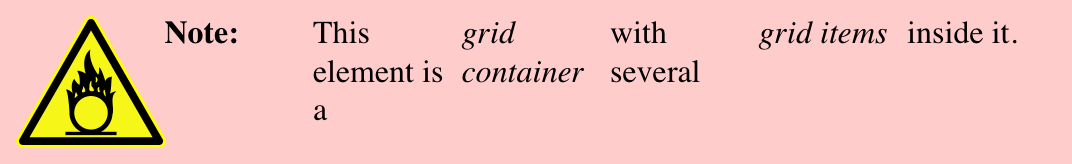
图 13-4: Grid items
Notice how each element, and each bit of text between them, has become a grid item. The image is a grid item, just as much as the elements and text runs—seven grid items in all. Each of these will participate in the grid layout, although the anonymous text runs will be much more difficult (or impossible) to affect with the various grid properties we’ll discuss.
请注意,每个元素以及它们之间的每个文本位是如何成为一个网格项的。图像是一个网格项,与元素和文本一样多——总共有 7 个网格项。其中的每一个都将参与到网格布局中,尽管匿名文本的运行将更加难以(或不可能)影响我们将讨论的各种网格属性。

If you’re wondering about grid-template-rows and gridtemplate-columns, we’ll tackle them in the next section.
In the course of using those properties, you’ll create or reference several core components of grid layout. These are summarized in Figure 13-5.
在使用这些属性的过程中,您将创建或引用网格布局的几个核心组件。这些在图 13-5 中进行了总结。
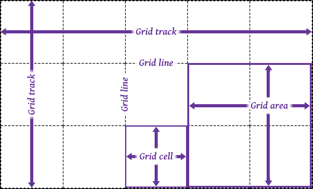
图 13-5: Grid components
The most fundamental unit is the grid line. By defining the placement of one or more grid lines, you implicitly create the rest of the grid’s components:
最基本的单元是“网格线”。通过定义一个或多个网格线的位置,您可以隐式地创建其余的网格组件:
- A
grid trackis a continuous run between two adjacent grid lines—in other words, a grid column or a grid row. It goes from one edge of the grid container to the other. The size of a grid track is dependent on the placement of the grid lines that define it. These are analogous to table columns and rows. More generically, these can be referred to as block axis and inline axis tracks, where (in Western languages) column tracks are on the block axis and row tracks are on the inline axis. - A
grid cellis any space bounded by four grid lines, with no grid lines running through it, analogous to a table cell. This is the smallest unit of area in grid layout. Grid cells cannot be directly addressed with CSS grid properties; that is, no property allows you to say a grid item should be associated with a given cell. (But see the next point for more details.) - A
grid areais any rectangular area bounded by four grid lines, and made up of one or more grid cells. An area can be as small as a single cell, or as large as all the cells in the grid. Grid areas are directly addressable by CSS grid properties, which allow you to define the areas and then associate grid items with them.
- “网格轨迹”是两个相邻的网格线之间的连续运行,换句话说,一个网格列或一个网格行。它从网格容器的一端延伸到另一端。网格轨迹的大小取决于定义它的网格线的位置。这些类似于表的列和行。更一般地,这些可以称为块轴和内联轴轨道,其中(在西方语言中)列轨道在块轴上,行轨道在内联轴上。
- “网格单元”是由四条网格线围绕的空间,没有网格线贯穿其中,类似于表格单元。这是网格布局中最小的面积单位。网格单元不能直接用 CSS 网格属性来处理;也就是说,没有任何属性允许您说网格项应该与给定的单元格关联。(但要了解更多细节,请参见下一点。)
- “网格区域”是由四条网格线围成的矩形区域,由一个或多个网格单元组成。一个区域可以小到一个单元格,也可以大到网格中的所有单元格。网格区域可以通过 CSS 网格属性直接寻址,允许您定义区域,然后将网格项与它们关联。
An important thing to note is that these grid tracks, cells, and areas are entirely constructed of grid lines—and more importantly, do not have to correspond to grid items. There is no requirement that all grid areas be filled with an item; it is perfectly possible to have some or even most of a grid’s cells be empty of any content. It’s also possible to have grid items overlap each other, either by defining overlapping grid areas or by using grid-line references that create overlapping situations.
需要注意的一件重要事情是,这些网格轨迹、单元格和区域完全是由网格线构成的,而且更重要的是,不必与网格项对应。没有要求所有的网格区域必须填入一个项目;完全有可能使网格的某些甚至大部分单元格空无一物。通过定义重叠的网格区域或使用创建重叠情况的网格线引用,也可以使网格项彼此重叠。
Another thing to keep in mind is that you can define as many or as few grid lines as you wish. You could literally define just a set of vertical grid lines, thus creating a bunch of columns and only one row. Or you could go the other way, creating a bunch of row tracks and no column tracks (though there would be one, stretching from one side of the grid container to the other).
另一件需要记住的事情是,您可以定义任意多的网格线,也可以定义任意少的网格线。可以只定义一组垂直网格线,从而创建一组列和一行。或者您也可以采用另一种方式,创建一组行轨迹而不创建列轨迹(尽管会有一个,从网格容器的一端延伸到另一端)。
The flip side to that is if you create a condition where a grid item can’t be placed within the column and row tracks you define, or if you explicitly place a grid item outside those tracks, new grid lines and tracks will be automatically added to the grid to accommodate.
另一面是如果你创建一个网格条件项不能放置在您定义的列和行轨道内,或者如果您显式地将一个网格项目以外,新的网格线和跟踪将会自动添加到网格适应。
13.3 Placing Grid Lines
It turns out that placing grid lines can get fairly complex. That’s not so much because the concept is difficult; there are just so many different ways to get it done, and each uses its own subtly different syntax.
事实证明,放置网格线会变得相当复杂。这并不是因为这个概念很难;有许多不同的方法可以完成它,每种方法都使用自己的语法。
We’ll get started by looking at two closely related properties.
我们将从两个密切相关的属性开始。
With these properties, you can define the grid lines in your overall grid template, or what the CSS specification calls the explicit grid. Everything depends on these grid lines; fail to place them properly, and the whole layout can very easily fall apart.
使用这些属性,您可以在整个网格模板中定义网格线,或者 CSS 规范所称的“显式网格”。一切都取决于这些网格线;如果放置不当,整个布局就会很容易崩溃。
When you’re starting out with CSS grid layout, it’s probably a very good idea to sketch out where the grid lines need to be on paper first, or in some close digital analogue. Having a visual reference for where lines should be, and how they should behave, will make writing your grid CSS a lot easier.
The exact syntax patterns for <track-list> and <auto-track-list> are complex and nest a few layers deep, and unpacking them would take a lot of time and space that’s better devoted to just exploring how things work. There are a lot of ways to specify your grid lines’ placement, so before we get started on learning those patterns, there are some basic things to establish.
<track-list>和<auto-track-list>的确切语法模式很复杂,并且嵌套了几层,将它们拆解将花费大量的时间和空间,最好将这些时间和空间用于探索事物是如何工作的。有很多方法可以指定网格线的位置,所以在我们开始学习这些模式之前,需要建立一些基本的东西。
First, grid lines can always be referred to by number, and can also be named by the author. Take the grid shown in Figure 13-6, for example. From your CSS, you can use any of the numbers to refer to a grid line, or you can use the defined names, or you can mix them together. Thus, you could say that a grid item stretches from column line 3 to line steve, and from row line skylight to line 2.
首先,网格线总是可以通过编号来引用,也可以由作者来命名。以图 13-6 所示的网格为例。在 CSS 中,可以使用任何数字来引用网格线,也可以使用定义的名称,或者将它们混合在一起。因此,您可以说一个网格项从列' 3 '延伸到行' steve ',从行' skylight '延伸到行' 2 '。
Note that a grid line can have more than one name. You can use any of them to refer to a given grid line, though you can’t combine them the way you can multiple class names. You might think that means it’s a good idea to avoid repeating grid-line names, but that’s not always the case, as we’ll soon see.
请注意,网格线可以有多个名称。您可以使用它们中的任何一个来引用给定的网格线,尽管您不能像组合多个类名那样组合它们。您可能认为这意味着避免重复网格线名称是一个好主意,但情况并不总是如此,我们很快就会看到。
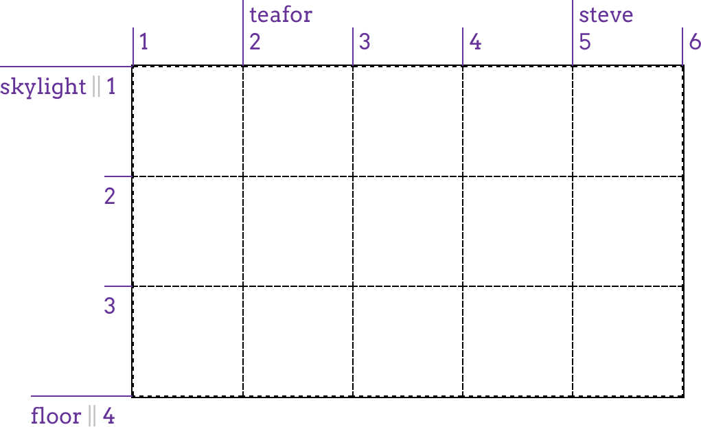
图 13-6: Grid-line numbers and names
I used intentionally silly grid-line names in Figure 13-6 to illustrate that you can pick any name you like, and also to avoid the implication that there are “default” names. If you’d seen start for the first line, you might have assumed that the first line is always called that. Nope. If you want to stretch an element from start to end, you’ll need to define those names yourself. Fortunately, that’s simple to do.
我在图 13-6 中故意使用了一些愚蠢的网格线名称来说明您可以选择任何喜欢的名称,同时也避免了“默认”名称的含义。如果您看到第一行的“start”,您可能会认为第一行总是被称为“start”。不。如果您想将一个元素从' start '扩展到' end ',您需要自己定义这些名称。幸运的是,这很容易做到。
As I’ve said, many value patterns can be used to define the grid template. We’ll start with the simpler ones and work our way toward the more complex.
如前所述,可以使用许多值模式来定义网格模板。我们将从简单的开始,然后逐步向复杂的方向发展。
13.3.1 Fixed-Width Grid Tracks
Our first step is to create a grid whose grid tracks are a fixed width. We don’t necessarily mean a fixed length like pixels or ems; percentages also count as fixed-width here. In this context, “fixed-width” means the grid lines are placed such that the distance between them does not change due to changes of content within the grid tracks.
我们的第一步是创建一个网格,其网格轨迹的宽度是固定的。我们不需要像像素或 ems 那样的固定长度;百分比在这里也算作固定宽度。在这种情况下,“固定宽度”是指网格线的位置,使它们之间的距离不会因为网格轨道内内容的变化而改变。
So, as an example, this counts as a definition of three fixed-width grid columns:
因此,作为一个例子,这可以看作是三个固定宽度的网格列的定义:
#grid {
  display: grid;
  grid-template-columns: 200px 50% 100px;
}
That will place a line 200 pixels from the start of the grid container (by default, the left side); a second grid line half the width of the grid container away from the first; and a third line 100 pixels away from the second. This is illustrated in Figure 13-7.
它将从网格容器的开始位置开始放置 200 像素的行(默认情况下是左侧);第二网格线距第一网格容器宽度的一半;第三行距离第二行 100 像素。如图 13-7 所示。
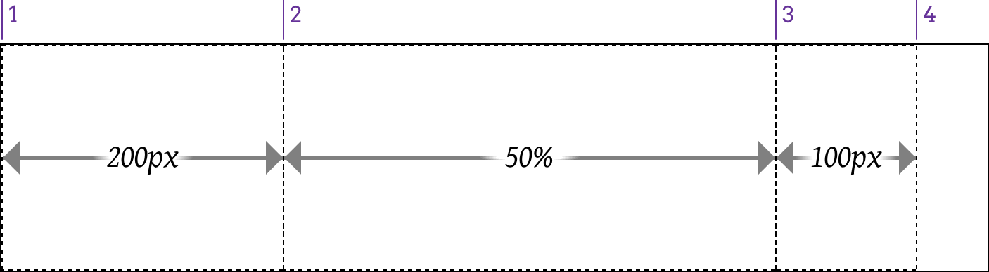
图 13-7: Grid-line placement
While it’s true that the second column can change in size if the grid container’s size changes, it will not change based on the content of the grid items. However wide or narrow the content placed in that second column, the column’s width will always be half the width of the grid container.
虽然如果网格容器的大小发生变化,第二列的大小也会发生变化,但是它不会根据网格项的内容发生变化。无论第二列中的内容有多宽或多窄,列的宽度总是网格容器宽度的一半。
It’s also true that the last grid line doesn’t reach the right edge of the grid container. That’s fine; it doesn’t have to. If you want it to—and you probably will—we’ll see vari‐ ous ways to deal with that in just a bit.
最后一条网格线没有到达网格容器的右边缘也是事实。这很好;不需要。如果你想这样做——你可能会这样做——我们很快就会看到各种各样的方法来解决这个问题。
This is all lovely, but what if you want to name your grid lines? Just place any gridline name you want, and as many as you want, in the appropriate place in the value, surrounded by square brackets. That’s all! Let’s add some names to our previous example, with the result shown in Figure 13-8:
这些都很好,但是如果你想给网格线命名呢?只需将您想要的任何 gridline 名称,以及您想要的任意多的 gridline 名称,放置在值中由方括号包围的适当位置。这是所有!让我们在前面的示例中添加一些名称,结果如图 13-8 所示:
#grid {
  display: grid;
  grid-template-columns: [start col-a] 200px [col-b] 50% [col-c] 100px [stop end last];
}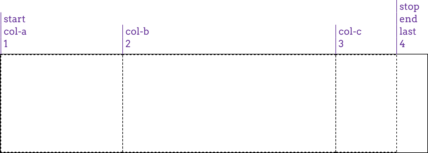
图 13-8: Grid-line name
What’s nice is that adding the names makes clear that each value is actually specifying a grid track’s width, which means there is always a grid line to either side of a width value. Thus, for the three widths we have, there are actually four grid lines created. Row grid lines are placed in exactly the same way as columns, as Figure 13-9 shows:
添加名称的好处是,可以清楚地看到每个值实际上指定了网格轨道的宽度,这意味着在宽度值的两侧始终有一条网格线。因此,对于我们所拥有的三个宽度,实际上创建了四条网格线。行网格线与列的放置方式完全相同,如图 13-9 所示:
#grid {
  display: grid;
  grid-template-columns: [start col-a] 200px [col-b] 50% [col-c] 100px [stop end last];
  grid-template-rows: [start masthead] 3em [content] 80% [footer] 2em [stop end];
}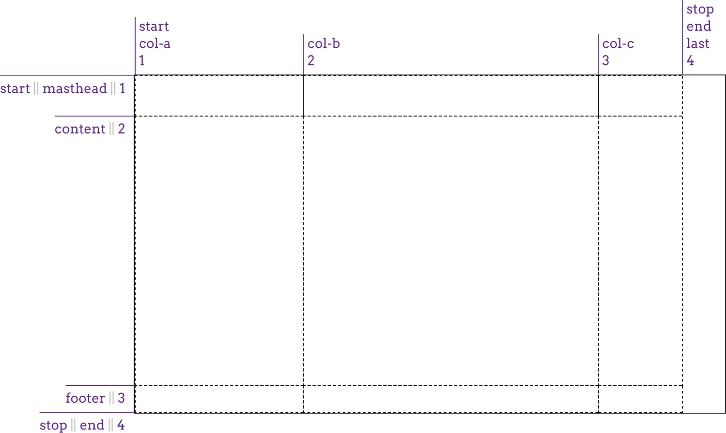
图 13-9: Creating a grid
There are a couple of things to point out here. First, there are both column and row lines with the names start and end. This is perfectly OK. Rows and columns don’t share the same namespace, so you can reuse names like these in the two contexts.
这里有几点需要指出。首先,有“开始”和“结束”名称的行和列。这完全没问题。行和列不共享相同的名称空间,因此可以在这两个上下文中重用这样的名称。
Second is the percentage value for the content row track. This is calculated with respect to the height of the grid container; thus, a container 500 pixels tall would yield a content row that’s 400 pixels tall. This requires that you know ahead of time how tall the grid container will be, which won’t always be the case.
第二个是“content”行轨道的百分比值。这是根据网格容器的高度计算的;因此,一个 500 像素高的容器将产生 400 像素高的“内容”行。这要求您提前知道网格容器的高度,但实际情况并非总是如此。
You might think we could just say 100% and have it fill out the space, but that doesn’t work, as Figure 13-10 illustrates: the content row track will be as tall as the grid container itself, thus pushing the footer row track out of the container altogether:
您可能认为我们可以只说' 100% ',并让它填充空间,但这并不工作,如图 13-10 所示:' content '行轨道将与网格容器本身一样高,从而将' footer '行轨道完全挤出容器:
#grid {
  display: grid;
  grid-template-columns: [start col-a] 200px [col-b] 50% [col-c] 100px [stop end last];
  grid-template-rows: [start masthead] 3em [content] 100% [footer] 2em [stop end];
}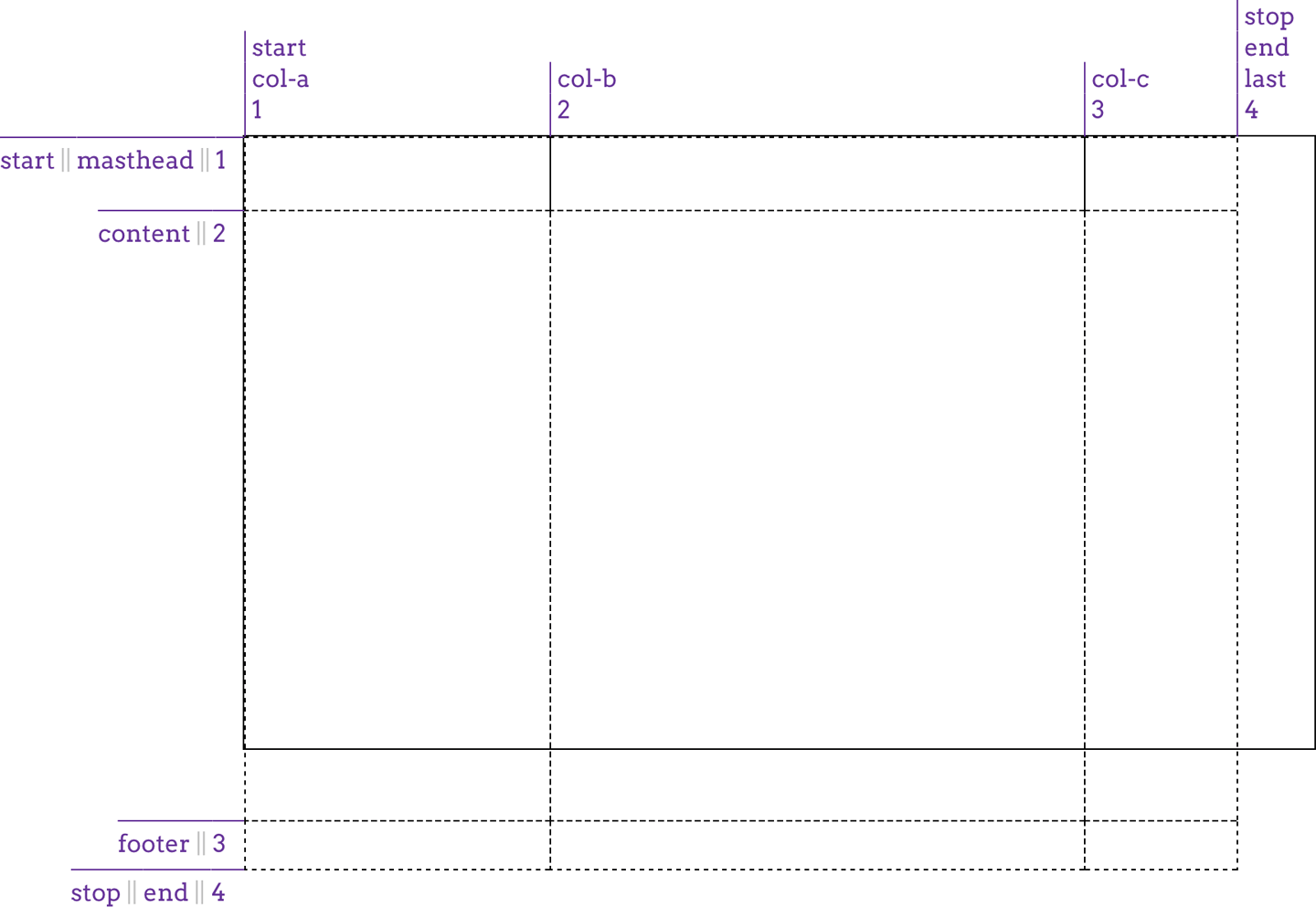
图 13-10: Exceeding the grid container
One way (not necessarily the best way) to handle this scenario is to minmax the row’s value, telling the browser that you want the row no shorter than one amount and no taller than another, leaving the browser to fill in the exact value. This is done with the minmax(a,b) pattern, where a is the minimum size and b is the maximum size:
处理这种情况的一种方法(不一定是最好的方法)是“minmax”行值,告诉浏览器您希望行不小于一个值,也不高于另一个值,让浏览器填写准确的值。这是通过“minmax(a,b)”模式完成的,其中“a”是最小尺寸,“b”是最大尺寸:
#grid {
  display: grid;
  grid-template-columns: [start col-a] 200px [col-b] 50% [col-c] 100px [stop end last];
  grid-template-rows:
    [start masthead] 3em [content] minmax(3em, 100%)
    [footer] 2em [stop end];
}
What we’ve said there is to make the content row never shorter than 3 ems tall, and never taller than the grid container itself. This allows the browser to bring up the size until it’s tall enough to fit the space left over from the masthead and footer tracks, and no more. It also allows the browser to make it shorter than that, as long as it’s not shorter than 3em, so this is not a guaranteed result. Figure 13-11 shows one possible outcome of this approach.
我们所说的是让“content”行不低于 3ems 高,也不高于网格容器本身。这允许浏览器调出大小,直到它足够高,以适应“报头”和“页脚”轨道留下的空间,仅此而已。它还允许浏览器使它更短,只要它不短于' 3em ',所以这不是一个保证的结果。图 13-11 显示了这种方法的一个可能结果。
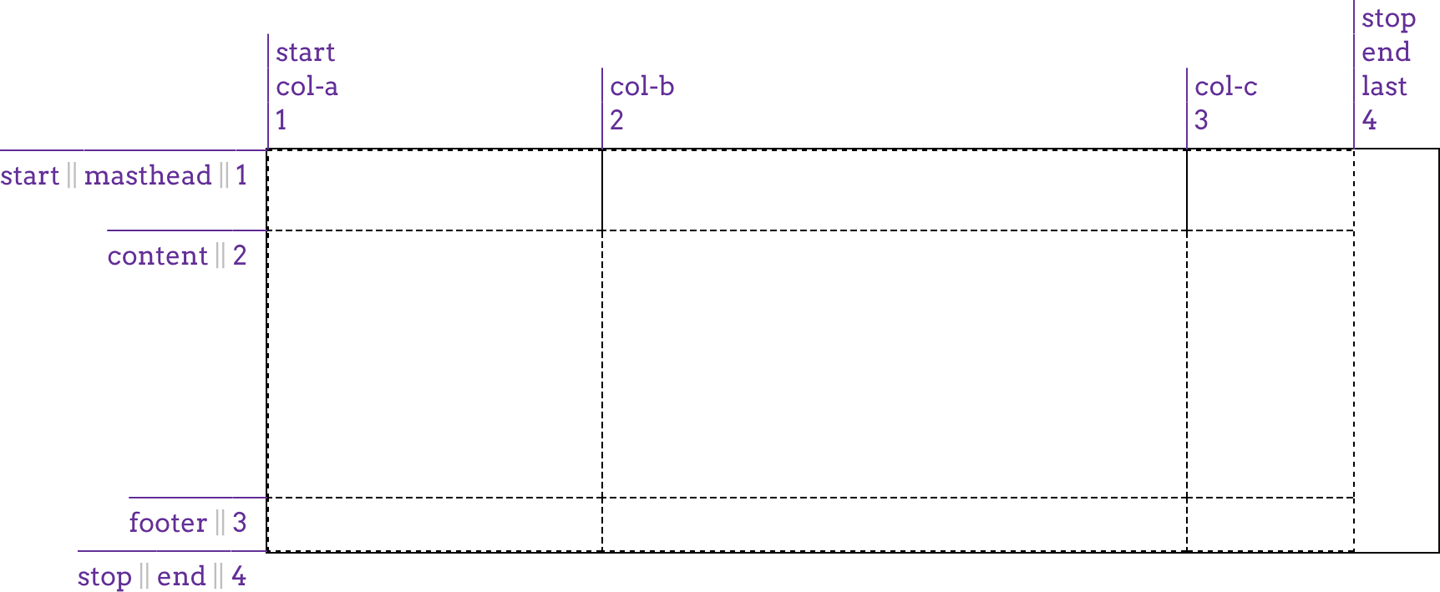
图 13-11: Adapting to the grid container
In like fashion, with the same caveats, minmax() could have been used to help the col-b column fill out the space across the grid container. The thing to remember with minmax() is that if the max is smaller than the min, then the max value is thrown out and the min value is used as a fixed-width track length. Thus, minmax(100px, 2em) would resolve to 100px for any font-size value smaller than 50px.
以类似的方式,使用相同的警告,“minmax()”可以用来帮助“col-b”列填充网格容器中的空间。' minmax() '需要记住的是,如果' max '小于' min ',那么' max '值将被抛出,' min '值将用作固定宽度的磁道长度。因此,' minmax(100px, 2em) '将解析为' 100px '对于任何小于' 50px '的字体大小值。
If the vagueness of minmax()’s behavior unsettles you, there are alternatives to this scenario. We could also have used the calc() value pattern to come up with a track’s height (or width). For example:
如果“minmax()”行为的模糊性让您感到不安,那么可以使用其他替代方案。我们也可以使用' calc() '值模式来得到轨道的高度(或宽度)。例如:
grid-template-rows:
  [start masthead] 3em [content] calc(100%-5em)
  [footer] 2em [stop end];
That would yield a content row exactly as tall as the grid container minus the sum of the masthead and footer heights, as we saw in the previous figure.
这将生成与网格容器一样高的' content '行,减去' masthead '和' footer '的高度之和,就像我们在前面的图中看到的那样。
That works as far as it goes, but is a somewhat fragile solution, since any changes to the masthead or footer heights will also require an adjustment of the calculation. It also becomes a lot more difficult (or impossible) if you want more than one column to flex in this fashion. As it happens, there are much more robust ways to deal with this sort of situation, as we’ll soon see.
目前为止,这是可行的,但这是一个有点脆弱的解决方案,因为任何改变“报头”或“页脚”的高度也需要调整计算。如果您希望以这种方式伸缩多个列,那么它也会变得更加困难(或者不可能)。实际上,我们很快就会看到,有很多更有效的方法来处理这种情况。
13.3.2 Flexible Grid Tracks
Thus far, all our grid tracks have been inflexible—their size determined by a length measure or the grid container’s dimensions, but unaffected by any other considerations. Flexible grid tracks, by contrast, can be based on the amount of space in the grid container not consumed by inflexible tracks, or alternatively, can be based on the actual content of the entire track.
到目前为止,我们所有的网格轨道都是“不灵活的”——它们的大小由长度度量或网格容器的尺寸决定,但是不受任何其他考虑的影响。相比之下,“灵活的”网格轨道可以基于网格容器中不被灵活轨道占用的空间量,也可以基于整个轨道的实际内容。
Fractional units
If you want to divide up whatever space is available by some fraction and distribute the fractions to various columns, the fr unit is here for you.
如果你想把任何可用的空间除以某个分数,并把分数分配到不同的列,“fr”单位就在这里。
In the simplest case, you can divide up the whole container by equal fractions. For example, if you want four columns, you could say:
在最简单的情况下,你可以把整个容器除以相等的分数。例如,如果你想要四列,你可以说:
grid-template-columns: 1fr 1fr 1fr 1fr;In this very limited case, that’s equivalent to saying:
在这种非常有限的情况下,这相当于说:
grid-template-columns: 25% 25% 25% 25%;The result either way is shown in Figure 13-12.
两种方法的结果如图 13-12 所示。
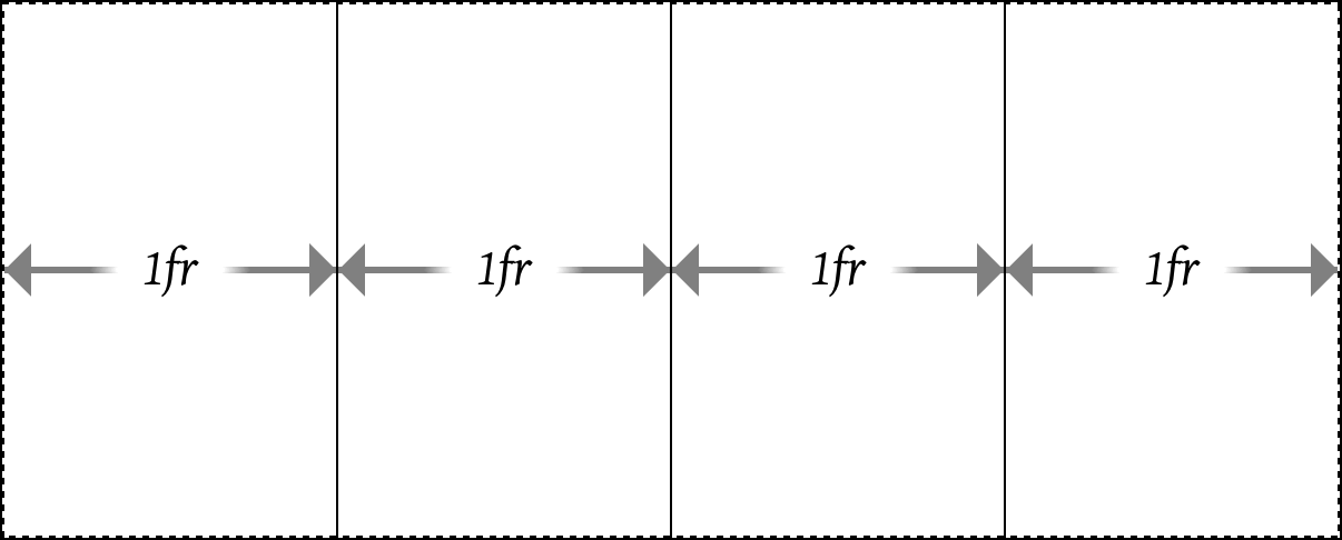
图 13-12: Dividing the container into four columns
Now suppose we want to add a fifth column, and redistribute the column size so they’re all still equal. With percentages, we’d have to rewrite the entire value to be five instances of 20%. With fr, though, we can just add another 1fr to the value and have everything done for us automatically:
现在假设我们要添加第五列,重新分配列的大小,使它们仍然相等。对于百分比,我们必须将整个值重写为 5 个“20%”实例。不过,有了“fr”,我们可以只添加另一个“1fr”的价值,并有一切为我们自动:
grid-template-columns: 1fr 1fr 1fr 1fr 1fr;The way fr units work is that all of the fr values are added together, with the available space divided by that total. Then each track gets the number of those fractions indicated by its number.
“fr”单元的工作方式是将所有“fr”值加在一起,用可用空间除以总数。然后每条轨迹得到由它的数量表示的分数的数量。
What that meant for the first of the previous examples is that when there were four fr values, their numbers were added together to get a total of four. The available space was thus divided by four, and each column got one of those fourths. When we added a fifth 1fr, the space was divided by five, and each column got one of those fifths.
对于前面的第一个示例,这意味着当有四个“fr”值时,将它们的数字相加得到四个值。可用空间因此被除以 4,每一列得到四分之一。当我们添加第五个 1fr 时,空间被 5 除去,每一列都是 5 分之 1。
You are not required to always use 1 with your fr units! Suppose you want to divide up a space such that there are three columns, with the middle column twice as wide as the other two. That would look like this:
你不需要总是使用' 1 '与你的' fr '单位!假设你想把一个空间分成三列,中间一列的宽度是其他两列的两倍。它是这样的:
grid-template-columns: 1fr 2fr 1fr;Again, these are added up and then 1 is divided by that total, so the base fr in this case is 0.25. The first and third tracks are thus 25% the width of the container, whereas the middle column is half the container’s width, because it’s 2fr, which is twice 0.25, or 0.5.
同样地,这些加起来,然后 1 除以总数,所以在这种情况下底数 fr 是 0。25。因此,第一个和第三个轨道是容器宽度的 25%,而中间一列是容器宽度的一半,因为它是' 2fr ',是' 0.25 '或' 0.5 '的两倍。
You aren’t limited to integers, either. A recipe card for apple pie could be laid out using these columns:
你也不局限于整数。苹果派的食谱卡可以用以下这些列出来:
grid-template-columns: 1fr 3.14159fr 1fr;I’ll leave the math on that one as an exercise for the reader. (Lucky you! Just remember to start with 1 + 3.14159 + 1, and you’ll have a good head start.)
我把那个问题留给读者作为练习。(你真幸运!只要记住从“1 + 3.14159 + 1”开始,你就会有一个好的开始。
This is a convenient way to slice up a container, but there’s more here than just replacing percentages with something more intuitive. Fractional units really come into their own when there are some fixed columns and some flexible space. Consider, for example, the following, which is illustrated in Figure 13-13:
这是分割容器的一种方便的方法,但是这里不仅仅是用更直观的东西替换百分比。当有一些固定的列和一些灵活的空间时,分数单位才真正发挥作用。例如,考虑如下图 13-13 所示:
grid-template-columns: 15em 1fr 10%;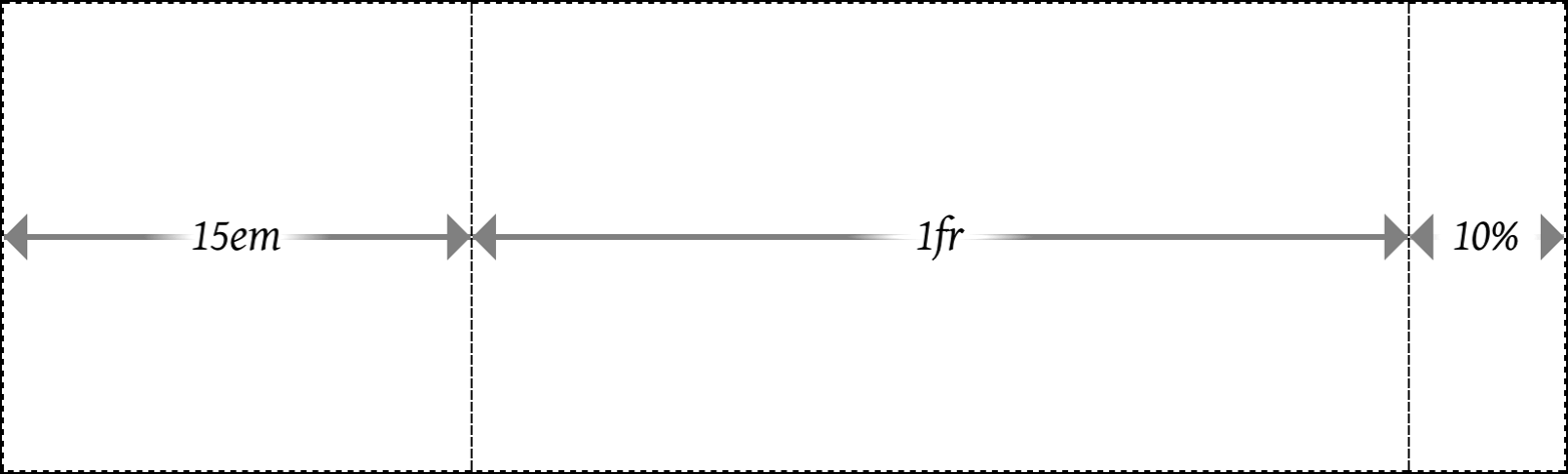
图 13-13: Giving the center column whatever’s available
What happened there is the browser assigned the first and third tracks to their inflexible widths, and then gave whatever was left in the grid container to the center track. This means that for a 1,000-pixel-wide grid container whose font-size is the usual browser default of 16px, the first column will be 240 pixels wide and the third will be 100 pixels wide. That totals 340 pixels, leaving 660 pixels that weren’t assigned to the fixed tracks. The fractional units total one, so 660 is divided by one, yielding 660 pixels, all of which are given to the single 1fr track. If the grid container’s width is increased to 1,400 pixels, the third column will be 140 pixels wide and the center column 1,020 pixels wide.
这里的情况是,浏览器将第一个和第三个轨道分配到它们的固定宽度,然后将网格容器中剩下的所有内容分配给中心轨道。这意味着对于一个 1,000 像素宽的网格容器,它的“字体大小”通常是浏览器默认的“16px”,第一列将是 240 像素宽,第三列将是 100 像素宽。总计 340 像素,剩下 660 像素没有分配到固定轨道。分数单位总数为 1,所以 660 除以 1,得到 660 个像素,所有这些都被分配给单一的“1fr”轨道。如果将网格容器的宽度增加到 1400 像素,则第三列宽 140 像素,中间列宽 1020 像素。
Just like that, we have a mixture of fixed and flexible columns. We can keep this going, splitting up any flexible space into as many fractions as we like. Consider this:
就像这样,我们有一个固定和灵活的列的混合物。我们可以继续这样做,把任意的弹性空间分割成任意多的分数。考虑一下:
width: 100em;
grid-template-columns: 15em 4.5fr 3fr 10%;
In this case, the columns will be sized as shown in Figure 13-14.
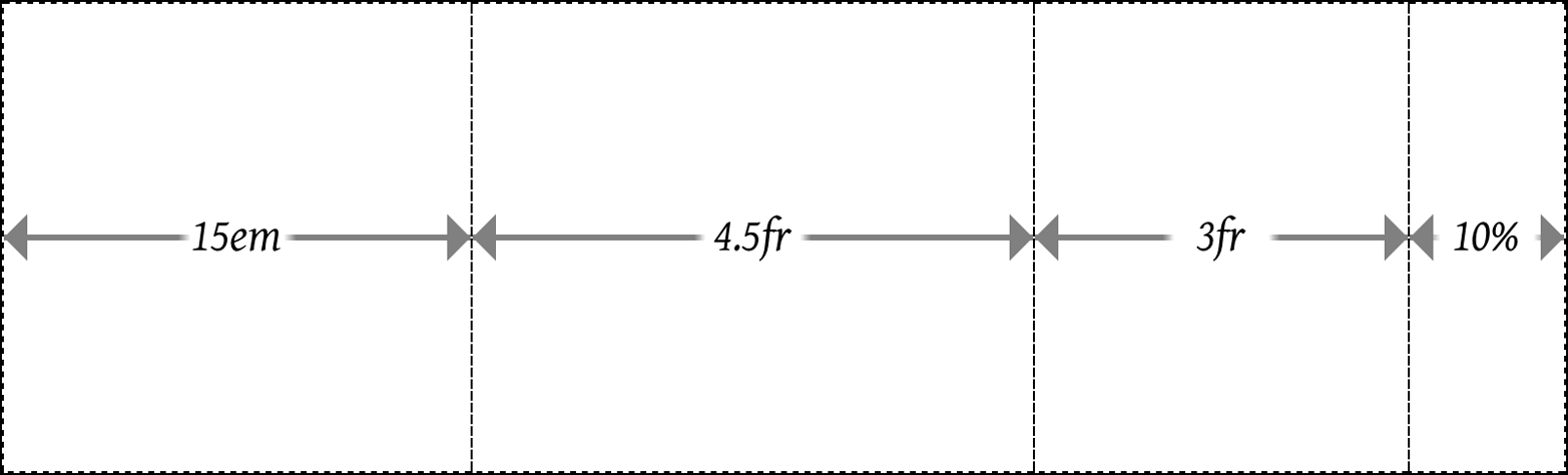
图 13-14: Flexible column sizing
The widths of the columns will be, from left to right: 15em, 45em, 30em, and 10em. The first column gets its fixed width of 15em. The last column is 10% of 100 em, which is 10 em. That leaves 75 em to distribute among the flexible columns. The two added together total 7.5 fr. For the wider column, 4.5 ÷ 7.5 equals 0.6, and that times 75 em equals 45 em. Similarly, 3 ÷ 7.5 = 0.4, and that times 75 em equals 30 em.
各柱的宽度从左至右为:' 15em ', ' 45em ', ' 30em ', ' 10em '。第一列的宽度固定为' 15em '。最后一列是 100 em 的“10%”,即 10 em,剩下 75 em 分布在灵活的列中。两者加起来是 7.5 fr。对于更宽的列,4.5÷7.5 = 0.6,乘以 75 em 等于 45 em,同样,3÷7.5 = 0.4,乘以 75 em 等于 30 em。
Yes, admittedly, I put a thumb on the scales for that example: the fr total and width value were engineered to yield nice, round numbers for the various columns. This was done purely to aid understanding. If you want to work through the process with less tidy numbers, consider using 92.5em or 1234px for the width value in the previous example.
是的,无可否认,我把一个拇指放在秤上的例子:“fr”的总和“宽度”的价值是工程,以产生漂亮的,各种列的整数。这样做纯粹是为了帮助理解。如果您希望使用不太整齐的数字来完成这个过程,可以考虑在前面的示例中使用' 92.5em '或' 1234px '作为' width '值。
In cases where you want to define a minimum or maximum size for a given track, minxmax() can be quite useful. To extend the previous example, suppose the third column should never be less than 5em wide, no matter what. The CSS would then be:
在需要为给定音轨定义最小或最大大小的情况下,' minxmax() '可能非常有用。为了扩展前面的示例,假设第三列的宽度永远不应小于' 5em ',无论如何。CSS 将是:
grid-template-columns: 15em 4.5fr minmax(5em, 3fr) 10%;Now the layout will have two flexible columns at its middle, down to the point that the third column reaches 5em wide. Below that point, the layout will have three inflexible columns (15em, 5em, and 10% wide, respectively) and a single flexible column that will get all the leftover space, if there is any. Once you run the math, it turns out that up to 30.5556em wide, the grid will have one flexible column. Above that width, there will be two such columns.
现在布局将在中间有两个灵活的列,直到第三列达到' 5em '宽。在这一点以下,布局将有三个不灵活的列(分别为' 15em '、' 5em '和' 10% '宽)和一个灵活的列(如果有剩余空间的话)。一旦您运行数学运算,结果是在' 30.5556em '宽的范围内,网格将有一个灵活的列。在这个宽度之上,将有两个这样的列。
You might think that this works the other way—for example, if you wanted to make a column track flexible up to a certain point, and then become fixed after, you would declare a minimum fr value. This won’t work, sadly, because fr units are not allowed in the min position of a minmax() expression. So any fr value provided as a minimum will invalidate the declaration.
您可能认为这是另一种工作方式-例如,如果您想使一个列跟踪灵活到某个特定的点,然后成为固定后,你会声明一个最小' fr '值。遗憾的是,这将不起作用,因为“fr”单元不允许在“minmax()”表达式的“min”位置。因此,任何最低“fr”值将使声明无效。
Speaking of setting to zero, let’s look at a situation where the minimum value is explicitly set to 0, like this:
说到设置为 0,让我们看看最小值被显式设置为' 0 '的情况,就像这样:
grid-template-columns: 15em 1fr minmax(0, 500px) 10%;Figure 13-15 illustrates the narrowest grid width at which the third column can remain 500 pixels wide. Any narrower, and the minmaxed column will be narrower than 500 pixels. Any wider, and the second column, the fr column, will grow beyond zero width while the third column stays at 500 pixels wide.
图 13-15 显示了第三列保持 500 像素宽的最窄网格宽度。任何变窄,则最小的列将小于 500 像素。再宽一点,第二列,也就是“fr”列的宽度就会超过零,而第三列的宽度会保持在 500 像素。
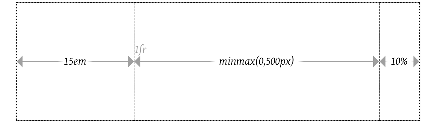
图 13-15: Minmaxed column sizing
If you look closely, you’ll see the 1fr label next to the boundary between the 15em and minmax(0,500px) columns. That’s there because the 1fr is placed with its left edge on the second column grid line, and has no width, because there is no space left to flex. Similarly, the minmax is placed on the third column grid line. It’s just that, in this specific situation, the second and third column grid lines are in the same place (which is why the 1fr column has zero width).
如果你仔细看,你会看到“1fr”标签在“15em”和“minmax(0,500px)”栏的边界附近。这是因为“1fr”的左边缘位于第二列网格线上,没有宽度,因为没有空间可以弯曲。类似地,“minmax”被放置在第三列网格线上。只是在这个特定的情况下,第二列和第三列网格线在相同的位置(这就是为什么“1fr”列的宽度为零)。
If you ever run into a case where the minimum value is greater than the maximum value, then the whole thing is replaced with the minimum value. Thus, minmax(500px,200px) would be treated as a simple 500px. You probably wouldn’t do this so obviously, but this feature is useful when mixing things like percentages and fractions. Thus, you could have a column that’s minmax(10%,1fr) that would be flexible down to the point where the flexible column was less than 10% of the grid container’s width, at which point it would stick at 10%.
如果遇到最小值大于最大值的情况,整个式子就会被替换成最小值。因此,“minmax(500px,200px)”将被视为一个简单的“500px”。您可能不会这么明显地这样做,但是这个特性在混合百分比和分数时非常有用。因此,您可以有一个' minmax(10%,1fr) '的列,该列将具有挠性,直到挠性列小于网格容器宽度的 10%,在这一点上它将保持在' 10% '。
Fractional units and minmaxes are usable on rows just as easily as columns; it’s just that rows are rarely sized in this way. You could easily imagine setting up a layout where the masthead and footer are fixed tracks, while the content is flexible down to a certain point. That might look something like this:
分数单位和最小值在行上和在列上一样容易使用;只是行的大小很少是这样的。你可以很容易地想象建立一个布局,其中的报头和页脚是固定的轨道,而内容是灵活的到一定程度。大概是这样的:
grid-template-rows: 3em minmax(5em, 1fr) 2em;That works OK, but it’s a lot more likely that you’ll want to size that row by the height of its content, not some fraction of the grid container’s height. The next section shows exactly how to make that happen.
这样做没问题,但是更可能的情况是,您希望根据内容的高度来调整该行的大小,而不是根据网格容器的高度来调整。下一节将详细说明如何实现这一点。
Content-aware tracks
It’s one thing to set up grid tracks that take up fractions of the space available to them, or that occupy fixed amounts of space. But what if you want to line up a bunch of pieces of a page and you can’t guarantee how wide or tall they might get? This is where min-content and max-content come in.
设置网格轨道是一回事,它占用了他们可用空间的一部分,或者占用了固定的空间。但是,如果你想把一页纸的许多部分排成一行,却不能保证它们有多宽或多高,那该怎么办呢?这就是“min-content”和“max-content”的用用之处。
What these keywords mean is simple to state, but not necessarily simple to describe in full. max-content means, in effect, “take up the maximum amount of space needed for this content.” For large blocks of text (like a blog post), this would generally mean taking as much room as is available, to maximize the space for that content. It can also mean “as wide as necessary to avoid any line-wrapping,” which can be very wide,
given normal paragraphs of text.
这些关键字的意思很容易表述,但不一定很容易完整地描述。“max-content”实际上是指“占用该内容所需的最大空间”。对于大段文字(比如一篇博客文章),这通常意味着要尽可能多地留出空间,以最大化内容的空间。它还可以表示“尽可能宽以避免任何换行”,换行可以非常宽,给出正常的段落。
min-content, by contrast, means “take up the bare minimum space needed for this content.” With text, that means squeezing the width down to the point that the longest word (or widest inline element, if there are things like images or form inputs) sits on a line by itself. That would lead to a lot of line breaks in a very skinny, very tall grid element.
相比之下,“min-content”的意思是“占用该内容所需的最小空间”。对于文本,这意味着将宽度压缩到最长的单词(或最宽的行内元素,如果有图像或表单输入的话)单独位于一行上。这将导致在一个非常细、非常高的网格元素中出现很多换行。
What’s so powerful about these sizing keywords is that they apply to the entire grid track they define. For example, if you size a column to be max-content, then the entire column track will be as wide as the widest content within it. This is easiest to illustrate with a grid of images (12 in this case) with the grid declared as follows and shown in Figure 13-16:
这些分级关键字的强大之处在于它们适用于它们定义的整个网格轨迹。例如,如果您将一个列的大小设置为“max-content”,那么整个列跟踪的宽度将与其中最宽的内容相同。这最容易用图像网格(本例中为 12)进行说明,网格声明如下,如图 13-16 所示:
#gallery {
  display: grid;
  grid-template-columns: max-content max-content max-content max-content;
  grid-template-rows: max-content max-content max-content;
}
Looking at the columns, we can see that each column track is as wide as the widest image within that track. Where a bunch of portrait images happened to line up, the column is more narrow; where a landscape image showed up, the column was made wide enough to fit it. The same thing happened with the rows. Each row is as tall as the tallest image within it, so wherever a row happened to have all short images, the row is also short.
看看这些列,我们可以看到每个列轨道的宽度与该轨道内最宽的图像一样宽。当一堆人像图像碰巧排成一行时,列就更窄了;在显示景观图像的地方,柱子被做得足够宽以适应它。同样的事情也发生在这些行上。每一行的高度与其中最高的图像一样高,所以无论哪一行碰巧有所有的短图像,该行也都是短的。
The advantage here is that this works for any sort of content, no matter what’s in there. So let’s say we add captions to the photos. All of the columns and rows will resize themselves as needed to handle both text and images, as shown in Figure 13-17.
这样做的好处是,它适用于任何类型的内容,不管里面有什么。假设我们给照片添加了标题。所有的列和行都将根据需要调整大小以处理文本和图像,如图 13-17 所示。
This isn’t a full-fledged design—the images are out of place, and there’s no attempt to constrain the caption widths. In fact, that’s exactly what we should expect from max-content values for the column widths. Since it means “make this column wide enough to hold all its content,” that’s what we got.
这不是一个成熟的设计-图像是不合适的地方,并没有试图限制标题宽度。事实上,这正是我们应该期望从列宽度的“max-content”值中得到的结果。因为它的意思是“让这个栏目足够宽,容纳所有内容”,所以我们得到了这个结果。
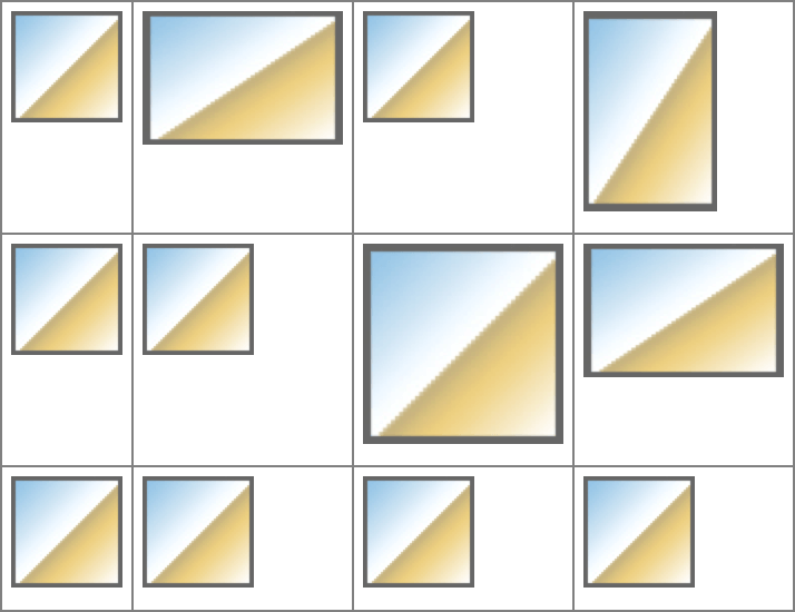
图 13-16: Sizing grid tracks by content
图 13-17: Sizing grid tracks around mixed content
What’s important to realize is that this will hold even if the grid tracks have to spill out of the grid container. That means that even if we’d assigned something like width: 250px to the grid container, the images and captions would be laid out just the same. That’s why things like max-content tend to appear in minmax() statements. Consider the following, where grids with and without minmax() appear side by side. In both cases, the grid container is represented by an orange background (see Figure 13-18):
重要的是要认识到,即使网格轨道必须溢出网格容器,这种方法也适用。这意味着,即使我们为网格容器分配了类似于“宽度:250px”这样的内容,图像和标题的布局也是一样的。这就是为什么“max-content”这样的语句常常出现在“minmax()”语句中。考虑下面的情况,其中包含和不包含“minmax()”的网格并排出现。在这两种情况下,网格容器都用橙色背景表示(参见图 13-18):
#g1 {
  display: grid;
  grid-template-columns: max-content max-content max-content max-content;
}
#g2 {
  display: grid;
  grid-template-columns:
    minmax(0, max-content) minmax(0, max-content)
    minmax(0, max-content) minmax(0, max-content);
}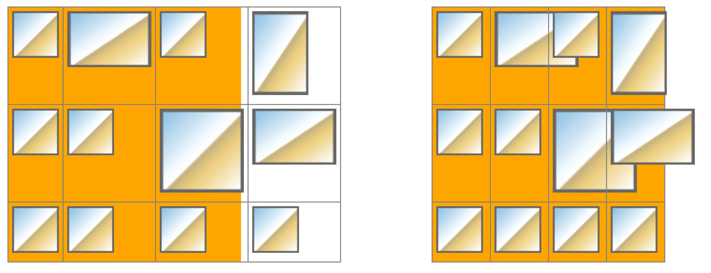
图 13-18: Sizing grid tracks with and without minmax()
In the first instance, the grid items completely contain their contents, but they spill out of the grid container. In the second, the minmax() directs the browser to keep the columns within the range of 0 and max-content, so they’ll all be fitted into the grid container if possible. A variant on this would be to declare minmax(mincontent, max-content), which can lead to a slightly different result than the 0, max-content approach.
在第一个实例中,网格项完全包含它们的内容,但是它们溢出了网格容器。在第二个示例中,“minmax()”指示浏览器将列保持在“0”和“max-content”的范围内,以便尽可能地将它们都安装到网格容器中。另一种变体是声明“minmax(mincontent, max-content)”,这可能导致与“0”、“max-content”方法略有不同的结果。
The reason that some images are overflowing their cells in the second example is that the tracks have been fitted into the grid container according to minmax(0,maxcontent). They can’t reach max-content in every track, but they can get as close as possible while all still fitting into the grid container. Where the contents are wider than the track, they just stick out of it, overlapping other tracks. This is standard grid behavior.
在第二个例子中,一些图像溢出它们的单元格的原因是轨道已经根据“minmax(0,maxcontent)”被安装到网格容器中。他们不可能在每首歌中都达到“最大内容”,但他们可以尽可能地接近,同时所有的歌都能融入网格容器中。当内容比轨道宽时,它们就会突出来,与其他轨道重叠。这是标准网格的行为。
If you’re wondering what happens if you min-content both the columns and the rows, it’s pretty much the same as applying min-content to the columns and leaving the rows alone. This happens because the grid specification directs browsers to resolve column sizing first, and row sizing after that.
如果您想知道如果对列和行都使用“min-content”会发生什么,那么这与对列应用“min-content”而不使用行几乎是一样的。这是因为网格规范要求浏览器首先解析列大小,然后解析行大小。
There’s one more keyword you can use with grid track sizing, which is auto. As a minimum, it’s treated as the minimum size for the grid item, as defined by min-width or min-height. As a maximum, it’s treated the same as max-content. You might think this means it can be used only in minmax() statements, but this is not the case. You can use it anywhere, and it will take on either a minimum or maximum role. Which one it takes on depends on the other track values around it, in ways that are frankly too complicated to get into here. As with so many other aspects of CSS, using auto is essentially letting the browser do what it wants. Sometimes that’s fine, but in general you’ll probably want to avoid it.
还有一个可以用于网格轨道大小调整的关键字,即“自动”。作为最小值,它被视为网格项的最小大小,由“最小宽度”或“最小高度”定义。作为一个最大值,它与“max-content”一样。您可能认为这意味着它只能在' minmax() '语句中使用,但事实并非如此。您可以在任何地方使用它,它将承担最小或最大的角色。哪一个取决于它周围的轨道值,以一种非常复杂的方式进入这里。与 CSS 的许多其他方面一样,使用“auto”实际上是让浏览器做它想做的事情。有时这是可以的,但通常你可能会想要避免它。
There is a caveat to that last statement: auto values allow grid items to be resized by the align-content and justify-content properties, a topic we’ll discuss in a later section, “Aligning and Grids” on page 721. Since auto values are the only track-sizing values that permit this, there may be very good reasons to use auto after all.
13.3.3 Fitting Track Contents
In addition to the min-content and max-content keywords, there’s a fit-content() function that allows you to more compactly express certain types of sizing patterns. It’s a bit complicated to decipher, but the effort is worth it:
除了“min-content”和“max-content”关键字之外,还有一个“fit-content()”函数,它允许您更简洁地表达某些类型的分级模式。这是一个有点复杂的破译,但努力是值得的:
fit-content() accepts a <length> or a <percentage> as its argument, like this:
fit-content()接受<length>或<percentage>作为其参数,如下所示:
#grid {
  display: grid;
  grid-template-columns: 1fr fit-content(150px) 2fr;
}
#grid2 {
  display: grid;
  grid-template-columns: 2fr fit-content(50%) 1fr;
}
Before we explore what that means, let’s ponder the pseudo-formula given by the specification:
在我们探索这意味着什么之前,让我们思考一下规范给出的伪公式:
fit-content(argument) => min(max-content, max(min-content, argument))which means, essentially, “figure out which is greater, the min-content sizing or the supplied argument, and then take that result and choose whichever is smaller, that result or the max-content size.” Which is probably confusing! It certainly was to me, the first 17 times I worked through it.
这意味着,本质上,“找出‘最小内容’大小和提供的参数哪个更大,然后选择那个结果,然后选择那个更小的结果或‘最大内容’大小。“这可能让人困惑!”对我来说,前 17 次我都是如此。
I feel like a better way of phrasing it is: “fit-content(argument) is equivalent to minmax(min-content,max-content), except that the value given as an argument sets an upper limit, similar to max-width or max-height.” Let’s consider this example:
我觉得更好的表达方式是:“‘fit-content(参数)’相当于‘minmax(min-content,max-content)’,只是作为参数给出的值设置了一个上限,类似于‘max-width’或‘max-height’。”让我们来看看这个例子:
#example {
  display: grid;
  grid-template-columns: fit-content(50ch);
}
The argument here is 50ch, or about 50 characters wide. So we’re setting up a single column that’s having its content fit to that measure.
这里的参数是“50ch”,即大约 50 个字符宽。我们设置了一个单独的列让它的内容符合这个标准。
For the initial case, assume the content is only 29 characters long, measuring 29ch (due to it being in a monospace font). That means the value of max-content is 29ch, and the column will be only that wide, because it minimizes to that measure—29ch is smaller than whatever the maximum of 50ch and min-content turns out to be.
对于初始情况,假设内容只有 29 个字符长,度量为 29ch(因为它是 monospace 字体)。这意味着“max-content”的值是“29ch”,而列的宽度将只有那么宽,因为它最小化了这个度量——“29ch”比“50ch”和“min-content”的最大值还要小。
Now, let’s assume a bunch of text content is added so that there are 256 characters measuring 256ch in width. That means max-content evaluates to 256ch. This is well beyond the 50ch argument, so the column is constrained to be the larger of min-content and 50ch, which is 50ch.
现在,让我们假设添加了一些文本内容,因此有 256 个字符,宽度为“256ch”。这意味着“max-content”的计算结果是“256ch”。这远远超出了' 50ch '参数的范围,因此该列被限制为' min-content '和' 50ch '中较大的一个,即' 50ch '。
As further illustration, consider the results of the following, as shown in Figure 13-19:
为了进一步说明,考虑下面的结果,如图 13-19 所示:
#thefollowing {
  display: grid;
  grid-template-columns: fit-content(50ch) fit-content(50ch) fit-content(50ch);
  font-family: monospace;
}
图 13-19: Sizing grid tracks with fit-content()
Notice the first column is narrower than the other two. Its 29ch content minimizes to that size. The other two columns have more content than will fit into 50ch, so they line-wrap, because their width has been limited to 50ch.
注意第一列比其他两列窄。它的“29ch”内容最小化到这个大小。另外两列的内容比‘50ch’中包含的内容更多,所以它们是换行的,因为它们的宽度被限制为‘50ch’。
Now let’s consider what happens if an image is added to the second column. We’ll make it 500px wide, which is wider than 50ch in this instance. For that column, the maximum of min-content and 50ch is determined. As we said, the larger value there is min-content, which is to say 500px (the width of the image). Then the minimum of 500px and max-content is determined. The text, rendered as a single line, would go on past 500px, so the minimum is 500px. Thus, the second column is now 500 pixels wide. This is depicted in Figure 13-20.
现在,让我们考虑如果将一个图像添加到第二列会发生什么。我们将它的宽度设为 500px,在本例中宽度大于 50ch。对于该列,确定“min-content”和“50ch”的最大值。如前所述,最大的值是“min-content”,即“500px”(图像的宽度)。然后确定“最小”为“500px”和“max-content”。文本,作为一个单一的行,将继续过去' 500px ',所以最低是' 500px '。因此,第二列现在是 500 像素宽。如图 13-20 所示。
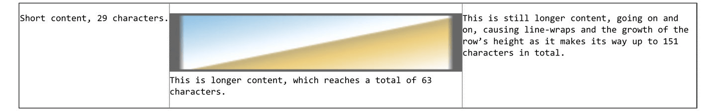
图 13-20: Fitting to wide content
If you compare Figure 13-19 to Figure 13-20, you’ll see that the text in the second column wraps at a different point, due to the change in column width. But also compare the text in the the third column. It, too, has different line-wraps.
如果比较图 13-19 和图 13-20,您将看到由于列宽度的变化,第二列中的文本包装在不同的位置。还要比较第三栏的文字。它也有不同的行包装。
That happened because after the first and second columns were sized, the third column had a bit less than 50ch of space in which to be sized. fit-content(50ch) still did its thing, but here, it did so within the space available to it. Remember, the 50ch argument is an upper bound, not a fixed size.
这是因为在调整了第一列和第二列的大小之后,第三列的大小空间略小于' 50ch '。“fit-content(50ch)”仍然发挥着它的作用,但在这里,它是在可用空间内发挥作用的。请记住,' 50ch '参数是一个上限,而不是一个固定的大小。
This is one of the great advantages of fit-content() over the less flexible minmax(). It allows you to shrink tracks down to their minimum content-size when there isn’t much content, while still setting an upper bound on the track size when there’s a lot of content.
这是“fit-content()”相对于不太灵活的“minmax()”的一大优点。它允许您在没有太多内容时将音轨缩小到最小的内容大小,而在有大量内容时仍然设置音轨大小的上限。
You’ve probably been wondering about the repetitive grid template values in previous examples, and what happens if you need more than three or four grid tracks. Will you have to write out every single track width individually? Indeed not, as we’ll see in the next section.
您可能想知道在前面的示例中重复的网格模板值,以及如果需要超过 3 或 4 个网格轨道会发生什么。你要把每条轨道的宽度单独写出来吗?确实不是,我们将在下一节看到。
13.3.4 Repeating Grid Lines
If you have a situation where you want to set up a bunch of grid tracks of the same size, you probably don’t want to have to type out every single one of them. Fortunately, repeat() is here to make sure you don’t have to.
如果您想要设置一组相同大小的网格轨迹,您可能不希望必须键入它们中的每一个。幸运的是,“repeat()”可以确保您不必这样做。
Let’s say we want to set up a column grid line every 5 ems, and have 10 column tracks. Here’s how to do that:
假设我们想要每隔 5 ems 建立一个列网格线,并且有 10 个列轨迹。以下是如何做到这一点:
#grid {
  display: grid;
  grid-template-columns: repeat(10, 5em);
}
That’s it. Done. Ten column tracks, each one 5em wide, for a total of 50 ems of column tracks. It sure beats typing 5em 10 times!
就是这样。做。十列轨道,每' 5em '宽,共 50 ems 列轨道。它肯定比打字‘5em’10 次强多了!
Any track-sizing value can be used in a repeat, from min-content and max-content to fr values to auto, and so on, and you can put together more than one sizing value. Suppose we want to define a column structure such that there’s a 2em track, then a 1fr track, and then another 1fr track—and, furthermore, we want to repeat that pattern three times. Here’s how to do that, with the result shown in Figure 13-21:
任何跟踪大小值都可以重复使用,从“min-content”和“max-content”到“fr”值再到“auto”,等等,您可以组合多个大小值。假设我们要定义一个列结构,其中有一个' 2em '轨道,然后是一个' 1fr '轨道,然后是另一个' 1fr '轨道,而且,我们希望重复该模式三次。下面是如何做到这一点,结果如图 13-21 所示:
#grid {
  display: grid;
  grid-template-columns: repeat(3, 2em 1fr 1fr);
}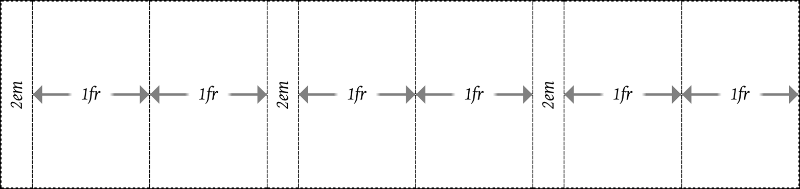
图 13-21: Repeating a track pattern
Notice how the last column track is a 1fr track, whereas the first column track is 2em wide. This is an effect of the way the repeat() was written. It’s easy to add another 2em track at the end, in order to balance things out, just by making this change:
注意最后一列磁道是“1fr”磁道,而第一列磁道是“2em”宽。这是' repeat() '的书写方式的结果。很容易添加另一个' 2em '轨道在年底,以平衡的东西,只需做这样的变化:
#grid {
  display: grid;
  grid-template-columns: repeat(3, 2em 1fr 1fr) 2em;
}
See that extra 2em at the end of the value? That adds one more column track after the three repeated patterns. This highlights the fact that repeat can be combined with any other track-sizing values—even other repeats—in the construction of a grid. The one thing you can’t do is nest a repeat inside another repeat.
看到值末尾的那个额外的“2em”了吗?这在三个重复模式之后又添加了一个列跟踪。这突出了这样一个事实:在网格的构建过程中,“repeat”可以与任何其他跟踪大小值(甚至是其他 repeat)相结合。你“不能”做的一件事是把一个重复嵌套在另一个重复中。
Other than that, just about anything goes within a repeat() value. Here’s an example taken straight from the grid specification:
除此之外,几乎所有内容都位于' repeat() '值内。下面是一个直接取自网格规范的例子:
#grid {
  display: grid;
  grid-template-columns: repeat(4, 10px [col-start] 250px [col-end]) 10px;
}
In this case, there are four repetitions of a 10-pixel track, a named grid line, a 250-pixel track, and then another named grid line. Then, after the four repetitions, a final 10-pixel column track. Yes, that means there will be four column grid lines named col-start, and another four named col-end, as shown in Figure 13-22. This is acceptable; grid-line names are not required to be unique.
在本例中,一个 10 像素的轨迹重复 4 次,一个指定的网格线重复 4 次,一个 250 像素的轨迹重复 4 次,然后是另一个指定的网格线重复 4 次。然后,经过 4 次重复,最后得到一个 10 像素的列轨迹。是的,这意味着将有四个列网格线命名为“coll -start”,另外四个列网格线命名为“coll -end”,如图 13-22 所示。这是可以接受的;网格线名称不需要是唯一的。
图 13-22: Repeated columns with named grid lines
One thing to remember, if you’re going to repeat named lines, is that if you place two named lines next to each other, they’ll be merged into a single, double-named grid line. In other words, the following two declarations are equivalent:
需要记住的一点是,如果你要重复命名的线,如果你把两个命名的线放在一起,它们会合并成一个,双命名的网格线。换句话说,以下两种声明是等价的:
grid-template-rows: repeat(3, [top] 5em [bottom]);
grid-template-rows: [top] 5em [bottom top] 5em [top bottom] 5em [bottom];
If you’re concerned about having the same name applied to multiple grid lines, don’t be: there’s nothing preventing it, and it can even be helpful in some cases. We’ll explore ways to handle such situations in an upcoming section, “Using Column and Row Lines” on page 687.
Auto-filling tracks
There’s even a way to set up a simple pattern and repeat it until the grid container is filled. This doesn’t have quite the same complexity as regular repeat()—at least not yet—but it can still be pretty handy.
甚至可以创建一个简单的模式并重复它,直到网格容器被填满。它没有常规的“repeat()”那么复杂——至少现在还没有——但它仍然非常方便。
For example, suppose we want to have the previous row pattern repeat as many times as the grid container will comfortably accept:
例如,假设我们想让前面的行模式重复多少次网格容器就可以接受多少次:
grid-template-rows: repeat(auto-fill, [top] 5em [bottom]);That will define a row line every 5 ems until there’s no more room. Thus, for a grid container that’s 11 ems tall, the following is equivalent:
每隔 5 ems 就会定义一行,直到没有空间。因此,对于一个 11 ems 高的网格容器,以下内容是等价的:
grid-template-rows: [top] 5em [bottom top] 5em [bottom];If the grid container’s height is increased past 15 ems, but is less than 20 ems, then this is an equivalent declaration:
如果网格容器的高度增加了超过 15 ems,但是小于 20 ems,那么这是一个等价的声明:
grid-template-rows: [top] 5em [bottom top] 5em [top bottom] 5em [bottom];See Figure 13-23 for examples of the auto-filled rows at three different grid container heights.
图 13-23 给出了三个不同网格容器高度的自动填充行示例。
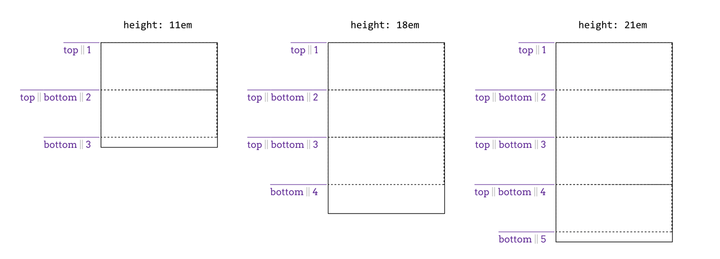
图 13-23: Auto-filling rows at three different heights
The limitation with auto-repeating is that it can take only an optional grid-line name, a fixed track size, and another optional grid-line name. So [top] 5em [bottom] represents about the maximum value pattern. You can drop the named lines and just repeat 5em, or just drop one of the names. It’s not possible to repeat multiple fixed track sizes, nor can you repeat flexible track sizes. (Which makes sense: how many times would a browser repeat 1fr to fill out a grid container? Once.)
自动重复的限制是它只能使用一个可选的网格线名称、一个固定的磁道大小和另一个可选的网格线名称。所以“[顶]5em[底]”代表了最大值模式。您可以删除已命名的行,然后重复“5em”,或者删除其中一个名称。不可能重复多个固定轨道尺寸,也不能重复灵活轨道尺寸。(这是有道理的:浏览器会重复多少次“1fr”来填充一个网格容器?一次。)
You might wish you could auto-repeat multiple track sizes in order to define “gutters” around your content columns. This is usually unnecessary because grids have a concept of (and properties to define) track gutters, which we’ll cover in an upcoming section, “Opening Grid Spaces” on page 714.
Furthermore, you can have only one auto-repeat in a given track template. Thus, the following would not be permissible:
此外,在给定的跟踪模板中只能有一个自动重复。因此,以下内容是不允许的:
grid-template-columns: repeat(auto-fill, 4em) repeat(auto-fill, 100px);However, you can combine fixed-repeat tracks with auto-fill tracks. For example, you could start with three wide columns, and then fill the rest of the grid container with narrow tracks (assuming there’s space for them). That would look something like this:
但是,您可以将固定重复音轨与自动填充音轨相结合。例如,您可以从三个宽列开始,然后用窄轨填充网格容器的其余部分(假设有空间)。大概是这样的:
grid-template-columns: repeat(3, 20em) repeat(auto-fill, 2em);You can flip that around, too:
你也可以反过来看:
grid-template-columns: repeat(auto-fill, 2em) repeat(3, 20em);That works because the grid layout algorithm assigns space to the fixed tracks first, and then fills up whatever space is left with auto-repeated tracks. The end result of that example is to have one or more auto-filled 2-em tracks, and then three 20-em tracks. Two examples of this are shown in Figure 13-24.
这是可行的,因为网格布局算法首先将空间分配给固定轨道,然后用自动重复轨道填充剩余的空间。该示例的最终结果是拥有一个或多个自动填充的 2-em 音轨,以及三个 20-em 音轨。图 13-24 中显示了两个这样的例子。
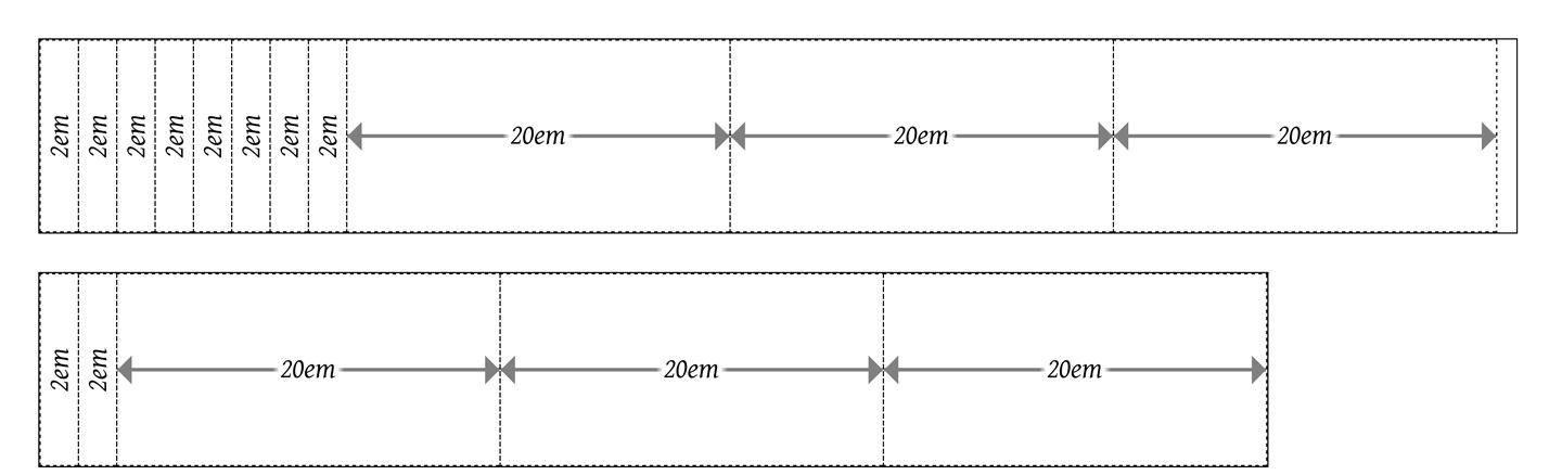
图 13-24: Auto-filling columns next to fixed columns
With auto-fill, you will always get at least one repetition of the track template, even if it won’t fit into the grid container for some reason. You’ll also get as many tracks as will fit, even if some of the tracks don’t have content in them. As an example, suppose you set up an auto-fill that placed five columns, but only the first three of them actually ended up with grid items in them. The other two would remain in place, holding open layout space.
使用“自动填充”,您将始终得到至少一个重复的轨道模板,即使它不适合网格容器的某些原因。你也会得到尽可能多的音轨,即使有些音轨没有内容。例如,假设您设置了一个放置了五列的自动填充,但实际上只有前三列中包含网格项。另外两个将保留在原地,保持开放的布局空间。
If you use auto-fit, on the other hand, then tracks that don’t contain any grid items will be dropped. Otherwise, auto-fit acts the same as auto-fill. Suppose the following:
另一方面,如果你使用“自动适应”,那么不包含任何网格项目的轨道将被删除。否则,' auto-fit '的作用与' auto-fill '相同。假设如下:
grid-template-columns: repeat(auto-fit, 20em);If there’s room for five column tracks in the grid container (i.e., it’s more than 100 ems wide), but two tracks don’t have any grid items to go into them, those empty grid tracks will be dropped, leaving the three column tracks that do contain grid items. The leftover space is handled in accordance with the values of align-content and justify-content (discussed in the upcoming section, “Aligning and Grids” on page 721). A simple comparison of auto-fill and auto-fit is shown in Figure 13-25, where the numbers in the colored boxes indicate the grid-column number to which they’ve been attached.
如果网格容器中有五个列轨道的空间(即,它超过 100 ems 宽),但两个轨道没有任何网格项目进入他们,那些空的网格轨道将被删除,留下三列轨道'做'包含网格项目。剩下的空间是按照“对齐内容”和“对齐内容”的值来处理的(在接下来的章节中讨论,“对齐和网格”在 721 页)。图 13-25 显示了“auto-fill”和“auto-fit”的简单比较,其中彩色框中的数字表示它们所附加的网格列号。
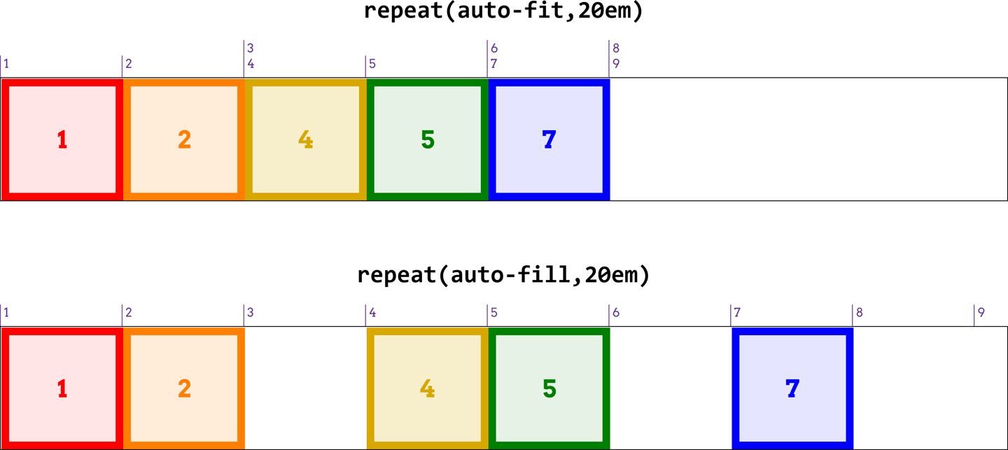
图 13-25: Auto-fill versus auto-fit
13.3.5 Grid Areas
Sometimes, you’d rather just draw a picture of your grid—both because it’s fun to do, and because the picture can serve as self-documenting code. It turns out you can more or less do exactly that with the grid-template-areas property.
有时,您宁愿只绘制网格的图片—因为这样做很有趣,而且图片可以作为自文档化代码。事实证明,使用' grid-template-area '属性可以或多或少地做到这一点。
We could go through a wordy description of how this works, but it’s a lot more fun to just show it. The following rule has the result shown in Figure 13-26:
我们可以详细地描述一下它是如何工作的,但是展示它要有趣得多。以下规则的结果如图 13-26 所示:
#grid {
  display: grid;
  grid-template-areas:
    "h h h h"
    "l c c r"
    "l f f f";
}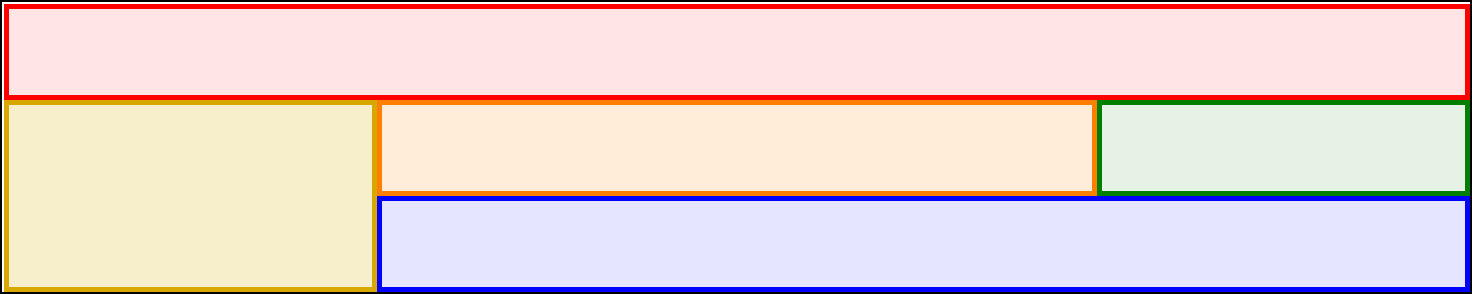
图 13-26: A simple set of grid areas
That’s right: the letters in the string values are used to define how areas of the grid are shaped. Really! And you aren’t even restricted to single letters! For example, we could expand the previous example like so:
这是正确的:字符串值中的字母用于定义网格区域的形状。真的!你甚至不受限于单个字母!例如,我们可以像这样展开前面的例子:
#grid {
  display: grid;
  grid-template-areas:
    "header header header header"
    "leftside content content rightside"
    "leftside footer footer footer";
}
The grid layout is the same as that shown in Figure 13-26, though the name of each area would be different (e.g., footer instead of f).
网格布局与图 13-26 所示相同,但是每个区域的名称不同(例如,“footer”而不是 f)。
In defining template areas, the whitespace is collapsed, so you can use it (as I did in the previous example) to visually line up columns of names in the value of grid-template-areas. You can line them up with spaces or tabs, whichever will annoy your coworkers the most. Or you can just use a single space to separate each identifier, and not worry about the names lining up with each other. You don’t even have to line break between strings; the following works just as well as a pretty-printed version:
在定义模板区域时,空格是折叠的,所以您可以使用它(就像我在前面的示例中所做的那样)来在“网格模板区域”的值中可视化地排列名称列。你可以用空格或制表符把它们排起来,无论哪种最让你的同事讨厌。或者,您可以只使用一个空格来分隔每个标识符,而不必担心名称之间的排列。你甚至不需要在字符串之间换行;下面的作品,以及一个漂亮的印刷版本:
grid-template-areas: "h h h h" "l c c r" "l f f f";What you can’t do is merge those separate strings into a single string and have it mean the same thing. Every new string (as delimited by the double quote marks) defines a new row in the grid. So the previous example, like the examples before it, defines three rows. If we merged them all into a single string, like so:
你不能做的是把这些单独的字符串合并成一个单独的字符串,让它的意思相同。每个新字符串(由双引号分隔)在网格中定义一个新行。前面的例子,和前面的例子一样,定义了三行。如果我们把它们合并成一个字符串,就像这样:
grid-template-areas: "h h h h
 l c c r
 l f f f";
then we’d have a single row of 12 columns, starting with the 4-column area h and ending with the 3-column area f. The line breaks aren’t significant in any way, except as whitespace that separates one identifier from another.
然后我们会有一个 12 列的单行,从 4 列的区域“h”开始,以 3 列的区域“f”结束。换行符在任何方面都不重要,除了作为分隔一个标识符与另一个标识符的空白。
If you look at these values closely, you may come to realize that each individual identifier represents a grid cell. Let’s bring back our first example from this section, and consider the result shown in Figure 13-27:
如果仔细查看这些值,您可能会发现每个标识符都代表一个网格单元。让我们回到本节的第一个示例,并考虑图 13-27 所示的结果:
#grid {
  display: grid;
  grid-template-areas:
    "h h h h"
    "l c c r"
    "l f f f";
}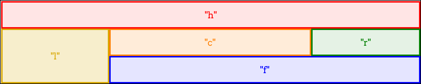
图 13-27: Grid cells with identifiers
This is exactly the same layout result, but here, we’ve shown how each grid identifier in the grid-template-areas value corresponds to a grid cell. Once all the cells are identified, the browser merges any adjacent cells with the same name into a single area that encloses all of them—as long as they describe a rectangular shape! If you try to set up more complicated areas, the entire template is invalid. Thus, the following would result in no grid areas being defined:
这是完全相同的布局结果,但是在这里,我们已经展示了' grid-template-areas '值中的每个网格标识符如何对应于一个网格单元格。一旦所有的单元格都被识别出来,浏览器就会将所有具有相同名称的相邻单元格合并到一个单独的区域中,只要它们描述的是一个矩形!如果试图设置更复杂的区域,则整个模板无效。因此,以下结果将导致没有定义网格区域:
#grid {
  display: grid;
  grid-template-areas:
    "h h h h"
    "l c c r"
    "l l f f";
}
See how l outlines an “L” shape? That humble change causes the entire grid-template-areas value to be dropped as invalid. A future version of grid layout may allow for nonrectangular shapes, but for now, this is what we have.
看到“l”是如何勾勒出“l”形状的吗?这个微小的更改将导致整个“网格模板区域”值作为无效值删除。网格布局的未来版本可能允许非矩形的形状,但现在,这是我们所拥有的。
If you have a situation where you want to only define some grid cells to be part of grid areas, but leave others unlabeled, you can use one or more . characters to fill in for those unnamed cells. Let’s say you just want to define some header, footer, and sidebar areas, and leave the rest unnamed. That would look something like this, with the result shown in Figure 13-28:
如果你有一个情况,你只想定义一些网格单元格是网格区域的一部分,但不标记其他,你可以使用一个或多个'。来填充那些未命名的细胞。假设您只想定义一些页眉、页脚和边栏区域,其余部分未命名。结果如图 13-28 所示:
#grid {
  display: grid;
  grid-template-areas:
    "header header header header"
    "left ... ... right"
    "footer footer footer footer";
}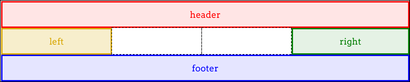
图 13-28: A grid with some unnamed grid cells
The two grid cells in the center of the grid are not part of a named area, having been represented in the template by null cell tokens (the . identifiers). Where each of those ... sequences appears, we could have used one or more null tokens—so left . . right or left ..... ..... right would work just as well.
网格中心的两个网格单元不属于指定区域的一部分,在模板中表示为“空单元标记”(即“”)。的标识符)。每一个。序列出现时,我们可以使用一个或多个空标记—所以' left . .“右”或“左……”“对”也行。
You can be as simple or creative with your cell names as you like. If you want to call your header ronaldo and your footer podiatrist, go for it. You can even use any Unicode character above codepoint U+0080, so ConHugeCo©®™ and åwësømë are completely valid area identifiers…as are emoji!
您可以简单或有创意地使用您喜欢的细胞名称。如果你想称你的头球为
ronaldo,称你的脚部为podiatrist,那就去做吧。你甚至可以使用任何 Unicode 字符 codepoint U + 0080 以上,所以ConHugeCo©®™和åwësømë是完全有效的区域标识符…emoji 也一样!
Now, to size the grid tracks created by these areas, we bring in our old friends grid-template-columns and grid-template-rows. Let’s add both to the previous example, with the result shown in Figure 13-29:
现在,为了调整这些区域创建的网格轨迹的大小,我们引入了老朋友
grid-template-columns和grid-template-rows。让我们将它们都添加到前面的示例中,结果如图 13-29 所示:
#grid {
  display: grid;
  grid-template-areas:
    "header header header header"
    "left ... ... right"
    "footer footer footer footer";
  grid-template-columns: 1fr 20em 20em 1fr;
  grid-template-rows: 40px 10em 3em;
}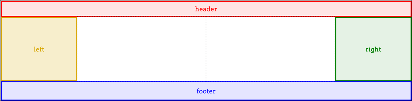
图 13-29: Named areas and sized tracks
Thus, the columns and rows created by naming the grid areas are given track sizes. If we give more track sizes than there are area tracks, that will add more tracks past the named areas. Therefore, the following CSS will lead to the result shown in Figure 13-30:
因此,通过命名网格区域创建的列和行被赋予轨道大小。如果我们给出的轨道大小比区域轨道的大小多,那么将会在命名区域之后添加更多的轨道。因此,下面的 CSS 将得到如图 13-30 所示的结果:
#grid {
  display: grid;
  grid-template-areas:
    "header header header header"
    "left ... ... right"
    "footer footer footer footer";
  grid-template-columns: 1fr 20em 20em 1fr 1fr;
  grid-template-rows: 40px 10em 3em 20px;
}
图 13-30: Adding more tracks beyond the named areas
So, given that we’re naming areas, how about mixing in some named grid lines? As it happens, we already have: naming a grid area automatically adds names to the grid lines at its start and end. For the header area, there’s an implicit header-start name on its first column-grid line and its first row-grid line, and header-end for its second column- and row-grid lines. For the footer area, the footer-start and footer-end names were automatically assigned to its grid lines.
既然我们已经命名了区域,那么混合一些命名的网格线呢?实际上,我们已经有了:为网格区域命名会自动将名称添加到网格线的开始和结束处。对于“header”区域,它的第一个列-网格线和第一个行-网格线上有一个隐含的“head -start”名称,而第二个列-网格线和行-网格线上有“head -end”名称。对于“footer”区域,“footer-start”和“footer-end”名称被自动分配到网格线上。
Grid lines extend throughout the whole grid area, so a lot of these names are coincident. Figure 13-31 shows the naming of the lines created by the following template:
网格线延伸到整个网格区域,因此许多名称是重合的。图 13-31 显示了以下模板创建的行名称:
grid-template-areas:
  "header header header header"
  "left ... ... right"
  "footer footer footer footer";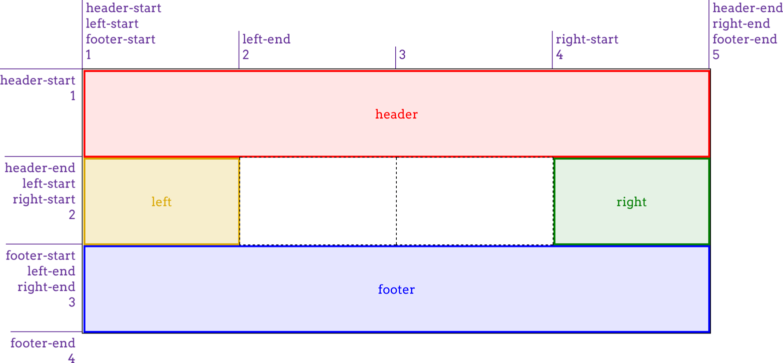
图 13-31: Implicit grid-line names made explicit
Now let’s mix it up even more by adding a couple of explicit grid-line names to our CSS. Given the following rules, the first column-grid line in the grid would add the name begin, and the second row-grid line in the grid would add the name content:
现在,让我们通过向 CSS 添加一些显式网格线名称来进一步混合它。根据以下规则,网格中的第一个列-网格线将添加名称 begin,而网格中的第二个行-网格线将添加名称“content”:
#grid {
  display: grid;
  grid-template-areas:
    "header header header header"
    "left ... ... right"
    "footer footer footer footer";
  grid-template-columns: [begin] 1fr 20em 20em 1fr 1fr;
  grid-template-rows: 40px [content] 1fr 3em 20px;
}
Again: those grid-line names are added to the implicit grid-line names created by the named areas. Interestingly enough, grid-line names never replace other grid-line names. Instead, they just keep piling up.
同样:这些网格线名称被“添加”到由命名区域创建的隐式网格线名称中。有趣的是,网格线名称永远不会取代其他网格线名称。相反,它们只会越积越多。
Even more interesting, this implicit-name mechanism runs in reverse. Suppose you don’t use grid-template-areas at all, but instead set up some named grid lines like so, as illustrated in Figure 13-32:
更有趣的是,这种隐名机制是反向运行的。假设您根本不使用“网格模板-区域”,而是像这样设置一些命名的网格线,如图 13-32 所示:
grid-template-columns:
  [header-start footer-start] 1fr
  [content-start] 1fr [content-end] 1fr
  [header-end footer-end];
grid-template-rows:
  [header-start] 3em
  [header-end content-start] 1fr
  [content-end footer-start] 3em
  [footer-end];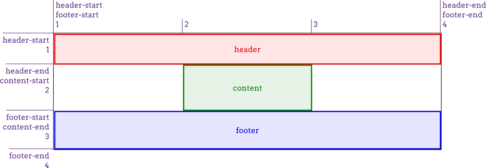
图 13-32: Implicit grid-area names made explicit
Because the grid lines use the form of name-start/name-end, the grid areas they define are implicitly named. To be frank, it’s clumsier than doing it the other way, but the capability is there in case you ever want it.
因为网格线使用
name-start/name-end的形式,所以它们定义的网格区域是隐式命名的。坦率地说,它比另一种方法更笨拙,但是在你需要的时候,它是有能力的。
Bear in mind that you don’t need all four grid lines to be named in order to create a named grid area, though you probably do need them all to create a named grid area where you want it to be. Consider the following example:
请记住,您不需要为了创建一个指定的网格区域而对所有的 4 条网格线进行命名,尽管您可能确实需要将它们全部用于在您希望的位置创建一个指定的网格区域。考虑下面的例子:
grid-template-columns: 1fr [content-start] 1fr [content-end] 1fr;
grid-template-rows: 3em 1fr 3em;
This will still create a grid area named content. It’s just that the named area will be placed into a new row after all the defined rows. What’s odd is that an extra, empty row will appear after the defined rows but before the row containing content. This has been confirmed to be the intended behavior. Thus, if you try to create a named area by naming the grid lines and miss one or more of them, then your named area will effectively hang off to one side of the grid instead of being a part of the overall grid structure.
这仍然会创建一个名为“content”的网格区域。只是在所有已定义的行之后,命名区域将被放置到新行中。奇怪的是,一个额外的空行会出现在定义的行之后,但在包含“content”的行之前。这已被证实是有意为之的行为。因此,如果您试图通过命名网格线来创建一个命名区域,而遗漏了一个或多个网格线,那么您的命名区域将有效地挂在网格的一侧,而不是整个网格结构的一部分。
So, again, you should probably stick to explicitly naming grid areas and let the start- and end- grid-line names be created implicitly, as opposed to the other way around.
因此,再次强调,您可能应该坚持显式地命名网格区域,并允许隐式地创建“开始”和“结束”网格线名称,而不是相反。
13.4 Attaching Elements to the Grid
Believe it or not, we’ve gotten this far without talking about how grid items are actually attached to a grid, once it’s been defined.
信不信由你,我们已经讲了这么多,但还没有讨论网格项是如何被实际附加到一个网格的,一旦它被定义。
13.4.1 Using Column and Row Lines
There are a couple of ways to go about this, depending on whether you want to refer to grid lines or grid areas. We’ll start with four simple properties that attach an element to grid lines.
有几种方法可以做到这一点,这取决于您是要引用网格线还是网格区域。我们将从四个将元素附加到网格线的简单属性开始。
What these properties do is let you say, “I want the edge of the element to be attached to grid line such-and-so.” As with so much of grid layout, it’s a lot easier to show than to describe, so ponder the following styles and their result (see Figure 13-33):
这些属性的作用是让你说,“我想让元素的边缘连接到网格线上,诸如此类。由于有这么多的网格布局,它更容易显示而不是描述,所以考虑以下样式和它们的结果(参见图 13-33):
.grid {
  display: grid;
  width: 50em;
  grid-template-rows: repeat(5, 5em);
  grid-template-columns: repeat(10, 5em);
}
.one {
  grid-row-start: 2;
  grid-row-end: 4;
  grid-column-start: 2;
  grid-column-end: 4;
}
.two {
  grid-row-start: 1;
  grid-row-end: 3;
  grid-column-start: 5;
  grid-column-end: 10;
}
.three {
  grid-row-start: 4;
  grid-column-start: 6;
}
Here, we’re using grid-line numbers to say where and how the elements should be placed within the grid. Column numbers count from left to right, and row numbers from top to bottom. Note that if you omit ending grid lines, as was the case for .three, then the next grid lines in sequence are used for the end lines.
在这里,我们使用网格线编号来表示元素在网格中的位置和方式。列号从左到右计数,行号从上到下计数。注意,如果您省略了结束网格线,就像'的情况一样。三',然后依次使用下一个网格线作为结束线。
Thus, the rule for .three in the previous example is exactly equivalent to the following:
因此,'的规则。在前面的例子中,‘three’完全等价于以下内容:
.three {
  grid-row-start: 4;
  grid-row-end: 5;
  grid-column-start: 6;
  grid-column-end: 7;
}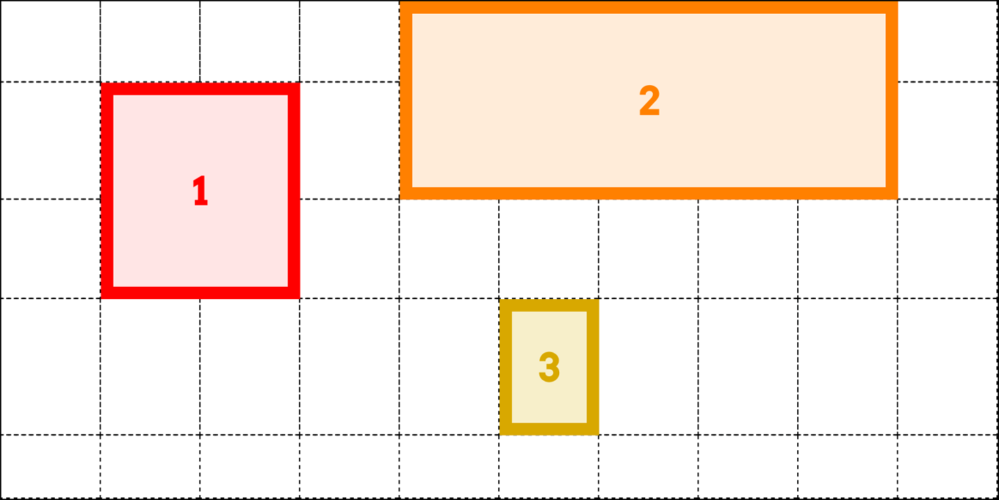
图 13-33: Attaching elements to grid lines
There’s another way to say that same thing, as it happens: you could replace the ending values with span 1, or even just plain span, like this:
还有另一种方式来表达同样的事情:你可以用‘span 1’来替换结束值,或者甚至是简单的‘span’,就像这样:
.three {
  grid-row-start: 4;
  grid-row-end: span 1;
  grid-column-start: 6;
  grid-column-end: span;
}
If you supply span with a number, you’re saying, “span across this many grid tracks.” So we can rewrite our earlier example like this, and get exactly the same result:
如果你给‘span’加上一个数字,你是在说,“跨越这么多网格轨道的 span。所以我们可以像这样重写之前的例子,得到完全相同的结果:
#grid {
  display: grid;
  grid-template-rows: repeat(5, 5em);
  grid-template-columns: repeat(10, 5em);
}
.one {
  grid-row-start: 2;
  grid-row-end: span 2;
  grid-column-start: 2;
  grid-column-end: span 2;
}
.two {
  grid-row-start: 1;
  grid-row-end: span 2;
  grid-column-start: 5;
  grid-column-end: span 5;
}
.three {
  grid-row-start: 4;
  grid-row-end: span 1;
  grid-column-start: 6;
  grid-column-end: span;
}
If you leave out a number for span, it’s set to be 1. You can’t use zero or negative numbers for span; only positive integers.
如果你省略了数字‘span’,它就会被设置为‘1’。你不能用 0 或负数来表示“张成的空间”;唯一的正整数。
An interesting feature of span is that you can use it for both ending and starting grid lines. The precise behavior of span is that it counts grid lines in the direction “away” from the grid line where it starts. In other words, if you define a start grid line and set the ending grid line to be a span value, it will search toward the end of the grid.
“span”的一个有趣的特性是,你可以将它用于结束网格线和开始网格线。“span”的准确行为是它计算网格线的方向“远离”它开始的网格线。换句话说,如果您定义了一个起始网格线,并将结束网格线设置为‘span’值,那么它将搜索网格的末端。
Conversely, if you define an ending grid line and make the start line a span value, then it will search toward the start of the grid.
相反,如果您定义了一个结束网格线,并将起始网格线设置为‘span’值,那么它将搜索网格的起始部分。
That means the following rules will have the result shown in Figure 13-34:
这意味着以下规则的结果如图 13-34 所示:
#grid {
  display: grid;
  grid-rows: repeat(4, 2em);
  grid-columns: repeat(5, 5em);
}
.box01 {
  grid-row-start: 1;
  grid-column-start: 3;
  grid-column-end: span 2;
}
.box02 {
  grid-row-start: 2;
  grid-column-start: span 2;
  grid-column-end: 3;
}
.box03 {
  grid-row-start: 3;
  grid-column-start: 1;
  grid-column-end: span 5;
}
.box04 {
  grid-row-start: 4;
  grid-column-start: span 1;
  grid-column-end: 5;
}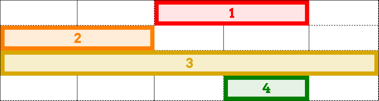
图 13-34: Spanning grid lines
In contrast to span numbering, you aren’t restricted to positive integers for your actual grid-line values. Negative numbers will count backward from the end of explicitly defined grid lines. Thus, to place an element into the bottom-right grid cell of a defined grid, regardless of how many columns or rows it might have, you can just say this:
与“span”编号不同,您的实际网格线值不局限于正整数。负数将从显式定义的网格线的末尾开始向后计数。因此,要将一个元素放入已定义网格的右下角网格单元中,不管它可能有多少列或行,您只需这样说:
grid-column-start: -1;
grid-row-start: -1;
Note that this doesn’t apply to any implicit grid tracks, a concept we’ll get to in a bit, but only to the grid lines you explicitly define via one of the grid-template-* properties (e.g., grid-template-rows).
注意,这并不适用于任何隐含的网格轨迹,我们稍后将讨论这个概念,但只适用于通过' grid-template-* '属性(例如,' grid-template-rows ')显式定义的网格线。
We aren’t restricted to grid-line numbers, as it happens. If there are named grid lines, we can refer to those instead of (or in conjunction with) numbers. If you have multiple instances of a grid-line name, then you can use numbers to identify which instance of the grid-line name you’re talking about. Thus, to start from the fourth instance of a row grid named mast-slice, you can say mast-slice 4. Take a look at the following, illustrated in Figure 13-35, for an idea of how this works:
事实上,我们并不局限于网格线编号。如果有指定的网格线,我们可以引用它们而不是(或与它们一起)数字。如果您有一个网格线名称的多个实例,那么您可以使用数字来确定您所谈论的网格线名称的实例。因此,要从名为“mast-slice”的行网格的第四个实例开始,您可以说“mast-slice 4”。请看下面的图 13-35,了解一下它是如何工作的:
#grid {
  display: grid;
  grid-template-rows: repeat(5, [R] 4em);
  grid-template-columns: 2em repeat(5, [col-A] 5em [col-B] 5em) 2em;
}
.one {
  grid-row-start: R 2;
  grid-row-end: 5;
  grid-column-start: col-B;
  grid-column-end: span 2;
}
.two {
  grid-row-start: R;
  grid-row-end: span R 2;
  grid-column-start: col-A 3;
  grid-column-end: span 2 col-A;
}
.three {
  grid-row-start: 9;
  grid-column-start: col-A -2;
}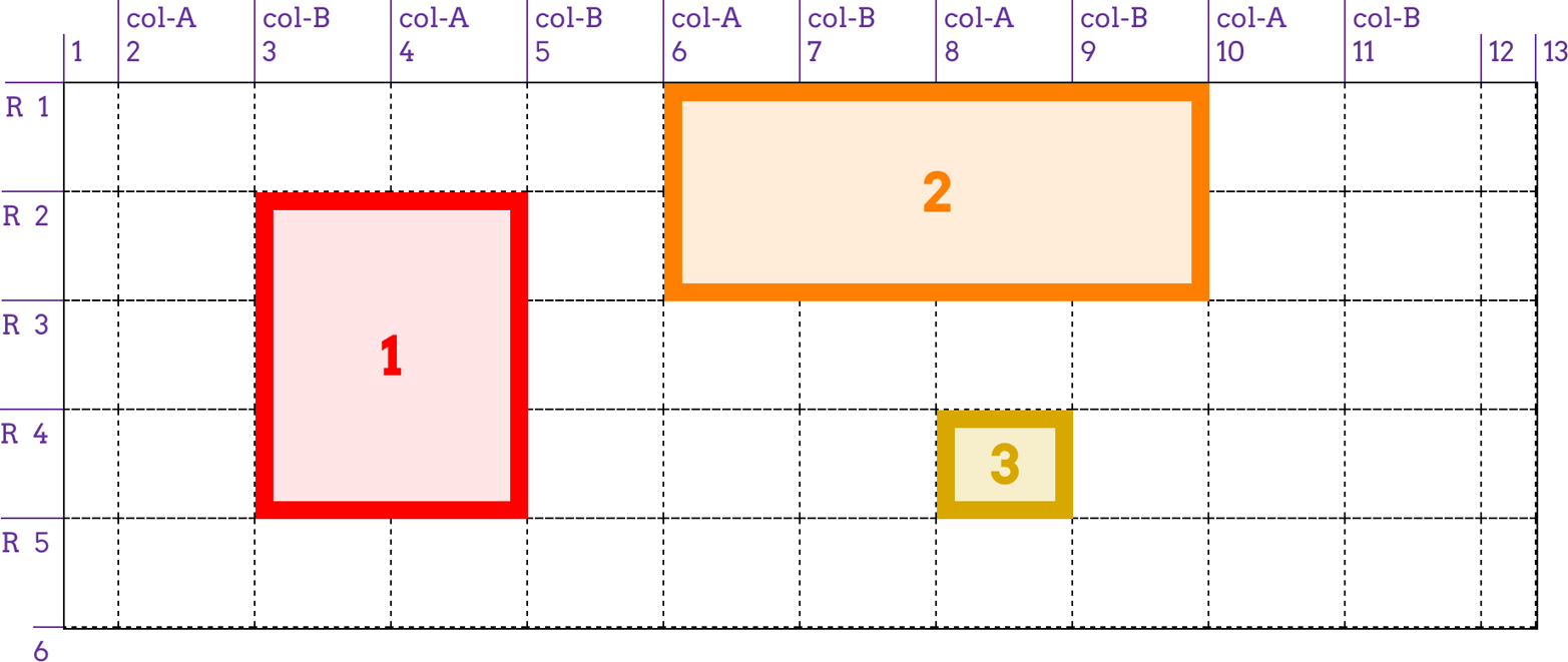
图 13-35: Attaching elements to named grid lines
Notice how span changes when we add a name: where we said span 2 col-A, that caused the grid item to span from its starting point (the third col-A) across another col-A and end at the col-A after that. This means the grid item actually spans four column tracks, since col-A appears on every other column grid line.
注意,当我们添加一个名称时,' span '是如何变化的:在这里我们说' span 2 ' - a ',这导致网格项从它的起点(第三个' - a ')跨越另一个' - a ',然后在' - a '结束。这意味着网格项目实际上跨越了四个列轨道,因为‘col-A’出现在每隔一个列网格线上。
Again, negative numbers count backward from the end of a sequence, so col-A -2 gets us the second-from-last instance of a grid line named col-A. Because there are no end-line values declared for .three, they’re both set to span 1. That means the following is exactly equivalent to the .three in the previous example:
同样,负数从序列的末尾开始倒数,因此“cola -2”为我们提供了名为“cola”的网格线的倒数第二个实例。因为没有为'声明结束行值。3 '它们都被设置成'张成空间 1 '这意味着下面的式子与'完全等价。在前面的例子中:
.three {
  grid-row-start: 9;
  grid-row-end: span 1;
  grid-column-start: col-A -2;
  grid-row-end: span 1;
}
There’s an alternative way to use names with named grid lines—specifically, the named grid lines that are implicitly created by grid areas. For example, consider the following styles, illustrated in Figure 13-36:
有一种方法可以将名称与指定的网格线一起使用——具体来说,就是由网格区域隐式创建的指定网格线。例如,考虑下面的样式,如图 13-36 所示:
grid-template-areas:
  "header header header header"
  "leftside content content rightside"
  "leftside footer footer footer";
#masthead {
  grid-row-start: header;
  grid-column-start: header;
  grid-row-end: header;
}
#sidebar {
  grid-row-start: 2;
  grid-row-end: 4;
  grid-column-start: leftside / span 1;
}
#main {
  grid-row-start: content;
  grid-row-end: content;
  grid-column-start: content;
}
#navbar {
  grid-row-start: rightside;
  grd-row-end: 3;
  grid-column-start: rightside;
}
#footer {
  grid-row-start: 3;
  grid-row-end: span 1;
  grid-column-start: footer;
  grid-row-end: footer;
}
图 13-36: Another way of attaching elements to named grid lines
What happens if you supply a custom identifier (i.e., a name you defined) is that the browser looks for a grid line with that name plus either -start or -end added on, depending on whether you’re assigning a start line or an end line. Thus, the following are equivalent:
如果你提供一个自定义标识符会发生什么?,您定义的名称)是浏览器查找名称为“+”或“-start”或“-end”的网格线,取决于您是分配起始线还是结束线。因此,以下是等价的:
grid-column-start: header;
grid-column-end: header;
grid-column-start: header-start;
grid-column-end: header-end;
This works because, as was mentioned with grid-template-areas, explicitly creating a grid area implicitly creates the named -start and -end grid lines that surround it.
这是因为,正如“网格模板-区域”中提到的,显式地创建一个网格区域将隐式地创建包围它的命名为“-start”和“-end”的网格线。
The final value possibility, auto, is kind of interesting. According to the Grid Layout specification, if one of the grid-line start/end properties is set to auto, that indicates “auto-placement, an automatic span, or a default span of one.” In practice, what this tends to mean is that the grid line that gets picked is governed by the grid flow, a concept we have yet to cover (but will soon!). For a start line, auto usually means that the next available column or row line will be used. For an end line, auto usually means a one-cell span. In both cases, the word “usually” is used intentionally: as with any automatic mechanism, there are no absolutes.
最后一个值,auto,很有趣。根据网格布局规范,如果其中一个网格线开始/结束属性设置为“auto”,表示“自动放置、自动跨度或默认跨度为 1”。“在实践中,这往往意味着被选中的网格线是由‘网格流’控制的,这个概念我们还没有涉及(但很快就会涉及!)对于起始行,“auto”通常意味着将使用下一个可用的列或行行。对于结束行,“auto”通常表示一个单元格。在这两种情况下,“通常”这个词都是有意使用的:就像任何自动机制一样,没有绝对原则。
13.4.2 Row and Column Shorthands
There are two shorthand properties that allow you to more compactly attach an element to grid lines.
有两个简写属性允许您更紧密地将元素附加到网格线。
The primary benefit of these properties is that they make it a lot simpler to declare the start and end grid lines to be used for laying out a grid item. For example:
这些属性的主要好处是,它们使声明用于布局网格项的起始和结束网格线变得简单得多。例如:
#grid {
  display: grid;
  grid-template-rows: repeat(10, [R] 1.5em);
  grid-template-columns: 2em repeat(5, [col-A] 5em [col-B] 5em) 2em;
}
.one {
  grid-row: R 3 / 7;
  grid-column: col-B / span 2;
}
.two {
  grid-row: R / span R 2;
  grid-column: col-A 3 / span 2 col-A;
}
.three {
  grid-row: 9;
  grid-column: col-A -2;
}
That’s a whole lot easier to read than having each start and end value in its own property, honestly. Other than being more compact, the behavior of these properties is more or less what you’d expect. If you have two bits separated by a solidus, the first part defines the starting grid line, and the second part defines the ending grid line. If you have only one value with no solidus, it defines the starting grid line. The ending grid line depends on what you said for the starting line. If you supply a name for the starting grid line, then the ending grid line is given that same name. Thus, the following are equivalent:
坦白地说,这比将每个开始值和结束值放在自己的属性中要容易得多。除了更紧凑之外,这些属性的行为或多或少是您所期望的。如果有两个位由一个 solidus 分隔,第一部分定义起始网格线,第二部分定义结束网格线。如果只有一个没有 solidus 的值,它将定义起始网格线。结束的网格线取决于你说的起始线。如果您为起始网格线提供一个名称,那么结束网格线将被赋予相同的名称。因此,以下是等价的:
grid-column: col-B;
grid-column: col-B / col-B;
That will span from one instance of that grid-line name to the next, regardless of how many grid cells are spanned.
它将从网格线名称的一个实例跨越到下一个实例,而不管跨越了多少网格单元格。
If a single number is given, then the second number (the end line) is set to auto. That means the following pairs are equivalent:
如果给定一个数字,那么第二个数字(结束行)被设置为“auto”。这意味着下列配对是等价的:
grid-row: 2;
grid-row: 2 / auto;
grid-column: header;
grid-column: header / header;
There’s a subtle behavior built into the handling of grid-line names in grid-row and grid-column that pertains to implicitly named grid lines. If you recall, defining a named grid area creates -start and -end grid lines. That is, given a grid area with a name of footer, there are implicitly created footer-start grid lines to its top and left, and footer-end grid lines to its bottom and right.
在处理“网格行”和“网格列”中的网格行名称时,内置了一个微妙的行为,它属于隐式命名的网格行。如果您还记得,定义一个命名的网格区域会创建“-start”和“-end”网格线。也就是说,给定一个名为“footer”的网格区域,它的顶部和左侧会隐式地创建“footer-start”网格线,底部和右侧会创建“footer-end”网格线。
In that case, if you refer to those grid lines by the area’s name, the element will still be placed properly. Thus, the following styles have the result shown in Figure 13-37:
在这种情况下,如果您通过区域的名称引用这些网格线,元素仍然会被正确放置。因此,以下样式的结果如图 13-37 所示:
#grid {
  display: grid;
  grid-template-areas:
    "header header"
    "sidebar content"
    "footer footer";
  grid-template-rows: auto 1fr auto;
  grid-template-columns: 25% 75%;
}
#header {
  grid-row: header / header;
  grid-column: header;
}
#footer {
  grid-row: footer;
  grid-column: footer-start / footer-end;
}
图 13-37: Attaching to implicit grid lines via grid-area names
You can always explicitly refer to the implicitly named grid lines, but if you just refer to the grid area’s name, things still work out. If you refer to a grid-line name that doesn’t correspond to a grid area, then it falls back to the behavior discussed previously. In detail, it’s the same as saying line-name 1, so the following two are equivalent:
您总是可以显式地引用隐式命名的网格线,但是如果只引用网格区域的名称,那么仍然可以解决问题。如果您引用的网格线名称与网格区域不对应,那么它将返回到前面讨论的行为。在细节上,它相当于说
line-name 1,所以下面两个是等价的:
grid-column: jane / doe;
grid-column: jane 1 / doe 1;
This is why it’s risky to name grid lines the same as grid areas. Consider the following:
grid-template-areas:
  "header header"
  "sidebar content"
  "footer footer"
  "legal legal";
grid-template-rows: auto 1fr [footer] auto [footer];
grid-template-columns: 25% 75%;
This explicitly sets grid lines named footer above the “footer” row and below the “legal” row…and now there’s trouble ahead. Suppose we add this:
它显式地将名为“footer”的网格线设置在“footer”行之上、“legal”行之下……现在前面有麻烦了。假设我们加上这个:
#footer {
  grid-column: footer;
  grid-row: footer;
}
For the column lines, there’s no problem. footer gets expanded to footer / footer. The browser looks for a grid area with that name and finds it, so it translates footer / footer to footer-start / footer-end. The #footer element is attached to those implicit grid lines.
对于列行,没有问题。' footer '被扩展为' footer / footer '。浏览器会查找具有该名称的网格区域并找到它,因此它将“footer / footer”转换为“footer-start / footer-end”。' #footer '元素附加到这些隐式网格线。
For grid-row, everything starts out the same. footer becomes footer / footer, which is translated to footer-start / footer-end. But that means the #footer will only be as tall as the “footer” row. It will not stretch to the second explicitly named footer grid line below the “legal” row, because the translation of footer to footer-end (due to the match between the grid-line name and the grid-area name) takes precedence.
对于“grid-row”来说,所有东西一开始都是一样的。“footer”变成了“footer / footer”,翻译成“footer-start / footer-end”。但这意味着“#footer”将只与“footer”行一样高。它将“不”延伸到“合法”行下面的第二个显式命名为“footer”的网格线,因为将“footer”转换为“footer-end”(由于网格线名称和网格区域名称之间的匹配)优先。
The upshot of all this: it’s generally a bad idea to use the same name for grid areas and grid lines. You might be able to get away with it in some scenarios, but you’re almost always better off keeping your line and area names distinct, so as to avoid tripping over name-resolution conflicts.
所有这些的结果是:对网格区域和网格线使用相同的名称通常是一个坏主意。在某些情况下,您可能不需要这样做,但是最好保持行名和区域名是不同的,这样可以避免出现名称解析冲突。
13.4.3 The Implicit Grid
Up to this point, we’ve concerned ourselves solely with explicitly defined grids: we’ve talked about the row and column tracks we define via properties like grid-template-columns, and how to attach grid items to the cells in those tracks.
到目前为止,我们只关心显式定义的网格:我们讨论了通过诸如“网格模板-列”之类的属性定义的行和列轨迹,以及如何将网格项附加到这些轨迹中的单元格。
But what happens if we try to place a grid item, or even just part of a grid item, beyond that explicitly created grid? For example, consider the following grid:
但是,如果我们试图在显式创建的网格之外放置一个网格项,甚至只是网格项的一部分,会发生什么?例如,考虑以下网格:
#grid {
  display: grid;
  grid-template-rows: 2em 2em;
  grid-template-columns: repeat(6, 4em);
}
Two rows, six columns. Simple enough. But suppose we define a grid item to sit in the first column and go from the first grid line to the fourth:
两行,六列。很简单。但是假设我们定义了一个网格项,它位于第一列,并从第一个网格线移动到第四个网格线:
.box01 {
  grid-column: 1;
  grid-row: 1 / 4;
}
Now what? There are only two rows bounded by three grid lines, and we’ve told the browser to go beyond that, from row line 1 to row line 4.
现在怎么办呢?只有两行以三条网格线为界,我们已经告诉浏览器超出这一范围,从行 1 到行 4。
What happens is that another row line is created to handle the situation. This grid line, and the new row track it creates, are both part of the implicit grid. Here are a few examples of grid items that create implicit grid lines (and tracks) and how they’re laid out (see Figure 13-38):
所发生的是创建另一行来处理这种情况。此网格线及其创建的新行跟踪都是隐式网格的一部分。以下是一些创建隐式网格线(和轨迹)的网格项示例,以及它们的布局方式(参见图 13-38):
.box01 {
  grid-column: 1;
  grid-row: 1 / 4;
}
.box02 {
  grid-column: 2;
  grid-row: 3 / span 2;
}
.box03 {
  grid-column: 3;
  grid-row: span 2 / 3;
}
.box04 {
  grid-column: 4;
  grid-row: span 2 / 5;
}
.box05 {
  grid-column: 5;
  grid-row: span 4 / 5;
}
.box06 {
  grid-column: 6;
  grid-row: -1 / span 3;
}
.box07 {
  grid-column: 7;
  grid-row: span 3 / -1;
}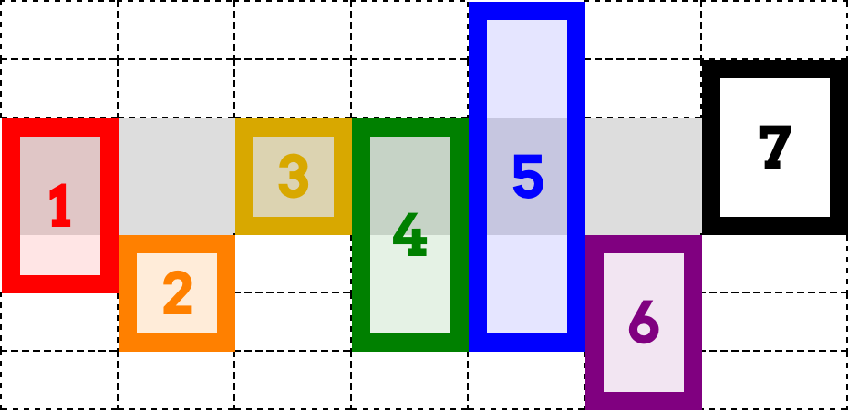
图 13-38: Creating implicit grid lines and tracks
There’s a lot going on there, so let’s break it down. First off, the explicit grid is represented by the light-gray box behind the various numbered boxes; all the dashed lines represent the implicit grid.
这里有很多东西,让我们把它分解一下。首先,显式网格由各种编号的方框后面的浅灰色方框表示;所有虚线表示隐式网格。
So, what about those numbered boxes? box1 adds an extra grid line after the end of the explicit grid, as we discussed before. box2 starts on the last line of the explicit grid, and spans forward two lines, so it adds yet another implicit grid line. box3 ends on the last explicit grid line (line 3) and spans back two lines, thus starting on the first explicit grid line.
那么,那些编号的盒子呢?如前所述,“box1”在显式网格结束后添加了一条额外的网格线。“box2”从显式网格的最后一行开始,向前跨越两行,因此它又添加了一条隐式网格线。“box3”以最后一个显式网格线结束(第 3 行),跨越“back”两行,因此从第一个显式网格线开始。
box4 is where things really get interesting. It ends on the fifth row line, which is to say the second implicit grid line. It spans back three lines—and yet, it still starts on the same grid line as box3. This happens because spans have to start counting within the explicit grid. Once they start, they can continue on into the implicit grid (as happened with box2), but they cannot start counting within the implicit grid.
“box4”是真正让事情变得有趣的地方。它在第 5 行结束,也就是第二个隐式网格线。它跨越了三条线——但它仍然从与《box3》相同的网格线开始。这是因为 span 必须在显式网格中开始计算。一旦开始,它们可以继续进入隐式网格(就像“box2”那样),但是它们“不能”在隐式网格中开始计数。
Thus, box4 ends on row-line 5, but its span starts with grid-line 3 and counts back two lines (span 2) to arrive at line 1. Similarly, box5 ends on line 5, and spans back four lines, which means it starts on row-line –2. Remember: span counting must start in the explicit grid. It doesn’t have to end there.
因此,“box4”在第 5 行结束,但是它的 span 从第 3 行开始,并返回两行(“span 2”),到达第 1 行。类似地,“box5”在第 5 行结束,向后跨越 4 行,这意味着它从第 2 行开始。请记住:span 计数必须在显式网格中“开始”。事情不必到此为止。
After those, box6 starts on the last explicit row line (line 3), and spans out to the sixth row line—adding yet another implicit row line. The point of having it here is to show that negative grid-line references are with respect to the explicit grid, and count back from its end. They do not refer to negatively indexed implicit lines that are placed before the start of the explicit grid.
之后,“box6”从最后一个显式行行(第 3 行)开始,扩展到第六行行——添加另一个隐式行行。在这里使用它的目的是为了显示负网格线引用是相对于显式网格的,并从其末端开始计数。它们“不”指的是放在显式网格开始之前的带负索引的隐式行。
If you want to start an element on an implicit grid line before the explicit grid’s start, then the way to do that is shown by box7: put its end line somewhere in the explicit grid, and span back past the beginning of the explicit grid. And you may have noticed: box7 occupies an implicit column track. The original grid was set up to create six columns, which means seven column lines, the seventh being the end of the explicit grid. When box7 was given grid-column: 7, that was equivalent to grid-column: 7 / span 1 (since a missing end line is always assumed to be span 1). That necessitated the creation of an implicit column line in order to hold the grid item in the implicit seventh column.
如果您想要在显式网格开始之前在隐式网格线上开始一个元素,那么方法是' box7 ':将它的结束线放在显式网格的某个地方,并跨越回显式网格的开始。您可能已经注意到:“box7”占用了一个隐式的列跟踪。最初的网格被设置为创建 6 个列,这意味着 7 个列行,第七行是显式网格的结束。当' box7 '被赋予' grid-column: 7 '时,它等价于' grid-column: 7 / span 1 '(因为丢失的结束行总是被假定为' span 1 ')。这就需要创建一个隐式的列行,以便在隐式的第七列中保存网格项。
Now let’s take those principles and add named grid lines to the mix. Consider the following, illustrated in Figure 13-39:
现在让我们采用这些原则并将命名网格线添加到混合中。考虑如下图 13-39 所示:
#grid {
  display: grid;
  grid-template-rows: [begin] 2em [middle] 2em [end];
  grid-template-columns: repeat(5, 5em);
}
.box01 {
  grid-column: 1;
  grid-row: 2 / span end 2;
}
.box02 {
  grid-column: 2;
  grid-row: 2 / span final;
}
.box03 {
  grid-column: 3;
  grid-row: 1 / span 3 middle;
}
.box04 {
  grid-column: 4;
  grid-row: span begin 2 / end;
}
.box05 {
  grid-column: 5;
  grid-row: span 2 middle / begin;
}
What you can see at work there, in several of the examples, is what happens with grid-line names in the implicit grid: every implicitly created line has the name that’s being hunted. Take box2, for example. It’s given an end line of final, but there is no line with that name. Thus the span-search goes to the end of the explicit grid and, having not found the name it’s looking for, creates a new grid line, to which it attaches the name final. (In Figure 13-39, the implicitly-created line names are italicized and faded out a bit.)
在一些示例中,您可以看到隐式网格中的网格行名称:每个隐式创建的行都有被搜索的名称。以“box2”为例。它有一个“final”的结束行,但是没有与这个名字相关的行。因此,span-search 将转到显式网格的末尾,在没有找到要查找的名称之后,创建一个新的网格线,并将名称“final”附加到其中。(在图 13-39 中,隐式创建的行名称用斜体显示,并略为淡出。)
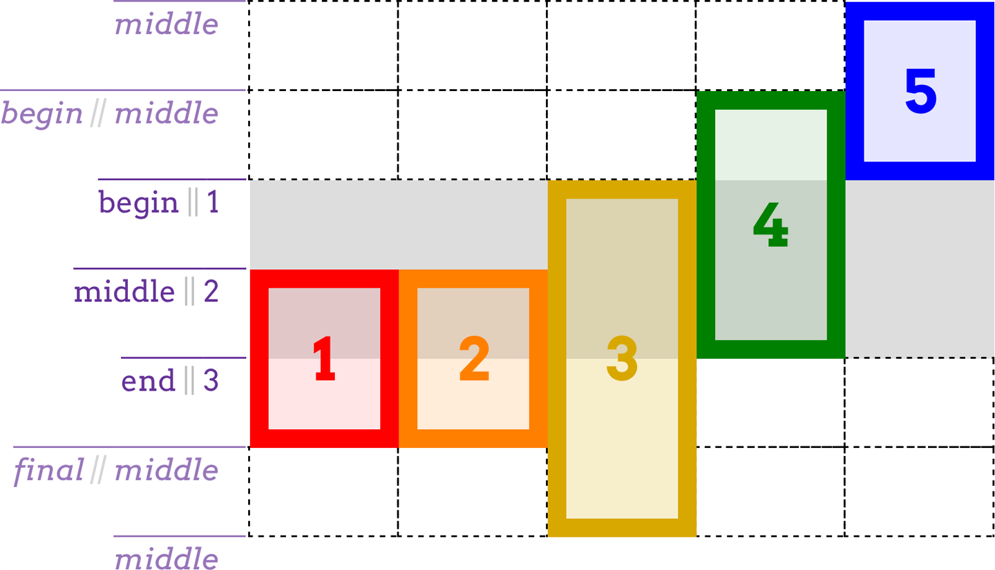
图 13-39: Named implicit grid lines and tracks
Similarly, box3 starts on the first explicit row line, and then needs to span three middle named lines. It searches forward and finds one, then goes looking for the other two. Not finding any, it attaches the name middle to the first implicit grid line, and then does the same for the second implicit grid line. Thus, it ends two implicit grid lines past the end of the explicit grid.
类似地,“box3”从第一个显式行开始,然后需要跨越三个“中间”命名行。它向前搜索,找到一个,然后去寻找另外两个。没有找到任何,它将名称“middle”附加到第一个隐式网格线,然后对第二个隐式网格线执行相同的操作。因此,它结束了两个隐式网格线,超过了显式网格的结束。
The same sort of thing happens with box4 and box5, except working backward from endpoints. box4 ends with the end line (line 3), then spans back to the second begin line it can find. This causes an implicit line to be created before the first line, named begin. box 5 spans back from begin (the explicitly labeled begin) to the second middle it can find. Since it can’t find any, it labels two implcit lines middle and ends at the one furthest from where it started looking.
类似的事情也会发生在“box4”和“box5”上,除了从端点反向工作。“box4”以结束行(第 3 行)结束,然后跨越回它能找到的第二个“开始”行。这将导致在第一行之前创建一个隐式行,名为“begin”。“box 5”从“begin”(明确标记为“begin”)一直延伸到它能找到的第二个“middle”。由于找不到任何线索,它将两条线索标为“中间”,并在离它开始寻找的地方最远的地方结束。
When you get right down to it, the implicit grid is a delightfully baroque fallback mechanism. It’s generally best practice to stick to the explicit grid, and to make sure the explicit grid covers everything you want to do. If you find you need another row, don’t just run off the edge of the grid—adjust your grid template’s values instead!
当你开始着手时,隐含的网格是一种令人愉快的巴洛克式后退机制。通常,最好的实践是坚持使用显式网格,并确保显式网格涵盖您想要做的所有事情。如果您发现您需要另一行,不要仅仅从网格边缘运行—而是调整您的网格模板的值!
13.4.4 Error Handling
There are a few cases that need to be covered, as they fall under the general umbrella of “what grids do when things go pear-shaped.”
有一些情况是需要覆盖的,因为它们属于“当事情变得梨形时网格会做什么”的一般范畴。
First, what if you accidentally put the start line after the end line? Say, something like this:
首先,如果你不小心把起始线放在了结束线之后怎么办?比如说:
grid-row-start: 5;
grid-row-end: 2;
All that happens is probably what was meant in the first place: the values are swapped. Thus, you end up with this:
所发生的一切可能就是最初的含义:交换值。因此,您最终得到以下结果:
grid-row-start: 2;
grid-row-end: 5;
Second, what if both the start and the end lines are declared to be spans of some variety? For example:
其次,如果起始线和结束线都被声明为某种类型的跨度,该怎么办?例如:
grid-column-start: span;
grid-column-end: span 3;
If this happens, the end value is dropped and replaced with auto. That means you’d end up with this:
如果发生这种情况,则将结束值删除并替换为 auto。这意味着你最终会得到这个:
grid-column-start: span; /* 'span' is equal to 'span 1' */
grid-column-end: auto;
That would cause the grid item to have its ending edge placed automatically, according to the current grid flow (a subject we’ll soon explore), and the starting edge to be placed one grid line earlier. Third, what if the only thing directing placement of the grid item is a named span? In other words:
这将导致根据当前网格流(我们将很快讨论的主题)自动放置网格项的结束边缘,并将开始边缘放置在更早的网格线上。第三,如果指导网格项目放置的惟一东西是一个名为 span 的空间,该怎么办?换句话说:
grid-row-start: span footer;
grid-row-end: auto;
This is not permitted, so the span footer in this case is replaced with span 1.
这是不允许的,所以本例中的
span footer被替换为span 1。
13.4.5 Using Areas
Attaching by row lines and column lines is great, but what if you could refer to a grid area with a single property? Behold: grid-area.
通过行和列进行附加非常好,但是如果可以使用单个属性引用网格区域呢?看:
grid-area。
Let’s start with the easier use of grid-area: assigning an element to a previously defined grid area. Makes sense, right? Let’s bring back our old friend grid-template-areas, put it together with grid-area and some markup, and see what magic results (as shown in Figure 13-40):
让我们从更容易使用的
grid-area开始:将一个元素分配给先前定义的网格区域。很有道理,对吧?让我们回到我们的老朋友grid-template-areas,将它与grid-area和一些标记放在一起,看看有什么神奇的结果(如图 13-40 所示):
#grid {
  display: grid;
  grid-template-areas:
    "header header header header"
    "leftside content content rightside"
    "leftside footer footer footer";
}
#masthead {
  grid-area: header;
}
#sidebar {
  grid-area: leftside;
}
#main {
  grid-area: content;
}
#navbar {
  grid-area: rightside;
}
#footer {
  grid-area: footer;
}<div id="grid">
<div id="masthead">…</div>
<div id="main">…</div>
<div id="navbar">…</div>
<div id="sidebar">…</div>
<div id="footer">…</div>
</div>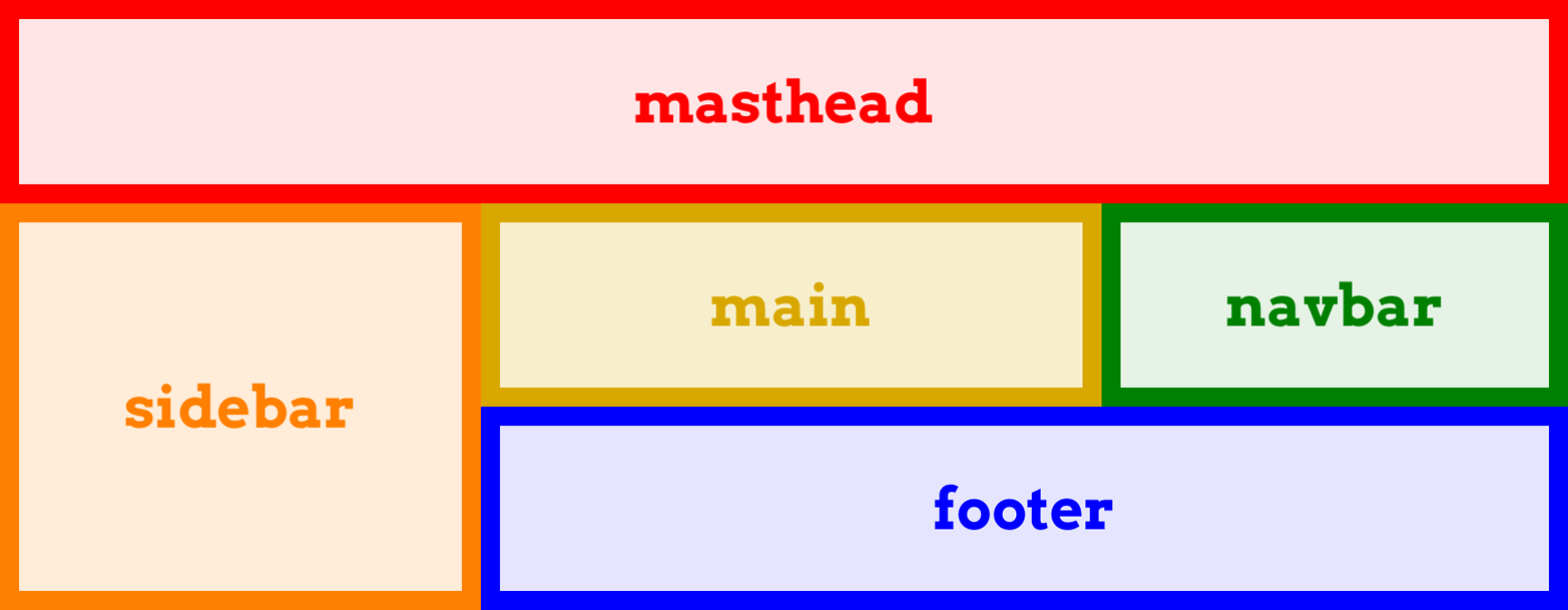
图 13-40: Assigning elements to grid areas
That’s all it takes: set up some named grid areas to define your layout, and then drop grid items into them with grid-area. So simple, and yet so powerful.
这就是它所需要的:建立一些命名的网格区域来定义你的布局,然后用
grid-area将网格项放入其中。如此简单,却又如此强大。
As you might have noticed, the sizing of the column and row tracks was omitted from that CSS. This was done entirely for clarity’s sake. In an actual design, the rule probably would look more like this:
您可能已经注意到,该 CSS 省略了列和行轨道的大小调整。这样做完全是为了清晰。在实际的设计中,规则可能看起来更像这样:
grid-template-areas:
  "header header header header"
  "leftside content content rightside"
  "leftside footer footer footer";
grid-template-rows: 200px 1fr 3em;
grid-template-columns: 20em 1fr 1fr 10em;
There is another way to use grid-area that refers to grid lines instead of grid areas. Fair warning: it’s likely to be confusing at first, for a couple of reasons.
还有另一种使用
grid-area的方法,它指的是网格线而不是网格区域。公平警告:一开始可能会让人感到困惑,原因有几个。
Here’s an example of a grid template that defines some grid lines, and some grid-area rules that reference the lines, as illustrated in Figure 13-41:
下面是一个网格模板的例子,它定义了一些网格线,以及一些引用这些线的
grid-area规则,如图 13-41 所示:
#grid {
  display: grid;
  grid-template-rows: [r1-start] 1fr [r1-end r2-start] 2fr [r2-end];
  grid-template-columns: [col-start] 1fr [col-end main-start] 1fr [main-end];
}
.box01 {
  grid-area: r1 / main / r1 / main;
}
.box02 {
  grid-area: r2-start / col-start / r2-end / main-end;
}
.box03 {
  grid-area: 1 / 1 / 2 / 2;
}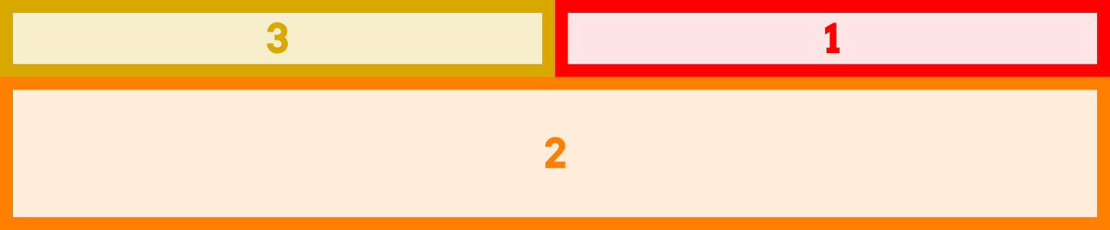
图 13-41: Assigning elements to grid lines
As you can see, the elements were placed as directed. Note the ordering of the gridline values, however. They’re listed in the order row-start, column-start, row-end, column-end. If you diagram that in your head, you’ll quickly realize that the values go anticlockwise around the grid item—the exact opposite of the TRBL (Top, Right, Bottom, Left) pattern we’re used to from margins, padding, borders, and so on. Further more, this means the column and row references are not grouped together, but are instead split up.
如您所见,元素被定向放置。但是,请注意网格线值的顺序。它们按
row-start,column-start,row-end,column-end的顺序列出。如果您在头脑中绘制图表,您将很快意识到这些值在网格项周围是逆时针移动的——这与我们习惯的边距、填充、边框等 TRBL(上、右、下、左)模式完全相反。此外,这意味着列和行引用不是分组在一起的,而是分开的。
Yes, this is intentional. No, I don’t know why.
是的,这是故意的。不,我不知道为什么。
If you supply fewer than four values, the missing values are taken from those you do supply. If there are only three values, then the missing grid-column-end is the same as grid-column-start if it’s a name; if the start line is a number, the end line is set to auto. The same holds true if you give only two values, except that the now-missing grid-row-end is copied from grid-row-start if it’s a name; otherwise, it’s set to auto.
如果你提供的值少于 4 个,缺失的值将从你提供的值中取出。如果只有三个值,那么缺失的
grid-column-end与grid-column-start相同,如果它是一个名称;如果起始行是一个数字,结束行被设置为auto。如果你只给两个值,同样也成立,除了现在丢失的grid-row-end复制从grid-row-start如果它是一个名字;否则,它被设为 auto。
From that, you can probably guess what happens if only one value is supplied: if it’s a name, use it for all four values; if it’s a number, the rest are set to auto.
由此,您可能会猜到如果只提供一个值会发生什么:如果它是一个名称,则对所有四个值使用它;如果它是一个数字,其余的设置为
auto。
This one-to-four replication pattern is actually how giving a single grid-area name translates into having the grid item fill that area. The following are equivalent:
这种 1 - 4 的复制模式实际上是将一个网格区域名称转换为网格项填充该区域的方式。以下是等价的:
grid-area: footer;
grid-area: footer / footer / footer / footer;
Now recall the behavior discussed in the previous section about grid-column and grid-row: if a grid line’s name matches the name of a grid area, then it’s translated into a -start or -end variant, as appropriate. That means the previous example is translated to the following:
现在回想一下上一节中讨论的关于
grid-column和grid-row的行为:如果网格线的名称与网格区域的名称匹配,那么它将根据需要被转换为-start或-end变体。这意味着前面的例子可以翻译成以下内容:
grid-area: footer-start / footer-start / footer-end / footer-end;And that’s how a single grid-area name causes an element to be placed into the corresponding grid area.
这就是单个网格区域名称导致将元素放置到相应网格区域的原因。
13.4.6 Grid Item Overlap
One thing we’ve been very careful to do in our grid layouts thus far is to avoid overlap. Rather like positioning, it’s absolutely (get it?) possible to make grid items overlap each other. Let’s take a simple case, illustrated in Figure 13-42:
到目前为止,我们在网格布局中一直非常小心地避免重叠。就像定位一样,完全有可能(明白了吗?)使网格项相互重叠。让我们看一个简单的例子,如图 13-42 所示:
#grid {
  display: grid;
  grid-template-rows: 50% 50%;
  grid-template-columns: 50% 50%;
}
.box01 {
  grid-area: 1 / 1 / 2 / 3;
}
.box02 {
  grid-area: 1 / 2 / 3 / 2;
}
图 13-42: Overlapping grid items
Thanks to the grid numbers that were supplied, the two grid items overlap in the upper-right grid cell. Which is on top of the other depends on the layering behavior discussed later, but for now, just take it as given that they do layer when overlapping.
由于提供了网格号,两个网格项在右上方的网格单元格中重叠。哪一个在另一个之上取决于后面讨论的分层行为,但现在,只要假定它们在重叠时进行分层即可。
Overlap isn’t restricted to situations involving raw grid numbers. In the following case, the sidebar and the footer will overlap, as shown in Figure 13-43. (Assuming the footer comes later than the sidebar in the markup, then in the absence of other styles, the footer will be on top of the sidebar.)
重叠并不局限于涉及原始网格数字的情况。在下面的例子中,侧边栏和页脚将重叠,如图 13-43 所示。(假设在标记中页脚比侧边栏晚,那么在没有其他样式的情况下,页脚将位于侧边栏的顶部。)
#grid {
  display: grid;
  grid-template-areas:
    "header header"
    "sidebar content"
    "footer footer";
}
#header {
  grid-area: header;
}
#sidebar {
  grid-area: sidebar / sidebar / footer-end / sidebar;
}
#footer {
  grid-area: footer;
}
图 13-43: Overlapping sidebar and footer
I bring this up in part to warn you about the possibility of overlap, and also to serve as a transition to the next topic. It’s a feature that sets grid layout apart from positioning, in that it can sometimes help avoid overlap: the concept of grid flow.
我提出这一点,部分是为了警告您可能存在重叠,同时也是为了过渡到下一个主题。这是一个将网格布局与定位区分开来的特性,因为它有时可以帮助避免重叠:这就是
grid flow的概念。
13.5 Grid Flow
For the most part, we’ve been explicitly placing grid items on the grid. If items aren’t explicitly placed, then they’re automatically placed into the grid. Following the grid flow in effect, an item is placed in the first area that will fit it. The simplest case is just filling a grid track in sequence, one grid item after another, but things can get a lot more complex than that, expecially if there is a mixture of explicitly and automatically placed grid items—the latter must work around the former.
在大多数情况下,我们已经显式地将网格项放置在网格上。如果项目没有显式地放置,那么它们将自动放置到网格中。根据有效的网格流,将一个项目放置在第一个适合它的区域中。最简单的情况是按顺序填充一个网格轨道,一个接着一个网格项,但事情可能会比这复杂得多,特别是当有显式和自动放置网格项的混合时——后者必须围绕前者工作。
There are primarily two grid-flow models, row-first and column-first, though you can enhance either by specifying a dense flow. All this is done with the property gridauto-flow.
主要有两种网格流模型,
row-first和column-first,不过您可以通过指定dense流来增强这两种模型。所有这些都是通过属性gridauto-flow完成的。
To see how these values work, consider the following markup:
要了解这些值是如何工作的,请考虑以下标记:
<ol id="grid">
  <li>1</li>
  <li>2</li>
  <li>3</li>
  <li>4</li>
  <li>5</li>
</ol>
To that markup, let’s apply the following styles:
让我们对该标记应用以下样式:
#grid {
  display: grid;
  width: 45em;
  height: 8em;
  grid-auto-flow: row;
}
#grid li {
  grid-row: auto;
  grid-column: auto;
}
Assuming a grid with a column line every 15 ems and a row line every 4 ems, we get the result shown in Figure 13-44.
假设网格的列行每 15 个 ems 一次,行行每 4 个 ems 一次,我们得到的结果如图 13-44 所示。
图 13-44: Row-oriented grid flow
This probably seems pretty normal, the same sort of thing you’d get if you floated all the boxes, or if all of them were inline blocks. That’s why row is the default value. Now, let’s try switching the grid-auto-flow value to column, as shown in Figure 13-45:
这看起来很正常,就像你浮动所有的框,或者所有的都是内联块一样。这就是为什么
row是默认值。现在,让我们尝试将grid-auto-flow值切换为column,如图 13-45 所示:
#grid {
  display: grid;
  width: 45em;
  height: 8em;
  grid-auto-flow: column;
}
#grid li {
  grid-row: auto;
  grid-column: auto;
}
So with grid-auto-flow: row, each row is filled in before starting on the next row. With grid-auto-flow: column, each column is filled first.
因此,对于
grid-auto-flow: row,在开始下一行之前会填充每一行。使用grid-auto-flow: column,首先填充每一列。
图 13-45: Column-oriented grid flow
What needs to be stressed here is that the list items weren’t explicitly sized. By default, they were resized to attach to the defined grid lines. This can be overridden by assigning explicit sizing to the elements. For example, if we make the list items be 7 ems wide and 1.5 ems tall, we’ll get the result shown in Figure 13-46:
这里需要强调的是,列表项的大小并不是显式的。默认情况下,它们被调整大小以附加到定义的网格线上。可以通过向元素分配显式大小来覆盖这一点。例如,如果我们使列表项宽为 7 ems,高为 1.5 ems,我们将得到如图 13-46 所示的结果:
#grid {
  display: grid;
  width: 45em;
  height: 8em;
  grid-auto-flow: column;
}
#grid li {
  grid-row: auto;
  grid-column: auto;
  width: 7em;
  height: 1.5em;
}
图 13-46: Explicitly sized grid items
If you compare that to the previous figure, you’ll see that the corresponding grid items start in the same place in each figure; they just don’t end in the same places. This illustrates that what’s really placed in grid flow is grid areas, to which the grid items are then attached.
如果您将其与前面的图进行比较,您将看到对应的网格项在每个图中都从相同的位置开始;它们只是不会在同一个地方结束。这说明在网格流中真正放置的是网格区域,然后将网格项附加到网格区域。
This is important to keep in mind if you auto-flow elements that are wider than their assigned column or taller than their assigned row, as can very easily happen when turning images or other intrinsically sized elements into grid items. Let’s say we want to put a bunch of images, each a different size, into a grid that’s set up to have a column line every 50 horizontal pixels, and a row line every 50 vertical pixels. This grid is illustrated in Figure 13-47, along with the results of flowing a series of images into that grid by either row or column:
如果您自动流动的元素比指定的列宽或比指定的行高,这一点非常重要,因为在将图像或其他本质大小的元素转换为网格项时,很容易发生这种情况。假设我们想把一堆图像,每个大小不同,放到一个网格中,网格的列行每 50 个水平像素,行行每 50 个垂直像素。这个网格如图 13-47 所示,以及将一系列图像按行或列输入该网格的结果:
#grid {
  display: grid;
  grid-template-rows: repeat(3, 50px);
  grid-template-columns: repeat(4, 50px);
  grid-auto-rows: 50px;
  grid-auto-columns: 50px;
}
img {
  grid-row: auto;
  grid-column: auto;
}
图 13-47: Flowing images in grids
Notice how some of the images overlap others? That’s because each image is attached to the next grid line in the flow, without taking into account the presence of other grid items. We didn’t set up images to span more than one grid track when they needed it, so overlap occurred.
注意到一些图像是如何重叠的吗?这是因为每个图像都附加到流中的下一个网格线,而没有考虑其他网格项的存在。当需要的时候,我们没有设置跨越多个网格轨道的图像,所以会发生重叠。
This can be managed with class names or other identifiers. We could class images as tall or wide (or both) and specify that they get more grid tracks. Here’s some CSS to add to the previous example, with the result shown in Figure 13-48:
这可以通过类名或其他标识符进行管理。我们可以将图像分类为
tall或wide(或两者都有),并指定它们得到更多的网格轨迹。下面是添加到前面示例中的一些 CSS,结果如图 13-48 所示:
img.wide {
  grid-column: auto / span 2;
}
img.tall {
  grid-row: auto / span 2;
}
图 13-48: Giving images more track space
This does cause the images to keep spilling down the page, but there’s no overlapping. However, notice how there are gaps in that last grid? That happened because the placement of some grid items across grid lines didn’t leave enough room for other items in the flow. In order to illustrate this, and the two flow patterns, more clearly, let’s try an example with numbered boxes (Figure 13-49).
这确实会导致图片继续溢出页面,但没有重叠。但是,注意到最后一个网格中是如何有间隙的吗?之所以出现这种情况,是因为跨网格线放置一些网格项没有为流中的其他项留下足够的空间。为了更清楚地说明这一点以及这两个流模式,让我们尝试一个带有编号框的示例(图 13-49)。
图 13-49: Illustrating flow patterns
Follow across the rows of the first grid, counting along with the numbers. In this particular flow, the grid items are laid out almost as if they were leftward floats. Almost, but not quite: notice that grid item 13 is actually to the left of grid item 11. That would never happen with floats, but it can with grid flow. The way row flow (if we may call it that) works is that you go across each row from left to right, and if there’s room for a grid item, you put it there. If a grid cell has been occupied by another grid item, you skip over it. So the cell next to item 10 didn’t get filled, because there wasn’t room for item 11. Item 13 went to the left of item 11 because there was room for it there when the row was reached.
沿着第一个格子的行,跟着数字一起计数。在这个特定的流中,网格项的布局几乎就像向左的浮动一样。差不多了,但还不够:请注意,网格项 13 实际上在网格项 11 的左边。对于浮动,这种情况永远不会发生,但是对于网格流,它可以发生。行流(如果我们可以这样称呼它的话)的工作方式是您从左到右遍历每一行,如果有一个网格项的空间,您就把它放在那里。如果一个网格单元格已被另一个网格项占用,则跳过它。所以第 10 项旁边的单元格没有被填满,因为第 11 项没有空间了。Item 13 移到 Item 11 的左边,因为当到达这一行时,这里还有空间给它。
The same basic mechanisms hold true for column flow, except in this case you work from top to bottom. Thus, the cell below item 9 is empty because item 10 wouldn’t fit there. It went into the next column and spanned four grid cells. The items after it, since they were just one grid cell in size, filled in the cells after it in column order.
列流也适用相同的基本机制,只是在本例中是从上到下工作。因此,项目 9 下面的单元格是空的,因为项目 10 不适合那里。它进入下一列,跨越四个网格单元格。它之后的项,因为它们只是一个大小的网格单元格,以列顺序填充它之后的单元格。
Grid flow works left-to-right, top-to-bottom in languages that have that writing pattern. In right-to-left languages, such as Arabic and Hebrew, the row-oriented flow would be right-to-left, not left-toright.
If you were just now wishing for a way to pack grid items as densely as possible, regardless of how that affected the ordering, good news: you can! Just add the keyword dense to your grid-auto-flow value, and that’s exactly what will happen. We can see the result in Figure 13-50, which shows the results of grid-auto-flow: row dense and grid-auto-flow: dense column side by side.
如果您现在希望能够尽可能密集地打包网格项,而不考虑这会如何影响排序,那么好消息是:您可以做到!只需在你的“网格自动流”值中添加关键字“稠密”,这就是将要发生的事情。我们可以在图 13-50 中看到结果,其中并列地显示了
grid-auto-flow: row dense和grid-auto-flow: dense column的结果。
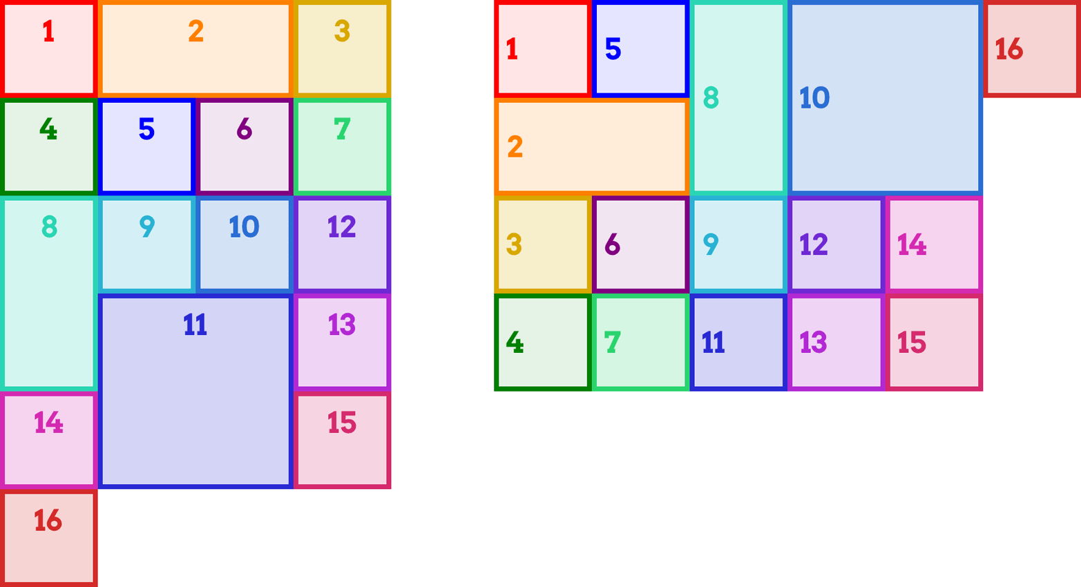
图 13-50: Illustrating dense flow patterns
In the first grid, item 12 appears in the row above item 11 because there was a cell that fit it. For the same reason, item 11 appears to the left of item 10 in the second grid.
在第一个网格中,项目 12 出现在项目 11 上面的一行中,因为有一个单元格适合它。出于同样的原因,在第二个网格中,项目 11 出现在项目 10 的左边。
In effect, what happens with dense grid flow is that for each grid item, the browser scans through the entire grid in the given flow direction (row or column), starting from the flow’s starting point (the top-left corner, in LTR—left-to-right—languages), until it finds a place where that grid item will fit. This can make things like photo galleries more compact, and works great as long as you don’t have a specific order in which the images need to appear.
实际上,密集的网格流发生了什么是为每个网格项目,浏览器扫描整个的网格在给定的流向(
row或column),从流的起点(左上角,LTR-left-to-right-languages),直到找到一个地方,适合电网项目。这可以使像相册这样的东西更紧凑,并且只要你没有一个特定的顺序需要图像出现,就可以工作得很好。
Now that we’ve explored grid flow, I have a confession to make: in order to make the last couple of grid items look right, I included some CSS that I didn’t show you. Without it, the items hanging off the edge of the grid would have looked quite a bit different than the other items—much shorter in row-oriented flow, and much narrower in column-oriented flow. We’ll see why, and the CSS I used, in the next section.
既然我们已经研究了网格流,我有一点要坦白:为了使最后两个网格项看起来正确,我包含了一些没有展示给您的 CSS。如果没有它,挂在网格边缘的项看起来会与其他项大不相同——在面向行流中要短得多,在面向列流中要窄得多。在下一节中,我们将看到原因,以及我使用的 CSS。
13.6 Automatic Grid Lines
So far, we’ve almost entirely seen grid items placed into a grid that was explicitly defined. But in the last section we had situations where grid items ran off the edge of the explicitly defined grid. What happens when a grid item goes off the edge? Rows or columns are added as needed to satisfy the layout directives of the items in question (see “The Implicit Grid” on page 694). So, if an item with a row span of 3 is added after the end of a row-oriented grid, three new rows are added after the explicit grid.
到目前为止,我们几乎完全看到了将网格项放入显式定义的网格中。但在上一节中,我们遇到了网格项超出显式定义的网格边缘的情况。当网格项脱离边缘时会发生什么?根据需要添加行或列,以满足项目的布局指令(参见第 694 页的“隐式网格”)。因此,如果在面向行网格的末尾添加一个行跨度为“3”的项,则在显式网格之后添加三个新行。
By default, these automatically added rows are the absolute minimum size needed. If you want to exert a little more control over their sizing, then grid-auto-rows and grid-auto-columns are for you.
默认情况下,这些自动添加的行是所需的绝对最小大小。如果你想对它们的大小施加更多的控制,那么
grid-auto-rows和grid-auto-columns就很适合你。
For any automatically created row or column tracks, you can provide a single track size or a minmaxed pair of track sizes. Let’s take a look at a reduced version of the grid-flow example from the previous section: we’ll set up a 2 × 2 grid, and try to put five items into it. In fact, let’s do it twice: once with grid-auto-rows, and once without, as illustrated in Figure 13-51:
对于任何自动创建的行或列轨道,您可以提供单个轨道大小或最小的一对轨道大小。让我们看一看前一节中网格流示例的简化版本:我们将设置一个 2×2 的网格,并尝试将 5 个项目放入其中。实际上,让我们做两次:一次使用
grid-auto-rows,另一次不使用,如图 13-51 所示:
.grid {
  display: grid;
  grid-template-rows: 80px 80px;
  grid-template-columns: 80px 80px;
}
#g1 {
  grid-auto-rows: 80px;
}
As you can see, without sizing the automatically created row, the grid item is placed in a row that’s exactly as tall as the grid item’s content, and not a pixel more. It’s still just as wide as the column into which it’s placed, because that has a size (80px). The row, lacking an explicit height, defaults to auto, with the result shown.
如您所见,在不调整自动创建的行大小的情况下,网格项被放置在与网格项内容一样高的行中,而不是多出一个像素。它仍然和它所在的列一样宽,因为它有一个大小(
80px)。缺少显式高度的行,默认为auto,并显示结果。
图 13-51: Grids with and without auto-row sizing
If we flip it around to columns, the same basic principles apply (see Figure 13-52):
如果我们将它翻转到列,同样的基本原则也适用(参见图 13-52):
.grid {
  display: grid;
  grid-auto-flow: column;
  grid-template-rows: 80px 80px;
  grid-template-columns: 80px 80px;
}
#g1 {
  grid-auto-columns: 80px;
}
图 13-52: Grids with and without auto-column sizing
In this case, because the flow is column-oriented, the last grid item is placed into a new column past the end of the explicit grid. In the second grid, where there’s no grid-auto-columns, that fifth item is as tall as its row (80px), but has an auto width, so it’s just as wide as it needs to be and no wider. If a sixth item were added and it had wider content, then the column would be sized to fit that content, thus widening the fifth item.
在本例中,因为流是面向列的,所以最后一个网格项被放置到显式网格结束后的新列中。在第二个网格中,没有“网格自动列”,第五个项目和它的行一样高(“80px”),但是有一个“自动”宽度,所以它只需要它需要的宽度,而不是更宽。如果添加了第六个项目,并且它的内容更宽,那么该列的大小将适应该内容,从而扩大第五个项目。
So now you know what I used in the grid-auto-flow figures in the previous section: I silently made the auto-rows and auto-columns the same size as the explicitly sized columns, in order to not have the last couple of items look weird. Let’s bring back one of those figures, only this time the grid-auto-rows and grid-auto-columns styles will be removed. As you can see in Figure 13-53, the last few items in each grid are shorter or narrower than the rest, due to the lack of auto-track sizing.
现在您知道我在上一节的
grid-auto-flow图中使用了什么了:我悄悄地将自动行和自动列设置为与显式设置的列相同的大小,以避免最后两个项看起来很奇怪。让我们返回其中一个图形,只是这次grid-auto-rows和grid-auto-columns样式将被删除。正如您在图 13-53 中所看到的,由于缺少自动跟踪大小调整,每个网格中的最后几个项都比其余的项更短或更窄。
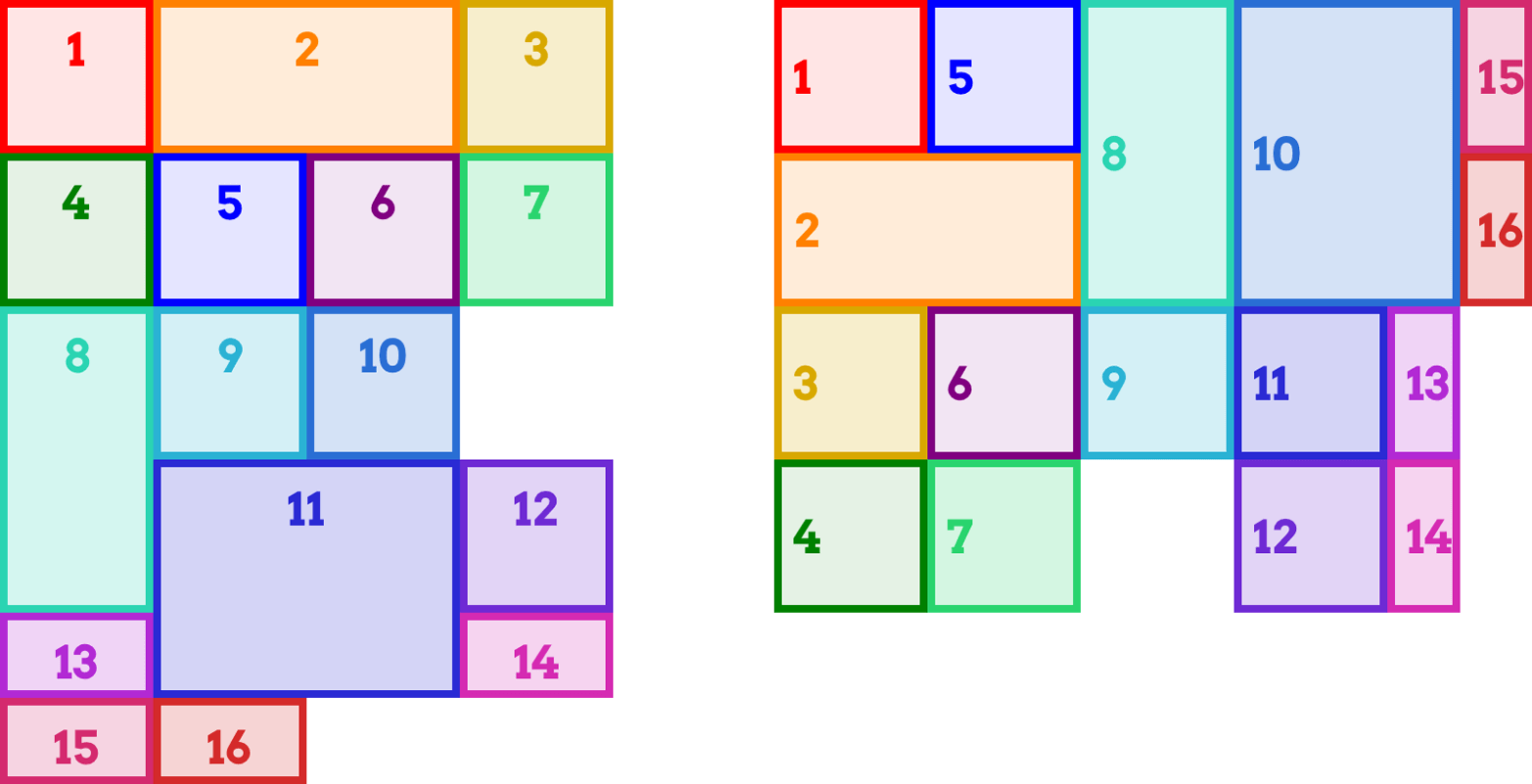
图 13-53: A previous figure with auto-track sizing removed
And now you know…the rest of the story.
现在你知道了…剩下的故事。
13.7 The grid Shorthand
At long last, we’ve come to the shorthand property grid. It might just surprise you, though, because it’s not like other shorthand properties.
终于,我们来到了简略的属性网格。不过,它可能会让您感到惊讶,因为它不像其他速记属性。
The syntax is a little bit migraine-inducing, I admit, but we’ll step through it a piece at a time.
我承认,它的语法有点让人头疼,但我们将一步一步地介绍它。
Let’s get to the elephant in the room right away: grid allows you to either define a grid template or to set the grid’s flow and auto-track sizing in a compact syntax. You can’t do both at the same time.
让我们马上进入这个棘手的问题:
grid允许您定义一个网格模板or用简洁的语法设置网格的流程和自动跟踪大小’。你不能同时做两件事。
Furthermore, whichever you don’t define is reset to its defaults, as is normal for a shorthand property. So if you define the grid template, then the flow and auto tracks will be returned to their default values. This includes grid gutters, a topic we haven’t even covered yet. You can’t set the gutters with grid, but it will reset them anyway.
此外,未定义的属性将重置为默认值,这对于速记属性来说是正常的。因此,如果您定义了网格模板,那么流和自动跟踪将返回到它们的默认值。这包括网格沟槽,一个我们甚至还没有涉及的话题。你不能设置排水沟与
grid,但它将重置他们无论如何。
Yes, this is intentional. No, I don’t know why.
是的,这是故意的。不,我不知道为什么。
So let’s talk about creating a grid template using grid. The values can get fiendishly complex, and take on some fascinating patterns, but can be very handy. As an example, the following rule is equivalent to the set of rules that follows it:
所以让我们讨论一下使用
grid创建网格模板。这些值可能非常复杂,并具有一些迷人的模式,但非常方便。举个例子,下面的规则相当于它后面的一组规则:
grid:
  "header header header header" 3em
  ". content sidebar ." 1fr
  "footer footer footer footer" 5em /
  2em 3fr minmax(10em, 1fr) 2em;
grid-template-areas:
  "header header header header"
  ". content sidebar ."
  "footer footer footer footer";
grid-template-rows: 3em 1fr 5em;
grid-template-columns: 2em 3fr minmax(10em, 1fr) 2em;
Notice how the value of grid-template-rows is broken up and scattered around the strings of grid-template-areas. That’s how row sizing is handled in grid when you have grid-area strings present. Take those strings out, and you end up with the following:
注意
grid-template-rows的值是如何被分解的,并分散在grid-template-areas的字符串周围。这就是当网格区域字符串出现时,grid中处理行大小调整的方式。将这些字符串取出,您将得到以下结果:
grid: 3em 1fr 5em / 2em 3fr minmax(10em, 1fr) 2em;In other words, the row tracks are separated by a solidus (/) from the column tracks.
换句话说,行轨道由一个 solidus(
/)与列轨道分开。
Remember that with grid, undeclared shorthands are reset to their defaults. That means the following two rules are equivalent:
记住,对于
grid,未声明的缩写将被重置为默认值。这意味着以下两个规则是等价的:
#layout {
  display: grid;
  grid: 3em 1fr 5em / 2em 3fr minmax(10em, 1fr) 2em;
}
#layout {
  display: grid;
  grid: 3em 1fr 5em / 2em 3fr minmax(10em, 1fr) 2em;
  grid-auto-rows: auto;
  grid-auto-columns: auto;
  grid-auto-flow: row;
}
Therefore, make sure your grid declaration comes before anything else related to defining the grid. That means that if we wanted a dense column flow, we’d write something like this:
因此,请确保您的
grid声明出现在与定义网格相关的所有内容之前。这意味着如果我们想要一个密集的列流,我们可以这样写
#layout {
  display: grid;
  grid: 3em 1fr 5em / 2em 3fr minmax(10em, 1fr) 2em;
  grid-auto-flow: dense column;
}
Now, let’s bring the named grid areas back, and add some extra row grid-line names to the mix. A named grid line that goes above a row track is written before the string, and a grid line that goes below the row track comes after the string and any track sizing. So let’s say we want to add main-start and main-stop above and below the middle row, and page-end at the very bottom:
现在,让我们把命名的网格区域带回来,
并添加一些额外的行网格线名称到混合。在行轨道之上的命名网格线被写入字符串的前面,而行轨道下面的网格线在字符串和任何轨道大小之后。假设我们想要在中间行上面和下面添加main-start和main-stop,在最下面添加page-end:
grid:
  "header header header header" 3em
  [main-start] ". content sidebar ." 1fr [main-stop]
  "footer footer footer footer" 5em [page-end] /
  2em 3fr minmax(10em, 1fr) 2em;
That creates the grid shown in Figure 13-54, with the implicitly created named grid lines (e.g., footer-start), along with the explicitly named grid lines we wrote into the CSS.
这样就创建了如图 13-54 所示的网格,其中包含隐式创建的命名网格线(例如,“footer-start”),以及我们在 CSS 中编写的显式命名网格线。
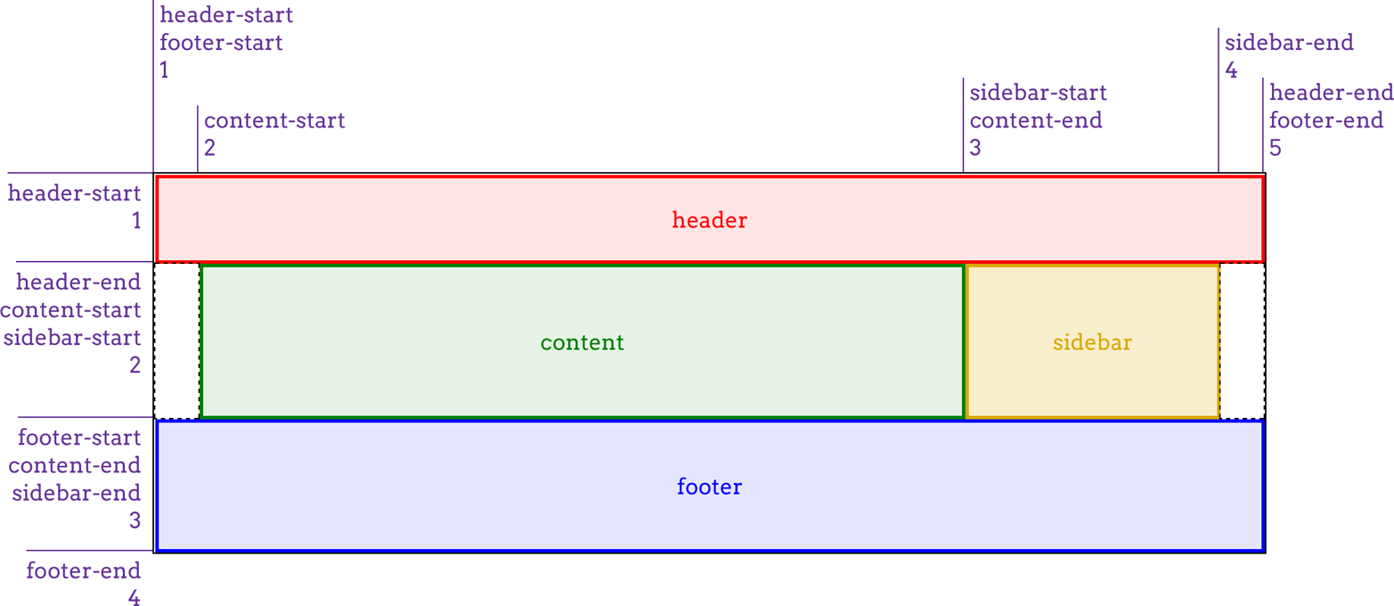
图 13-54: Creating a grid with the grid shorthand
You can see how grid can get very complicated very quickly. It’s a very powerful syntax, and it’s surprisingly easy to get used to once you’ve had just a bit of practice. On the other hand, it’s also easy to get things wrong and have the entire value be invalid, thus preventing the appearance of any grid at all.
你可以看到
grid可以很快变得非常复杂。它是一种非常强大的语法,而且只要稍加练习就可以很容易地习惯它。另一方面,它也很容易出错,使整个值无效,从而完全阻止任何网格的出现。
For the other use of grid, it’s a merging of grid-auto-flow, grid-auto-rows, and grid-auto-columns. The following rules are equivalent:
对于
grid的另一种用法,它是grid-auto-flow、grid-auto-rows和grid-auto-columns的合并。以下规则是等价的:
#layout {
  grid-auto-flow: dense rows;
  grid-auto-rows: 2em;
  grid-auto-columns: minmax(1em, 3em);
}
#layout {
  grid: dense rows 2em / minmax(1em, 3em);
}
That’s certainly a lot less typing for the same result! But once again, I have to remind you: if you write this, then all the column and row track properties will be set to their defaults. Thus, the following rules are equivalent:
对于相同的结果,这显然要少得多的输入!但再一次,我必须提醒你:如果你写了这个,那么所有的列和行跟踪属性将被设置为默认值。因此,以下规则是等价的:
#layout {
  grid: dense rows 2em / minmax(1em, 3em);
}
#layout {
  grid: dense rows 2em / minmax(1em, 3em);
  grid-template-rows: auto;
  grid-template-columns: auto;
}
So once again, it’s important to make sure your shorthand comes before any properties it might otherwise override.
因此,再次强调,确保您的简写出现在任何它可能覆盖的属性之前是很重要的。
13.7.1 Subgrids
There’s another possible value for grid, which is subgrid. It might be used something like this:
grid还有另一个可能的值,即subgrid。它可以这样使用:
#grid {
  display: grid;
  grid: repeat(auto-fill, 2em) / repeat(10, 1% 8% 1%);
}
.module {
  display: grid;
  grid: subgrid;
}
What happens inside each module element is that its grid items (i.e., its child elements) use the grid defined by #grid to align themselves.
在每个
module元素内部发生的事情是它的网格项(即。使用由#grid定义的网格来对齐自己。
This is potentially really useful, because you can imagine having a module that spans three of its parent’s column patterns and containing child elements that are aligned to and laid out using the “master” grid. This is illustrated in Figure 13-55.
这可能非常有用,因为您可以想象,一个模块跨越了其父的三个列模式,并且包含与“master”网格对齐并布局的子元素。如图 13-55 所示。
图 13-55: Aligning subgridded items
The problem is that, as of this writing, subgrid is an “at-risk” feature of grid layout, and may be dropped entirely. That’s why it rates just this small section, instead of a more comprehensive examination.
问题是,在写这篇文章时,
subgrid是网格布局的一个“危险”特性,可能会被完全删除。这就是为什么它只评价这一小部分,而不是更全面的考试。
13.8 Opening Grid Spaces
So far, we’ve seen a lot of grid items jammed right up against one another, with no space between them. There are a number of ways to mitigate this, as we’ll talk about in this section, starting with gutters.
13.8.1 Grid Gutters (or Gaps)
Simply put, a gutter is a space between two grid tracks. It’s created as if by expanding the grid line between them to have actual width. It’s much like border-spacing in table styling—both because it creates space between grid cells and because you can set only a single spacing value for each axis, via the properties grid-row-gap and gridcolumn-gap.
Right up front: as the value syntax shows, you can supply only a length for these properties; what it’s less clear about is that the lengths must be non-negative. It’s not possible to supply a percentage, a fractional value via fr, nor a minmax of some sort. If you want your columns to be separated by 1 em, then it’s easy enough: gridcolumn-gap: 1em. That’s pretty much as fancy as it gets. All the columns in the grid will be pushed apart by 1 em, as illustrated in Figure 13-56:
#grid {
  display: grid;
  grid-template-rows: 5em 5em;
  grid-template-columns: 15% 1fr 1fr;
  grid-column-gap: 1em;
}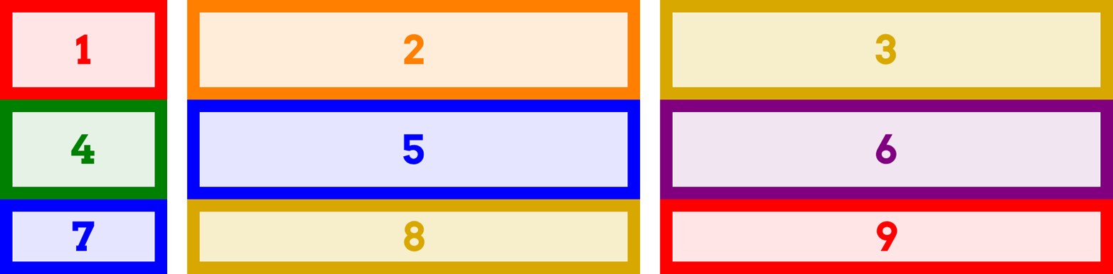
图 13-56: Creating column gutters
In terms of sizing the tracks in a grid, gutters are treated as if they’re grid tracks. Thus, given the following styles, the fractional grid rows will each be 140 pixels tall:
#grid {
  display: grid;
  height: 500px;
  grid-template-rows: 100px 1fr 1fr 75px;
  grid-row-gap: 15px;
}
We get 140 pixels for each fraction row’s height because there are a total of 500 pixels of height. From that, we subtract the two row tracks (100 and 75) to get 325. From that result, we subtract the three 15-pixel gutters, which totals 45 pixels; this yields 280 pixels. That divided in half (because the fractional rows have equal fractions) gets us 140 pixels each. If the gutter value were increased to 25px, then the fractional rows would have 250 pixels to divide between them, making each 125 pixels tall.
Track sizing can be much more complicated than this; the example used all pixels because it makes the math simple. You can always mix units however you’d like, including minmaxing your actual grid tracks. This is one of the main strengths of grid layout.
Grid gutters can be changed from their declared size by the effects of align-content and justify-content. This will be covered in the upcoming section, “Opening Grid Spaces” on page 714.
There is, as you might have already suspected, a shorthand that combines row and column gap lengths into a single property.
Not a lot more to say than that, really: supply two non-negative lengths, and you’ll have defined the row gutters and column gutters, in that order. Here’s an example, as shown in Figure 13-57:
#grid {
  display: grid;
  grid-template-rows: 5em 5em;
  grid-template-columns: 15% 1fr 1fr;
  grid-gap: 12px 2em;
}
图 13-57: Defining grid gutters
13.8.2 Grid Items and the Box Model
Now we can create a grid, attach items to the grid, and even create gutters between the grid tracks. But what happens if we style the element that’s attached to the grid with, say, margins? Or if it’s absolutely positioned? How do these things interact with the grid?
Let’s take margins first. The basic principle at work is that an element is attached to the grid by its margin edges. That means you can push the visible parts of the element
inward from the grid area it occupies by setting positive margins—and pull it outward with negative margins. For example, these styles will have the result shown in Figure 13-58:
#grid {
  display: grid;
  grid-template-rows: repeat(2, 100px);
  grid-template-columns: repeat(2, 200px);
}
.box02 {
  margin: 25px;
}
.box03 {
  margin: -25px 0;
}
图 13-58: Grid items with margins
This worked as it did because the items had both their width and height set to auto, so they could be stretched as needed to make everything work out. If width and/or height have non-auto values, then they’ll end up overriding margins to make all the math work out. This is much like what happens with right and left margins when element sizing is overconstrained: eventually, one of the margins gets overridden.
Consider an element with the following styles placed into a 200-pixel-wide by 100-pixel-tall grid area:
.exel {
  width: 150px;
  height: 100px;
  padding: 0;
  border: 0;
  margin: 10px;
}
Going across the element first, it has 10 pixels of margin to either side, and its width is 150px, giving a total of 170 pixels. Something’s gotta give, and in this case it’s the right margin (in left-to-right languages), which is changed to 40px to make everything work—10 pixels on the left margin, 150 pixels on the content box, and 40 pixels on the right margin equals the 200 pixels of the grid area’s width.
On the vertical axis, the bottom margin is reset to -10px. This compensates for the top margin and content height totalling 110 pixels, when the grid area is only 100 pixels tall.
Margins on grid items are ignored when calculating grid-track sizes. That means that no matter how big or small you make a grid item’s margins, it won’t change the sizing of a min-content column, for example, nor will increasing the margins on a grid item cause fr-sized grid tracks to change size.
As with block layout, you can selectively use auto margins to decide which margin will have its value changed to fit. Suppose we wanted the grid item to align to the right of its grid area. By setting the item’s left margin to auto, that would happen:
.exel {
  width: 150px;
  height: 100px;
  padding: 0;
  border: 0;
  margin: 10px;
  margin-left: auto;
}
Now the element will add up 160 pixels for the right margin and content box, and then give the difference between that and the grid area’s width to the left margin, since it’s been explicitly set to auto. This has the result shown in Figure 13-59, where there are 10 pixels of margin on each side of the exel item, except the left margin, which is (as we just calculated) 40 pixels.
图 13-59: Using auto margins to align items
That might seem familiar from block-level layout, where you can use auto left and right margins to center an element in its containing block, as long as you’ve given it an explicit width. Where grid layout differs is that you can do the same thing on the vertical axis; that is, given an element with an absolute height, you can vertically center it by setting the top and bottom margins to auto. Figure 13-60 shows a variety of auto margin effects on images, which naturally have explicit heights and widths:
.i01 {
  margin: 10px;
}
.i02 {
  margin: 10px;
  margin-left: auto;
}
.i03 {
  margin: auto 10px auto auto;
}
.i04 {
  margin: auto;
}
.i05 {
  margin: auto auto 0 0;
}
.i06 {
  margin: 0 auto;
}
图 13-60: Various auto-margin alignments
There are other ways to align grid items, notably with properties like justify-self, which don’t depend on having explicit height and width values. These will be covered in the next section.
This is a lot like how margins and element sizes operate when elements are absolutely positioned. Which leads us to the next question: what if a grid item is also absolutely positioned? For example:
.exel {
  grid-row: 2 / 4;
  grid-column: 2 / 5;
  position: absolute;
  top: 1em;
  bottom: 15%;
  left: 35px;
  right: 1rem;
}
The answer is actually pretty elegant: if you’ve defined grid-line starts and ends, that grid area is used as the containing block and positioning context, and the grid item is positioned within that context. That means the offset properties (top et al.) are calculated in relation to the declared grid area. Thus, the previous CSS would have the result shown in Figure 13-61.
图 13-61: Absolutely positioning a grid item
Everything you know about absolutely positioned elements regarding offsets, margins, element sizing, and so on applies within this formatting context. It’s just that in this case, the formatting context is defined by a grid area.
There is a wrinkle that absolute positioning introduces: it changes the behavior of the auto value for grid-line properties. If, for example, you set grid-column-end: auto for an absolutely positioned grid item, the ending grid line will actually create a new and special grid line that corresponds to the padding edge of the grid container itself.
This is true even if the explicit grid is smaller than the grid container, as can happen. To see this in action, we’ll modify the previous example as follows, with the result
shown in Figure 13-62:
.exel {
  grid-row: 1 / auto;
  grid-column: 2 / auto;
  position: absolute;
  top: 1em;
  bottom: 15%;
  left: 35px;
  right: 1rem;
}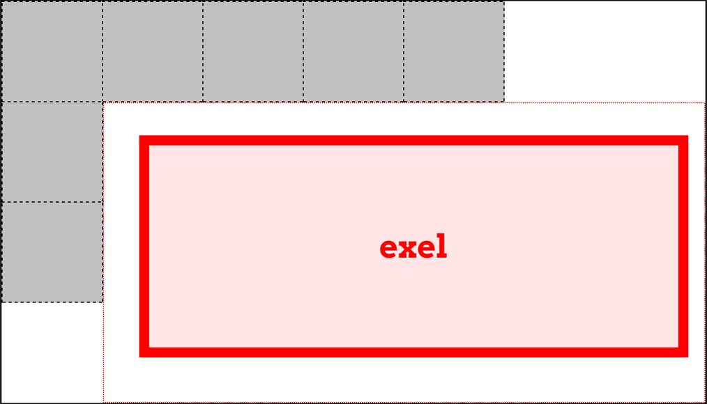
图 13-62: Auto values and absolute positioning
Note how the positioning context now starts at the top of the grid container, and stretches all the way to the right edge of the grid container, even though the grid itself ends well short of that edge.
One implication of this behavior is that if you absolutely position an element that’s a grid item, but you don’t give it any grid-line start or end values, then it will use the inner padding edge of the grid container as its positioning context. It does this without having to set the grid container to position: relative, or any of the other usual tricks to establish a positioning context.
Note that absolutely positioned grid items do not participate in figuring out grid cell and track sizing. As far as the grid layout is concerned, the positioned grid item doesn’t exist. Once the grid is set up, then the grid item is positioned with respect to the grid lines that define its positioning context.

As of late 2017, browsers did not support any of this absolute positioning behavior. The only way to recreate it was to relatively position the element establishing the grid area, and absolutely position a child element within it. That’s how the absolute-positioning figures in this section were created. The special auto behavior was also not supported.
13.9 Aligning and Grids
If you have any familiarity with flexbox, you’re probably aware of the various alignment properties and their values. Those same properties are also available in grid layout, and have very similar effects.
First, a quick refresher. The properties that are available and what they affect are summarized in Table 13-1.
Table 13-1. Justify and align values
| Property | Aligns | Applied to |
|---|---|---|
| justify-self | A grid item in the inline (horizontal) direction | Grid items |
| justify-items | All grid items in the inline (horizontal) direction | Grid container |
| justify-content | The entire grid in the inline (horizontal) direction | Grid container |
| align-self | A grid item in the block (vertical) direction | Grid items |
| align-items | All grid items in the block (vertical) direction | Grid container |
| align-content | The entire grid in the block (vertical) direction | Grid container |
As Table 13-1 shows, the various justify-* properties change alignment along the inline axis—in English, this will be the horizontal direction. The difference is whether a property applies to a single grid item, all the grid items in a grid, or the entire grid. Similarly, the align-* properties affect alignment along the block axis; in English, this is the vertical direction.
13.9.1 Aligning and Justifying Individual Items
It’s easiest to start with the *-self properties, because we can have one grid show various justify-self property values, while a second grid shows the effects of those same values when used by align-self. (See Figure 13-63.)
图 13-63: Self alignment in the inline and block directions
Each grid item in Figure 13-63 is shown with its grid area (the dashed blue line) and a label identifying the property value that’s applied to it. Each deserves a bit of commentary.
First, though, realize that for all of these values, any element that doesn’t have an explicit width or height will “shrink-wrap” its content, instead of using the default grid-item behavior of filling out the entire grid area.
start and end cause the grid item to be aligned to the start or end edge of its grid area, which makes sense. Similarly, center centers the grid item within its area along the alignment axis, without the need to declare margins or any other properties, including height and width.
left and right have the expected results for horizontal alignment, but if they’re applied to elements via align-self (which is vertical alignment), they’re treated as start.
self-start and self-end are more interesting. self-start aligns a grid item with the grid-area edge that corresponds to the grid item’s start edge. So in Figure 13-63, the self-start and self-end boxes were set to direction: rtl. That set them to use right-to-left language direction, meaning their start edges were their right edges, and their end edges their left. You can see in the first grid that this right-aligned self-start and left-aligned self-end. In the second grid, however, the RTL direction is irrelevant to block-axis alignment. Thus, self-start was treated as start, and self-end was treated as end.
The last value, stretch, is interesting. To understand it, notice how the other boxes in each grid “shrink-wrap” themselves to their content. stretch, on the other hand, directs the element to stretch from edge to edge in the given direction—align-self: stretch causes the grid item to stretch vertically, and justify-self: stretch causes horizontal stretching. This is as you might expect, but bear in mind that it works only if the element’s size properties are set to auto. Thus, given the following styles, the first example will stretch vertically, but the second will not:
.exel01 {
  align-self: stretch;
  height: auto;
}
.exel02 {
  align-self: stretch;
  height: 50%;
}
Because the second example sets a height value that isn’t auto (which is the default value), it cannot be resized by stretch. The same holds true for justify-self and width.
There are two more values that can be used to align grid items, but they are sufficiently interesting to merit their own explanation. These permit the alignment of a grid item’s first or last baseline with the highest or lowest baseline in the grid track.
For example, suppose you wanted a grid item to be aligned so the baseline of its last line was aligned with the last baseline in the tallest grid item sharing its row track. That would look like the following:
.exel {
  align-self: last-baseline;
}
Conversely, to align its first baseline with the lowest first baseline in the same row track, you’d say this:
.exel {
  align-self: baseline;
}
In a situation where a grid element doesn’t have a baseline, or it’s asked to baselinealign itself in a direction where baselines can’t be compared, then baseline is treated as start and last-baseline is treated as end.
There are two values that were intentionally skipped in this section: flex-start and flex-end. These values are supposed to be used only in flexbox layout, and are defined to be equivalent to start and end in any other layout context, including grid layout.
13.9.2 Aligning and Justifying All Items
Now let’s consider align-items and justify-items. These properties accept all the same values we saw in the previous section, and have the same effect, except they apply to all grid items in a given grid container, and must be applied to a grid container instead of to individual grid items.
Thus, you could set all of the grid items in a grid to be center-aligned within their grid areas as follows, with a result like that depicted in Figure 13-64:
#grid {
  display: grid;
  align-items: center;
  justify-items: center;
}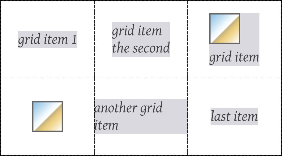
图 13-64: Centering all the grid items
As you can see, that horizontally and vertically centers every grid item within its given grid area. Furthermore, it causes any grid item without an explicit width and height to “shrink-wrap” its content rather than stretch out to fill their grid area. If a grid item has an explicit height and width, then those will be honored, and the item centered within its grid area.
Beyond aligning and justifying every grid item, it’s possible to distribute the grid items, or even to justify or align the entire grid, using align-content and justify-content. There is a small set of distributive values for these properties. Figure 13-65 illustrates the effects of each value as applied to justify-content, with each grid sharing the following styles:
.grid {
  display: grid;
  padding: 0.5em;
  margin: 0.5em 1em;
  width: auto;
  grid-gap: 0.75em 0.5em;
  border: 1px solid;
  grid-template-rows: 4em;
  grid-template-columns: repeat(5, 6em);
}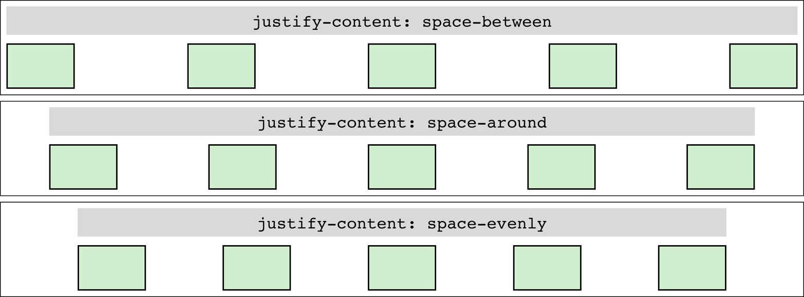
图 13-65: Distributing grid items horizontally
This works just as well in column tracks as it does in row tracks, as Figure 13-66 illustrates, as long as you switch to align-content. This time, the grids all share these styles:
.grid {
  display: grid;
  padding: 0.5em;
  grid-gap: 0.75em 0.5em;
  border: 1px solid;
  grid-template-rows: repeat(4, 3em);
  grid-template-columns: 5em;
}
The way this distribution works is that the grid tracks, including any gutters, are all sized as usual. Then, if there is any leftover space within the grid container—that is, if the grid tracks don’t reach all the way from one edge of the grid container to the other—then the remaining space is distributed according to the value of justify-content (in the horizontal) or align-content (in the vertical).
This space distribution is carried out by resizing the grid gutters. If there are no declared gutters, there will be gutters. If there are already gutters, their sizes are altered as required to distribute the grid tracks.
Note that because space is distributed only when the tracks don’t fill out the grid container, the gutters can only increase in size. If the tracks are larger than the container, which can easily happen, there is no leftover space to distribute (negative space turns out to be indivisible).
There is another distribution value, very new as of this writing, which wasn’t shown in the previous figures. stretch takes any leftover space and applies it equally to the grid tracks, not the gutters. So if there are 400 pixels of leftover space and 8 grid tracks, each grid track is increased by 50 pixels. The grid tracks are not increased proportionally, but equally. As of late 2017, there was no browser support for this value in terms of grid distribution.
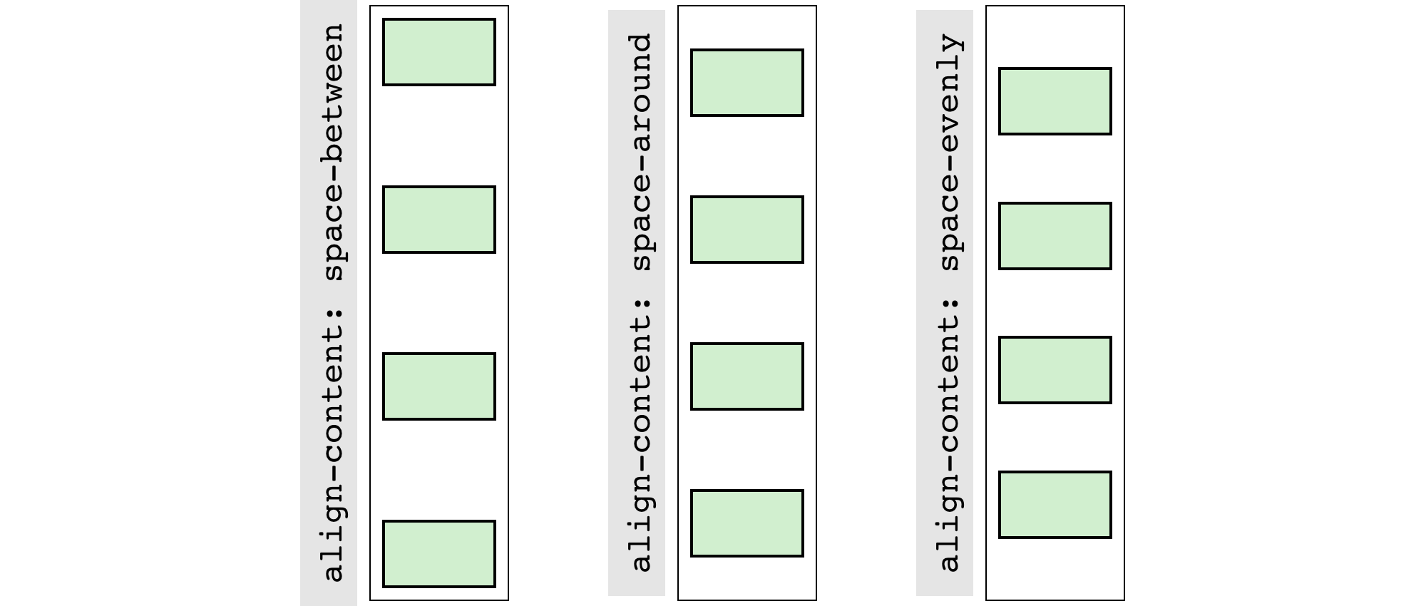
图 13-66: Distributing grid items vertically
We’ll round out this section with examples of justifying, as opposed to distributing, grid tracks. Figure 13-67 shows the possibilities when justifying horizontally.
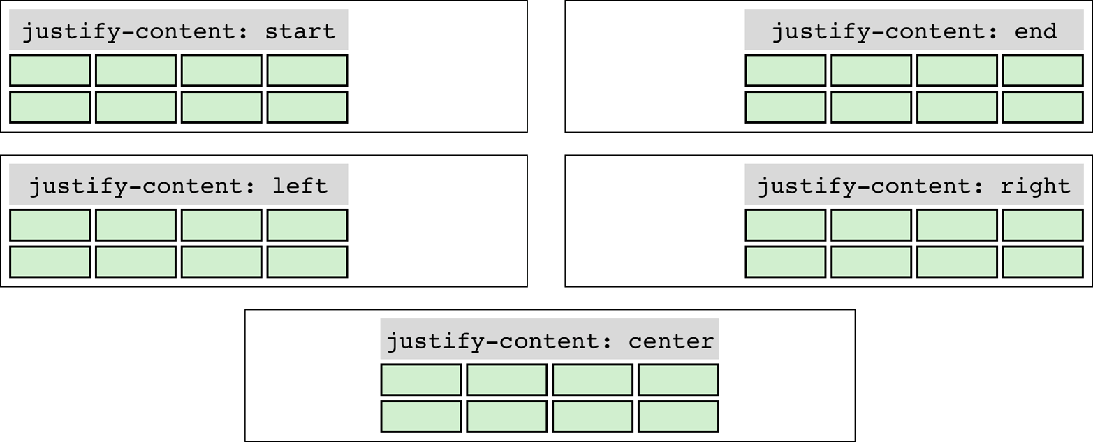
图 13-67: Justifying the grid horizontally
In these cases, the set of grid tracks is taken as a single unit, and justified by the value of justify-content. That alignment does not affect the alignment of individual grid items; thus, you could end-justify the whole grid with justify-content: end while having individual grid items be left-, center-, or start-justified (among other options) within their grid areas.
As you might expect by now, being able to justify-content horizontally means you can align-content vertically. Figure 13-68 shows each value in action.
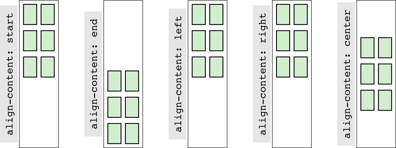
图 13-68: Aligning the grid vertically
left and right don’t really make sense in a vertical context, so they’re treated as start. The others have the effect you’d expect from their names.
13.10 Layering and Ordering
As we saw in a previous section, it’s entirely possible to have grid items overlap each other, whether because negative margins are used to pull a grid item beyond the edges of its grid area, or because the grid areas of two different grid items share grid cells. By default, the grid items will visually overlap in document source order: grid items later in the document source will appear in front of grid items earlier in the document source. Thus we see the following result in what’s depicted in Figure 13-69. (Assume the number in each class name represents the grid item’s source order.)
正如我们在上一节中看到的,网格项完全可能相互重叠,这可能是因为使用了负边距将网格项拉出其网格区域的边缘,也可能是因为两个不同网格项的网格区域共享网格单元格。默认情况下,网格项将按照文档源的顺序重叠:文档源中后面的网格项将出现在文档源中前面的网格项之前。因此,我们可以看到图 13-69 所示的结果。(假设每个类名中的数字表示网格项的源顺序。)
#grid {
  display: grid;
  width: 80%;
  height: 20em;
  grid-rows: repeat(10, 1fr);
  grid-columns: repeat(10, 1fr);
}
.box01 {
  grid-row: 1 / span 4;
  grid-column: 1 / span 4;
}
.box02 {
  grid-row: 4 / span 4;
  grid-column: 4 / span 4;
}
.box03 {
  grid-row: 7 / span 4;
  grid-column: 7 / span 4;
}
.box04 {
  grid-row: 4 / span 7;
  grid-column: 3 / span 2;
}
.box05 {
  grid-row: 2 / span 3;
  grid-column: 4 / span 5;
}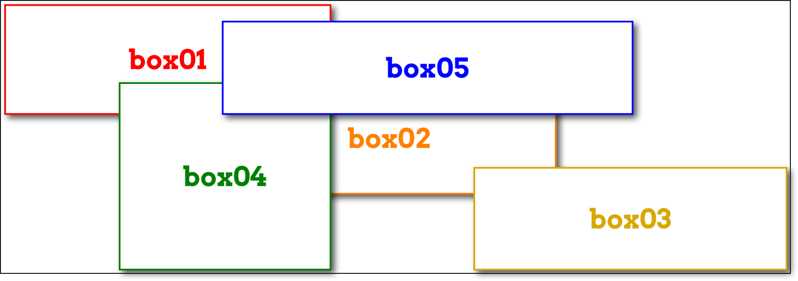
图 13-69: Grid items overlapping in source order
If you want to assert your own stacking order, then z-index is here to help. Just as in positioning, z-index places elements relative to each other on the z-axis, which is perpendicular to the display surface. Positive values are closer to you, and negative values further away. So to bring the second box to the “top,” as it were, all you need is to give it a z-index value higher than any other (with the result shown in Figure 13-70):
如果你想确定你自己的堆叠顺序,那么
z-index可以帮助你。就像在定位中一样,z-index将元素相对地放置在 z 轴上,z 轴垂直于显示表面。正值离你更近,负值离你更远。因此,要将第二个框移到“顶部”,您所需要的就是给它一个比其他任何框都高的z-index值(结果如图 13-70 所示):
.box02 {
  z-index: 10;
}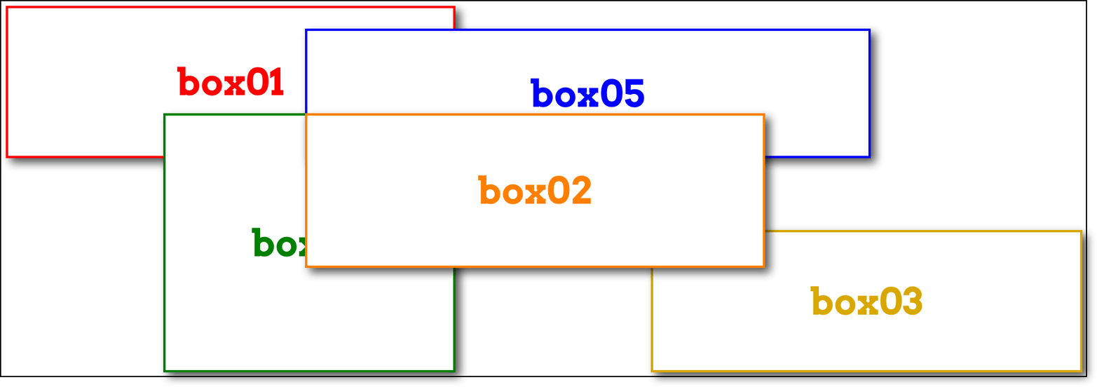
图 13-70: Elevating a grid item
Another way you can affect the ordering of grid items is by using the order property. Its effect is essentially the same as it is in flexbox—you can change the order of grid items within a grid track by giving them order values. This affects not only placement within the track, but also paint order if they should overlap. For example, we could change the previous example from z-index to order, as shown here, and get the same result shown in Figure 13-70:
影响网格项顺序的另一种方法是使用
order属性。它的效果与 flexbox 中的效果基本相同,您可以通过给网格跟踪中的网格项指定order值来改变它们的顺序。这不仅影响在轨道内的位置,而且油漆顺序,如果他们应该重叠。例如,我们可以将之前的例子z-index改为order,如图所示,得到如图 13-70 所示的相同结果:
.box02 {
  order: 10;
}
In this case, box02 appears “on top of ” the other grid items because its order places it after the rest of them. Thus, it’s drawn last. Similarly, if those grid items were all placed in sequence in a grid track, the order value for box02 would put it at the end of the sequence. This is depicted in Figure 13-71.
在本例中,
box02出现在其他网格项的“顶部”,因为它的顺序是放在其他网格项的后面。因此,它是最后绘制的。类似地,如果这些网格项都按顺序放置在一个网格轨道中,那么box02的order值将把它放在序列的末尾。如图 13-71 所示。
图 13-71: Changing grid-item order
Remember that just because you can rearrange the order of grid items this way, it doesn’t necessarily mean you should. As the Grid Layout specification says (section 4.2):
记住,仅仅因为你
可以这样重新排列网格条目的顺序,并不意味着你应该这样做。如网格布局规范(4.2 节)所述:
As with reordering flex items, the order property must only be used when the visual order needs to be out-of-sync with the speech and navigation order; otherwise the underlying document source should be reordered instead.
与重新排序 flex 项目一样,
order属性只能在视觉顺序需要与语音和导航顺序out-of-sync时使用;否则,应该重新排序基础文档源。
So the only reason to use order to rearrange grid item layout is if you need to have the document source in one order and layout in the other. This is already easily possible by assigning grid items to areas that don’t match source order.
因此,使用
order来重新安排网格项布局的唯一原因是,如果您需要在一种顺序和另一种布局中使用文档源。通过将网格项分配给不匹配源顺序的区域,这已经很容易实现了。
This is not to say that order is useless and should always be shunned; there may well be times it makes sense. But unless you find yourself nearly forced into using it by specific circumstances, think very hard about whether it’s the best solution.
这并不是说
order是无用的,应该永远避开;在某些时候,这是有意义的。但是,除非你发现自己因为特定的情况几乎被迫使用它,否则要非常认真地思考它是否是最好的解决方案。
13.11 Summary
Grid layout is complex and powerful, so don’t be discouraged if you feel overwhelmed. It takes some time to get used to how grid operates, especially since so many of its features are nothing like what we’ve dealt with before. Much of those features’ power comes directly from their novelty—but like any powerful tool, it can be difficult and frustrating to learn to use. I got frustrated and confused as I wrote about grid, going down blind alleys and falling victim to two decades of instincts that had been honed on a layout-less CSS.
网格布局是复杂而强大的,所以如果你感到不知所措,不要气馁。我们需要花一些时间来适应网格的操作方式,特别是它的许多特性与我们以前处理的完全不同。这些功能的威力大多直接来自于它们的新奇性——但就像任何强大的工具一样,学习使用它们可能会很困难,而且会令人沮丧。当我写关于网格的文章时,我感到沮丧和困惑,走向了死胡同,成为了 20 年来在没有布局的 CSS 上磨练出来的本能的受害者。
I hope I was able to steer you past some of those pitfalls, but still, remember the wisdom of Master Yoda: “You must unlearn what you have learned.” When coming to grid layout, there has never been greater need to put aside what you think you know about layout and learn anew. Over time, your patience and persistence will be rewarded.
我希望我能引导你越过一些陷阱,但仍然要记住尤达大师的智慧:“你必须忘记你所学到的。当谈到网格布局时,从来没有比现在更需要把你所知道的关于布局的知识放在一边,重新学习。随着时间的推移,你的耐心和坚持会得到回报。