第 16 章 转换 Transforms
第 16 章 转换 Transforms
Ever since the inception of Cascading Style Sheets (CSS), elements have been rectangular and firmly oriented on the horizontal and vertical axes. A number of tricks arose to make elements look like they were tilted and so on, but underneath it all was a rigid grid. In the late 2000s, an interest grew in being able to break the shackles of that grid and transform objects in interesting ways—and not just in two dimensions.
自从层叠样式表(CSS)出现以来,元素一直是矩形的,并且在水平和垂直轴上都有固定的方向。为了使元素看起来像倾斜的,出现了许多技巧,但是在它的下面是一个严格的网格。在 2000 年代后期,人们对打破网格的束缚并以有趣的方式转换对象的兴趣开始增长,而不仅仅是在二维空间。
If you’ve ever positioned an object, whether relatively or absolutely, then you’ve already transformed that object. For that matter, any time you used floats or negative-margin tricks (or both), you transformed an object. All of those are examples of translation, or the movement of an element from where it would normally appear to some other place. With CSS transforms, you have a new way to translate elements, and a whole lot more. Whether it’s as simple as rotating some photographs a bit to make them appear more natural, or creating interfaces where information can be revealed by flipping over elements, or just doing interesting perspective tricks with sidebars, CSS transforms can—if you’ll pardon the obvious expression—transform the way you design.
如果你曾经定位过一个对象,无论是相对的还是绝对的,那么你已经转换了那个对象。因此,每当使用浮点数或负边距技巧(或两者都使用)时,都要转换对象。所有这些都是
translation的例子,或者一个元素从它通常出现的地方移动到另一个地方。有了 CSS 转换,您就有了一种转换元素的新方法,以及更多的方法。无论是简单地旋转一些照片使它们看起来更自然,还是创建可以通过翻转元素来显示信息的界面,或者只是使用边栏进行有趣的透视图技巧,CSS 转换都可以—如果您不介意这个明显的表达—转换您的设计方式。
16.1 Coordinate Systems
Before embarking on this journey, let’s take a moment to orient ourselves. Two types of coordinate systems are used in transforms, and it’s a good idea to be familiar with both.
在开始这段旅程之前,让我们先花点时间熟悉一下环境。在转换中使用了两种类型的坐标系统,最好熟悉这两种系统。

If you’re already well familiar with Cartesian and spherical coordinate systems, particularly as used in computing, feel free to skip to the next section.
The first is the Cartesian coordinate system, or what’s often called the x/y/z coordinate system. This system is a way of describing the position of a point in space using two numbers (for two-dimensional placement) or three numbers (for three-dimensional placement). In CSS, the system uses three axes: the x, or horizontal axis; the y, or vertical axis; and the z, or depth axis. This is illustrated in Figure 16-1.
第一个是
Cartesian coordinate system,也就是通常所说的x/y/z coordinate system。这个系统是使用两个数字(用于二维放置)或三个数字(用于三维放置)来描述空间中一个点的位置的一种方法。在 CSS 中,系统使用三个轴:x 轴,或水平轴;y 轴,或者说纵轴;z 轴,或者说深度轴。如图 16-1 所示。
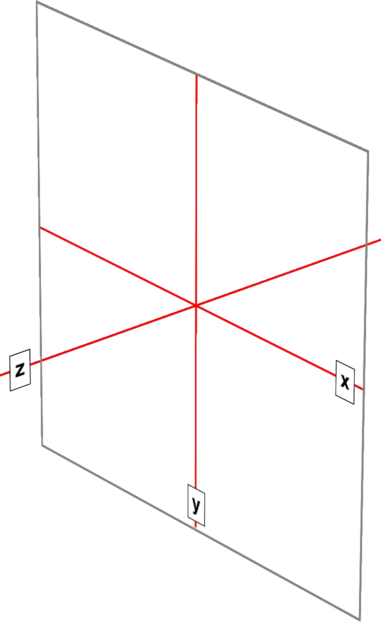
图 16-1: The three Cartesian axes used in CSS transforms
For any 2D (two-dimensional) transform, you only need to worry about the x- and yaxes. By convention, positive x values go to the right, and negative values go to the left. Similarly, positive y values go downward along the y-axis, while negative values go upward along the y-axis.
对于任何二维变换,只需要考虑 x 轴和 y 轴。按照惯例,x 的正值向右,负值向左。同样,正的 y 值沿 y 轴向下,而负的 y 值沿 y 轴向上。
That might seem a little weird, since we tend to think that higher numbers should place something higher up, not lower down, as many of us learned in pre-algebra. (This why the “y” label is at the bottom of the y-axis in Figure 16-1: the labels are placed in the positive direction on all three axes.) If you are experienced with absolute positioning in CSS, think of the top property values for absolutely positioned elements: they get moved downward for positive top values, and upward when top has a negative length.
这可能看起来有点奇怪,因为我们倾向于认为更高的数字应该是更高的数字,而不是更低的数字,就像我们许多人在前代数中所学到的那样。(这就是为什么“y”标签位于图 16-1 中 y 轴的底部:标签被放置在所有三个轴的正方向。)如果你在 CSS 中有绝对定位的经验,可以考虑绝对定位元素的“top”属性值:当“top”为正值时,它们向下移动,当“top”为负值时,它们向上移动。
Given this, in order to move an element leftward and down, you would give it a negative x and a positive y value, like this:
有了这个,为了让一个元素向左向下移动,你会给它一个负的 x 值和一个正的 y 值,就像这样:
translateX(-5em) translateY(33px)That is in fact a valid transform value, as we’ll see in just a bit. Its effect is to translate (move) the element five ems to the left and 33 pixels down.
这实际上是一个有效的转换值,稍后我们会看到。它的效果是将元素向左移动 5 个 ems,向下移动 33 个像素。
If you want to transform something in three-dimensional space, then you add a zaxis value. This axis is the one that “sticks out” of the display and runs straight through your head. In a theoretical sense, that is. Positive z values are closer to you, and negative z values are further away from you. In this regard, it’s exactly like the z-index property.
如果你想在三维空间中进行变换,那么你需要添加一个 zaxis 值。这个轴是一个“突出”的显示,并运行直接通过你的头。从理论上讲,的确如此。正 z 值离你更近,负 z 值离你更远。在这方面,它就像
z-index属性。
So let’s say that we want to take the element we moved before and add a z-axis value:
假设我们想要取之前移动的元素并添加一个 z 轴值:
translateX(-5em) translateY(33px) translateZ(200px)Now the element will appear 200 pixels closer to us than it would be without the z value.
现在元素将比没有 z 值时更接近我们 200 像素。
Well you might wonder exactly how an element can be moved 200 pixels closer to you, given that holographic displays are regrettably rare and expensive. How many molecules of air between you and your monitor are equivalent to 200 pixels? What does an element moving closer to you even look like, and what happens if it gets too close? These are excellent questions that we’ll get to later on. For now, just accept that moving an element along the z-axis appears to move it closer or farther away.
嗯,你可能想知道一个元素是如何被移动到离你近 200 像素的地方的,因为全息显示是非常罕见和昂贵的。你和显示器之间有多少空气分子相当于 200 像素?靠近你的元素是什么样子的?如果它离你太近会发生什么?这些都是我们之后会讲到的很好的问题。现在,只要接受一个元素沿着 z 轴移动似乎会使它更近或更远。
The really important thing to remember is that every element carries its own frame of reference and so considers its axes with respect to itself. That is to say, if you rotate an element, the axes rotate along with it, as illustrated in Figure 16-2. Any further transforms are calculated with respect to those rotated axes, not the axes of the display.
真正重要的是要记住,每个元素都有它自己的参照系,所以考虑它的坐标轴。也就是说,如果您旋转一个元素,轴也随之旋转,如图 16-2 所示。任何进一步的变换都是根据那些旋转的轴来计算的,而不是根据显示的轴。
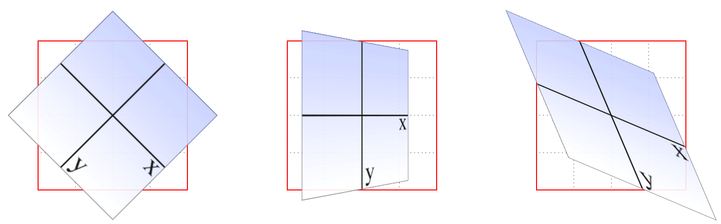
图 16-2: Elemental frames of reference
Speaking of rotations, the other coordinate system used in CSS transforms is a spherical system, which describes angles in 3D space. It’s illustrated in Figure 16-3.
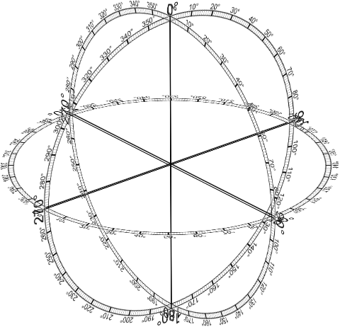
图 16-3: The spherical coordinate system used in CSS transforms
For the purposes of 2D transforms, you only have to worry about a single 360-degree polar system: the one that sits on the plane described by the x- and y-axes. When it comes to rotations, a 2D rotation actually describes a rotation around the z-axis. Similarly, rotations around the x-axis tilt the element toward or away from you, and rotations around the y-axis turn the element from side to side. These are illustrated in Figure 16-4.
对于 2D 变换的目的,您只需要考虑一个单独的 360 度极坐标系统:它位于由 x 轴和 y 轴描述的平面上。当谈到旋转时,2D 旋转实际上描述了绕 z 轴的旋转。类似地,绕 x 轴的旋转使元素向您倾斜或远离您,绕 y 轴的旋转使元素从一边转向另一边。这些在图 16-4 中进行了说明。
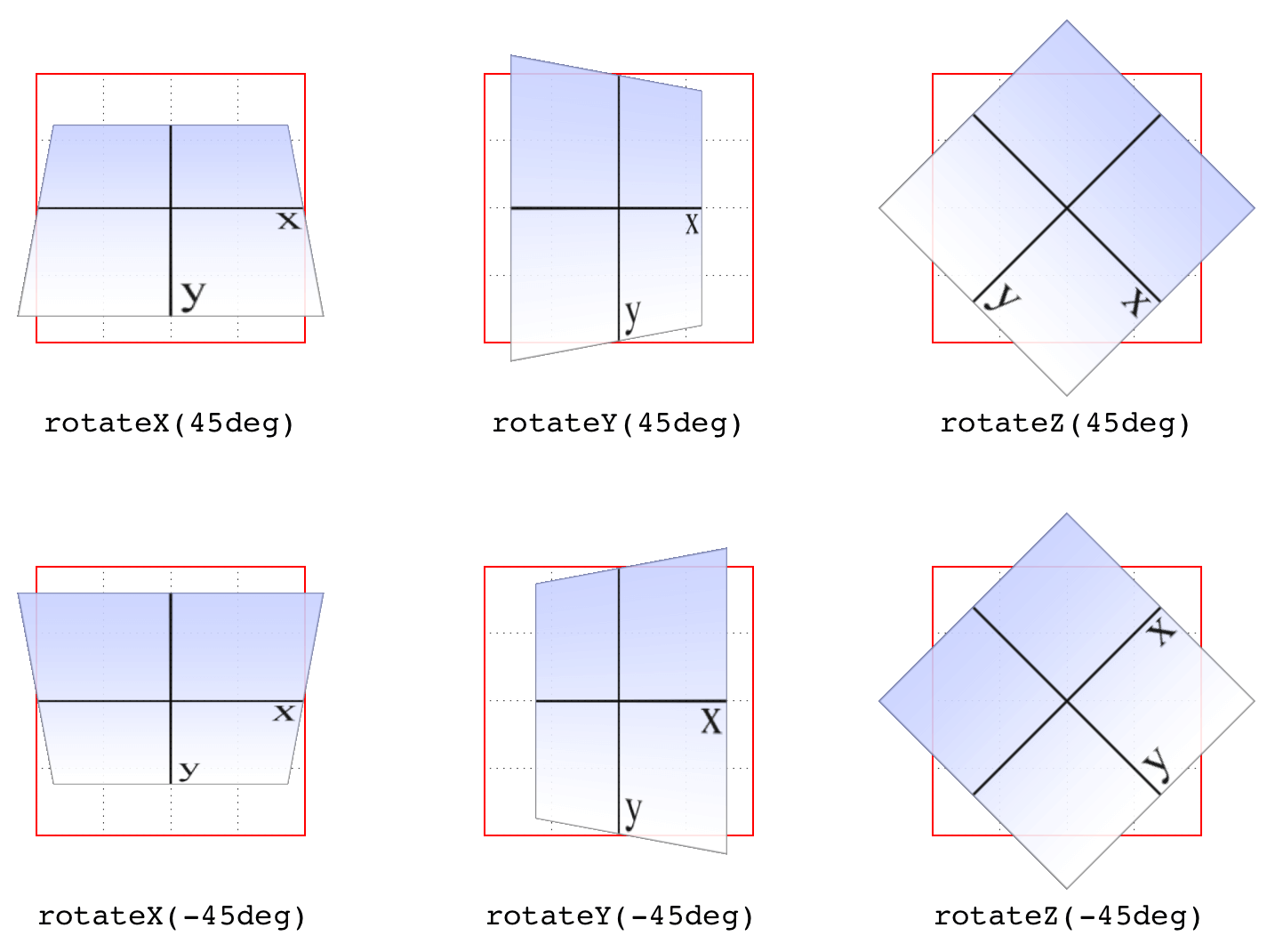
图 16-4: Rotations around the three axes
But back to 2D rotations. Suppose you wanted to rotate an element 45 degrees clockwise in the plane of the display (i.e., around the z-axis). The transform value you’re most likely to use is:
回到 2D 旋转。假设您想要在显示平面上顺时针旋转一个元素 45 度(即,绕 z 轴)。您最可能使用的转换值是:
rotate(45deg)Change that to –45deg, and the element will rotate counterclockwise (anticlockwise for our international friends) around the z-axis. In other words, it will rotate in the xy plane, as illustrated in Figure 16-5.
将其更改为
–45deg,则元素将绕 z 轴逆时针旋转(对于我们的国际朋友来说是逆时针旋转)。换句话说,它将在 xy 平面内旋转,如图 16-5 所示。
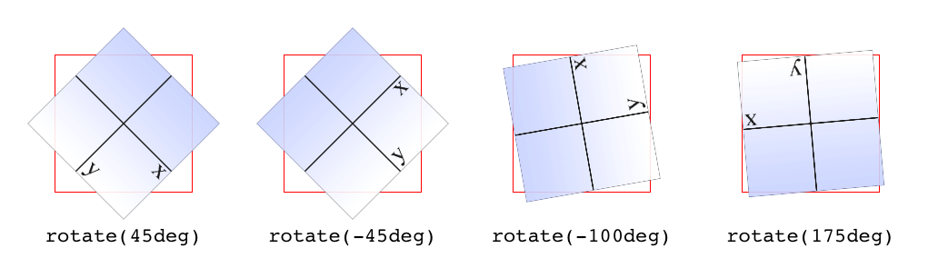
图 16-5: Rotations in the xy plane
All right, now that we have our bearings, let’s get started with transforms!
好了,现在我们有了方向,让我们开始学习变换!
16.2 Transforming
There’s really only one property that applies transforms, along with a few ancillary properties that affect exactly how the transforms are applied. We’ll start with the big cheese.
实际上,只有一个属性可以应用转换,还有一些辅助属性可以影响转换的应用方式。我们先从大人物开始。
First off, let’s clear up the matter of the bounding box. For any element being affected by CSS, this is the border box; that is, the outermost edge of the element’s border. That means that any outlines and margins are ignored for the purposes of calculating the bounding box.
首先,让我们清除
bounding box的问题。对于任何受 CSS 影响的元素,这是边框框;也就是元素边界的最外层。这意味着为了计算边界框而忽略任何轮廓和边距。
If a table-display element is being transformed, its bounding box is the table wrapper box, which encloses the table box and any associated caption box.
如果正在转换表显示元素,则其包围框是表包装器框,它包围表框和任何相关的标题框。
If you’re transforming a Scalable Vector Graphics (SVG) element with CSS, then its bounding box is its SVG-defined object bounding box.
如果使用 CSS 转换可缩放向量图形(SVG)元素,那么它的边界框就是它的 SVG 定义的对象边界框。
Note that all transformed elements (i.e., elements with transform set to a value other than none) have their own stacking context. While the scaled element may be much smaller or larger than it was before the transform was applied, the actual space on the page that the element occupies remains the same as before the transform was applied. This is true for all the transform functions.
注意所有转换后的元素(即,将
transform设置为非none值的元素)有自己的堆栈上下文。虽然缩放后的元素可能比应用转换之前要小或大得多,但元素在页面上占用的实际空间与应用转换之前相同。这适用于所有的变换函数。
Now, the value entry <transform-list> requires some explanation. This placeholder refers to a list of one or more transform functions, one after the other, in spaceseparated format. It looks like this, with the result shown in Figure 16-6:
现在,值条目
<transform-list>需要一些解释。这个占位符指的是一个或多个转换函数的列表,一个接一个,采用分隔格式。结果如图 16-6 所示:
#example {
  transform: rotate(30deg) skewX(-25deg) scaleY(2);
}
图 16-6: A transformed div element
The functions are processed one at a time, starting with the first (leftmost) and proceeding to the last (rightmost). This first-to-last processing order is important, because changing the order can lead to drastically different results. Consider the following two rules, which have the results shown in Figure 16-7:
每次处理一个函数,从第一个(最左边)开始,一直到最后一个(最右边)。这种从前到后的处理顺序很重要,因为更改顺序可能导致截然不同的结果。考虑以下两个规则,其结果如图 16-7 所示:
img#one {
  transform: translateX(200px) rotate(45deg);
}
img#two {
  transform: rotate(45deg) translateX(200px);
}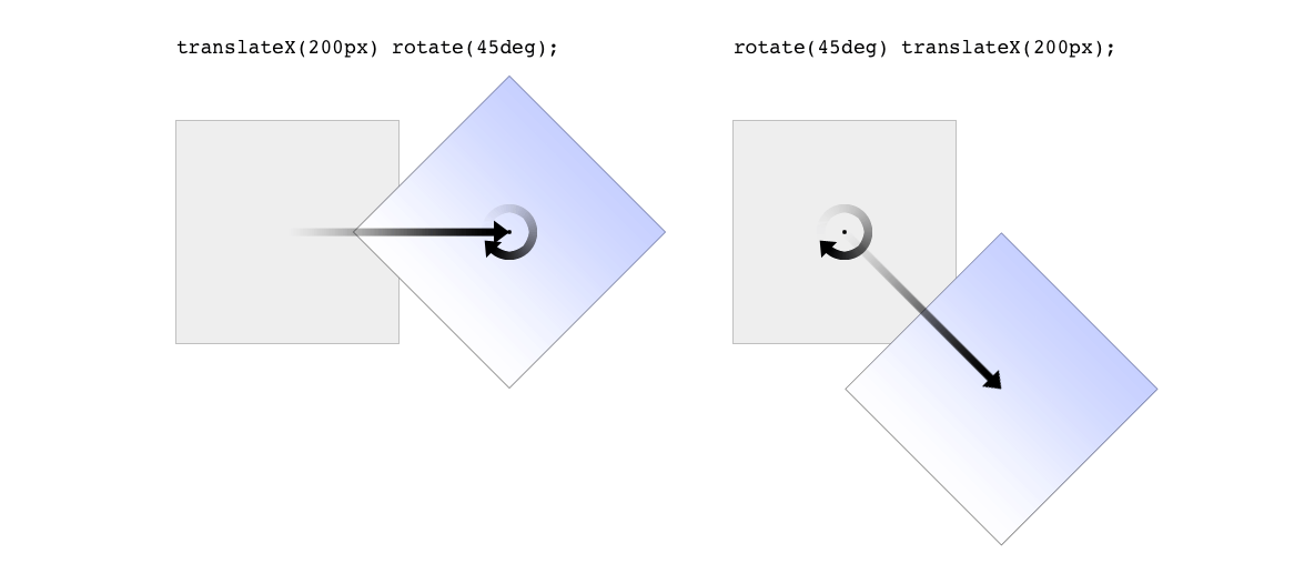
图 16-7: Different transform lists, different results
In the first instance, an image is translated (moved) 200 pixels along its x-axis and then rotated 45 degrees. In the second instance, an image is rotated 45 degrees and then moved 200 pixels along its x-axis—that’s the x-axis of the transformed element, not of the parent element, page, or viewport. In other words, when an element is rotated, its x-axis (along with its other axes) rotates along with it. All element transforms are conducted with respect to the element’s own frame of reference.
在第一个实例中,图像沿 x 轴平移(移动)200 像素,然后旋转 45 度。在第二个实例中,一个图像被旋转 45 度,然后沿着它的 x 轴移动 200 像素——x 轴是被转换元素的 x 轴,而不是父元素、页面或视图的“x 轴”。换句话说,当一个元素旋转时,它的 x 轴(以及它的其他轴)也随之旋转。所有元素转换都是根据元素自身的参考框架进行的。
Compare this to a situation where an element is translated and then scaled, or vice versa; it doesn’t matter which is which, because the end result is the same:
将此与一个元素被平移然后缩放的情况相比较,或者相反;哪个是哪个并不重要,因为最终的结果是一样的:
img#one {
  transform: translateX(100px) scale(1.2);
}
img#two {
  transform: scale(1.2) translateX(100px);
}
The situations where the order doesn’t matter are far outnumbered by the situations where it does; so in general, it’s a good idea to just assume the order always matters, even when it technically doesn’t.
顺序不重要的情况远远多于顺序重要的情况;所以一般来说,我们最好假设顺序总是重要的,即使在技术上并不重要。
Note that when you have a series of transform functions, all of them must be properly formatted; that is, they must be valid. If even one function is invalid, it renders the entire value invalid. Consider:
注意,当您有一系列转换函数时,所有这些函数都必须正确格式化;也就是说,它们必须是有效的。即使只有一个函数无效,它也会使整个值无效。考虑:
img#one {
  transform: translateX(100px) scale(1.2) rotate(22);
}
Because the value for rotate() is invalid—rotational values must have a unit—the entire value is dropped. The image in question will just sit there in its initial untransformed state, neither translated nor scaled, let alone rotated.
因为
rotate()的值是无效的—旋转值必须有一个单元—整个值将被删除。所讨论的图像将停留在它最初的未变换状态,既不平移也不缩放,更不用说旋转了。
It’s also the case that transforms are not usually cumulative. That is to say, if you apply a transform to an element and then later want to add a transformation, you need to restate the original transform. Consider the following scenarios, illustrated in Figure 16-8:
这种情况下,变换通常不是累积的。也就是说,如果您对一个元素应用转换,然后稍后想要添加转换,那么您需要重新声明原始转换。考虑以下场景,如图 16-8 所示:
#ex01 {
  transform: rotate(30deg) skewX(-25deg);
}
#ex01 {
  transform: scaleY(2);
}
#ex02 {
  transform: rotate(30deg) skewX(-25deg);
}
#ex02 {
  transform: rotate(30deg) skewX(-25deg) scaleY(2);
}
图 16-8: Overwriting or modifying transforms
In the first case, the second rule completely replaces the first, meaning that the element is only scaled along the y-axis. This actually makes some sense; it’s the same as if you declare a font size and then elsewhere declare a different font size for the same element. You don’t get a cumulative font size that way. You just get one size or the other. In the second example, the entirety of the first set of transforms is included in the second set, so they all are applied along with the scaleY() function.
在第一种情况下,第二个规则完全替换了第一个规则,这意味着元素只沿着 y 轴缩放。这是有道理的;这与您声明字体大小,然后在其他地方为相同的元素声明不同的字体大小是一样的。这样就不会得到累计字体大小。你只能得到一个大小。在第二个示例中,第一个转换集的全部内容都包含在第二个集合中,因此它们都与
scaleY()函数一起应用。
There is an exception to this, which is that animated transforms, whether using transitions or actual animations, are additive. That way, you can take an element that’s transformed and then animate one of its transform functions without overwriting the others. For example, assume you had:
这里有一个例外,那就是动画转换,无论是使用转换还是实际的动画,都是附加的。通过这种方式,您可以获取一个已转换的元素,然后激活其中一个转换函数,而不覆盖其他函数。例如,假设你有:
img#one {
  transform: translateX(100px) scale(1.2);
}
If you then animate the element’s rotation angle, it will rotate from its translated, scaled state to the new angle, and its translation and scale will remain in place. What makes this interesting is that even if you don’t explicitly specify a transition or animation, you can still create additive transforms via the user-interaction pseudo‐classes, such as :hover. That’s because things like hover effects are types of transitions; they’re just not invoked using the transition properties. Thus, you could declare:
如果对元素的旋转角度进行动画处理,它将从已平移、已缩放的状态旋转到新的角度,其平移和缩放将保持不变。有趣的是,即使您没有明确指定转换或动画,您仍然可以通过用户交互伪‐类(如
:hover)创建附加转换。这是因为悬停效果是一种过渡;只是没有使用转换属性来调用它们。因此,您可以声明:
img#one {
  transform: translateX(100px) scale(1.2);
}
img#one:hover {
  transform: rotate(-45deg);
}
This would rotate the translated, scaled image 45 degrees to its left on hover. The rotation would take place over zero seconds because no transition interval was declared, but it’s still an implicit transition. Thus, any state change can be thought of as a transition, and thus any transforms that are applied as a result of those state changes are additive with previous transforms.
这将使经过平移和缩放的图像在悬停时向左旋转 45 度。因为没有声明转换间隔,所以旋转将在 0 秒内发生,但它仍然是隐式转换。因此,任何状态更改都可以被视为转换,因此,由于这些状态更改而应用的任何转换都可以与以前的转换相加。
There’s one important caveat: as of this writing, transforms are not applied to atomic inline-level boxes. These are inline boxes like spans, hyperlinks, and so on. Those elements can be transformed if their block-level parent is transformed, in which case they go along for the ride. But you can’t just rotate a span unless you’ve changed its display role via display: block, display: inline-block, or something along those lines. The reason for this limitation boils down to an uncertainty. Suppose you have a span (or any inline-level box) that breaks across multiple lines. If ou rotate it, what happens? Does each line box rotate with respect to itself, or should all the line boxes be rotated as a single group? There’s no clear answer, and the debate continues, so for now you can’t directly transform inline-level boxes.
有一个重要的警告:在撰写本文时,转换还没有应用到
atomic inline-level框。这些是像 span、超链接等内联框。如果转换它们的块级父元素,则可以转换这些元素,在这种情况下,它们会继续前进。但你不能只是旋转一个span除非你通过display: block,display: inline-block或者其他类似的方式改变了它的显示角色。这种限制的原因归结起来就是不确定性。假设有一个span(或任何内联级框)跨多行。如果你旋转它,会发生什么?每个行盒是相对自身旋转,还是应该将所有行盒旋转为单个组?目前还没有明确的答案,争论还在继续,所以目前还不能直接转换内联级的方框。
16.2.1 The Transform Functions
There are, as of this writing, 21 different transform functions, employing a number of different value patterns to get their jobs done. Table 16-1 provides a list of all the available transform functions, minus their value patterns.
在撰写本文时,有 21 个不同的转换函数,使用了许多不同的值模式来完成它们的工作。表 16-1 提供了所有可用转换函数的列表,减去它们的值模式。
| translate() | scale() | rotate() | skew() | matrix() |
| translate3d() | scale3d() | rotate3d() | skewX() | matrix3d() |
| translateX() | scaleX() | rotateX() | skewY() | perspective() |
| translateY() | scaleY() | rotateY() | ||
| translateZ() | scaleZ() | rotateZ() |
The most common value pattern for transform is a space-separated list of one or more functions, processed from first (leftmost) to last (rightmost), and all of the functions must have valid values. If any one of the functions is invalid, it will invalidate the entire value of transform, thus preventing any transformation at all.
Translation functions
A translation transform is just a move along one or more axes. For example, translateX() moves an element along its own x-axis, translateY() moves it along its y-axis, and translateZ() moves it along its z-axis.
平移变换就是沿着一个或多个轴的移动。例如,translateX() 沿着它自己的 x 轴移动一个元素,translateY() 沿着它的 y 轴移动,translateZ() 沿着它的 z 轴移动。
| Functions | Permitted values |
|---|---|
| translateX(), translateY() | <length> | <percentage> |
These are usually referred to as the “2D” translation functions, since they can slide an element up and down, or side to side, but not forward or backward along the z-axis.
这些通常被称为“2D”平移函数,因为它们可以上下或左右滑动元素,但不能沿着 z 轴向前或向后滑动。
Each of these functions accepts a single distance value, expressed as either a length or a percentage.
每个函数都接受一个单独的距离值,用长度或百分比表示。
If the value is a length, then the effect is about what you’d expect. Translate an element 200 pixels along the x-axis with translateX(200px), and it will move 200 pixels to its right. Change that to translateX(-200px), and it will move 200 pixels to its left. For translateY(), positive values move the element downward, while negative values move it upward, both with respect to the element itself. Thus, if you flip the element upside down by rotation, positive translateY() values will actually move the element downward on the page.
如果值是长度,那么效果与您所期望的差不多。使用
translateX(200px)沿 x 轴平移一个 200 像素的元素,它将向右移动 200 像素。将它改为translateX(-200px),它将向左移动 200 像素。对于translateY(),正值将元素向下移动,而负值将元素向上移动,两者都是相对于元素本身而言的。因此,如果通过旋转将元素翻转过来,translateY()的正值实际上会将元素向下移动到页面上。
If the value is a percentage, then the distance is calculated as a percentage of the element’s own size. Thus, translateX(50%) will move an element 300 pixels wide and 200 pixels tall to its right by 150 pixels, and translateY(-10%) will move that same element upward (with respect to itself) by 20 pixels.
如果值是一个百分比,那么距离将以元素自身大小的百分比计算。因此,
translateX(50%)将把一个 300 像素宽、200 像素高的元素向右移动 150 像素,而translateY(-10%)将把这个元素向上移动 20 像素。
| Function | Permitted values |
|---|---|
| translate() | [ <length> | <percentage> ][, <length> | <percentage>]? |
If you want to translate an element along both the x- and y-axes at the same time, then translate() makes it easy. Just supply the x value first and the y value second, and it will act the same as if you combined translateX() translateY(). If you omit the y value, then it’s assumed to be zero. Thus, translate(2em) is treated as if it were translate(2em,0), which is also the same as translateX(2em). See Figure 16-9 for some examples of 2D translation.
如果您想要同时沿着 x 轴和 y 轴平移一个元素,那么
translate()会使这变得简单。只需先提供 x 值,然后提供 y 值,它的作用与组合使用translateX() translateY()相同。如果你省略了 y 值,那么它就被认为是 0。因此,translate(2em)被视为translate(2em,0),它与translateX(2em)相同。有关 2D 翻译的一些示例,请参见图 16-9。
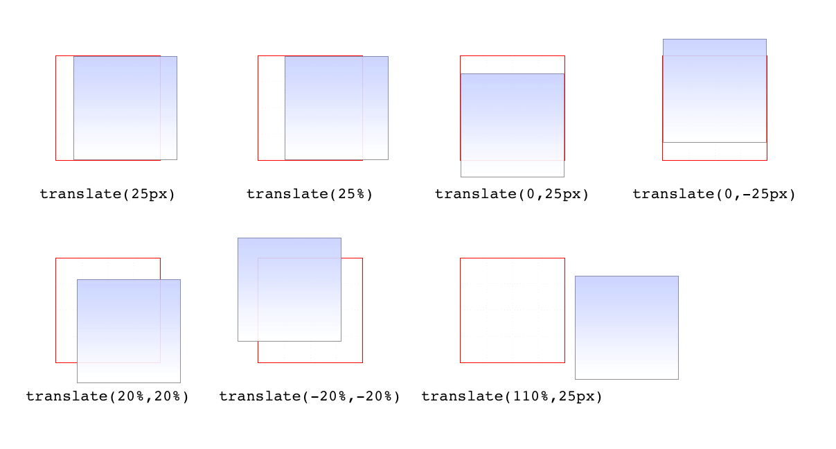
图 16-9: Translating in two dimensions
According to the latest version of the specification, both of the 2D translation functions can be given a unitless number. In this case, the number is treated as being expressed in terms of a user unit, which is treated the same as a pixel unless otherwise defined. The CSS specification does not explain how a user unit is otherwise defined; however, the SVG specification does, albeit briefly. In the field, no browser tested as of this writing supported unitless numbers of translation values, so the capability is academic, at best.
根据规范的最新版本,这两个 2D 翻译函数都可以给出一个无单元数。在这种情况下,数字被认为是用一个
user unit来表示的,除非另有定义,否则它被视为一个像素。CSS 规范没有解释如何定义用户单元;但是,SVG 规范可以做到这一点,尽管很简单。在这个领域,在写这篇文章的时候,还没有测试过支持翻译值的无单位数的浏览器,所以这个功能最多是学术性的。
| Function | Permitted value |
|---|---|
| translateZ() | <length> |
This function translates elements along the z-axis, thus moving them into the third dimension. Unlike the 2D translation functions, translateZ() only accepts length values. Percentage values are not permitted for translateZ(), or indeed for any zaxis value.
这个函数沿着 z 轴平移元素,从而将它们移动到第三维。与 2D 翻译函数不同,
translateZ()只接受长度值。对于translateZ()或任何 zaxis 值,不允许使用百分比值。
| Functions | Permitted values |
|---|---|
| translate3d() | [ <length> | <percentage> ], [ <length> | <percentage>], [ <length> ] |
Much like translate() does for x and y translations, translate3d() is a shorthand function that incorporates the x, y, and z translation values into a single function. This is handy if you want to move an element over, up, and forward in one fell swoop. See Figure 16-10 for an illustration of how 3D translation works. There, each arrow represents the translation along that axis, arriving at a point in 3D space. The dashed lines show the distance and direction from the origin point (the intersection of the three axes) and the distance above the xz plane.
与
translate()处理 x 和 y 的转换类似,translate3d()是一个简化函数,它将 x、y 和 z 的转换值合并到一个函数中。如果您想一次性地将一个元素向前、向上、向上移动,这是很方便的。图 16-10 展示了 3D 翻译的工作原理。这里,每个箭头表示沿该轴的平移,到达三维空间中的一个点。虚线表示从原点(三个轴的交点)到 xz 平面上方的距离和方向。
Unlike translate(), there is no fallback for situations where translate3d() does not contain three values. Thus, translate3d(1em,-50px) should be treated as invalid by user agents instead of being assumed to be translate3d(2em,-50px,0).
与
translate()不同,对于translate3d()不包含三个值的情况,没有回退。因此,用户代理应该将translate3d(1em,-50px)视为无效,而不是假定为translate3d(2em,-50px,0)。
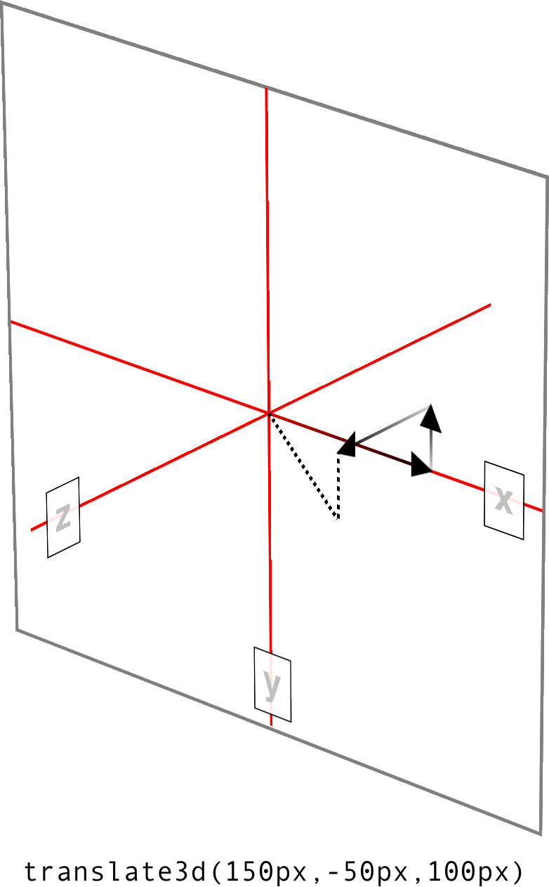
图 16-10: Translating in three dimensions
Scale functions
A scale transform makes an element larger or smaller, depending on what value you use. These values are unitless real numbers and are always positive. On the 2D plane, you can scale along the x- and y-axes individually, or scale them together.
scale transform使元素变大或变小,这取决于您使用的值。这些值是没有单位的实数,并且总是正的。在 2D 平面上,您可以分别沿着 x 轴和 y 轴伸缩,也可以将它们放在一起伸缩。
| Functions | Permitted value |
|---|---|
| scaleX(), scaleY(), scaleZ() | <number> |
The number value supplied to a scale function is a multiplier; thus, scaleX(2) will make an element twice as wide as it was before the transformation, whereas scaleY(0.5) will make it half as tall. Given this, you might expect that percentage values are permissible as scaling values, but they aren’t.
提供给比例函数的数值是乘数;因此,
scaleX(2)将使元素的宽度是转换之前的两倍,而scaleY(0.5)将使元素的高度减半。考虑到这一点,您可能会认为百分比值可以作为比例值使用,但事实并非如此。
| Function | Permitted value |
|---|---|
| scale() | <number> [, <number> ]? |
If you want to scale along both axes simultaneously, use scale(). The x value is always first and the y always second, so scale(2,0.5) will make the element twice as wide and half as tall as it was before being transformed. If you only supply one number, it is used as the scaling value for both axes; thus, scale(2) will make the element twice as wide and twice as tall. This is in contrast to translate(), where an omitted second value is always set to zero. scale(1) will scale an element to be exactly the same size it was before you scaled it, as will scale(1,1). Just in case you were dying to do that.
如果您想要同时沿两个轴伸缩,请使用
scale()。x 值总是第一,y 总是第二,因此scale(2,0.5)将使元素的宽度增加一倍,高度减半。如果您只提供一个数字,它将被用作两个轴的缩放值;因此,scale(2)将使元素的宽度增加一倍,高度增加一倍。这与translate()相反,后者省略的第二个值总是设置为 0。scale(1)和scale(1,1)将按比例缩放一个元素,使其大小与缩放前完全相同。以防你很想那样做。
Figure 16-11 shows a few examples of element scaling, using both the single-axis scaling functions, as well as the combined scale().
图 16-11 显示了几个元素缩放的例子,使用了单轴缩放函数和组合的
scale()。
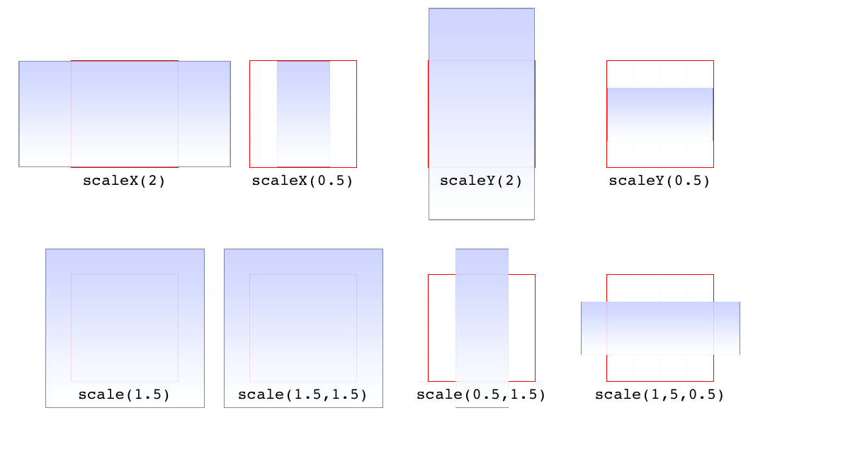
图 16-11: Scaled elements
If you can scale in two dimensions, you can also scale in three. CSS offers scaleZ() for scaling just along the z-axis, and scale3d() for scaling along all three axes at once. These really only have an effect if the element has any depth, which elements don’t by default. If you do make a change that conveys depth—say, rotating an element around the x- or y-axes—then there is a depth that can be scaled, and either scaleZ() or scale3d() can do so.
如果你可以在二维中缩放,你也可以在三维中缩放。CSS 提供了
scaleZ()来沿着 z 轴缩放,以及scale3d()来同时沿着三个轴缩放。这些只有在元素有深度时才有效果,而默认情况下元素没有深度。如果您确实做了一个传递深度的更改(例如,围绕 x 轴或 y 轴旋转一个元素),那么就可以对深度进行缩放,而scaleZ()或scale3d()都可以做到这一点。
| Function | Permitted value |
|---|---|
| scale3d() | <number>, <number>, <number> |
Similar to translate3d(), scale3d() requires all three numbers to be valid. If you fail to do this, then the malformed scale3d() will invalidate the entire transform value to which it belongs.
与
translate3d()类似,scale3d()要求三个数字都是有效的。如果您没有这样做,那么变形的scale3d()将使它所属的整个转换值无效。
Rotation functions
A rotation function causes an element to be rotated around an axis, or around an arbitrary vector in 3D space. There are four simple rotation functions, and one lesssimple function meant specifically for 3D.
一个
rotation function使一个元素绕轴旋转,或绕三维空间中的任意向量旋转。有四个简单的旋转函数,还有一个不太简单的函数是专门为 3D 设计的。
| Functions | Permitted values |
|---|---|
| rotate(), rotateX(), rotateY(), rotateZ() | <angle> |
All four basic rotation functions accept just one value: a degree. This can be expressed using any of the valid degree units (deg, grad, rad, and turn) and a number, either positive or negative. If a value’s number runs outside the usual range for the given unit, it will be normalized to fit into the accepted range. In other words, a value of 437deg will be tilted the same as if it were 77deg, or, for that matter, -283deg.
所有四个基本的旋转函数都只接受一个值:度。可以使用任意有效的学位单位(
deg、grad、rad和turn)和一个数字(正数或负数)来表示。如果一个值的数值超出了给定单元的正常范围,那么它将被规范化以适应接受范围。换句话说,437deg的值将与77deg或-283deg一样倾斜。
Note, however, that these are only exactly equivalent if you don’t animate the rotation in some fashion. That is to say, animating a rotation of 1100deg will spin the element around several times before coming to rest at a tilt of -20 degrees (or 340 degrees, if you like). By contrast, animating a rotation of -20deg will tilt the element a bit to the left, with no spinning; and animating a rotation of 340deg will animate an almost-full spin to the right. All three animations come to the same end state, but the process of getting there is very different in each case.
但是,请注意,只有当您不以某种方式激活旋转时,它们才完全相等。也就是说,旋转
1100deg的动画会让元素旋转几次,然后倾斜-20 度(或者 340 度,如果你喜欢的话)。相比之下,动画旋转-20deg将倾斜元素向左一点,没有旋转;而旋转340deg的动画将使旋转几乎完全向右旋转。这三种动画都达到了相同的结束状态,但每种情况下的实现过程都非常不同。
The function rotate() is a straight 2D rotation, and the one you’re most likely to use. It is equivalent to rotateZ() because it rotates the element around the z-axis (the one that shoots straight out of your display and through your eyeballs). In a similar manner, rotateX() causes rotation around the x-axis, thus causing the element to tilt toward or away from you; and rotateY() rotates the element around its y-axis, as though it were a door. These are all illustrated in Figure 16-12.
rotate()函数是一个直接的 2D 旋转,您最可能使用它。它与rotateZ()是等价的,因为它围绕 z 轴旋转元素(z 轴是直接从显示器中射出并穿过眼球的元素)。以类似的方式,rotateX()导致绕 x 轴旋转,从而导致元素向您倾斜或远离您;而rotateY()将元素绕 y 轴旋转,就好像它是一扇门。这些都在图 16-12 中进行了说明。
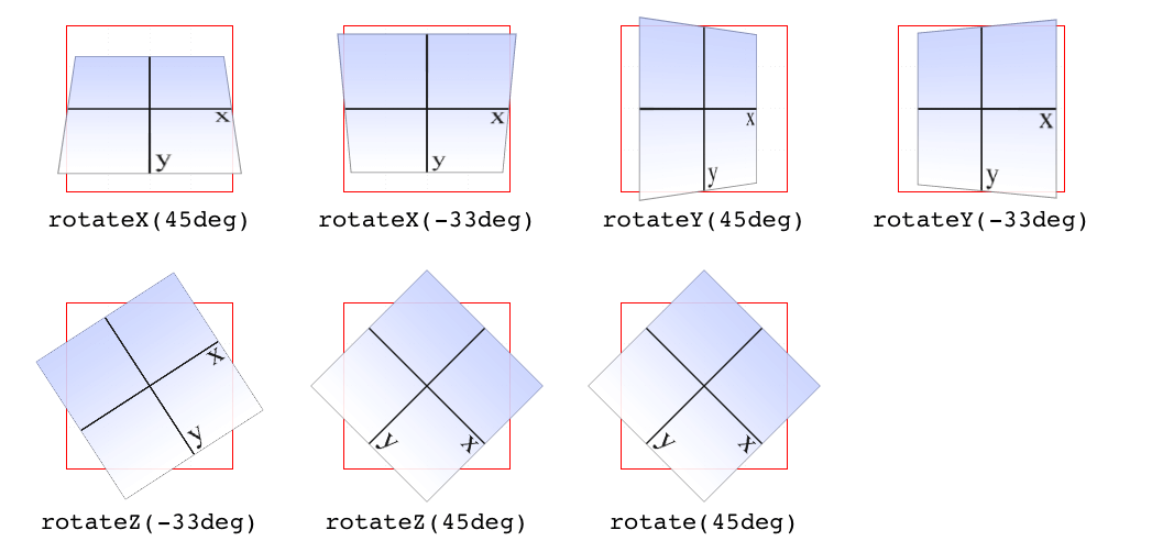
图 16-12: Rotations around the three axes

Several of the examples in Figure 16-12 present a fully 3D appearance. This is only possible with certain values of the properties transform-style and perspective, described in sections “Choosing a 3D Style” on page 845 and “Changing Perspective” on page 847 and omitted here for clarity. This will be true throughout this text in any situation where 3D-transformed elements appear to be fully three-dimensional. This is important to keep in mind because if you just try to apply the transform functions shown, you won’t get the same visual results as in the figures.
| Function | Permitted value |
|---|---|
| rotate3d() | <number>,<number>,<number>,<angle> |
If you’re comfortable with vectors and want to rotate an element through 3D space, then rotate3d() is for you. The first three numbers specify the x, y, and z components of a vector in 3D space, and the degree value (angle) determines the amount of rotation around the declared 3D vector.
如果您熟悉向量并希望在 3D 空间中旋转元素,那么
rotate3d()是适合您的。前三个数字指定了三维空间中向量的 x、y 和 z 分量,度值(角度)决定了所声明的三维向量的旋转量。
To start with a basic example, the 3D equivalent to rotate(45deg) is rotate3d(0,0,1,45deg). This specifies a vector of zero magnitude on the x- and yaxes, and a magnitude of 1 along the z-axis. In other words, it describes the z-axis. The element is thus rotated 45 degrees around that vector, as shown in Figure 16-13. This figure also shows the appropriate rotate3d() values to rotate an element by 45 degrees around the x- and y-axes.
从一个基本的例子开始,与
rotate(45deg)等价的 3D 是rotate3d(0,0,1,45deg)。它指定了 x 轴和 y 轴上大小为 0 的向量,以及 z 轴上大小为 1 的向量。换句话说,它描述了 z 轴。因此,元素围绕该向量旋转 45 度,如图 16-13 所示。该图还显示了适当的rotate3d()值,该值使元素在 x 轴和 y 轴上旋转 45 度。
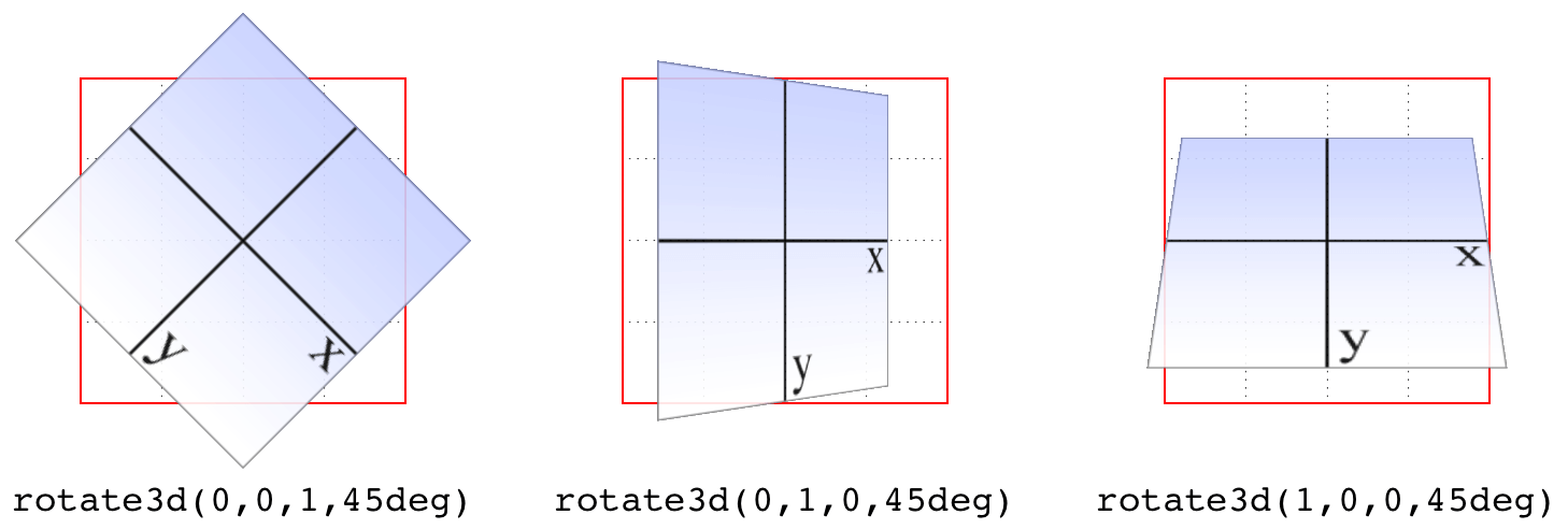
图 16-13: Rotations around 3D vectors
A little more complicated is something like rotate3d(-0.95,0.5,1,45deg), where the described vector points off into 3D space between the axes. To understand how this works, let’s start with a basic example: rotateZ(45deg) (illustrated in Figure 16-13). The equivalent is rotate3d(0,0,1,45deg). The first three numbers describe the components of a vector that has no x or y magnitude, and a z magnitude of 1. Thus, it points along the z-axis in a positive direction; that is, toward the viewer.
稍微复杂一点的是
rotate3d(-0.95,0.5,1,45deg),其中描述的向量指向轴之间的 3D 空间。为了理解它是如何工作的,让我们从一个基本的示例开始:rotateZ(45deg)(如图 16-13 所示)。相当于rotate3d(0,0,1,45deg)。前三个数字描述了一个矢量的分量,它没有 x 或 y 的模,而 z 的模是 1。因此,它沿着 z 轴指向正方向;也就是说,面向观众。
The element is then rotated clockwise as you look toward the origin of the vector. Similarly, the 3D equivalent of rotateX(45deg) is rotate3d(1,0,0,45deg). The vector points along the x-axis in the positive direction (to the right). If you stand at the end of that vector and look toward its origin, then you rotate the element 45 degrees clockwise around the vector. Thus, from the usual viewer placement, the top of the element rotates away from and the bottom rotates toward the viewer.
当你看向矢量的原点时,这个元素就会顺时针旋转。类似地,
rotateX(45deg)的 3D 等效物是rotate3d(1,0,0,45deg)。向量沿着 x 轴指向正方向(向右)。如果你站在这个向量的末端,看着它的原点,那么你就可以把这个元素绕着这个向量顺时针旋转 45 度。因此,从通常的查看器位置开始,元素的顶部旋转远离查看器,而底部旋转靠近查看器。
Let’s make it slightly more complex: suppose you have rotate3d(1,1,0,45deg). When viewed on your monitor, that describes a vector running from the top-left to bottom-right corner, going right through the center of the element (by default, anyway; we’ll see how to change that later on). So the element’s rectangle has a line running through it at a 45-degree angle, effectively spearing it. Then the vector rotates 45 degrees, taking the element with it. The rotation is clockwise as you look back toward the vector’s origin, so again, the top of the element rotates away from the viewer, while the bottom rotates toward the viewer. If we were to change the rotation to rotate3d(1,1,0,90deg), then the element would be edge-on to the viewer, tilted at a 45-degree angle and facing off toward the upper right. Try it with a piece of paper: draw a line from the top left to bottom right, and then rotate the paper around that line.
让我们让它稍微复杂一点:假设您有
rotate3d(1,1,0,45deg)。在您的显示器上显示时,它描述了一个从左上角到右下角的向量,该向量直接穿过元素的中心(无论如何,默认情况下;我们稍后会看到如何改变)。因此,元素的矩形有一条 45 度角的直线贯穿其中,有效地将其插入。然后矢量旋转 45 度,带着元素一起旋转。当你向后看矢量原点时,旋转是顺时针的,因此,同样,元素的顶部旋转远离查看器,而底部旋转朝向查看器。如果我们将旋转改为rotate3d(1,1,0,90deg),那么元素将是面向观众的,倾斜 45 度,面向右上角。用一张纸试试:从左上角到右下角画一条线,然后把纸绕着这条线旋转。
OK, so given all that, try visualizing how the vector is determined for rotate3d(-0.95,0.5,1,45deg). If we assume a cube 200 pixels on a side, the vector’s components are 190 pixels to the left along the x-axis, 100 pixels down along the yaxis, and 200 pixels toward the views along the z-axis. The vector goes from the origin point (0, 0, 0) to the point (-190 px, 100 px, 200 px). Figure 16-14 depicts that vector, as well as the final result presented to the viewer.
好了,考虑到这些,试着想象一下如何确定
rotate3d(-0.95,0.5,1,45deg)的矢量。如果我们假设一个立方体的一面是 200 像素,那么这个矢量的分量是沿着 x 轴向左 190 像素,沿着 y 轴向下 100 像素,沿着 z 轴向视图方向 200 像素。向量从原点(0,0,0)到点(-190 px, 100 px, 200 px)图 16-14 描述了该向量,以及呈现给查看者的最终结果。
So the vector is like a metal rod speared through the element being rotated. As we look back along the line of the vector, the rotation is 45 degrees clockwise. But since the vector points left, down, and forward, that means the top-left corner of the element rotates toward the viewer, and the bottom right rotates away, as shown in Figure 16-14.
所以矢量就像一根金属杆穿过旋转的元素。当我们沿着向量的方向往回看,旋转是顺时针 45 度。但是,由于向量指向左、下和前,这意味着元素的左上角向查看器旋转,右下角向外旋转,如图 16-14 所示。
Just to be crystal clear, rotate3d(1,1,0,45deg) is not equivalent to rotateX(45deg) rotateY(45deg) rotateZ(0deg)! It’s an easy mistake to make, and many people—including several online tutorial authors and, until researching and writing this section, your humble correspondent—have made it. It seems like it should be equivalent, but it really isn’t. If we place that vector inside the imaginary 200 × 200 × 200 cube previously mentioned, the axis of rotation would go from the origin point to a point 200 pixels right and 200 pixels down (200, 200, 0).
简单地说,
rotate3d(1,1,0,45deg)不等于rotateX(45deg) rotateY(45deg) rotateZ(0deg)!这是一个很容易犯的错误,很多人都犯了这个错误,包括一些在线教程的作者,在研究和撰写这个部分之前,还有你的那些谦虚的读者。看起来应该是相等的,但实际上不是。如果我们把那个向量放在前面提到的假想的 200×200×200 的立方体中,旋转轴将从原点到一个点,右移 200 像素,向下 200 像素(200,200,0)。
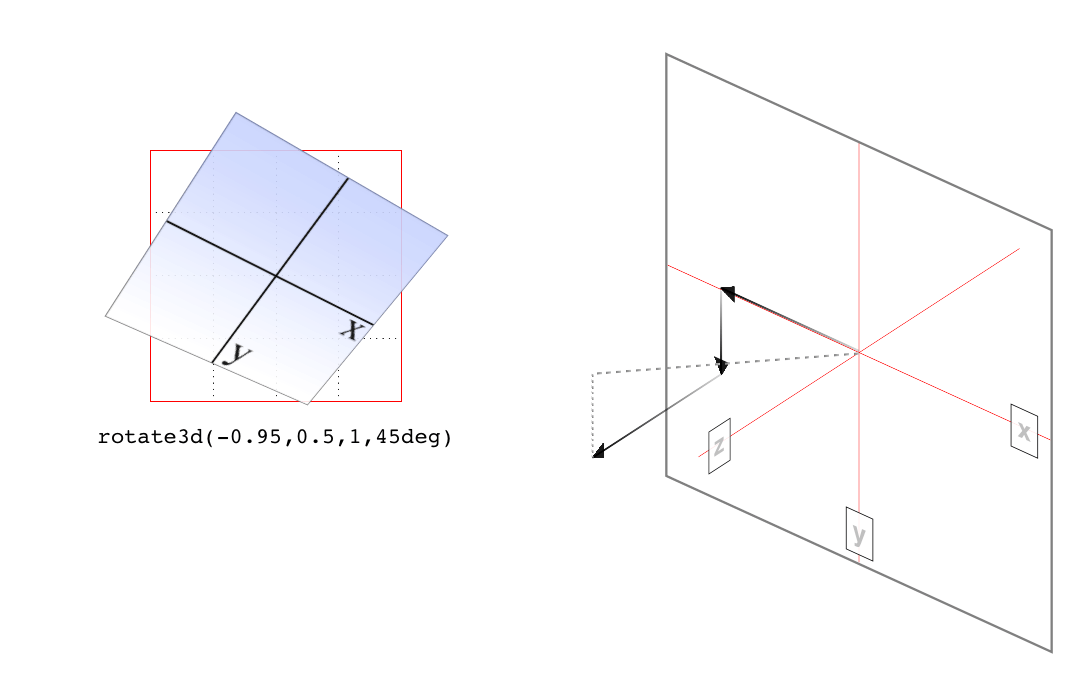
图 16-14: Rotation around a 3D vector, and how that vector is determined
Having done that, the axis of rotation is shooting through the element from the top left to the bottom right, at a 45-degree angle. The element then rotates 45 degrees clockwise around that diagonal, as you look back toward its origin (the top left), which rotates the top-right corner of the element away and a bit to the left, while the bottom-left corner rotates closer and a bit to the right. This is distinctly different than the result of rotateX(45deg) rotateY(45deg) rotateZ(0deg), as you can see in Figure 16-15.
完成之后,旋转轴从左上角到右下角以 45 度角穿过元素。然后,当您回头看它的原点(左上角)时,元素将沿该对角线顺时针旋转 45 度,该原点将元素的右上角旋转到左边,而左下角旋转到更近的地方,并向右旋转一点。这与
rotateX(45deg) rotateY(45deg) rotateZ(0deg)的结果明显不同,如图 16-15 所示。
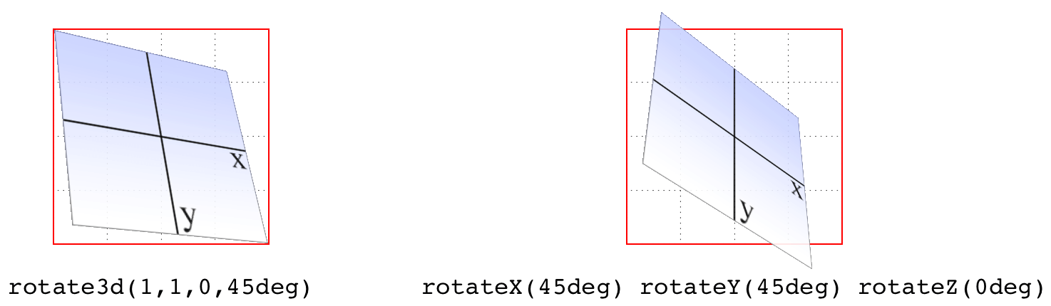
图 16-15: The difference between rotating around two axes and rotating around a 3D axis
Skew functions
When you skew an element, you slant it along one or both of the x- and y-axes. There is no z-axis or other 3D skewing.
当您
skew一个元素时,您将它沿着 x 轴和 y 轴的一个或两个轴倾斜。没有 z 轴或其他 3D 倾斜。
| Functions | Permitted value |
|---|---|
| skewX(), skewY() | <angle> |
In both cases, you supply an angle value, and the element is skewed to match that angle. It’s much easier to show skewing rather than try to explain it in words, so Figure 16-16 shows a number of skew examples along the x- and y-axes.
在这两种情况下,您都提供一个角度值,并且元素倾斜以匹配该角度。显示歪斜比试图用文字解释要容易得多,因此图 16-16 显示了沿 x 轴和 y 轴的许多歪斜示例。
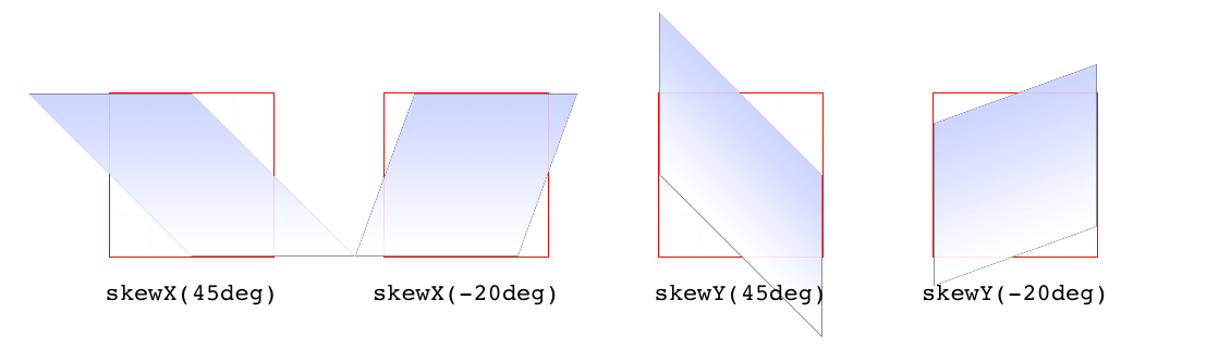
图 16-16: Skewing along the x- and y-axes
| Function | Permitted values |
|---|---|
| skew() | <angle> [, <angle> ]? |
The behavior of including skew(a,b) is different from including skewX(a) with skewY(b). Instead, it specifies a 2D skew using the matrix operation [ax,ay]. Figure 16-17 shows some examples of this matrix skewing and how they differ from double-skew transforms that look the same at first, but aren’t.
包含
skew(a,b)的行为与包含skewX(a)和skewY(b)的行为不同。相反,它使用矩阵运算[ax,ay]来指定 2D 倾斜。图 16-17 显示了这个矩阵倾斜的一些例子,以及它们与起初看起来相同但实际上不同的双斜变换的区别。
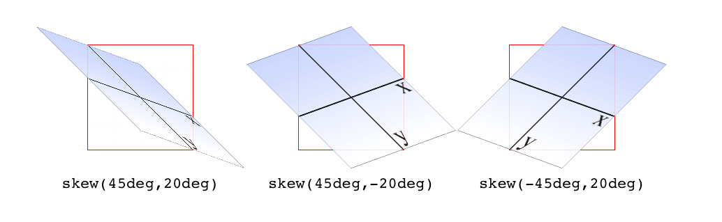
图 16-17: Skewed elements
If you supply two values, the x skew angle is always first, and the y skew angle comes second. If you leave out a y skew angle, then it’s treated as zero.
如果您提供两个值,则 x 歪斜角总是第一,y 歪斜角总是第二。如果你忽略了一个 y 偏角,那么它就是 0。
The perspective function
If you’re transforming an element in 3D space, you most likely want it to have some perspective. Perspective gives the appearance of front-to-back depth, and you can vary the amount of perspective applied to an element.
如果你在三维空间中转换一个元素,你很可能希望它有一些透视。透视图提供了前后深度的外观,您可以更改应用于元素的透视图数量。
| Function | Permitted values |
|---|---|
| perspective() | <length> |
It might seem a bit weird that you specify perspective as a distance. After all, perspective(200px) seems a bit odd when you can’t really measure pixels along the z-axis. And yet, here we are. You supply a length, and the illusion of depth is constructed around that value. Lower numbers create more extreme perspective, as though you are right up close to the element and viewing it through a fish-eye lens. Higher numbers create a gentler perspective, as though viewing the element through a zoom lens from far away. Really high perspective values create an isometric effect.
将透视图指定为距离可能有点奇怪。毕竟,
perspective(200px)看起来有点奇怪,因为你无法真正测量 z 轴上的像素。然而,我们在这里。你提供一个长度,深度的错觉是围绕着这个值建立的。较低的数字会产生更极端的视角,就好像你正靠近这个元素,通过鱼眼镜头观察它。更高的数字会产生更温和的视角,就像通过变焦镜头从远处观察元素一样。“真正的”高透视值会产生等距效果。
This makes a certain amount of sense. If you visualize perspective as a pyramid, with its apex point at the perspective origin and its base the closest thing to you, then a shorter distance between apex and base will create a shallower pyramid, and thus a more extreme distortion. This is illustrated in Figure 16-18, with hypothetical pyramids representing 200 px, 800 px, and 2,000 px perspective distances.
这是有一定道理的。如果你把透视法想象成一个金字塔,它的顶点在透视原点,它的底部离你最近,那么顶点和底部之间较短的距离就会形成一个较浅的金字塔,从而产生更极端的扭曲。如图 16-18 所示,假设金字塔分别代表 200 像素、800 像素和 2000 像素的透视距离。
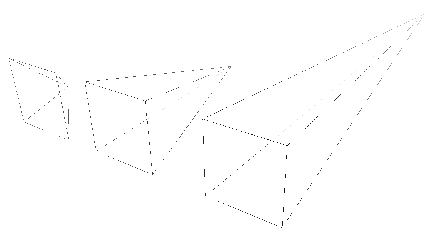
图 16-18: Different perspective pyramids
In the documentation for Safari, Apple writes that perspective values below 300px tend to be extremely distorted, values above 2000px create “very mild” distortion, and values between 500px and 1000px create “moderate perspective.” To illustrate this, Figure 16-19 shows a series of elements with the exact same rotation as displayed with varying perspective values.
在 Safari 的文档中,苹果写道,低于
300px的透视值会严重失真,高于2000px的会产生“非常轻微”的失真,而介于500px和1000px之间的会产生“适度的透视”。为了说明这一点,图 16-19 显示了一系列具有完全相同旋转的元素,这些元素具有不同的透视图值。
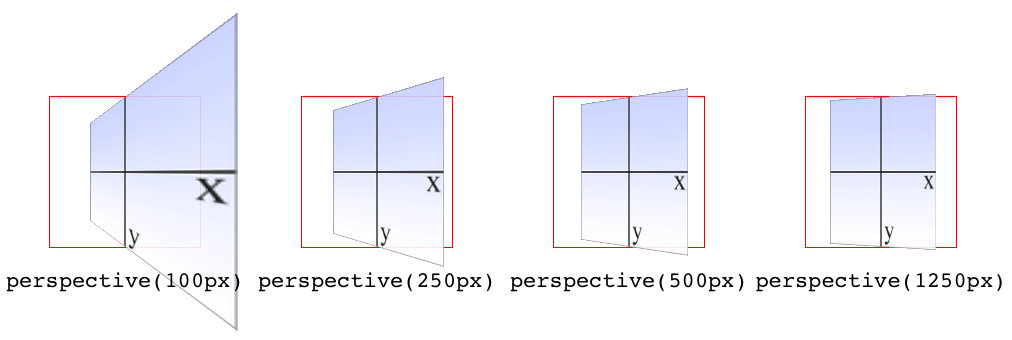
图 16-19: The effects of varying perspective values
Perspective values must always be positive, nonzero lengths. Any other value will cause the perspective() function to be ignored. Also note that its placement in the list of functions is very important. If you look at the code for Figure 16-19, the perspective() function comes before the rotateY() function. If you were to reverse the order, the rotation would happen before the perspective is applied, so all four examples in Figure 16-19 would look exactly the same. So if you plan to apply a perspective value via the list of transform functions, make sure it comes first, or at the very least before any transforms that depend on it. This serves as a particularly stark reminder that the order in which you write transform functions can be very important.
透视图值必须总是正的、非零长度。任何其他值都会导致
perspective()函数被忽略。还要注意,它在函数列表中的位置非常重要。如果查看图 16-19 的代码,会发现perspective()函数位于rotateY()函数之前。如果颠倒顺序,那么旋转将在应用透视图之前发生,因此图 16-19 中的所有四个示例看起来都是完全相同的。因此,如果您计划通过转换函数列表应用透视图值,请确保首先应用它,或者至少在依赖于它的任何转换之前应用它。这是一个特别明显的提醒,您编写“转换”函数的顺序可能非常重要。
Note that the function perspective() is very similar to the property perspective, which will be covered later, but they are applied in critically different ways. Generally, you will want to use the perspective property instead of the perspective() function, but there may be exceptions.
Matrix functions
If you’re a particular fan of advanced math, or stale jokes derived from the Wachowskis’ movies, then these functions will be your favorites.
如果你是高等数学的特别爱好者,或者是来自沃卓斯基兄弟电影的陈腐笑话,那么这些函数将是你的最爱。
| Function | Permitted values |
|---|---|
| matrix() | <number> [, <number> ]{5,5} |
In the CSS transforms specification, we find the trenchant description of matrix() as a function that “specifies a 2D transformation in the form of a transformation matrix of the six values a-f.”
在 CSS 转换规范中,我们发现
matrix()是一个函数,它“以a-f的六个值的转换矩阵的形式指定了一个 2D 转换”。
First things first: a valid matrix() value is a list of six comma-separated numbers. No more, no less. The values can be positive or negative. Second, the value describes the final transformed state of the element, combining all of the other transform types (rotation, skewing, and so on) into a very compact syntax. Third, very few people actually use this syntax.
首先:一个有效的
matrix()值是一个由六个逗号分隔的数字组成的列表。不多不少。值可以是正的,也可以是负的。其次,该值描述元素的最终转换状态,将所有其他转换类型(旋转、倾斜等)组合成一个非常紧凑的语法。第三,很少有人真正使用这种语法。
We’re not actually going to go through the complicated process of actually doing the matrix math. For most readers, it would be an eye-watering wall of apparent gibberish; and for the rest, it would be time wasted on familiar territory. You can certainly research the intricacies of matrix calculations online, and I encourage anyone with an interest to do so. We’ll just look at the basics of syntax and usage in CSS.
我们实际上不会经历做矩阵计算的复杂过程。对大多数读者来说,这将是一堵令人流泪的胡言乱语墙;而其余的时间则浪费在熟悉的领域。你当然可以在网上研究复杂的矩阵计算,我鼓励任何对此感兴趣的人去做。我们来看看 CSS 的基本语法和用法。
Here’s a brief rundown of how it works. Say you have this function applied to an element:
这里是它如何工作的一个简短纲要。假设你把这个函数应用到一个元素上:
matrix(0.838671, 0.544639, -0.692519, 0.742636, 6.51212, 34.0381)That’s the CSS syntax used to describe this transformation matrix:
这是用来描述这个转换矩阵的 CSS 语法:
0.838671 -0.692519 0 6.51212
0.544639 0.742636 0 34.0381
0 0 1 0
0 0 0 1
Right. So what does that do? It has the result shown in Figure 16-20, which is exactly the same result as writing this:
正确的。这是什么意思呢?它的结果如图 16-20 所示,与下面的结果完全相同:
rotate(33deg) translate(24px,25px) skewX(-10deg)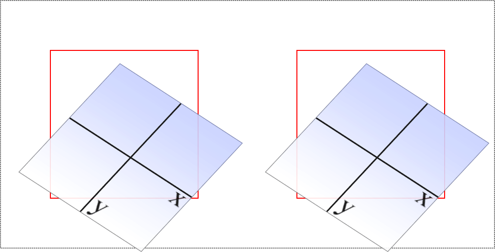
图 16-20: A matrix-transformed element and its functional equivalent
What this comes down to is that if you’re familiar with or need to make use of matrix calculations, you can and should absolutely use them. If not, you can chain much more human-readable transform functions together and get the element to the same end state.
归根结底,如果你熟悉或需要使用矩阵计算,你完全可以而且应该使用它们。如果不是,您可以将更多人类可读的转换函数链接在一起,使元素处于相同的结束状态。
Now, that was for plain old 2D transforms. What if you want to use a matrix to transform through three dimensions?
这是一个普通的二维变换。如果你想用一个矩阵来进行三维变换呢?
| Function | Permitted values |
|---|---|
| matrix3d() | <number> [, <number> ]{15,15} |
Again, just for kicks, we’ll savor the definition of matrix3d() from the CSS Transforms specification: “specifies a 3D transformation as a 4 × 4 homogeneous matrix of 16 values in column-major order.” This means the value of matrix3d must be a list of 16 comma-separated numbers, no more or less. Those numbers are arranged in a 4 × 4 grid in column order, so the first column of the matrix is formed by the first set of four numbers in the value, the second column by the second set of four numbers, the third column by the third set, and so on. Thus, you can take the following function:
再一次,只是为了消遣,我们将细细品味来自 CSS 转换规范的
matrix3d()定义:“将 3D 转换指定为一个 4×4 的齐次矩阵,其中 16 个值按列主序排列。这意味着matrix3d的值必须是一个由 16 个逗号分隔的数字组成的列表,不能多也不能少。这些数字排列在一个 4×4 网格列订单,所以矩阵的第一列是由第一组四个数字的值,第二列第二组的四个数字,第三列到了第三集,等等。因此,可以取以下函数:
matrix3d(
 0.838671, 0, -0.544639, 0.00108928,
 -0.14788, 1, 0.0960346, -0.000192069,
 0.544639, 0, 0.838671, -0.00167734,
 20.1281, 25, -13.0713, 1.02614)
And write it out as this matrix:
写成这个矩阵
 0.838671 -0.14788 0.544639 20.1281
 0 1 0 25
-0.544639 0.0960346 0.838671 -13.0713
 0.00108928 -0.000192069 -0.00167734 1.02614
Both of which have an end state equivalent to:
两者的结束状态都相当于:
perspective(500px) rotateY(33deg) translate(24px,25px) skewX(-10deg)as shown in Figure 16-21.
如图 16-21 所示。
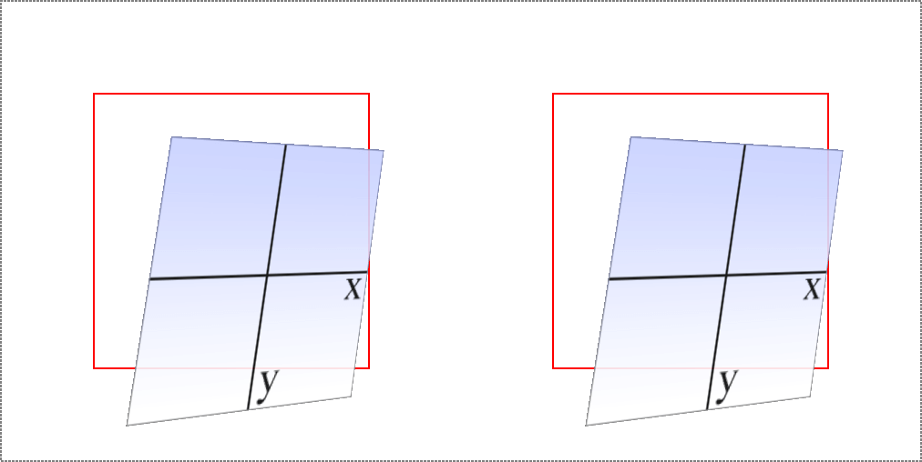
图 16-21: A matrix3d-transformed element and its functional equivalent
A note on end-state equivalence
It’s important to keep in mind that only the end states of a matrix() function, and of an equivalent chain of transform functions, can be considered identical. This is for the same reason discussed in the section on rotation: because a rotation angle of 393deg will end with the same visible rotation as an angle of 33deg. This matters if you are animating the transformation, since the former will cause the element to do a barrel roll in the animation, whereas the latter will not. The matrix() version of this end state won’t include the barrel roll, either. Instead, it will always use the shortest possible rotation to reach the end state.
重要的是要记住,只有
matrix()函数和等价的变换函数链的结束状态才能被认为是相同的。这和我们在旋转一节中讨论的原因是一样的:因为393deg的旋转角度与33deg的可视旋转角度相同。如果您正在动画转换,这一点很重要,因为前者将导致元素在动画中做桶滚,而后者不会。matrix()版本的结束状态也不包括桶滚。相反,它总是使用尽可能短的旋转来达到最终状态。
To illustrate what this means, consider the following: a transform chain and its matrix() equivalent:
为了说明这意味着什么,考虑以下:一个转换链和它的
matrix()等价:
rotate(200deg) translate(24px,25px) skewX(-10deg)
matrix(-0.939693, -0.34202, 0.507713, -0.879385, -14.0021, -31.7008)
Note the rotation of 200 degrees. We naturally interpret this to mean a clockwise rotation of 200 degrees, which it does. If these two transforms are animated, however, they will have act differently: the chained-functions version will indeed rotate 200 degrees clockwise, whereas the matrix() version will rotate 160 degrees counter‐clockwise. Both will end up in the same place, but will get there in different ways.
注意 200 度的旋转。我们很自然地把这个解释为顺时针旋转 200 度,确实如此。但是,如果这两个转换是动画的,它们的作用就不同了:函数链版本将顺时针旋转 200 度,而
matrix()版本将逆时针旋转 160 度。两者最终都会在同一个地方,但会以不同的方式到达那里。
There are similar differences that arise even when you might think they wouldn’t. Once again, this is because a matrix() transformation will always take the shortest possible route to the end state, whereas a transform chain might not. (In fact, it probably doesn’t.) Consider these apparently equivalent transforms:
即使你可能认为它们不会出现,它们也会出现类似的差异。再次说明,这是因为
matrix()转换总是以最短的可能路径到达结束状态,而转换链则可能不会。(事实上,可能不会。)考虑这些明显等价的变换:
rotate(160deg) translate(24px,25px) rotate(-30deg) translate(-100px)
matrix(-0.642788, 0.766044, -0.766044, -0.642788, 33.1756, -91.8883)
As ever, they end up in the same place. When animated, though, the elements will take different paths to reach that end state. They might not be obviously different at first glance, but the difference is still there.
和以往一样,它们最终都在同一个地方。然而,当元素被动画化时,它们会采取不同的路径来达到最终的状态。乍一看,它们可能没有明显的不同,但差异仍然存在。
None of this matters if you aren’t animating the transformation, but it’s an important distinction to make nevertheless, because you never know when you’ll decide to start animating things. (Hopefully after reading the companion text on animations!)
如果你没有动画化转换,这些都不重要,但是这是一个重要的区别,因为你永远不知道什么时候你会决定开始动画化东西。(希望在阅读了相关的动画文本之后!)
16.3 More Transform Properties
In addition to the base transform property, there are a few related properties that help to define things such as the origin point of a transform, the perspective used for a “scene,” and more.
除了基本的
transform属性之外,还有一些相关的属性可以帮助定义一些东西,比如转换的起始点、用于“场景”的透视图等等。
16.3.1 Moving the Origin
So far, all of the transforms we’ve seen have shared one thing in common: the precise center of the element was used as the transform origin. For example, when rotating the element, it rotated around its center, instead of, say, a corner. This is the default behavior, but with the property transform-origin, you can change it.
到目前为止,我们看到的所有转换都有一个共同点:元素的精确中心被用作
transform origin。例如,当旋转元素时,它绕着它的中心旋转,而不是一个角。这是默认的行为,但是使用属性transform origin,您可以更改它。
The syntax definition looks really abstruse and confusing, but it’s actually fairly simple in practice. With transform-origin, you supply two or three keywords to define the point around which transforms should be made: first the horizontal, then the vertical, and optionally a length along the z-axis. For the horizontal and vertical axes, you can use plain-English keywords like top and right, percentages, lengths, or a combination of different keyword types. For the z-axis, you can’t use plain-English keywords or percentages, but can use any length value. Pixels are by far the most common.
语法定义看起来很复杂,但实际上很简单。使用
transform-origin,您可以提供两个或三个关键字来定义应该进行转换的位置:首先是水平位置,然后是垂直位置,还可以选择 z 轴长度。对于水平和垂直轴,可以使用top和right等纯英文关键词、百分比、长度或不同关键词类型的组合。对于 z 轴,您不能使用纯英文的关键字或百分比,但可以使用任何长度值。像素是最常见的。
Length values are taken as a distance starting from the top-left corner of the element. Thus, transform-origin: 5em 22px will place the transform origin 5 em to the right of the left side of the element, and 22 pixels down from the top of the element. Similarly, transform-origin: 5em 22px -200px will place it 5 em over, 22 pixels down, and 200 pixels away; that is, 200 pixels behind the place where the element sits.
长度值作为从元素左上角开始的距离。因此,
transform-origin: 5em 22px将把变换原点 5em 放在元素左侧的右侧,从元素顶部向下 22 个像素。类似地,transform-origin: 5em 22px -200px将把它放置在 5em 以上,22 像素以下,200 像素之外;也就是说,在元素所在位置的后面 200 像素处。
Percentages are calculated with respect to the corresponding axis and size of the element, as offsets from the element’s top-left corner. For example, transform-origin: 67% 40% will place the transform origin 67 percent of the width to the right of the element’s left side, and 40 percent of the element’s height down from the element’s top side. Figure 16-22 illustrates a few origin calculations.
百分比是根据相应的轴和元素的大小计算的,作为元素左上角的偏移量。例如,
transform-origin: 67% 40%将把变换原点宽度的 67%放在元素左侧的右侧,40%放在元素顶部的下方。图 16-22 说明了一些原点计算。
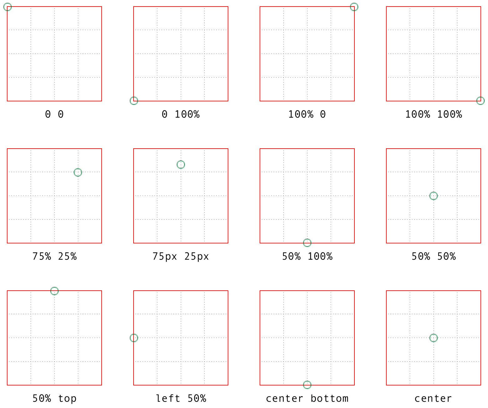
图 16-22: Various origin calculations
All right, so if you change the origin, what happens? The easiest way to visualize this is with 2D rotations. Suppose you rotate an element 45 degrees to the right. Its final placement will depend on its origin. Figure 16-23 illustrates the the effects of several different transform origins; in each case, the transform origin is marked with a circle.
如果改变原点,会发生什么?最简单的形象化方法是二维旋转。假设你把一个元素向右旋转 45 度。它的最终位置将取决于它的起源。图 16-23 说明了几种不同转换来源的影响;在每种情况下,转换原点都用圆圈标记。
The origin matters for other transform types, such as skews and scales. Scaling an element with its origin in the center will pull in all sides equally, whereas scaling an element with a bottom-right origin will cause it to shrink toward that corner. Similarly, skewing an element with respect to its center will result in the same shape as if it’s skewed with respect to the top-right corner, but the placement of the shape will be different. Some examples are shown in Figure 16-24; again, each transform origin is marked with a circle.
对于其他转换类型(如倾斜和刻度),原点很重要。将一个元素的原点缩放到中间将会对所有的边产生同样的拉力,而将一个元素的原点缩放到右下角将会导致它向那个角收缩。类似地,将一个元素相对于它的中心倾斜将导致与它相对于右上角倾斜相同的形状,但是形状的位置将不同。一些例子如图 16-24 所示;同样,每个变换原点都用一个圆标记。
The one transform type that isn’t really affected by changing the transform origin is translation. If you push an element around with translate(), or its cousins like translateX() and translateY(), it’s going to end up in the same place regardless of where the transform origin is located. If that’s all the transforming you plan to do, then setting the transform origin is irrelevant. If you ever do anything besides translating, though, the origin will matter. Use it wisely.
转换类型实际上不受转换原点更改的影响的是 translation。如果你用
translate()或者它的兄弟translateX()和translateY()来推一个元素,不管转换的原点在哪里,它都会在同一个地方结束。如果这就是您计划做的所有转换,那么设置转换原点是不相关的。如果你做过翻译以外的事情,那么源文件就很重要了。明智地使用它。
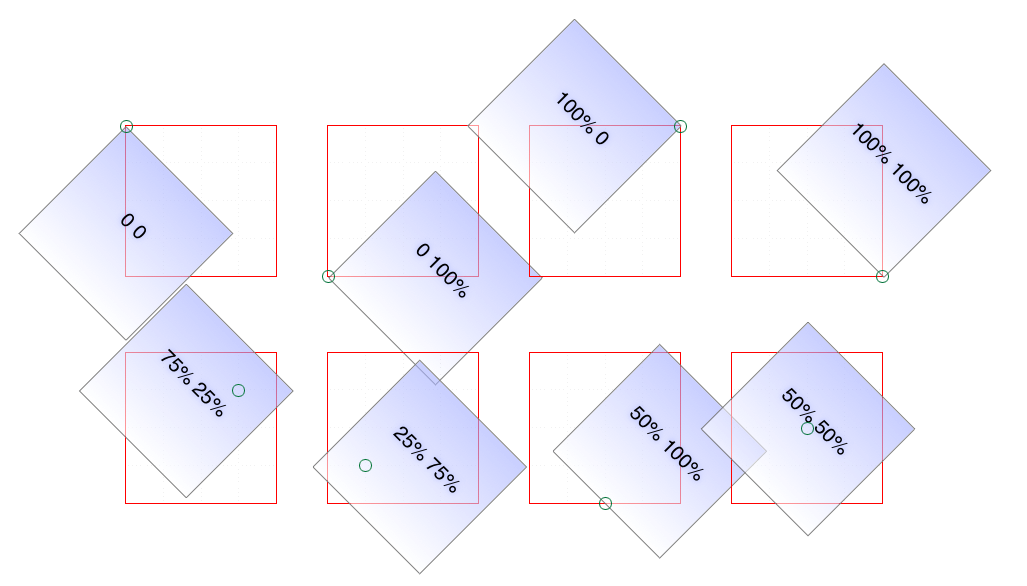
图 16-23: The rotational effects of using various transform origins
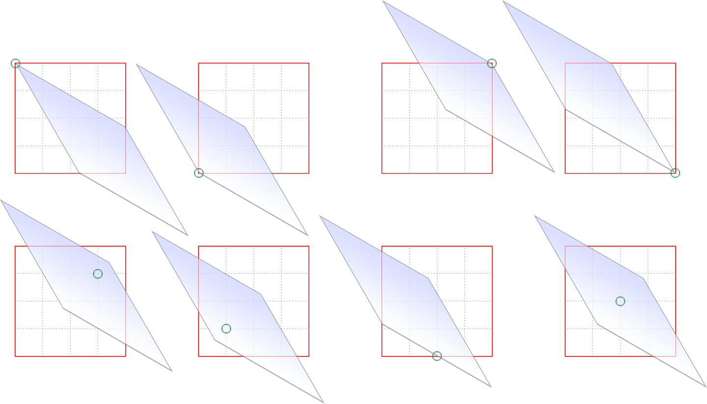
图 16-24: The skew effects of using various transform origins
16.3.2 Choosing a 3D Style
If you’re setting elements to be transformed through three dimensions—using, say, translate3d() or rotateY()—you probably expect that the elements will be presented as though they’re in a 3D space. And yet, this is not the default behavior. By default, everything looks flat no matter what you do. Fortunately, this can be overridden with the transform-style property.
如果您正在设置要通过三维空间转换的元素—例如使用
translate3d()或rotateY()—您可能希望这些元素将像在三维空间中一样显示。然而,这并不是默认的行为。默认情况下,无论你做什么,一切看起来都是平的。幸运的是,可以使用transform-style属性覆盖此属性。
Suppose you have an element you want to move “closer to” your eye, and then tiltaway a bit, with a moderate amount of perspective. Something like this rule, as applied to the following HTML:
假设您有一个元素想要“更靠近”您的眼睛,然后倾斜一点,以适当的角度。类似这样的规则,适用于以下 HTML:
div#inner {
  transform: perspective(750px) translateZ(60px) rotateX(45deg);
}<div id="outer">
outer
<div id="inner">inner</div>
</div>So you do that, and get the result shown in Figure 16-25; more or less what you might have expected.
这样就得到了如图 16-25 所示的结果;或多或少是你所期望的。
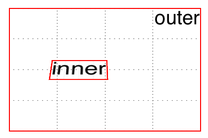
图 16-25: A 3D-transformed inner div
But then you decide to rotate the outer div to one side, and suddenly nothing makes sense any more. The inner div isn’t where you envisioned it. In fact, it just looks like a picture pasted to the front of the outer div.
但是,当您决定将外部的
div旋转到一边时,突然之间就没有任何意义了。内部的div并不是您预想的那样。事实上,它看起来就像一张粘贴到外部div前面的图片。
Well, that’s exactly what it is, because the default value of transform-style is flat. The inner div got drawn in its moved-forward-tilted-back state, and that was applied to the front of the outer div as if it was an image. So when you rotated the outer div, the flat picture rotated right along with it, as shown in Figure 16-26:
嗯,这正是它的含义,因为
transform-style的默认值是flat。内部的div以其移动-前倾-后倾的状态被绘制,它被应用到外部div的前面,就好像它是一个图像。因此,当您旋转外部div时,平面图像也随之旋转,如图 16-26 所示:
div#outer {
  transform: perspective(750px) rotateY(60deg) rotateX(-20deg);
}
div#inner {
  transform: perspective(750px) translateZ(60px) rotateX(45deg);
}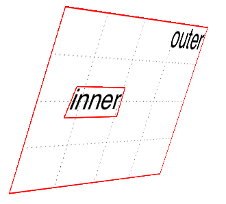
图 16-26: The effects of a flat transform style
Change the value to preserve-3d, however, and things are suddenly different. The inner div will be drawn as a full 3D object with respect to its parent outer div, floating in space nearby, and not as a picture pasted on the front of the outer div. You can see the results of this change in Figure 16-27:
然而,如果将值更改为
preserve-3d,情况就会突然发生变化。内部的div将被绘制成一个完整的 3D 对象,相对于它的父对象外部的div,它将漂浮在附近的空间中,而“not”则被粘贴在外部div的前面。您可以在图 16-27 中看到这种变化的结果:
div#outer {
  transform: perspective(750px) rotateY(60deg) rotateX(-20deg);
  transform-style: preserve-3d;
}
div#inner {
  transform: perspective(750px) translateZ(60px) rotateX(45deg);
}
One important aspect of transform-style is that it can be overridden by other properties. The reason is that some values of these other properties require a flattened presentation of an element and its children in order to work at all. In such cases, the value of transform-style is forced to be flat, regardless of what you may have declared.
transform-style的一个重要方面是它可以被其他属性覆盖。原因是,这些其他属性的一些值需要元素及其子元素的扁平表示才能正常工作。在这种情况下,不管您声明了什么,transform-style的值都被迫是flat。
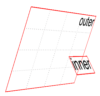
图 16-27: The effects of a 3D-preserved transform style
So, in order to avoid this overriding behavior, make sure the following properties are set to the listed values:
因此,为了避免这种覆盖行为,请确保将下列属性设置为列出的值:
- overflow: visible
- filter: none
- clip: auto
- clip-path: none
- mask-image: none
- mask-border-source: none
- mix-blend-mode: normal
Those are all the default values for those properties, so as long as you don’t try to change any of them for your preserved 3D elements, you’re fine! But if you find that editing some CSS suddenly flattens out your lovely 3D transforms, one of these properties might be the culprit.
这些都是这些属性的默认值,所以只要您不尝试对保留的 3D 元素进行任何更改,就不会有问题!但是,如果您发现编辑一些 CSS 会突然使您可爱的 3D 转换变平,那么这些属性中的一个可能就是罪魁祸首。
One more note: in addition to the values just mentioned, the value of the property isolation must be, or be computed to be, isolate. (isolation is a compositing property, in case you were wondering.)
还有一点需要注意:除了刚才提到的值之外,属性
isolation的值必须是,或者计算为isolate。(如果你想知道的话,isolation是一个复合属性。)
16.3.3 Changing Perspective
There are actually two properties that are used to define how perspective is handled: one to define the perspective distance, as with the perspective() function discussed in an earlier section; and another to define the perspective’s origin point.
实际上有两个属性用于定义如何处理透视图:一个用于定义透视图距离,如前面一节讨论的' perspective() '函数;另一个是定义透视图的原点。
Defining a group perspective
First, let’s consider the property perspective, which accepts a length that defines the depth of the perspective pyramid. At first glance, it looks just like the perspective() function discussed earlier, but there are some critical differences.
首先,让我们考虑属性
perspective,它接受一个定义了透视图金字塔深度的长度。乍一看,它看起来就像前面讨论的perspective()函数,但是有一些关键的区别。
As a quick example, if you want to create a very deep perspective, one mimicking the results you’d get from a zoom lens, you might declare something like perspective: 2500px. For a shallow depth, one that mimics a closeup fish-eye lens effect, you might declare perspective: 200px.
举个简单的例子,如果你想创建一个非常深的透视图,一个模拟你从变焦镜头中得到的结果的透视图,你可以声明类似
perspective: 2500px这样的东西。对于浅景深,一个模仿特写鱼眼镜头效果,你可以声明perspective: 200px。
So how does this differ from the perspective() function? When you use perspective(), you’re defining the perspective effect for the element that is given that function. So if you say transform: perspective(800px) rotateY(-50grad);, you’re applying that perspective to each element that has the rule applied.
那么,这与
perspective()函数有什么不同呢?当您使用perspective()时,您是在为赋予该函数的元素定义透视图效果。因此,如果您说transform: perspective(800px) rotateY(-50grad);,那么您就将该透视图应用到应用了该规则的每个元素。
With the perspective property, on the other hand, you’re creating a perspective depth that is applied to all the child elements of the element that received the property. Confused yet? Don’t be. Here’s an illustration of the difference, as shown in Figure 16-28:
另一方面,使用
perspective属性,您将创建一个应用于接收该属性的元素的所有子元素的透视图深度。困惑了吗?不要。下面是一个区别的例子,如图 16-28 所示:
div {
  transform-style: preserve-3d;
  border: 1px solid gray;
  width: 660px;
}
img {
  margin: 10px;
}
#one {
  perspective: none;
}
#one img {
  transform: perspective(800px) rotateX(-50grad);
}
#two {
  perspective: 800px;
}
#two img {
  transform: rotateX(-50grad);
}<div><img src="rsq.gif" /><img src="rsq.gif" /><img src="rsq.gif" /></div>
<div id="one">
<img src="rsq.gif" /><img src="rsq.gif" /><img src="rsq.gif" />
</div>
<div id="two">
<img src="rsq.gif" /><img src="rsq.gif" /><img src="rsq.gif" />
</div>
图 16-28: Shared perspective versus individual perspectives
In Figure 16-28, we first see a line of images that haven’t been transformed. In the second line, each image has been rotated 50 gradians (equivalent to 45 degrees) toward us, but each one within its own individual perspective.
在图 16-28 中,我们首先看到的是一行没有转换的图像。在第二行中,每张图像都向我们旋转了 50 个梯度(相当于 45 度),但是每张图像都有自己的视角。
In the third line of images, none of them has an individual perspective. Instead, they are all drawn within the perspective defined by perspective: 800px; that’s been set on the div that contains them. Since they all operate within a shared perspective, they look “correct”; that is, like we would expect if we had three physical pictures mounted on a clear sheet of glass and rotated toward us around the center horizontal axis of that glass.
在第三行图像中,没有一个是单独的视角。相反,它们都是在
perspective: 800px;定义的透视图中绘制的;perspective: 800px;是在包含它们的div上设置的。因为它们都在一个共享的视角下运行,所以看起来“正确”;也就是说,就像我们所期望的那样,如果我们把三张实体图片装在一块透明的玻璃上,然后绕着玻璃的横轴向我们旋转。
This is the critical difference between perspective, the property; and perspective(), the function. The former creates a 3D space shared by all its children. The latter affects only the element to which it’s applied. A less important difference is that the perspective() function has to come first or early in its chain of transforms in order to apply to the element as it’s transformed through 3D space. The perspective property, on the other hand, is applied to all children, regardless of where their transforms are declared.
这就是
perspective属性以及perspective()函数的关键区别。前者创建了一个所有孩子共享的 3D 空间。后者只影响应用它的元素。一个不太重要的区别是perspective()函数必须在它的转换链的前面或前面,以便在元素通过 3D 空间转换时应用它。另一方面,perspective属性应用于所有子元素,而不管它们的转换声明在哪里。
In most cases, you’re going to use the perspective property instead of the perspective() function. In fact, container divs (or other elements) are a very common feature of 3D transforms—the way they used to be for page layout—largely to establish a shared perspective. In the previous example, the <div id="two"> was there solely to serve as a perspective container, so to speak. On the other hand, we couldn’t have done what we did without it.
在大多数情况下,您将使用
perspective属性而不是perspective()函数。实际上,容器 div(或其他元素)是 3D 转换的一个非常常见的特性(它们曾经用于页面布局),主要用于建立一个共享的透视图。在前面的示例中,<div id="two">只是用作一个透视图容器。另一方面,如果没有它,我们不可能完成我们所做的事情。
Moving the perspective’s origin
When transforming elements in three dimensions—assuming you’ve allowed them to appear three-dimensional, that is—a perspective will be used. (See transform-style and perspective, respectively, in previous sections.) That perspective will have an origin, which is also known as the vanishing point, and you can change where it’s loca‐ted with the property perspective-origin.
As you may have spotted, perspective-origin and transform-origin have the same value syntax, right down to allowing an optional length value defining an offset along the z-axis. While the way the values are expressed is identical, the effects they have are very different. With transform-origin, you define the point around which transforms happen. With perspective-origin, you define the point on which sight lines converge.
正如您可能已经注意到的,
perspective-origin和transform-origin具有相同的值语法,甚至允许一个可选的长度值定义沿 z 轴的偏移量。虽然这些值的表达方式是相同的,但它们所产生的影响是非常不同的。使用transform-origin,您可以定义转换发生的点。在perspective-origin中,你定义了视线汇聚的点。
As with most 3D transform properties, this is more easily demonstrated than described. Consider the following CSS and markup, illustrated in Figure 16-29:
与大多数 3D 转换属性一样,这更容易演示而不是描述。考虑下面的 CSS 和标记,如图 16-29 所示:
#container {
  perspective: 850px;
  perspective-origin: 50% 0%;
}
#ruler {
  height: 50px;
  background: #ded url(tick.gif) repeat-x;
  transform: rotateX(60deg);
  transform-origin: 50% 100%;
}<div id="container">
<div id="ruler"></div>
</div>
图 16-29: A basic “ruler”
What we have is a repeated background image of tick-marks on a ruler, with the div that contains them tiled away from us by 60 degrees. All the lines point at a common vanishing point, the top center of the container div (because of the 50% 0% value for perspective-origin).
我们看到的是标尺上重复出现的标记的背景图像,其中的
div将它们平铺到离我们 60 度远的地方。所有的线条都指向一个共同的消失点,即容器div的顶部中心(因为perspective-origin的50% 0%值)。
Now consider that same setup with various perspective origins, as shown in Figure 16-30.
现在考虑具有不同透视图起源的相同设置,如图 16-30 所示。
图 16-30: A basic “ruler” with different perspective origins
As you can see, moving the perspective origin changes the rendering of the 3Dtransformed element.
正如您所看到的,移动透视图原点会改变 3dtransform 元素的呈现。
Note that these only had an effect because we supplied a value for perspective. If the value of perspective is ever the default none, then any value given for perspective-origin will be ignored. That makes sense, since you can’t have a perspective origin when there’s no perspective at all!
注意,这些只有在我们为
perspective提供了一个值时才有效果。如果perspective的值总是默认的none,那么perspective-origin的任何值都将被忽略。这是有道理的,因为当根本没有透视图时,就不可能有透视图原点!
16.3.4 Dealing with Backfaces
Something you probably never really thought about, over all the years you’ve been laying out elements, was: what would it look like if I could see the back side of the element? Now that 3D transforms are a possibility, there may well come a day when you do see the back side of an element. You might even mean to do so intentionally. What happens at that moment is determined by the property backface-visibility.
你可能从来没有想过,这么多年来你一直在设计元素,如果我能看到元素的背面会是什么样子?既然 3D 变换是可能的,那么很可能有一天你会看到元素的背面。你甚至可能故意这么做。在那一刻发生的事情是由
backface-visibility属性决定的。
Unlike many of the other properties and functions we’ve already talked about, this one is pretty uncomplicated. All it does is determine whether the back side of an element is rendered when it’s facing toward the viewer, or not. That’s it.
与我们已经讨论过的其他属性和函数不同,这个非常简单。它所做的就是确定元素的背面是否在面向查看器时呈现。就是这样。
So let’s say you flip over two elements, one with backface-visibility set to the default value of visible and the other set to hidden. You get the result shown in Figure 16-31:
假设你翻转两个元素,一个是
backface-visibility设置为visible的默认值,另一个设置为hidden。结果如图 16-31 所示:
span {
  border: 1px solid red;
  display: inline-block;
}
img {
  vertical-align: bottom;
}
img.flip {
  transform: rotateX(180deg);
  display: inline-block;
}
img#show {
  backface-visibility: visible;
}
img#hide {
  backface-visibility: hidden;
}<span><img src="salmon.gif" /></span>
<span><img src="salmon.gif" class="flip" id="show" /></span>
<span><img src="salmon.gif" class="flip" id="hide" /></span>
图 16-31: Visible and hidden backfaces
As you can see, the first image is unchanged. The second is flipped over around its xaxis, so we see it from the back. The third has also been flipped, but we can’t see it at all because its backface has been hidden.
如你所见,第一张图片没有改变。第二个绕 x 轴翻转,所以我们从后面看。第三个也翻转了,但我们根本看不见,因为它的背面被隐藏了。
This property can come in handy in a number of situations. The simplest is a case where you have two elements that represent the two sides of a UI element that flips over; say, a search area with preference settings on its back, or a photo with some information on the back. Let’s take the latter case. The CSS and markup might look something like this:
这个属性在很多情况下都可以派上用场。最简单的情况是,你有两个元素代表翻转过来的 UI 元素的两边;比如,一个带有偏好设置的搜索区域,或者一张带有一些信息的照片。让我们以后一种情况为例。CSS 和标记可能看起来像这样:
section {
  position: relative;
}
img,
div {
  position: absolute;
  top: 0;
  left: 0;
  backface-visibility: hidden;
}
div {
  transform: rotateY(180deg);
}
section:hover {
  transform: rotateY(180deg);
  transform-style: preserve-3d;
}<section>
<img src="photo.jpg" alt="" />
<div class="info">(…info goes here…)</div>
</section>Actually, this example shows that using backface-visibility isn’t quite as simple as it first appears. It’s not that the property itself is complicated, but if you forget to set transform-style to preserve-3d, then it won’t work as intended. That’s why transform-style is set on the section element.
实际上,这个例子表明使用
backface-visibility并不像它第一次出现时那么简单。这并不是说这个属性本身很复杂,而是如果你忘记将transform-style设置为preserve-3d,那么它将无法正常工作。这就是为什么section元素上设置了transform-style。
There’s a variant of this example that uses the same markup, but a slightly different CSS to show the image’s backface when it’s flipped over. This is probably more what was intended, since it makes information look like it’s literally written on the back of the image. It leads to the end result shown in Figure 16-32:
本例中有一个变体使用了相同的标记,但是在图像翻转时使用了稍微不同的 CSS 来显示图像的背面。这可能是更多的意图,因为它使信息看起来就像字面上写在图像的背面。最终结果如图 16-32 所示:
section {
  position: relative;
}
img,
div {
  position: absolute;
  top: 0;
  left: 0;
}
div {
  transform: rotateY(180deg);
  backface-visibility: hidden;
  background: rgba(255, 255, 255, 0.85);
}
section:hover {
  transform: rotateY(180deg);
  transform-style: preserve-3d;
}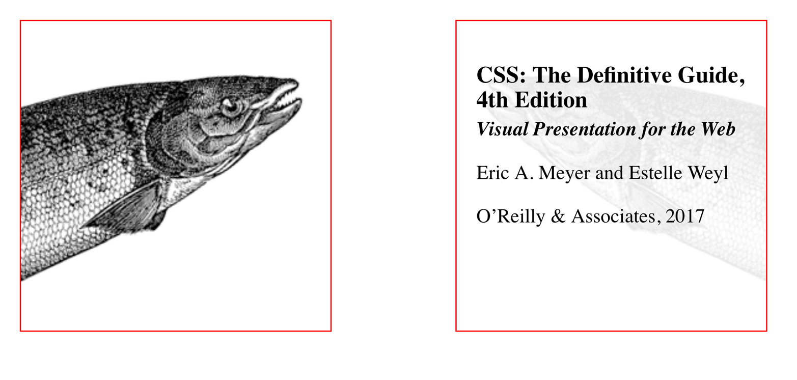
图 16-32: Photo on the front, information on the back
The only thing we had to do to make that happen was to just shift the backface-visibilty: hidden to the div instead of applying it to both the img and the div. Thus, the div’s backface is hidden when it’s flipped over, but that of the image is not.
我们唯一需要做的就是将
backface-visibilty: hidden转换为div,而不是同时应用于img和div。因此,div的后表面在翻转时是隐藏的,而图像的后表面则不是。
16.4 Summary
With the ability to transform elements in two- and three-dimensional space, CSS transforms provide a great deal of power to designers who are looking for new ways to present information. From creating interesting combinations of 2D transforms, to creating a fully 3D-acting interface, transforms open up a great deal of new territory in the design space. There are some interesting dependencies between properties, which is something that not every CSS author will find natural at first, but they become second nature with just a bit of practice.
通过在二维和三维空间中转换元素的能力,CSS 转换为正在寻找新方法来表示信息的设计师提供了大量的功能。从创建有趣的 2D 变换组合,到创建一个完整的 3d 操作界面,变换在设计空间中开辟了大量的新领域。属性之间有一些有趣的依赖关系,这并不是每个 CSS 作者一开始都会发现的,但是经过一些实践,它们就变成了第二天性。