第 17 章 过渡 Transitions
第 17 章 过渡 Transitions
CSS transitions allow us to animate CSS properties from an original value to a new value over time when a property value changes. These transition an element from one state to another, in response to some change—usually a user interaction, but it can also be due to the scripted change of class, ID, or other state.
CSS 过渡属性允许我们在属性值发生改变时,在原始值和新值之间添加动画。这些元素从一种状态转换到另一种状态。以相应某些更改。——通常是用户交互,但也可能是脚本引起的元素的类属性,ID,或是其他状态的更改。
Normally, when a CSS property value changes—when a “style change event” occurs-the change is instantaneous. The new property value replaces the old property in the milliseconds it takes to repaint, or reflow and repaint when necessary, the affected content. Most value changes seem instantaneous, taking less than 16 milliseconds to render. Even if the changes takes longer, it is still a single step from one value to the next. For example, when changing a background color on mouse hover, the background changes from one color to the next, with no gradual transition.
通常,在一个 CSS 属性发生改变(发生“样式更改事件”)时,变化是一瞬间完成的。新属性值在几毫秒内替换旧属性值,并重新绘制——必要时重新排版并重新绘制——受影响的内容。大多数值的改变是瞬时的,渲染时间不到 16 毫秒,即使花费的时间更长,也只是一步就完成了从旧值到新值的改变。例如在鼠标悬停更改背景颜色时,背景会从一个颜色更改到另一个颜色,而不会逐渐过渡。
17.1 CSS 过渡 CSS Transitions
CSS transitions provide a way to control how a property changes from one value to the next over a period of time. Thus, we can make the property values change gradually, creating pleasant and (hopefully) unobtrusive effects. For example:
CSS 过渡提供了一种方法来控制属性在一段时间内如何从一个值更改到下一个值。这样我们就可以使属性值逐渐变化,创造令人愉悦的(希望如此)不引人注目的效果。例如:
button {
  color: magenta;
  transition: color 200ms ease-in 50ms;
}
button:hover {
  color: rebeccapurple;
  transition: color 200ms ease-out 50ms;
}
In this example, instead of instantaneously changing a button’s color value on hover, with CSS transitions the button can be set to gradually fade from magenta to rebecca purple over 200 milliseconds, even adding a 50-millisecond delay before transitioning. Changing the color, no matter how long or short a time it takes, is a transition. But by adding the CSS transition property, the color change can happen gradually over a period of time and be perceivable by the human eye.
在这个例子中,将鼠标悬停在按钮上,按钮的颜色并不会立即改变,而是在 CSS 的过渡下,按钮的颜色在 200 毫秒内从品红色逐渐渐变为丽贝卡紫色,甚至在过渡开始前还有 50 毫秒的延迟。只要改变了颜色属性,不管设置了多长的时间,都会产生过渡。通过添加 CSS 的 transition 属性,颜色的变化可以在一段时间内逐渐发生,并被人眼所感知。
You can use CSS transitions today, even if you still support IE9 or older browsers. When a browser doesn’t support CSS transition properties, the change is immediate instead of gradual, which is completely fine. If the property or property values specified aren’t animatable, again, the change will be immediate instead of gradual.
即使你仍然支持 IE9 或更旧的浏览器,现在也可以使用 CSS 过渡。当浏览器不支持 CSS transition 属性时,变化是即时的而不是渐进的,这是完全可以的。如果指定的属性或属性值不能动画化,则更改也是即时的,而不是渐进的。

When we say “animatable,” we mean any properties that can be animated, whether through transitions or animations (the subject of the next chapter, “Animations.”) See Appendix A for a summary.
当我们说 "animatable" 时,我们指的是任何可以被动画化的属性,无论是通过过渡(transitions)还是动画(animations,下一章的主题),参见附录 A 的摘要。
Sometimes you want instantaneous value changes. Though we used link colors as an example in the preceding section, link colors usually change instantly on hover, informing sighted users an interaction is occurring and that the hovered content is a link. Similarly, options in an autocomplete listbox shouldn’t fade in: you want the options to appear instantly, rather than fade in more slowly than the user types. Instantaneous value changes are often the best user experience.
有时候你可能需要让属性的值瞬时更改。虽然我们在前面的小节中使用了链接颜色作为例子,但链接颜色通常在悬停时立即更改,以通知有视力的用户正在进行交互,而且悬停的内容是一个链接。同样,自动填充(补全)列表中的选项也不应该淡入,因为你希望选项立即出现,而且不应该在用户输入后缓慢淡入。瞬时值变化通常是最佳的用户体验。
(注:在
<input>元素中有一个 autocomplete 属性,提交表单之后再填写信息可以提示之前的输入)
At other times, you might want to make a property value change more gradually, bringing attention to what is occurring. For example, you may want to make a card game more realistic by taking 200 milliseconds to animate the flipping of a card, as the user may not realize what happened if there is no animation.
在其他时候,你可能希望属性值能够产生渐变,让人们意识到正在发生的事情。例如,你可能希望通过 200 毫秒的纸牌翻转动画 ,来使你的纸牌游戏更加逼真,如果没有动画用户可能意识不到发生了什么。

Look for the Play symbol to know when an online example is available. All of the examples in this chapter can be found at https://meyerweb.github.io/csstdg4figs/17-transitions/.
想知道在线例子在什么时候可用,留意一下”播放“符号。本章节的所有例子可以在这找到:https://meyerweb.github.io/csstdg4figs/17-transitions
As another example, you may want some drop-down menus to expand or become visible over 200 milliseconds (instead of instantly, which may be jarring). With transitions, you can make a drop-down menu appear slowly. In Figure 17-1 , we transition the submenu’s height by making a scale transform. This is a common use for CSS transitions, which we will also explore later in this chapter.
再举一个例子,你可能希望下拉菜单在 200 毫秒内展开或显示(而不是立即显示,这可能会令人不快)。通过过渡,你可以让下拉菜单缓慢出现。在图 17-1 中,我们通过缩放变换来为子项的高度进行过渡。这是 CSS 过渡的常见用法,我们将在本章后面讨论。
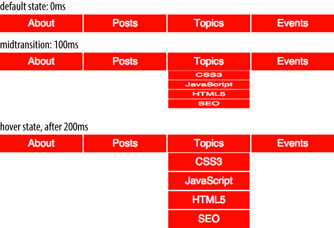
图 17-1: Transition initial, midtransition, and final state
17.2 Transition 属性 Transition Properties
In CSS, transitions are written using four transition properties: transition-property, transition-duration, transition-timing-function, and transition-delay, along with the transition property as a shorthand for the four longhand properties.
在 CSS 中,使用四个属性(
transition-property,transition-duration,transition-timing-function,transition-delay)以及一个transition属性(作为前面四个属性的简写形式)来使用过渡。
To create the drop-down navigation from Figure 17-1, we used all four CSS transition properties, in addition to non-transform properties defining the beginning and end states of the transition. The following code could define the transition for the example illustrated in Figure 17-1:
为了创建图 17-1 中的下拉菜单,我们使用了所有四个 CSS translation 属性,以及以及过渡开始状态和结束状态的非转换(no-transforms)属性。下列的代码展示了图 17-1 实现的过渡。
nav li ul {
  transition-property: transform;
  transition-duration: 200ms;
  transition-timing-function: ease-in;
  transition-delay: 50ms;
  transform: scale(1, 0);
  transform-origin: top center;
}
nav li:hover ul {
  transform: scale(1, 1);
}
Note that while we are using the :hover state for the style change event in our transition examples, you can transition properties in other scenarios too. For example, you might add or remove a class, or otherwise change the state—say, by changing an input from :invalid to :valid or from :checked to :not(:checked). Or you might append a table row at the end of a zebra-striped table or list item at the end of a list with styles based on :nth-last-of-type selectors.
注意到在示例里,我们使用
:hover来更改样式(为属性的变化生成过渡),但是你也可以在其他情况下使用过渡属性。比如,可以添加或者删除一个 class 属性,或是将<input>元素从:invalid更改为:vailid(或从:checked更改为:not(:checked)。或者,你可以使用基于:nth-last-of-type选择器的样式将一行添加到斑马条纹的表(或是一个列表)的末尾。
In the scenario pictured in Figure 17-1, the initial state of the nested lists is transform: scale(1, 0) with a transform-origin: top center. The final state istransform: scale(1, 1): the transform-origin remains the same.
在图 17-1 中所示的场景中,嵌套列表的初始状态为 transform:scale(1,0),其转换原点为:top center。 最终状态为 transform:scale(1,1),transform-origin 保持不变。
For more information on transform properties, see Chapter 16.
更多关于 transform 属性的内容,参见第 16 章。
In this example, the transition properties define a transition on the transform property: when the new transform value is set on hover, the nested unordered list scales to its original, default size, changing smoothly between the old value of transform: scale(1, 0) and the new value of transform: scale(1, 1), all over a period of 200 milliseconds. This transition starts after a 50-millisecond delay, and “eases in,” proceeding slowly at first, then picking up speed as it progresses.
在这个例子中,transition 属性定义了 transform 属性的一个过渡,当鼠标悬浮在菜单项时,transform 属性被设置成新的值。在执行过渡的 200 毫秒内,嵌套的无序列表缩放到了原来默认的大小,transform 属性也从原来的 scale(1, 0) 平滑过渡 scale(1, 1)。整个过渡在 50 毫秒的延迟后开始,然后”缓入“,首先缓慢进行,然后开始加快速度。
Transitions are declared along with the regular styles on an element. Whenever a target property changes, if a transition is set on that property, the browser will apply a transition to make the change gradual.
元素的 translation 属性了其他常规的样式一起声明。每当目标属性更改时,如果这个属性上设置了 translation,浏览器将为属性的改变生成过渡,使属性的值得以逐渐变化。
Note that all the transition properties were set for the unhovered state of the ul elements. The hovered state was only used to change the transform, not the transition. There’s a very good reason for this: it means not only that the menus will slide open when hovered, but will slide closed when the hover state ends.
注意,所有的 translation 属性都是在 ul 元素没有被 :hover 状态下设置的,:hover 状态下仅仅只是对 transform 属性做了更改,没有改变 transition 属性。有一个很好的理由,这不仅意味着菜单在悬停时滑动打开,而且会在悬停结束时滑动关闭。
Imagine if the transition properties were applied via the hover state instead, like this:
想象一下,如果 translation 属性是通过悬停状态来设置的,就像这样:
nav li ul {
  transform: scale(1, 0);
  transform-origin: top center;
}
nav li:hover ul {
  transition-property: transform;
  transition-duration: 200ms;
  transition-timing-function: ease-in;
  transition-delay: 50ms;
  transform: scale(1, 1);
}
That would mean that when not hovered, the element would have default transition values—which is to say, instantaneous transitions. That means the menus in our previous example would slide open on hover, but instantly disappear when the hover state ends—because without being in hover, the transition properties would no longer apply!
这意味着当元素没有鼠标悬停时,它将会保持原有的过渡方式,一下子完成过渡。之前的菜单在鼠标悬停时将会滑动展开,但是在悬停状态结束时,菜单会立即消失——因为在没有悬停状态的情况下,transition 属性将不再适用。
It might be that you want exactly this effect: slide smoothly open, but instantly disappear. If so, then apply the transitions to the hover state. Otherwise, apply them to the element directly so that the transitions will apply as the hover state is both entered and exited. When the state change is exited, the transition timing is reversed. You can override this default reverse transition by declaring different transitions in both the initial and changed states.
这可能正是你想要的效果:菜单滑动展开,但立即消失。如果是,那么将 transition 属性应用到悬停状态。否则,将它们直接应用与元素,以便在进入和退出悬停状态时应用过渡。退出更改后的状态(回到原来的状态)时,会倒着进行之前的过渡。你可以在初始状态和更改后的状态中声明不同的 transition 属性,来覆盖默认的反转过渡。
By “initial state,” we mean a state that matches the element on page load. This could be a state that the element always has, such as properties set on an element selector versus a :hover state for that element. It could mean a content-editable element that could get :focus, as in the following:
所谓“初始状态”,我们指的是,在页面加载时元素匹配到,并始终处于的状态。比如在元素选择器里的属性算是“初始状态”,而:hover 里的属性不是。可以体会下面的代码,一个可以内容可编辑,可以处于 :focus 状态的元素:
/* selector that matches elements all the time */
p[contenteditable] {
  background-color: rgba(0, 0, 0, 0);
}
/* selector that matches elements some of the time */
p[contenteditable]:focus {
  /* overriding declaration */
  background-color: rgba(0, 0, 0, 0.1);
}
In this example, the fully transparent background is always the initial state, only changing when the user gives the element focus. This is what we mean when we say initial or default value throughout this chapter. The transition properties included in the selector that matches the element all the time will impact that element whenever the state changes, whether it is from the initial state to the changed state (being focused, in the preceding example).
在这个例子中,完全透明的背景始终是“初始状态”,只有用户给予元素焦点时才会改变,这就是我们在本章说的初始值或默认值。无论是从“初始状态”到“更改后的状态”(前面的例子是元素被 focus ),只要元素的状态发生改变,一直影响元素的选择器里面的 transition 属性都会生效。
An initial state could also be a temporary state that may change, such as a :checked checkbox or a :valid form control, or even a class that gets toggled on and off:
”初始状态“也可能是一个可能改变的临时状态,例如处于
:checked的复选框,或是一个处于:valid的表单控件,甚至是一个在 on 和 off 之间切换的一个类。
/* selector that matches elements some of the time */
input:valid {
  border-color: green;
}
/* selector that matches elements some of the time,
 when the prior selector does NOT match. */
input:invalid {
  border-color: red;
}
/* selector that matches elements some of the time,
 whether the input is valid or invalid */
input:focus {
  /* alternative declaration */
  border-color: yellow;
}
In this example, either the :valid or :invalid selector can match any given element, but never both. The :focus selector, as shown in Figure 17-2, matches whenever an input has focus, regardless of whether the input is matching the :valid or :invalid selector simultaneously.
在本例中,任何给定的元素都可以匹配到
:valid选择器 或:invalid选择器,但是不能同时匹配到两个选择器。如图 17-2 无论 input 元素是否匹配:invalid或:valid选择器,:focus选择器都会在 input 元素具有焦点时进匹配。
In this case, when we refer to the initial state, we are referring to the original value, which could be either :valid or :invalid. The changed state for a given element the opposite of the initial :valid or :invalid state.
在本例中,我们说“初始状态”,其实是指元素的初始值,这里指
:valid或:invalid选择器。而“更改后的状态”指的是给定元素:invalid或:invalid以外的选择器(这里是 :focus 选择器)。
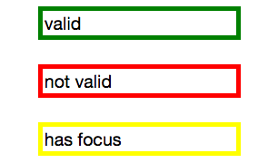
图 17-2: The input’s appearance in the valid, invalid, and focused states
Remember, you can apply different transition values to the initial and changed states, but you always want to apply the value used when you enter a given state. Take the following code as an example, where the transitions are set up to have menus slide open over 2 seconds but close in just 200 milliseconds:
请记住,你可以为初始状态和更改后的状态使用不同的过渡,但你可能希望在进入一个给定状态时,使用之前的值。下面的示例代码展示了一个在两秒内展开,却在 200ms 内关闭的菜单。
nav li ul {
  transition-property: transform;
  transition-duration: 200ms;
  transition-timing-function: ease-in;
  transition-delay: 50ms;
  transform: scale(1, 0);
  transform-origin: top center;
}
nav li:hover ul {
  transition-property: transform;
  transition-duration: 2s;
  transition-timing-function: linear;
  transition-delay: 1s;
  transform: scale(1, 1);
}
This provides a horrible user experience, but it nicely illustrates the point. When hovered over, the opening of the navigation takes a full 2 seconds. When closing, it quickly closes over 0.2 seconds. The transition properties in the changed, or hover, state are in force when hovering over the list item. Thus, the transition-duration: 2s defined for the hover state takes effect. When a menu is no longer hovered over, it returns to the default scaled-down state, and the transition properties of the initial state—the nav li ul condition—are used, causing the menu to take 200ms to close.
这提供了糟糕的用户体验,但很好地说明了这一点。在鼠标悬停时,打开菜单需要整整两秒,却在 0.2 秒内快速关闭。在鼠标悬停在列表上时,处于更改后的状态(或 hover 状态)中的 transition 属性生效,因此,过渡时间为两秒。当菜单不在悬停状态时,它将回到默认缩小的状态,并使用初始状态(nav li ui 选择器)里的 transition 属性,在 200ms 内关闭菜单。
Look more closely at the example, specifically the default transition styles. When the user stops hovering over the parent navigational element or the child drop-down menu, the drop-down menu delays 50 milliseconds before starting the 200ms transition to close. This is actually a decent user experience style, because it give users a chance (however brief) to get the mouse point back over a menu before it starts closing.
仔细查看这个示例,特别是默认的 transition 样式。当用户不再将鼠标悬停在导航元素或下拉菜单上时,下拉菜单在 200ms 的过渡之前延迟了 50ms。这个样式实际上提供了一种不错的用户体验,因为它给用户一个机会(无论多么短暂),在菜单开始关闭之前,让鼠标点回到菜单上。
While the four transition properties can be declared separately, you will probably always use the shorthand. We’ll take a look at the four properties individually first so you have a good understanding of what each one does.
虽然四个 transition 属性可以单独声明,但你可能总是使用简写。我们先来分别看看这四个属性,这样你就能很好地理解每个属性的作用。
17.2.1 按属性限制过渡效果 Limiting Transition Effects by Property
The transition-property property specifies the names of the CSS properties you want to transition. This allows you to limit the transition to only certain properties, while having other properties change instantaneously. And, yes, it’s weird to say “the transition-property property.”
transition-property属性指定了你想要使用过渡效果的 CSS 属性名。这样你就可以将过渡限制在某些属性上,让其他属性立即完成变化,虽然说”过渡-属性 属性“很奇怪。
The value of transition-property is a comma-separated list of properties; the keyword none if you want no properties transitioned; or the default all, which means “transition all the animatable properties.” You can also include the keyword all within a comma-separated list of properties.
transition-property属性的值一个逗号分隔的属性列表。属性值 none 表示没有属性需要进行过渡,而属性值 all 表示对所有属性都进行过渡。你还可以将 all 包含在以逗号分隔的属性列表中。
If you include all as the only keyword—or default to all—all animatable properties will transition in unison. Let’s say you want to change a box’s appearance on hover:
如果你只是将 all 作为属性值——或是没有指定 transition-property 属性,这时候 all 将作为这个属性的默认值——所有可以动画化的属性将一起产生过渡。假设你想在悬停时改变一个盒元素的外观:
div {
  color: #ff0000;
  border: 1px solid #00ff00;
  border-radius: 0;
  transform: scale(1) rotate(0deg);
  opacity: 1;
  box-shadow: 3px 3px rgba(0, 0, 0, 0.1);
  width: 50px;
  padding: 100px;
}
div:hover {
  color: #000000;
  border: 5px dashed #000000;
  border-radius: 50%;
  transform: scale(2) rotate(-10deg);
  opacity: 0.5;
  box-shadow: -3px -3px rgba(255, 0, 0, 0.5);
  width: 100px;
  padding: 20px;
}
When the mouse pointer hovers over the div, every property that has a different value in the initial state versus the hovered (changed) state will change to the hoverstate values. The transition-property property is used to define which of those properties are animated over time (versus instantly). All the properties change from the default value to the hovered value on hover, but only the animatable properties included in the transition-property transition over the transition’s duration. Nonanimatable properties like border-style change from one value to the next instantly.
在鼠标指针悬浮在 div 元素上时,在初始状态和悬停状态(更改后的状态)值不同的属性,其值都会变成悬停状态的值。transition-property 属性用来指定在这段时间内,哪些属性在变化时产生动画(没被指定的属性则立即变化)。所有的属性值都会从默认值变化到悬停状态的值,但是只有在 transition-property 中,并且能够产生动画的属性,才会在这个过程中产生过渡。不能产生动画的属性——比如 border-style 属性——将会从一个值”瞬间“变成另一个值。
If all is the only value or the last value in the comma-separated value for transition-property, then all the animatable properties will transition in unison. Otherwise, provide a comma-separated list of properties to be affected by the transition properties.
如果
transition-property属性中带逗号的列表中只有 all 一个值,或者 all 作为最后一个值,那么所有可以产生动画的属性将一起完成过渡。否则,你得提供一个逗号分隔的属性列表,这些属性将会受到 transition 属性的影响。
Thus, if we want to transition all the properties, the following statements are almost equivalent:
因此,如果我们想要过渡所有的属性,下面的语句几乎是等价的:
div {
  color: #ff0000;
  border: 1px solid #00ff00;
  border-radius: 0;
  transform: scale(1) rotate(0deg);
  opacity: 1;
  box-shadow: 3px 3px rgba(0, 0, 0, 0.1);
  width: 50px;
  padding: 100px;
  transition-property: color, border, border-radius, transform, opacity,
    box-shadow, width, padding;
  transition-duration: 1s;
}
div {
  color: #ff0000;
  border: 1px solid #00ff00;
  border-radius: 0;
  transform: scale(1) rotate(0deg);
  opacity: 1;
  box-shadow: 3px 3px rgba(0, 0, 0, 0.1);
  width: 50px;
  padding: 100px;
  transition-property: all;
  transition-duration: 1s;
}
Both transition-property property declarations will transition all the properties listed—but the former will transition only the eight properties that may change, based on property declarations that may be included in other rule blocks. Those eight property values are included in the same rule block, but they don’t have to be.
两个
transition-property都会过渡属性值里列出的属性——但前者将基于其他规则块中可能包含的属性声明,仅过渡可能更改的八个属性。这八个属性包含在同一规则快中,但不一定必须包含。
The transition-property: all in the latter rule ensures that all animatable property values that would change based on any style change event—no matter which CSS rule block includes the changed property value—transitions over one second. The transition applies to all animatable properties of all elements matched by the selector, not just the properties declared in the same style block as the all.
第二个 CSS 规则中的
transition-property属性设置成了 all,确保了在任何样式更改事件下,只要可以属性可以生成动画,无论更改后的属性值位于哪个 CSS 规则块里,都会在一秒内进行过渡。所有被选择器匹配到的元素里,能够产生动画的元素都会进行过渡,而不仅仅是在同一个语句块中声明的属性。
In this case, the first version limits the transition to only the eight properties listed, but enables us to provide more control over how each property will transition. Declaring the properties individually lets us provide different speeds, delays, and/or durations to each property’s transition if we declared those transition properties separately:
在本例中,第一个版本将过渡限制在列出的八个属性上,但也允许我们对每一个属性的过渡进行更精细的控制。如果我们在 transition-property 里分别声明这些属性,我们可以为每个属性的过渡设置不同的速度、延迟、或持续时间:
div {
  color: #ff0000;
  border: 1px solid #0f0;
  border-radius: 0;
  transform: scale(1) rotate(0deg);
  opacity: 1;
  box-shadow: 3px 3px rgba(0, 0, 0, 0.1);
  width: 50px;
  padding: 100px;
}
.foo {
  color: #00ff00;
  transition-property: color, border, border-radius, transform, opacity,
    box-shadow, width, padding;
  transition-duration: 1s;
}<div class="foo">Hello</div>If you want to define the transitions for each property separately, write them all out, separating each of the properties with a comma. If you want to animate almost all the properties at the same time, delay, and pace, with a few exceptions, you can use a combination of all and the individual properties you want to transition at different times, speeds, or pace. Make sure to use all as the first value:
如果你想要单独定义每个属性的过渡,请将它们全部写出来,用逗号分隔每一个属性。如果你想要让绝大多数属性在动画时,使用相同的时间、延迟和速度,又想要有少数例外,你可以将 all 和那些想要不同时间、延迟和速度过渡的属性写在一个用逗号分隔的列表里,并确保 all 作为第一个值。
div {
  color: #f00;
  border: 1px solid #00ff00;
  border-radius: 0;
  transform: scale(1) rotate(0deg);
  opacity: 1;
  box-shadow: 3px 3px rgba(0, 0, 0, 0.1);
  width: 50px;
  padding: 100px;
  transition-property: all, border-radius, opacity;
  transition-duration: 1s, 2s, 3s;
}
The all part of the comma-separated value includes all the properties listed in the example, as well as all the inherited CSS properties, and all the properties defined in any other CSS rule block matching or inherited by the element.
在逗号分隔的列表中的 all 包括了示例中列出来的所有属性,以及所有继承的 CSS 属性,以及在其他任何 CSS 规则块中与元素匹配的属性,或者继承的 CSS 规则块中定义的属性。
In the preceding example, all the properties getting new values will transition at the same duration, delay, and timing function, with the exception of border-radius and opacity, which we’ve explicitly included separately. Because we included them as part of a comma-separated list after the all, we can transition them at the the same time, delay, and timing function as all the other properties, or we can provide different times, delays, and timing functions for these two properties. In this case, we transition all the properties over one second, except for border-radius and opacity, which we transition over two seconds and three seconds respectively. (transition-duration is covered in an upcoming section.)
在前面的示例中,所有变成新值的属性将以相同的时间、延迟和时间函数进行过渡,除了我们明确指定的 border-radiu 和 opacity 属性。因为我们在 all 之后把它们作为逗号分隔列表的一部分,所以我们可以让这两个属性和其他属性一起,以相同的方式过渡,或是指定不同的时间、延迟和时间函数。在这里例子里,我们让所有属性在一秒内完成过渡,除了 border-radiu 和 opacity,它们的过渡时间分别是两秒和三秒。(transition-duration 将在下一节讨论)
Make sure to use all as the first value in your comma-separated value list, as the properties declared before the all will be included in the all, overriding any other transition property values you intended to apply to those now overridden properties.
确保将 all 作为逗号分隔列表里的第一个值,因为在 all 之前定义的属性将会包含在 all 中,覆盖掉那些你打算更改过渡值的属性。
通过属性限制抑制过渡 Suppressing transitions via property limits
While transitioning over time doesn’t happen by default, if you do include a CSS transition and want to override that transition in a particular scenario, you can set transition-property: none to override the entire transition and ensure no properties are transitioned.
The none keyword can only be used as a unique value of the property—you can’t include it as part of a comma-separated list of properties. If you want to override the transition of a limited set of properties, you will have to list all of the properties you still want to transition. You can’t use the transition-property property to exclude properties; rather, you can only use that property to include them.
none 关键字只能作为 transition-property 属性的唯一值,不能将其作为逗号分隔列表的一部分。如果你想覆盖一组有限的属性的过渡,就不得不列出所有想要应用过渡的属性。不能使用 transition-property 属性来排除属性,相反,只能用于包含它们。
Another method would be to set the delay and duration of the property to 0s. That way it will appear instantaneously, as if no CSS transition is being applied to it.
另一种方法是将属性的延迟和持续时间都设为 0,这样它会立即出现,就像没有应用 CSS 过渡属性一样。
过渡事件 Transition events
In the DOM, a transitionend event if fired at the end of every transition, in either direction, for every property that is transitioned over any amount of time or after any delay. This happens whether the property is declared individually or is part of the all declaration. For some seemingly single property declarations, there will be several transitionend events, as every animatable property within a shorthand property gets its own transitionend event. Consider:
在 DOM 中,
transitionend事件会在每次过渡结束触发,无论元素属性发生过渡的方向,过渡持续或延迟的时间长短。无论属性是单独声明,还是作为 all 声明的一部分,都会触发事件。一些看似是一个声明的属性,其实会触发多个transitionend事件,因为简写属性中每一个可以产生动画的属性,都会有自己的transitionend事件。考虑下面的代码:
div {
  color: #f00;
  border: 1px solid #00ff00;
  border-radius: 0;
  transform: scale(1) rotate(0deg);
  opacity: 1;
  box-shadow: 3px 3px rgba(0, 0, 0, 0.1);
  width: 50px;
  padding: 100px;
  transition-property: all, border-radius, opacity;
  transition-duration: 1s, 2s, 3s;
}
When the transitions conclude, there will be well over eight transitionend events. For example, the border-radius transition alone produces four transitionend events, one each for:
在过渡结束时,将触发 8 个以上的 transitionend 事件。例如,仅 border-radius 过渡就产生四个 transitionend 事件,每个事件对应:
- border-bottom-left-radius
- border-bottom-right-radius
- border-top-right-radius
- border-top-left-radius
The padding property is also a shorthand for four longhand properties:
padding 属性是四个属性的缩写:
- padding-top
- padding-right
- padding-bottom
- padding-left
The border shorthand property produces eight transitionend events: four values for the four properties represented by the border-width shorthand, and four for the properties represented by border-color:
简写属性 border 触发了八个 transitionend 事件:border-width 简写属性代表四个属性的四个值,而 border-color 属性也代表了四个值:
- border-left-width
- border-right-width
- border-top-width
- border-bottom-width
- border-top-color
- border-left-color
- border-right-color
- border-bottom-color
There are no transitionend events for border-style properties, however, as border-style is not an animatable property.
border-style 属性没有 transitionend 事件,因为 border-style 是一个不能产生动画的属性。
How do we know border-style isn’t animatable? We can assume it isn’t, since there is no logical midpoint between the two values of solid and dashed. We can confirm by looking up the list of animatable properties in Appendix A or the specifications for the individual properties.
我们怎么知道 border-style 不能产生动画(不能被动画化)?我们可以假定它不是,是因为在 solid(实线)和 dashed(虚线)这两个值之间没有符合逻辑的中间值。我们可以通过查看附录 A 的可动画化属性,或者各个属性的规范来确认。
There will be 21 transitionend events in our scenario in which 8 specific properties are listed, as those 8 include several shorthand properties that have different values in the pre and post states. In the case of all, there will be at least 21 transitionend events: one for each of the longhand values making up the 8 properties we know are included in the pre and post states, and possibly from others that are inherited or declared in other style blocks impacting the element:
You can listen for transitionend events in a manner like this:
你可以像这样监听
transitionend事件:
document.querySelector("div").addEventListener("transitionend", function(e) {
  console.log(e.propertyName);
});
The transitionend event includes three event specific attributes:
propertyName, which is the name of the CSS property that just finished transitioning.pseudoElement, which is the pseudoelement upon which the transition occurred, preceded by two semicolons, or an empty string if the transition was on a regular DOM node.elapsedTime, which is the amount of time the transition took to run, in seconds; usually this is the time listed in thetransition-durationproperty.
transitionend 事件包含三个特定属性:
propertyName:刚完成过渡的 CSS 属性名。pseudoElement:发生过渡的伪元素,前面有两个分号,如果是在常规 DOM 节点上的过渡,则是一个空字符串。elapsedTime:过渡持续的时间,以秒为单位,通常是 transition-duration 属性中的值。
The transitionend event only occurs if the property successfully transitions to the new value. The transitioned event doesn’t fire if the transition was interrupted, such as by another change to the same property on the same element.
仅当属性值成功过渡到新值时,transitionend 事件才会触发。如果过渡被中断(比如同一元素的同一属性发生了另一次更改),则 transitionend 事件不会被触发。
When the properties return to their initial value, another transitionend event occurs. This event occurs as long as the transition started, even if it didn’t finish its initial transition in the original direction.
如果属性(从变化后的值)变回初始值,会触发另一个
transitionend事件。只要过渡已经开始,该事件就会触发,即使还没有完成向原来方向发生的过渡。
17.2.2 设置过渡的持续时间 Setting Transition Duration
The transition-duration property takes as its value a comma-separated list of lengths of time, in seconds (s) or milliseconds (ms). These values describe the time it will take to transition from one state to another.
transition-duration属性的值是一个以逗号分隔的时间长度列表,以秒或毫秒为单位。这些值描述了从一个状态过渡到另一状态所需的时间。
If reverting between two states, and the duration is only present in a declaration applying to one of those states, the transition duration will only impact the transition to that state. Consider:
input:invalid {
  transition-duration: 1s;
  background-color: red;
}
input:valid {
  transition-duration: 0.2s;
  background-color: green;
}
If different values for the transition-duration are declared, the duration of the transition will be the transition-duration value declared in the rule block to which it is transitioning. In the preceding example, it will take 2 second for the input to change to a red background when it becomes invalid, and only 200 milliseconds to transition to a green background when it becomes valid.
如果为
transition-duration声明了不同的值,那么将要过渡到的 CSS 语句块里的transition-duration属性的值,将是这次过渡的持续时间。在前面的例子中,input 元素变为 invalid 时,将花费 1 秒变为红色背景,变为 valid 时仅需 200 毫秒即可过渡为绿色背景。
The value of the transition-duration property is a positive value in either seconds (s) or milliseconds (ms). The time unit of ms or s is required by the specification, even if the duration is set to 0s. By default, properties change from one value to the next instantly, showing no visible animation, which is why the default value for the duration of a transition is 0s.
transition-duration的值是正数,以秒(s)或毫秒(ms)为单位。规范要求使用 ms 或 s 作为时间单位,即使将设置为 0s。默认情况下,一个属性会立即从一个值变为另一个值,中间没有动画,这就是为什么transition-duration会将迷人值设成 0s 的原因。
Unless there is a positive value for transition-delay set on a property, if transition-duration is omitted, it is as if no transition-property declaration had been applied—with no transitionend event occuring. As long as the total time set for a transition to occur is greater than zero seconds—which can happen with a duration of 0s or when the transition-duration is omitted and defaults to 0s—the transition will still be applied, and a transitionend event will occur when the transition finishes.
除非将 transition-delay 设置为一个正值,否则如果忽略了 transition-duration ,将不会触发 transitionend 事件,就像没有声明 transition-property 属性一样。只要过渡的总时间大于 0——即使 transition-duration 属性被设为 0s,或者没有声明 transition-property 属性(默认值就是 0s)——在过渡结束时,都会触发 transitionend 事件。
Negative values for transition-duration are invalid, and, if included, will invalidate the entire property value.
如果
transition-duration属性设置成了负值,或者逗号分隔列表中包含了负值,那么整个属性值无效。
Using the same super-long transition-property declaration from before, we can declare a single duration for all the properties or individual durations for each property, or we can make alternate properties animate for the same length of time. We can declare a single duration that applies to all properties during the transition by including a single transition-duration value:
和之前见过超长的
transition-property属性一样,我们可以为所有属性设置相同的持续时间,或是为每个属性设置单独的持续时间,也可以使其他属性具有相同的动画长度。我们可以只为transition-duration设置一个值,来为所有属性设置相同的过渡持续时间:
div {
  color: #ff0000;
  ... transition-property: color, border, border-radius, transform, opacity, box-shadow,
    width, padding;
  transition-duration: 200ms;
}
We can also declare the same number of comma-separated time values for the transition-duration property value as the CSS properties listed in the transition-property property value. If we want each property to transition over a different length of time, we have to include a different comma-separated value for each property name declared:
我们可以与 transition-property 中列出的属性相对应,给 transition-duration 设置一个逗号分隔的列表。列表长度相同,里面是属性对应的时间值。如果我们希望每个属性有不同的过渡时间,就不得不为声明一个逗号分隔列表,来为每个属性设置不同的时间:
div {
  color: #ff0000;
  ... transition-property: color, border, border-radius, transform, opacity, box-shadow,
    width, padding;
  transition-duration: 200ms, 180ms, 160ms, 140ms, 120ms, 100ms, 1s, 2s;
}
If the number of properties declared does not match the number of durations declared, the browser has specific rules on how to handle the mismatch. If there are more durations than properties, the extra durations are ignored. If there are more properties than durations, the durations are repeated. In this example, color, border-radius, opacity, and width have a duration of 100 ms; border, transform, box-shadow, and padding will be set to 200 ms:
如果声明的 property 属性与 duration 属性数量不一致,浏览器将按自己的方式来处理。当 duration 数量大于 property 数量时,会忽略掉多余的 duration。当 property 个数大于 duration 时,浏览器会为 transition-property 里的属性“重复” transition-duration 里的值。在本例中,color、border-radiu、opacity 和 width 的持续时间为 100 ms;border、transform、box-shadow 和 padding 则被设置成 200ms:
div {
  ... transition-property: color, border, border-radius, transform, opacity, box-shadow,
    width, padding;
  transition-duration: 100ms, 200ms;
}
If we declare exactly two comma-separated durations, every odd property will transition over the first time declared, and every even property will transition over the second time value declared.
如果 transition-duration 的逗号分隔列表里只有两个值,transition-property 里的奇数属性在过渡时使用第一个值,偶数属性则使用二个值。
User experience is important. If a transition is too slow, the website will appear slow or unresponsive, drawing unwanted focus to what should be a subtle effect. If a transition is too fast, it may be too subtle to be noticed. While you can declare any positive length of time you want for your transitions, your goal is likely to provide an enhanced rather than annoying user experience. Effects should last long enough to be seen, but not so long as to be noticeable. Generally, the best effects range between 100 and 200 milliseconds, creating a visible, yet not distracting, transition.
We want a good user experience for our drop-down menu, so we set both properties to transition over 200 milliseconds:
我们想为下拉菜单营造良好的用户体验,因此为所有属性设置了 200ms 的过渡:
nav li ul {
  transition-property: transform, opacity;
  transition-duration: 200ms;
  ...;
}
17.2.3 设置过渡的 timing 函数 Altering the Internal Timing of Transitions
Do you want your transition to start off slow and get faster, start off fast and end slower, advance at an even keel, jump through various steps, or even bounce? The transition-timing-function provides a way to control the pace of the transition.
你有有想过让过渡缓缓开始、并逐渐加快,或者开始时很快、然后缓慢结束?或者平稳进行?或是跳过几个步骤,甚至弹跳一般完成过渡?transition-timing-function 属性提供了一种控制过渡速度的方法。
The transition-timing-function values include ease, linear, ease-in, ease-out, ease-in-out, step-start, step-end, steps(n, start)—where n is the number of steps—steps(n, end), and cubic-bezier(x1, y1, x2, y2). (These values are also the valid values for the animation-timing-function and are described in great detail in Chapter 18.)
transition-timing-function 的值有 ease、linear、ease-in、ease-out、ease-in-out、step-start、step-end、step(n, start) (其中 n 为插值步数)、cubic-bezier(x1, y1, x2, y2)(三次贝塞尔曲线)。(这些值也是 animation-timing-function 属性的有效值,在第 18 章里将详细讨论)
The non-step keywords are easing timing functions that server as aliases for cubic Bézier mathematical functions that provide smooth curves. The specification provides for five predefined easing functions, as shown in Table 17-1.
这些名字里没有 step 的 easing timing function 是一些三次贝塞尔曲线的别名,提供了平滑的变化曲线。规范里提供了五个预定义的 easing 函数,如表 17-1 表示:
| Timing function | Description | Cubic Bezier value |
|---|---|---|
| cubic-bezier() | Specifies a cubic-bezier curve | cubic-bezier(x1, y1, x2, y2) |
| ease | Starts slow, then speeds up, then slows down, then ends very slowly | cubic-bezier(0.25, 0.1, 0.25, 1) |
| linear | Proceeds at the same speed throughout transition | cubic-bezier(0, 0, 1, 1) |
| ease-in | Starts slow, then speeds up | cubic-bezier(0.42, 0, 1, 1) |
| ease-out | Starts fast, then slows down | cubic-bezier(0, 0, 0.58, 1) |
| ease-in-out | Similar to ease; faster in the middle, with a slow start but not as slow at the end | cubic-bezier(0.42, 0, 0.58, 1) |
Cubic Bézier curves, including the underlying curves defining the five named easing functions defined in Table 17-1 and displayed in Figure 17-3, take four numeric parameters. For example, linear is the same as cubic-bezier(0, 0, 1, 1). The first and third cubic Bézier function parameter values need to be between 0 and +1.
这些贝塞尔曲线(包括表 17-1 和图 17-3 里的已经命名的 5 个 easing 函数),使用四个数值作为参数。例如,linear 就与 cubic-bezier(0, 0, 1, 1) 等价。一次与三次贝塞尔曲线的参数值必须在 0 和 1 之间。
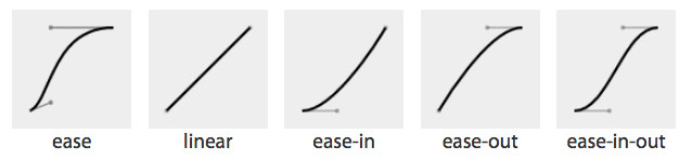
图 17-3: Curve representations of named cubic Bézier functions
The four numbers in a cubic-bezier() function define the x and y coordinates of two handles within a box. These handles are the endpoints of lines that stretch from the bottom-left and top-right corners of the box. The curve is constructed using the two corners, and the two handles’ coordinates, via a Bézier function.
cubic-bezier()函数四个参数,表示了一个矩形区域((0,0) 到 (1,1))内两个控制点的坐标,作为一条以矩形区域的坐下角为起点、右上角为终点的曲线的端点。贝塞尔函数通过矩形区域的左下角 (0,0) 与右上角(1,1),以及两个控制点的坐标(x1, y1),来绘制曲线。
To get an idea of how this works, look at the curves and their corresponding values, as shown in Figure 17-4.
要了解这是如何工作的,看下图 17-4 里的曲线和其对应的值。
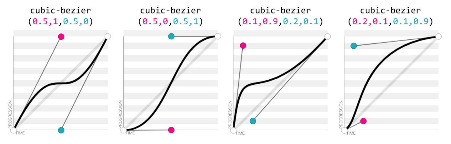
图 17-4: Four Bézier curves and their cubic-bezier() values (via http://cubicbezier.com)
Consider the first example. The first two values, corresponding to x1 and y1, are 0.5 and 1. If you go halfway across the box (x1 = 0.5) and all the way to the top of the box (y1 = 1), you land at the spot where the first handle is placed. Similarly, the coordinates 0.5,0 for x2,y2 describes the point at the center bottom of the box, which is where the second handle is placed. The curve shown there results from those handle placements.
体会下第一个例子,前两个值也就是 x1 和 y1 ,代表了坐标(0.5, 1)。从矩形区域的起点(0,0)开始,往右走 0.5 (x1)个单位,再往上走 1(y1)个单位,你就到了第一个控制点所在的位置。类似地,坐标点(0.5,0)——或者说(x2, y2)——位于矩形区域底边的中点,也就是第二个控制点的位置。图中的曲线就是由这些控制点产生的。
In the second example, the handle positions are switched, with the resulting change in the curve. Ditto for the third and fourth examples, which are inversions of each other. Notice how different the resulting curve is when switching the handle positions.
再看第二个例子:两个控制点的位置交换了一下,然后产生了不同的曲线。第三个和第四个例子也是如此(它们彼此相反),注意在交换两个控制点的位置后,所产生的曲线。
The predefined key terms are fairly limited. To better follow the principles of animation, you may want to use a cubic Bézier function with four float values instead of the predefined key words. If you’re a whiz at calculus or have a lot of experience with programs like Freehand or Illustrator, you might be able to invent cubic Bézier functions in your head; otherwise, there are online tools that let you play with different values, such as http://cubic-bezier.com/, which lets you compare the common keywords against each other, or against your own cubic Bézier function.
预定义的关键字其实相当有限,为了更好地控制动画的行为,你可能需要使用三次贝塞尔函数(有四个浮点参数),而不是那些预定义的关键字。除非你是一个微积分的天才,或者是一个 Freehand 或 Illustrator 老手,可以一下子在脑子里想出贝塞尔函数;否则,还是用下一些在线工具来测试不同的值,比如 http://cubic-bezier.com/,可以让你比较一些常用的(或是你自己的)贝塞尔曲线。
注:Freehand 和 Illustrator 都是 Adobe 公司软件中的一员。前者常被称为“FM”,后者即 Adobe Illustrator (常被称为“AI”),两者都是矢量图形处理工具。
As shown in Figure 17-5, the website http://easings.net provides many additional cubic Bézier function values you can use to provide for a more realistic, delightful animation.
如图 17-5 所示,网站 http://easings.net 提供许多其他的三次贝塞尔函数值,你可以使用这些值来提供更逼真的、令人愉悦的动画。
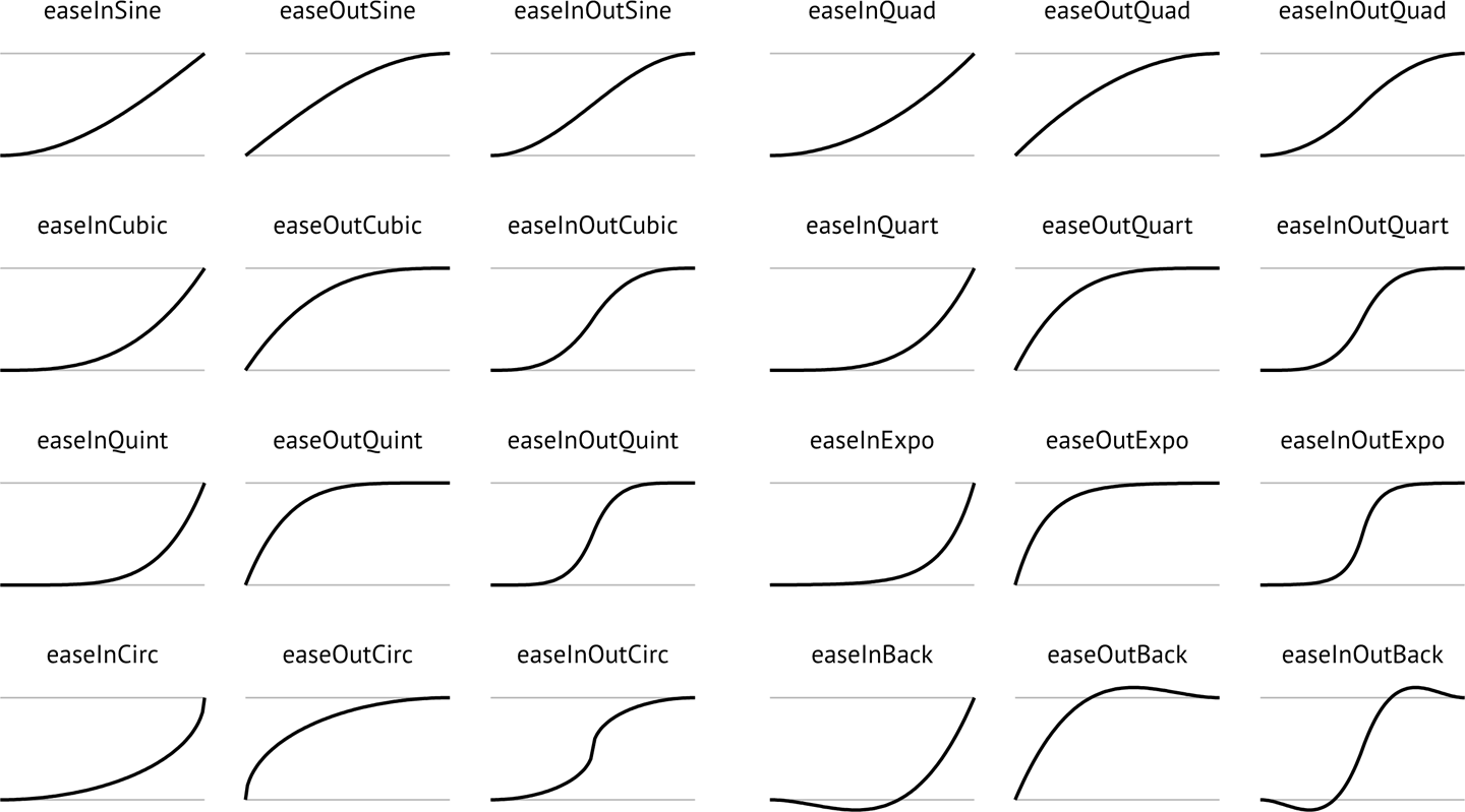
图 17-5: Useful author-defined cubic Bézier functions (from http://easings.net)
While the authors of the site named their animations, the preceding names are not part of the CSS specifications, and must be written as follows:
虽然网站的作者们为动画起了名字,但是这些名字并不是规范的一部分,因此,必须得像下面那样子编写代码:
| Unofficial name | Cubic Bézier function value |
|---|---|
| easeInSine | cubic-bezier(0.47, 0, 0.745, 0.715) |
| easeOutSine | cubic-bezier(0.39, 0.575, 0.565, 1) |
| easeInOutSine | cubic-bezier(0.445, 0.05, 0.55, 0.95) |
| easeInQuad | cubic-bezier(0.55, 0.085, 0.68, 0.53) |
| easeOutQuad | cubic-bezier(0.25, 0.46, 0.45, 0.94) |
| easeInOutQuad | cubic-bezier(0.455, 0.03, 0.515, 0.955) |
| easeInCubic | cubic-bezier(0.55, 0.055, 0.675, 0.19) |
| easeOutCubic | cubic-bezier(0.215, 0.61, 0.355, 1) |
| easeInOutCubic | cubic-bezier(0.645, 0.045, 0.355, 1) |
| easeInQuart | cubic-bezier(0.895, 0.03, 0.685, 0.22) |
| easeOutQuart | cubic-bezier(0.165, 0.84, 0.44, 1) |
| easeInOutQuart | cubic-bezier(0.77, 0, 0.175, 1) |
| easeInQuint | cubic-bezier(0.755, 0.05, 0.855, 0.06) |
| easeOutQuint | cubic-bezier(0.23, 1, 0.32, 1) |
| easeInOutQuint | cubic-bezier(0.86, 0, 0.07, 1) |
| easeInExpo | cubic-bezier(0.95, 0.05, 0.795, 0.035) |
| easeOutExpo | cubic-bezier(0.19, 1, 0.22, 1) |
| easeInOutExpo | cubic-bezier(1, 0, 0, 1) |
| easeInCirc | cubic-bezier(0.6, 0.04, 0.98, 0.335) |
| easeOutCirc | cubic-bezier(0.075, 0.82, 0.165, 1) |
| easeInOutCirc | cubic-bezier(0.785, 0.135, 0.15, 0.86) |
| easeInBack | cubic-bezier(0.6, -0.28, 0.735, 0.045) |
| easeOutBack | cubic-bezier(0.175, 0.885, 0.32, 1.275) |
| easeInOutBack | cubic-bezier(0.68, -0.55, 0.265, 1.55) |
Step timing
There are also step timing functions available, as well as two predefined step values:
| Timing function Definition |
|---|
| step-start |
| step-end |
| steps(n, start) |
| steps(n, end) |
As Figure 17-6 shows, the stepping functions show the progression of the transition from the initial value to the final value in steps, rather than as a smooth curve.
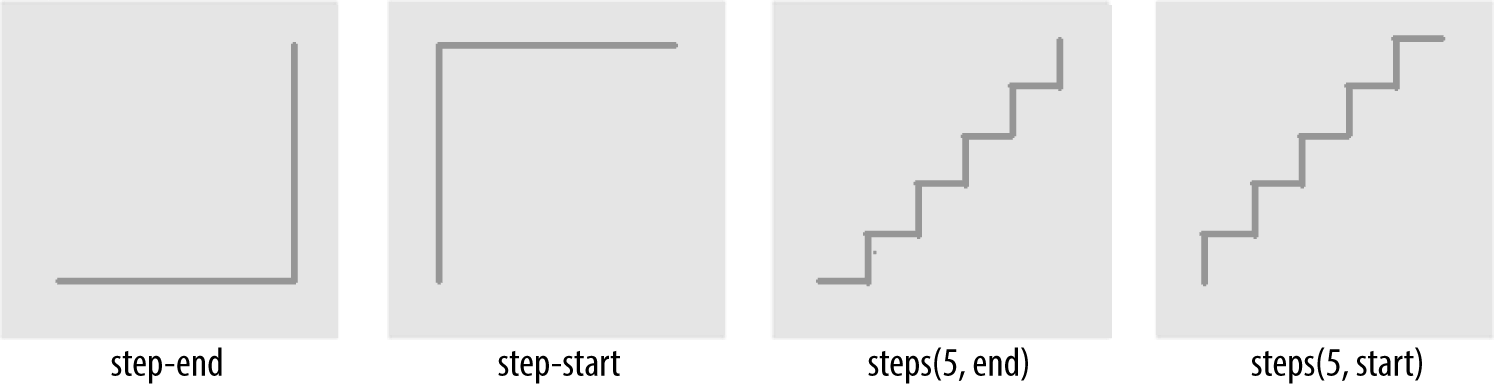
图 17-6: Step timing functions
The step functions allow you to divide the transition over equidistant steps. The functions define the number and direction of steps. There are two direction options: start and end. With start, the first step happens at the animation start. With end, the last step happens at the animation end. For example, steps(5, end) would jump through the equidistant steps at 0%, 20%, 40%, 60%, and 80%; and steps(5, start) would jump through the equidistant steps at 20%, 40%, 60%, 80%, and 100%.
The step-start function is the same as steps(1, start). When used, transitioned property values stay on their final values from the beginning until the end of the transition. The step-end function, which is the same as steps(1, end), sets transitioned values to their initial values, staying there throughout the transition’s duration.
Step timing, and especially the precise meaning of start and end, is discussed in depth in Chapter 18.
Continuing on with the same super-long transition-property declaration we’ve used before, we can declare a single timing function for all the properties, or define individual timing functions for each property and so on. Here, we set all the transitioned properties to a single duration:
div {
  transition-property: color, border-width, border-color, border-radius,
    transform, opacity, box-shadow, width, padding;
  transition-duration: 200ms;
  transition-timing-function: ease-in;
}
We can also create a horrible user experience by making every property transition at a different rhythm, like this:
Always remember that the transition-timing-function does not change the time it takes to transition properties: that is set with the transition-duration property. It just changes how the transition progresses during that set time. Consider the following:
div {
  ... transition-property: color, border-width, border-color, border-radius, transform,
    opacity, box-shadow, width, padding;
  transition-duration: 200ms;
  transition-timing-function: ease, ease-in, ease-out, ease-in-out, linear,
    step-end, step-start, steps(5, start), steps(3, end);
}
If we include these nine different timing functions for the nine different properties, as long as they have the same transition duration and delay, all the properties start and finish transitioning at the same time. The timing function controls how the transition progresses over the duration of the transition, but does not alter the time it takes for the transition to finish. (The preceding transition would be a terrible user experience, by the way. Please don’t do that.)
The best way to familiarize yourself with the various timing functions is to play with them and see which one works best for the effect you’re looking for. While testing, set a relatively long transition-duration to better visualize the difference between the various functions. At higher speeds, you may not be able to tell the difference with the easing function; just don’t forget to set it back to a faster speed before publishing the result to the web!
17.2.4 Delaying Transitions
The transition-delay property enables you to introduce a time delay between when the change that initiates the transition is applied to an element, and when the transition begins.
A transition-delay of 0s (the default) means the transition will begin immediately—it will start executing as soon as the state of the element is altered. This is familiar from the instant-change effect of a:hover, for example.
With a value other than 0s, the <time> value of transition-delay defines the time offset from the moment the property values would have changed, had no transition or transition-property been applied, until the property values declared in the transition or transition-property value begin animating to their final values.
Interestingly, negative values of time are valid. The effects you can create with negative transition-delays are described in “Negative delay values” on page 877.
Continuing with the 8- (or 21-) property transition-property declaration we’ve been using, we can make all the properties start transitioning right away by omitting the transition-delay property, or by including it with a value of 0s. Another possibility is to start half the transitions right away, and the rest 200 milliseconds later, as in the the following:
div {
  transition-property: color, border, border-radius, transform, opacity,
    box-shadow, width, padding;
  transition-duration: 200ms;
  transition-timing-function: linear;
  transitionproperties|875transition-delay: 0s, 200ms;
}
By including transition-delay: 0s, 200ms on a series of properties, each taking 200 milliseconds to transition, we make color, border-radius, opacity, and width begin their transitions immediately. All the rest begin their transitions as soon as the odd transitions have completed, because their transition-delay is equal to the transition-duration applied to all the properties.
As with transition-duration and transition-timing-function, when the number of comma-separated transition-delay values outnumbers the number of commaseparated transition-property values, the extra delay values are ignored. When the number of comma-separated transition-property values outnumbers the number of comma-separated transition-delay values, the delay values are repeated.
We can even declare nine different transition-delay values so that each property begins transitioning after the previous property has transitioned, as follows:
div {
  ... transition-property: color, border-width, border-color, border-radius, transform,
    opacity, box-shadow, width, padding;
  transition-duration: 200ms;
  transition-timing-function: linear;
  transition-delay: 0s, 0.2s, 0.4s, 0.6s, 0.8s, 1s, 1.2s, 1.4s, 1.6s;
}
In this example, we declared each transition to last 200 milliseconds with the transition-duration property. We then declare a transition-delay that provides comma-separated delay values for each property that increment by 200 milliseconds, or 0.2 seconds—the same time as the duration of each property’s transition. Each property starts transitioning at the point the previous property has finished.
We can use math to give every transitioning property different durations and delays, ensuring they all complete transitioning at the same time:
div {
  ... transition-property: color, border-width, border-color, border-radius, transform,
    opacity, box-shadow, width, padding;
  transition-duration: 1.8s, 1.6s, 1.4s, 1.2s, 1s, 0.8s, 0.6s, 0.4s, 0.2s;
  transition-timing-function: linear;
  transition-delay: 0s, 0.2s, 0.4s, 0.6s, 0.8s, 1s, 1.2s, 1.4s, 1.6s;
}
In this example, each property completes transitioning at the 1.8-second mark, but each with a different duration and delay. For each property, the transition-duration value plus the transition-delay value will add up to 1.8 seconds.
Generally, you want all the transitions to begin at the same time. You can make that happen by including a single transition-delay value, which gets applied to all the properties. In our drop-down menu in Figure 17-1, we include a delay of 50 milliseconds. This delay is not long enough for the user to notice and will not cause the application to appear slow. Rather, a 50-millisecond delay can help prevent the navigation from shooting open unintentionally as the user accidentally passes over, or hovers over, the menu items while moving the cursor from one part of the page or app to another.
Negative delay values
A negative value for transition-delay that is smaller than the transition-duration will cause the transition to start immediately, partway through the transition. For example:
div {
  transform: translateX(0);
  transition-property: transform;
  transition-duration: 200ms;
  transition-delay: -150ms;
  transition-timing-function: linear;
}
div:hover {
  transform: translateX(200px);
}
Given the transition-delay of -150ms on a 200ms transition, the transition will start three-quarters of the way through the transition and will last 50 milliseconds. In that scenario, with a linear timing function, it jumps to being translated 150px along the x-axis immediately on hover and then animates the translation from 150 pixels to 200 pixels over 50 milliseconds.
If the absolute value of the negative transition-delay is greater than or equal to the transition-duration, the change of property values is immediate, as if no transition had been applied, and no transitionend event occurs.
When transitioning back from the hovered state to the original state, by default, the same value for the transition-delay is applied. In the preceding scenario, since the transition-delay is not overridden in the hover state, it will jump 75% of the way back (or 25% of the way through the original transition) and then transition back to the initial state. On mouseout, it will jump to being translated 50 pixels along the xaxis and then take 50 milliseconds to return to its initial position of being translated 0 pixels along the x-axis.
17.2.5 The transition Shorthand
The transition shorthand property combines the four properties covered thus far—transition-property, transition-duration, transition-timing-function, and transition-delay—into a single shorthand property.
The transition property accepts the value of none, or any number of commaseparated list of single transitions. A single transition contains a single property to transition, or the keyword all to transition all the properties; the duration of the transition; the timing function; and the delay.
If a single transition within the transition shorthand omits the property to transition, the single transition will default to all. If the transition-timing-function value is omitted, it will default to ease. If only one time value is included, that will be the duration, and there will be no delay, as if transition-delay were set to 0s.
Within each single transition, the order of the duration versus the delay is important: the first value that can be parsed as a time will be set as the duration. If an additional time value is found before the comma or the end of the statement, that will be set as the delay.
Here are three equivalent ways to write the same transition effects:
nav li ul {
  transition: transform 200ms ease-in 50ms, opacity 200ms ease-in 50ms;
}
nav li ul {
  transition: all 200ms ease-in 50ms;
}
nav li ul {
  transition: 200ms ease-in 50ms;
}
In the first example, we see shorthand for each of the two properties. Because we are transitioning all the properties that change on hover, we could use the keyword all, as shown in the second example. And, since all is the default value, we could write the shorthand with just the duration, timing function, and delay. Had we used ease instead of ease-in, we could have omitted the timing function, since ease is the default.
We had to include the duration, or no transition would be visible. In other words, the only portion of the transition property value that can truly be considered required is transition-duration.
If we only wanted to delay the change from closed menu to open menu without a gradual transition, we would still need to include a duration of 0s. Remember, the first value parsable as time will be set as the duration, and the second one will be set as the delay:
nav li ul {
 transition: 0s 200ms; ...
This transition will wait 200 milliseconds, then show the dropdown fully open and opaque with no gradual transition. This is horrible user experience. Though if you switch the selector from nav li ul to \*, it might make for an April Fools’ joke.
If there is a comma-separated list of transitions (versus just a single declaration) and the word none is included, the entire transition declaration is invalid and will be ignored:
div {
  transition-property: color, border-width, border-color, border-radius,
    transform, opacity, box-shadow, width, padding;
  transition-duration: 200ms, 180ms, 160ms, 140ms, 120ms, 100ms, 1s, 2s, 3s;
  transition-timing-function: ease, ease-in, ease-out, ease-in-out, linear,
    step-end, step-start, steps(5, start), steps(3, end);
  transition-delay: 0s, 0.2s, 0.4s, 0.6s, 0.8s, 1s, 1.2s, 1.4s, 1.6s;
}
div {
  transition: color 200ms, border-width 180ms ease-in 200ms,
    border-color 160ms ease-out 400ms, border-radius 140ms ease-in-out 600ms,
    transform 120ms linear 800ms, opacity 100ms step-end 1s,
    box-shadow 1s step-start 1.2s, width 2s steps(5, start) 1.4s,
    padding 3s steps(3, end) 1.6s;
}
The two preceding CSS rule blocks are functionally equivalent: you can declare comma-separated values for the four longhand transition properties, or you can include a comma-separated list of multiple shorthand transitions. You can’t, however, mix the two: transition: transform, opacity 200ms ease-in 50ms will ease in the opacity over 200 milliseconds after a 50-millisecond delay, but the transform change will be instantaneous, with no transitionend event.
17.3 In Reverse: Transitioning Back to Baseline
In the preceding examples, we’ve declared a single transition. All our transitions have been applied in the default state and initiated with a hover. With these declarations, the properties return back to the default state via the same transition on mouseout, with a reversing of the timing function and a duplication of the delay.
With transition declarations only in the global state, both the hover and mouseout states use the same transition declaration: the selector matches both states. We can override this duplication of the entire transition or just some of the transition properties by including different values for transition properties in the global (versus the hover-only) state.
When declaring transitions in multiple states, the transition included is to that state:
a {
  background: yellow;
  transition: 200ms background-color linear 0s;
}
a:hover {
  background-color: orange;
  /* delay when going TO the :hover state */
  transition-delay: 50ms;
}
In this scenario, when the user hovers over a link, the background color waits 50 milliseconds before transitioning to orange. When the user mouses off the link, the background starts transitioning back to yellow immediately. In both directions, the transition takes 200 milliseconds to complete, and the gradual change proceeds in a linear manner. The 50 milliseconds is included in the :hover (orange) state. The delay happens, therefore, as the background changes to orange.
In our drop-down menu example, on :hover, the menu appears and grows over 200 milliseconds, easing in after a delay of 50 milliseconds. The transition is set with the transition property in the default (non-hovered) state. When the user mouses out, the properties revert over 200 milliseconds, easing out after a delay of 50 milliseconds. This reverse effect is responding to the transition value from the nonhovered state. This is the default behavior, but it’s something we can control. The best user experience is this default behavior, so you likely don’t want to alter it—but it’s important to know that you can.
If we want the closing of the menu to be jumpy and slow (we don’t want to do that; it’s bad user experience. But for the sake of this example, let’s pretend we do), we can declare two different transitions:
nav ul ul {
  transform: scale(1, 0);
  opacity: 0;
  ... transition: all 4s steps(8, start) 1s;
}
nav li:hover ul {
  transform: scale(1, 1);
  opacity: 1;
  transition: all 200ms linear 50ms;
}
Transitions are to the to state: when there’s a style change, the transition properties used to make the transition are the new values of the transition properties, not the old ones. We put the smooth, linear animation in the :hover state. The transition that applies is the one we are going toward. In the preceding example, when the user hovers over the drop-down menu’s parent li, the opening of the drop-down menu will be gradual but quick, lasting 200 milliseconds after a delay of 50 milliseconds. When the user mouses off the drop-down menu or its parent li, the transition will wait one second and take four seconds to complete, showing eight steps along the way.
When we only have one transition, we put it in the global from state, as you want the transition to occur toward any state, be that a hovering or a class change. Because we want the transition to occur with any change, we generally put the only transition declaration in the initial, default (least specific) block. If you do want to exert more control and provide for different effects depending on the direction of the transition, make sure to include a transition declaration in all of the possible class and UI states.
Beware of having transitions on both ancestors and descendants.Transitioning properties soon after making a change that transition ancestral or descendant nodes can have unexpected outcomes. If the transition on the descendant completes before the transition on the ancestor, the descendant will then resume inheriting the (still transitioning) value from its parent. This effect may not be what you expected.
Reversing interrupted transitions
When a transition is interrupted before it is able to finish (such as mousing off of our drop-down menu example before it finishes opening), property values are reset to the values they had before the transition began, and the properties transition back to those values. Because repeating the duration and timing functions on a reverting partial transition can lead to an odd or even bad user experience, the CSS transitions specification provides for making the reverting transition shorter.
In our menu example, we have a transition-delay of 50ms set on the default state and no transition properties declared on the hover state; thus, browsers will wait 50 milliseconds before beginning the reverse or closing transition.
When the forward animation finishes transitioning to the final values and the transitionend event is fired, all browsers will duplicate the transition-delay in the reverse states.
As Table 17-2 shows, if the transition didn’t finish—say, if the user moved off the navigation before the transition finished—all browsers except Microsoft Edge will repeat the delay in the reverse direction. Some browsers replicate the transition-duration as well, but Edge and Firefox have implemented the specification’s reverse shortening factor.
Table 17-2. Unfinished transition reverse behavior by browser
| Browser | Reverse delay | Transition time | Elapsed time |
|---|---|---|---|
| Chrome | Yes | 200 ms | 0.200 s |
| Chrome | Yes | 200 ms | 0.250 s |
| Safari | Yes | 200 ms | 0.200 s |
| Firefox | Yes | 38 ms | 0.038 s |
| Opera | Yes | 200 ms | 0.250 s |
| Edge | No | 38 ms | 0.038 s |
Let’s say the user moves off that menu 75 milliseconds after it started transitioning. This means the drop-down menu will animate closed without ever being fully opened and fully opaque. The browser should have a 50-millisecond delay before closing the menu, just like it waited 50 milliseconds before starting to open it.
This is actually a good user experience, as it provides a few milliseconds of delay before closing, preventing jerky behavior if the user accidentally navigates off the menu. As shown in Table 17-2, all browsers do this, except Microsoft Edge.
Even though we only gave the browser 75 milliseconds to partially open the dropdown menu before closing the menu, some browsers will take 200 milliseconds—the full value of the transition-duration property—to revert. Other browsers, including Firefox and Edge, have implemented the CSS specification’s reversing shortening factor and the reversing-adjusted start value. When implemented, the time to complete the partial transition in the reverse direction will be similar to the original value, though not necessarily exact.
In the case of a step timing function, Firefox and Edge will take the time, rounded down to the number of steps the function has completed. For example, if the transition was 10 seconds with 10 steps, and the properties reverted after 3.25 seconds, ending a quarter of the way between the third and fourth steps (completing 3 steps, or 30% of the transition), it will take 3 seconds to revert to the previous values. In the following example, the width of our div will grow to 130 pixels wide before it begins reverting back to 100 pixels wide on mouseout:
div {
  width: 100px;
  transition: width 10s steps(10, start);
}
div:hover {
  width: 200px;
}
While the reverse duration will be rounded down to the time it took to reach the most recently-executed step, the reverse direction will be split into the originally declared number of steps, not the number of steps that completed. In our 3.25-second case, it will take 3 seconds to revert through 10 steps. These reverse transition steps will be shorter in duration at 300 milliseconds each, each step shrinking the width by 3 pixels, instead of 10 pixels.
If we were animating a sprite by transitioning the background-position , this would look really bad. The specification and implementations may change to make the reverse direction take the same number of steps as the partial transition. Other browsers currently take 10 seconds, reverting the progression of the 3 steps over 10 seconds across 10 steps—taking a full second to grow the width in 3-pixel steps.
Browsers that haven’t implemented shortened reversed timing will take the full 10 seconds, instead of only 3, splitting the transition into 10 steps, to reverse the 30% change. Whether the initial transition completed or not, these browsers will take the full value of the initial transition duration, less the absolute value of any negative transition-delay, to reverse the transition, no matter the timing function. In the steps case just shown, the reverse direction will take 10 seconds. In our navigation example, it will reverse over 200 milliseconds, whether the navigation has fully scaled up or not.
For browsers that have implemented the reversing timing adjustments, if the timing function is linear, the duration will be the same in both directions. If the timing function is a step function, the reverse duration will be equal to the time it took to complete the last completed step. All other cubic-bezier functions will have a duration that is proportional to progress the initial transition made before being interrupted. Negative transition-delay values are also proportionally shortened. Positive delays remain unchanged in both directions.
No browser will have a transitionend for the hover state, as the transition did not end; but all browsers will have a transitionend event in the reverse state when the menu finishes collapsing. The elapsedTime for that reverse transition depends on whether the browser took the full 200 milliseconds to close the menu, or if the browser takes as long to close the menu as it did to partially open the menu.
To override these values, include transition properties in both the initial and final states (e.g., both the unhovered and hovered styles). While this does not impact the reverse shortening, it does provide more control.
17.4 Animatable Properties and Values
Before implementing transitions and animations, it’s important to understand that not all properties are animatable. You can transition (or animate) any animatable CSS properties; but which properties are animatable?
While we’ve included a list of these properties in Appendix A, CSS is evolving, and the animatable properties list will likely get new additions.
One key to developing a sense for which properties can be animated is to identify which have values that can be interpolated. Interpolation is the construction of data points between the values of known data points. The key guideline to determining if a property value is animatable is whether the computed value can be interpolated. If a property’s computed values are keywords, they can’t be interpolated; if its keywords compute to a number of some sort, they can be. The quick rule of thought is that if you can determine a midpoint between two property values, those property values are probably animatable.
For example, the display values like block and inline-block aren’t numeric and therefore don’t have a midpoint; they aren’t animatable. The transform property values of rotate(10deg) and rotate(20deg) have a midpoint of rotate(15deg); they are animatable.
The border property is shorthand for border-style, border-width, and border-color (which, in turn, are themselves shorthand properties for the four side values). While there is no midpoint between any of the border-style values, the border-width property length units are numeric, so they can be animated. The keyword values of medium, thick, and thin have numeric equivalents and are interpolatable: the computed value of the border-width property computes those keywords to lengths.
In the border-color value, colors are numeric—the named colors all represent hexadecimal color values—so colors are animatable as well. If you transition from border: red solid 3px to border: blue dashed 10px, the border width and border colors will transition at the defined speed, but border-style will jump from solid to dashed as soon as the transition begins (after any delay).
As noted (see Appendix A), numeric values tend to be animatable. Keyword values that aren’t translatable to numeric values generally aren’t. CSS functions that take numeric values as parameters generally are animatable. One exception to this rule is visibility: while there is no midpoint between the values of visible and hidden, visibility values are interpolatable between visible and not-visible. When it comes to the visibility property, either the initial value or the destination value must be visible or no interpolation can happen. The value will change at the end of the transition from visible to hidden. For a transition from hidden to visible, it changes at the start of the transition.
auto should generally be considered a non-animatable value and should be avoided for animations and transitions. According to the specification, it is not an animatable value, but some browsers interpolate the current numeric value of auto (such as height: auto) to be 0px. auto is non-animatable for properties like height, width, top, bottom, left, right, and margin.
Often an alternative property or value may work. For example, instead of changing height: 0 to height: auto, use max-height: 0 to max-height: 100vh, which will generally create the expected effect. The auto value is animatable for min-height and min-width, since min-height: auto actually computes to 0.
17.4.1 How Property Values Are Interpolated
Interpolation can happen when values falling between two or more known values can be determined. Interpolatable values can be transitioned and animated.
Numbers are interpolated as floating-point numbers. Integers are interpolated as whole numbers, incrementing or decrementing as whole numbers.
In CSS, length and percentage units are translated into real numbers. When transitioning or animating calc(), or from one type of length to or from a percentage, the values will be converted into a calc() function and interpolated as real numbers.
Colors, whether they are HSLA, RGB, or named colors like aliceblue, are translated to their RGBA equivalent values for transitioning, and interpolated across the RGBA color space.
When animating font weights, if you use keywords like bold, they’ll be converted to numeric values and animated in steps of multiples of 100. This may change in the future, as font weights may be permitted to take any integer value, in which case weights will be interpolated as integers instead of multiples of 100.
When including animatable property values that have more than one component, each component is interpolated appropriately for that component. For example, text-shadow has up to four components: the color, x, y, and blur. The color is interpolated as color: the x, y, and blur components are interpolated as lengths. Box shadows have two additional optional properties: inset (or lack thereof) and spread. spread, being a length, is interpolated as such. The inset keyword cannot be converted to a numeric equivalent: you can transition from one inset shadow to another inset shadow, or from one drop shadow to another drop shadow multicomponent value, but there is no way to gradually transition between inset and drop shadows.
Similar to values with more than one component, gradients can be transitioned only if you are transitioning gradients of the same type (linear or radial) with equal numbers of color stops. The colors of each color stop are then interpolated as colors, and the position of each color stop is interpolated as length and percentage units.
Interpolating repeating values
When you have simple lists of other types of properties, each item in the list is interpolated appropriately for that type—as long as the lists have the same number of items or repeatable items, and each pair of values can be interpolated:
.img {
  background-image: url(1gif), url(2gif), url(3gif), url(4gif), url(5gif),
    url(6gif), url(7gif), url(8gif), url(9gif), url(10gif), url(11gif),
    url(12gif);
  background-size: 10px 10px, 20px 20px, 30px 30px, 40px 40px;
  transition: background-size 1s ease-in 0s;
}
.img:hover {
  background-size: 25px 25px, 50px 50px, 75px 75px, 100px 100px;
}
For example, in transitioning four background-sizes, with all the sizes in both lists listed in pixels, the third background-size from the pretransitioned state can gradually transition to the third background-size of the transitioned list. In the preceding example, background images 1, 6, and 10 will transition from 10px to 25px in height and width when hovered. Similarly, images 3, 7, and 11 will transition from 30px to 75px, and so forth.
Thus, the background-size values are repeated three times, as if the CSS had been written as:
.img {
  ... background-size: 10px 10px, 20px 20px, 30px 30px, 40px 40px, 10px 10px, 20px
      20px, 30px 30px, 40px 40px, 10px 10px, 20px 20px, 30px 30px, 40px 40px;
  ...;
}
.img:hover {
  background-size: 25px 25px, 50px 50px, 75px 75px, 100px 100px, 25px 25px, 50px
      50px, 75px 75px, 100px 100px, 25px 25px, 50px 50px, 75px 75px, 100px 100px;
}
If a property doesn’t have enough comma-separated values to match the number of background images, the list of values is repeated until there are enough, even when the list in the :hover state doesn’t match the initial state:
.img:hover {
  background-size: 33px 33px, 66px 66px, 99px 99px;
}
If we transitioned from four background-size declarations in the initial state to three background-size declarations in the :hover state, all in pixels, still with 12 background images, the hover and initial state values are repeated (three and four times respectively) until we have the 12 necessary values, as if the following had been declared:
.img {
  ... background-size: 10px 10px, 20px 20px, 30px 30px, 40px 40px, 10px 10px, 20px
      20px, 30px 30px, 40px 40px, 10px 10px, 20px 20px, 30px 30px, 40px 40px;
  ...;
}
.img:hover {
  background-size: 33px 33px, 66px 66px, 99px 99px, 33px 33px, 66px 66px, 99px
      99px, 33px 33px, 66px 66px, 99px 99px, 33px 33px, 66px 66px, 99px 99px;
}
If a pair of values cannot be interpolated—for example, if the background-size changes from contain in the default state to cover when hovered—then, according to the specification, the lists are not interpolatable. However, some browsers ignore that particular pair of values for the purposes of the transition, but still animate the interpolatable values.
There are some property values that can animate if the browser can infer implicit values. For example, for shadows, the browser will infer an implicit shadow box-shadow: transparent 0 0 0 or box-shadow: inset transparent 0 0 0, replacing any values not explicitly included in the pre- or post-transition state. These examples are in the chapter files for this book.
Only the interpolatable values trigger transitionend events.
As noted previously, visibility animates differently than other properties: if animating or transitioning to or from visible, it is interpolated as a discrete step. It is always visible during the transition or animation as long as the timing function output is between 0 and 1. It will switch at the beginning if the transition is from hidden to visible. It will switch at the end if the transition is from visible to hidden. Note that this can be controlled with the step timing functions.
If you accidentally include a property that can’t be transitioned, fear not. The entire declaration will not fail. The browser will simply not transition the property that is not animatable. Note that the non-animatable property or nonexistent CSS property is not exactly ignored. The browser passes over unrecognized or non-animatable properties, keeping their place in the property list order to ensure that the other comma-separated transition properties described next are not applied on the wrong properties.2
Transitions can only occur on properties that are not currently being impacted by a CSS animation. If the element is being animated, properties may still transition, as long as they are not properties that are currently controlled by the animation. CSS animations are covered in Chapter 18.
17.5 Fallbacks: Transitions Are Enhancements
Transitions have excellent browser support. All browsers, including Safari, Chrome, Opera, Firefox, Edge, and Internet Explorer (starting with IE10) support CSS transitions.
Transitions are user-interface (UI) enhancements. Lack of full support should not prevent you from including them. If a browser doesn’t support CSS transitions, the changes you are attempting to transition will still be applied: they will just “transition” from the initial state to the end state instantaneously when the style recomputation occurs.
Your users may miss out on an interesting (or possibly annoying) effect, but will not miss out on any content.
As transitions are generally progressive enhancements, there is no need to polyfill for archaic IE browsers. While you could use a JavaScript polyfill for IE9 and earlier, and prefix your transitions for Android 4.3 and earlier, there is likely little need to do so.
17.6 Printing Transitions
When web pages or web applications are printed, the stylesheet for print media is used. If your style element’s media attribute matches only screen, the CSS will not impact the printed page at all.
Often, no media attribute is included; it is as if media="all" were set, which is the default. Depending on the browser, when a transitioned element is printed, either the interpolating values are ignored, or the property values in their current state are printed.
You can’t see the element transitioning on a piece of paper, but in some browsers, like Chrome, if an element transitioned from one state to another, the current state at the time the print function is called will be the value on the printed page, if that property is printable. For example, if a background color changed, neither the pre-transition or the post-transition background color will be printed, as background colors are generally not printed. However, if the text color mutated from one value to another, the current value of color will be what gets printed on a color printer or PDF.
In other browsers, like Firefox, whether the pre-transition or post-transition value is printed depends on how the transition was initiated. If it initiated with a hover, the non-hovered value will be printed, as you are no longer hovering over the element while you interact with the print dialog. If it transitioned with a class addition, the post-transition value will be printed, even if the transition hasn’t completed. The printing acts as if the transition properties are ignored.
Given that there are separate printstyle sheets or @media rules for print, browsers compute style separately. In the print style, styles don’t change, so there just aren’t any transitions. The printing acts as if the property values changed instantly, instead of transitioning over time.