第 18 章 动画 Animation
第 18 章 动画 Animation
CSS transitions, covered in the previous chapter, enabled simple animations. With transitions, an element’s properties change from the values set in one rule to the values set in a different rule as the element changes state over time, instead of changing instantly. With CSS transitions, the start and end states of property values are controlled by existing property values, and provide little control over how things change over time.
CSS 过渡,在前一章中介绍过,支持简单的动画。使用转换,当元素随时间改变状态而不是立即改变状态时,元素的属性将从一个规则中设置的值更改为另一个规则中设置的值。使用 CSS 转换,属性值的开始和结束状态由现有的属性值控制,几乎无法控制事物随时间的变化。
CSS animations are similar to transitions in that values of CSS properties change over time, but provide much more control over how those changes happen. Specifically, CSS keyframe animations let us decide if and how an animation repeats, give us granular control over what happens throughout the animation, and more. While transitions trigger implicit property values changes, animations are explicitly executed when animation keyframe properties are applied.
CSS 动画类似于过渡,因为 CSS 属性的值会随时间变化,但是对于这些变化如何发生提供了更多的控制。具体来说,CSS 关键帧动画让我们决定一个动画是否和如何重复,给我们颗粒控制什么发生在整个动画,以及更多。当转换触发隐式属性值更改时,动画将在应用动画关键帧属性时显式执行。
With CSS animations, you can change property values that are not part of the set preor post-state of an element. The property values set on the animated element don’t necessarily have to be part of the animation progression. For example, with transitions, going from black to white will only animate through various shades of gray. With animation, that same element doesn’t have to be black or white or even inbetween shades of gray during the animation.
使用 CSS 动画,您可以更改不属于元素的设置前状态或后状态的属性值。在动画元素上设置的属性值不一定是动画进程的一部分。例如,在过渡中,从黑色到白色只会在各种灰色阴影中产生动画效果。在动画中,相同的元素不必是黑色或白色,甚至在动画中也不需要介于灰色之间。
While you can transition through shades of gray, you could instead turn the element yellow, then animate from yellow to orange. Alternatively, you could animate through various colors, starting with black and ending with white, but progressing through the entire rainbow along the way. This chapter will explore how keyframe animation works.
当你“可以”通过灰色渐变过渡时,你可以把元素变成黄色,然后从黄色变成橙色。或者,您可以在各种颜色中进行动画,以黑色开始,以白色结束,但是在整个彩虹中一直前进。本章将探讨关键帧动画的工作原理。

Look for the Play symbol to know when an online example is available. All of the examples in this chapter can be found at https://meyerweb.github.io/csstdg4figs/18-animations.
18.1 Defining Keyframes
To animate an element, we need to set the name of a keyframe animation; to do that, we need a named keyframe animation. Our first step is to define this reusable CSS keyframe animation using the @keyframes at-rule, giving our animation a name. The name we define will then be used to attach this particular animation to elements or pseudo-elements.
要使一个元素产生动画效果,我们需要设置关键帧动画的名称;为此,我们需要一个命名的关键帧动画。我们的第一步是使用
@keyframesat-rule 定义这个可重用的 CSS 关键帧动画,为我们的动画命名。然后,我们定义的名称将用于将这个特定的动画附加到元素或伪元素上。
A @keyframes at-rule includes the animation identifier, or name, and one or more keyframe blocks. Each keyframe block includes one or more keyframe selectors with declaration blocks of property-value pairs. The entire @keyframes at-rule specifies the behavior of a single full iteration of the animation. The animation can iterate zero or more times, depending mainly on the animation-iteration-count property value, which we’ll discuss in “Declaring Animation Iterations” on page 905.
@keyframesat-rule 包括动画“标识符”或名称,以及一个或多个关键帧块。每个关键帧块都包含一个或多个关键帧选择器,并带有属性-值对的声明块。整个@keyframesat-rule 指定动画的单个完整迭代的行为。动画可以迭代 0 次或更多次,这主要取决于animation-iteration-count属性值,我们将在 905 页的“声明动画迭代”中讨论这个属性值。
Each keyframe block includes one or more keyframe selectors. The keyframe selectors are percentage-of-time positions along the duration of the animation; they are declared either as percentages, or with the keywords from or to. Here’s the generic structure of an animation:
每个关键帧块包含一个或多个关键帧选择器。关键帧选择器是沿着动画持续时间的时间百分比位置;它们被声明为百分比,或者使用关键字
from或to。下面是动画的一般结构:
@keyframes animation_identifier {
  keyframe_selector {
    property: value;
    property: value;
  }
  keyframe_selector {
    property: value;
    property: value;
  }
}
and here are a couple of basic examples:
这里有几个基本的例子:
@keyframes fadeout {
  from {
    opacity: 1;
  }
  to {
    opacity: 0;
  }
}
@keyframes color-pop {
  0% {
    color: black;
    background-color: white;
  }
  33% {
    /* one-third of the way through the animation */
    color: gray;
    background-color: yellow;
  }
  100% {
    color: white;
    background-color: orange;
  }
}
The first set of keyframes shown takes an element, sets its opacity to 1 (fully opaque), and animates it to 0 opacity (fully transparent). The second keyframe set sets an element’s foreground to black and its background to white, then animates the foreground black to gray and then white, and the background white to yellow and then orange.
所示的第一组关键帧获取一个元素,将其
opacity设置为1(完全不透明),并将其动画化为0不透明度(完全透明)。第二个关键帧设置将元素的前景设置为黑色,背景设置为白色,然后将前景的黑色设置为灰色,然后设置为白色,背景设置为黄色,然后设置为橙色。
Note that the keyframes don’t say how long this should take—that’s handled by a CSS property dedicated to the purpose. Instead they say “go from this state to that state” or “hit these various states at these percentage points of the total animation.” That’s why keyframe selectors are always percentages, or from and to. If you try to fill time values (like 1.5s) into your keyframe selectors, you’ll render them invalid.
请注意,关键帧并没有说明需要多长时间——这是由专门用于此目的的 CSS 属性处理的。相反,他们说“从这个状态到那个状态”或者“点击这些不同的状态在整个动画中的百分比”。“这就是为什么关键帧选择器总是百分比,或
from和to。如果试图在关键帧选择器中填充时间值(如1.5s),则会使它们无效。
18.2 Setting Up Keyframe Animations
To create an animation, you start with the @keyframes, add an animation name, and drop in curly brackets to encompass the actual keyframes you’re defining. It’s a lot like a media query at this point, if you’re familiar with those (see Chapter 20).
要创建一个动画,您可以从
@keyframes开始,添加一个动画名称,然后放入花括号来包含您正在定义的实际关键帧。在这一点上,它很像一个媒体查询,如果你熟悉那些(参见第 20 章)。
Within the opening and closing curly brackets, you include a series of keyframe selectors with blocks of CSS that declare the properties you want to animate. Once the keyframes are defined, you “attach” the animation to an element using the animation-name property. We’ll discuss that property shortly, in “Naming Animations” on page 901.
在开始和结束的花括号中,您包含了一系列关键帧选择器,这些关键帧选择器使用 CSS 块声明您希望动画化的属性。一旦定义了关键帧,就可以使用
animation-name属性将动画“附加”到元素上。我们稍后将在 901 页的“命名动画”中讨论这个属性。
Start with the at-rule declaration, followed by the animation name and brackets:
以 at-rule 声明开始,然后是动画名称和括号:
@keyframes nameOfAnimation {
  ...;
}
18.2.1 Naming Your Animation
The name, which you create, is an identifier or a string. Originally, the keyframe names had to be an identifier, but both the specification and the browsers also support quoted strings.
您创建的名称是一个标识符或字符串。最初,关键帧名称必须是一个标识符,但是规范和浏览器都支持带引号的字符串。
Identifiers are unquoted and have specific rules. You can use any characters a-z, A-Z, and 0-9, the hyphen (-), underscore (_), and any ISO 10646 character U+00A0 and higher. ISO 10646 is the universal character set; this means you can use any character in the Unicode standard that matches the regular expression [-_a-zA-Z0-9\u00A0-\u10FFFF]. The identifier can’t start with a digit (0-9) or two hyphens. One hyphen is fine, as long as it is not followed by a digit—unless you escape the digit or hyphen with a backslash.
标识符没有引号,并且有特定的规则。你可以使用任何字符“a-z”、“a-z”、“0-9”、连字符(“-”)、下划线(“_”),以及任何 iso10646 字符(U+00A0 及以上)。iso10646 国际编码标准是通用字符集;这意味着您可以使用 Unicode 标准中任何与正则表达式“[-_a- za - z0 -9\u00A0-\u10FFFF]”匹配的字符。标识符不能以数字(0-9)或两个连字符开头。一个连字符是可以的,只要它后面没有数字——除非您用反斜杠转义数字或连字符。
If you include any escape characters within your animation name, make sure to escape them with a backslash (\). For example, Q&A! must be written as Q\&A\!. ✎ can be left as ✎ (no, that’s not a typo), and ✎ is a valid name as well. But if you’re going to use any keyboard characters that aren’t letters or digits in an identifier, like !, @, #, $, and so on, escape them with a backslash.
如果在动画名称中包含任何转义字符,请确保使用反斜杠(
\)转义它们。例如,Q&A!必须写成Q\&A\!。✎可以离开✎(不,这不是一个错字),以及 ✎ 是一个有效的名字。但如果你要使用任何不是字母或数字的键盘字符作为标识符,比如!,@,#,$等等,用反斜杠将它们转义。
Also, don’t use any of the keywords covered in this chapter as the name of your animation. For example, possible values for the various animation properties we’ll be covering later in the chapter include none, paused, running, infinite, backwards, and forwards. Using an animation property keyword, while not prohibited by the spec, will likely break your animation when using the animation shorthand property (discussed in “Bringing It All Together” on page 935). So, while you can legally name your animation paused (or another keyword,) I strongly recommend against it.
另外,不要使用本章所涉及的任何关键词作为你的动画的名字。例如,我们将在本章后面讨论的各种动画属性的可能值包括
none,paused,running,infinite,backwards, 和forwards。使用 animation 属性关键字,虽然没有被规范所禁止,但在使用' animation '速记属性时可能会破坏你的动画(在 935 页的" bring It All Together "中讨论过)。因此,虽然你可以合法地命名你的动画“暂停”(或另一个关键字),我“强烈”建议不要这样做。
18.3 Keyframe Selectors
Keyframe selectors provide points during our animation where we set the values of the properties we want to animate. In defining animations, we dictate the values we want properties to have at a specific percentage of the way through the animations. If you want a value at the start of the animation, you declare it at the 0% mark. If you want a different value at the end of the animation, you declare the property value at the 100% mark. If you want a value a third of the way through the animation, you declare it at the 33% mark. These marks are defined with keyframe selectors.
Keyframe选择器在我们的动画过程中提供了一些点,在这些点上我们设置了想要动画的属性值。在定义动画时,我们规定了我们希望属性在整个动画中具有的特定百分比的值。如果你想要一个值在动画的开始,你声明它在0%标记。如果你想在动画结束时得到一个不同的值,你需要在属性值的100%处声明。如果你想在动画的三分之一处得到一个值,你需要在33%处声明它。这些标记是用关键帧选择器定义的。
Keyframe selectors consist of a comma-separated list of one or more percentage values or the keywords from or to. The keyword from is equal to 0%. The keyword to equals 100%. The keyframe selectors are used to specify the percentage along the duration of the animation the keyframe represents. The keyframe itself is specified by the block of property values declared on the selector. The % unit must be used on percentage values. In other words, 0 is invalid as a keyframe selector:
关键帧选择器由一个或多个百分比值或关键字
from或to的逗号分隔列表组成。关键字from等于0%。关键字to等于100%。关键帧选择器用于指定关键帧所表示的动画的持续时间百分比。关键帧本身由选择器上声明的属性值块指定。%单位必须用在百分数上。换句话说,0作为关键帧选择器是无效的:
@keyframes W {
  from {
    left: 0;
    top: 0;
  }
  25%,
  75% {
    top: 100%;
  }
  50% {
    top: 50%;
  }
  to {
    left: 100%;
    top: 0;
  }
}
This @keyframes animation, named W, when attached to a non-statically positioned element, would move that element along a W-shaped path. W has five keyframes: one each at the 0%, 25%, 50%, 75%, and 100% marks. The from is the 0% mark. The to is the 100% mark.
这个名为
W的@keyframes动画连接到一个非静态定位的元素时,将沿着 W 形路径移动该元素。W有五个关键帧:分别是0%, 25%, 50%, 75%和100%。“from”是“0%”的标记。“to”是“100%”的标记。
As the property values we set for the 25% and 75% mark are the same, we can put the two keyframe selectors together as a comma-separated list. This is very similar to regular selectors, where you can comma-group several together. Whether you keep those selectors on one line (as in the example) or put each selector on its own line is up to your personal preference. The following is just as valid as what we saw in the previous code:
由于我们为
25%和75%标记设置的属性值相同,我们可以将两个关键帧选择器作为逗号分隔的列表放在一起。这与常规选择器非常相似,在常规选择器中,可以将多个选择器逗号组合在一起。您是将这些选择器保持在一行(如本例中所示),还是将每个选择器放在自己的行中,这取决于您的个人偏好。下面的内容和我们在之前的代码中看到的一样有效:
25%,
75% {
  top: 100%;
}
Note that selectors do not need to be listed in ascending order. In the preceding example, we have the 25% and 75% on the same line, with the 50% mark coming after that declaration. For legibility, it is highly encouraged to progress from the 0% to the 100% mark. However, as demonstrated by the 75% keyframe in this example, it is not required. You could define your keyframes with the last first and the first last, or scramble them up randomly, or whatever works for you.
注意,选择器不需要按升序列出。在前面的示例中,
25%和75%在同一行,50%标记在声明之后。对于易读性,强烈建议从0%提高到100%。然而,正如本例中的75%关键帧所演示的,它不是必需的。你可以用最后一个和第一个最后一个定义你的关键帧,或者随机打乱它们,或者任何适合你的方法。
18.3.1 Omitting from and to Values
If a 0% or from keyframe is not specified, then the user agent (browser) constructs a 0% keyframe using the original values of the properties being animated, as if the 0% keyframe were declared with the same property values that impact the element when no animation was applied, unless another animation applied to that element is currently animating the same property (see the upcoming section “Naming Animations” on page 901 for details). Similarly, if the 100% or to keyframe is not defined and no other animations are being applied, the browser creates a faux 100% keyframe using the value the element would have had if no animation had been set on it.
如果一个
0%或from没有指定关键帧,然后用户代理(浏览器)构造一个0%关键帧动画使用原始值的属性,就好像“0%”关键帧被宣布使用相同的属性值,当没有动画应用的元素影响,除非另一个动画应用于目前动画元素相同的属性(参见即将到来的部分“命名动画”901 页)。类似地,如果没有定义100%或to关键帧,也没有应用其他动画,那么浏览器会使用元素在没有动画的情况下的值创建一个假的100%关键帧。
Assuming we have a background-color change animation:
假设我们有一个
background-color变化动画:
@keyframes change_bgcolor {
  45% {
    background-color: green;
  }
  55% {
    background-color: blue;
  }
}
And the element originally had background-color: red set on it, it would be as if the animation were:
元素原来有
background-color: red的设置,它就像动画:
@keyframes change_bgcolor {
  0% {
    background-color: red;
  }
  45% {
    background-color: green;
  }
  55% {
    background-color: blue;
  }
  100% {
    background-color: red;
  }
}
Or, remembering that we can include multiple identical keyframes as a commaseparated list, this faux animation also could be written as:
或者,记住我们可以包含多个相同的关键帧作为一个逗号分隔的列表,这个人造动画也可以写成:
@keyframes change_bgcolor {
  0%,
  100% {
    background-color: red;
  }
  45% {
    background-color: green;
  }
  55% {
    background-color: blue;
  }
}
Note the background-color: red; declarations are not actually part of the keyframe animation. If the background color were set to yellow in the element’s default state, the 0% and 100% marks would display a yellow background, animating into green, then blue, then back to yellow as the animation progressed:
注意
background-color: red;声明实际上不是关键帧动画的一部分。如果背景颜色在元素的默认状态下设置为黄色,那么0%和100%标记将显示黄色背景,然后动画变成绿色,然后是蓝色,然后在动画进行过程中又回到黄色:
@keyframes change_bgcolor {
  0%,
  100% {
    background-color: yellow;
  }
  45% {
    background-color: green;
  }
  55% {
    background-color: blue;
  }
}
We can include this change_bgcolor animation on many elements, and the perceived animation will differ based on the element’s value for the background-color property in the non-animated state.
我们可以在许多元素上包含这个
change_bgcolor动画,并且感知到的动画将根据非动画状态下元素的background-color属性的值而有所不同。
Although we’ve been using exclusively integer values for our percentages, non-integer percentage values, such as 33.33%, are perfectly valid. Negative percentages, values greater than 100%, and values that aren’t otherwise percentages or the keywords to or from are invalid and will be ignored.
虽然我们使用的百分比仅使用整数值,但非整数值,例如
33.33%,是完全有效的。负数百分比、大于100%的值以及不是百分比的值或关键字to或from无效,将被忽略。
18.3.2 Repeating Keyframe Properties
In the original -webkit- implementation of animation, each keyframe could only be declared once: if declared more than once, only the last declaration would be applied, and the previous keyframe selector block was ignored. This has been updated. Now, similar to the rest of CSS, the values in the keyframe declaration blocks with identical keyframe values cascade. In the standard (nonprefixed) syntax, the preceding W animation can be written with the to, or 100%, declared twice, overriding the value of the left property:
在最初的
-webkit-实现的动画,每个关键帧只能声明一次:如果声明超过一次,只有最后一个声明将被应用,和前一个关键帧选择器块被忽略。这已经更新。现在,与 CSS 的其余部分类似,关键帧声明中的值与相同的关键帧值级联。在标准(无前缀)语法中,前面的W动画可以用两次声明的to或100%编写,覆盖左属性的值:
@keyframes W {
  from,
  to {
    top: 0;
    left: 0;
  }
  25%,
  75% {
    top: 100%;
  }
  50% {
    top: 50%;
  }
  to {
    left: 100%;
  }
}
Notice how to is declared along with from as keyframe selectors for the first code block? That sets both top and left for the to keyframe. Then, the left value is over-ridden for the to in the last keyframe block.
注意
to如何与from一起声明为第一个代码块的关键帧选择器? 这将top和left设置为to关键帧。然后,在最后一个关键帧块中覆盖to的left值。
18.3.3 Animatable Properties
It’s worth taking a moment to talk about the fact that not all properties are animatable. Within an animation’s keyframe, if you list a property that can’t be animated, it’s just ignored. (For that matter, so are properties and values that he browser doesn’t recognize at all, the same as any other part of CSS.)
我们有必要花点时间来讨论这样一个事实:并非所有属性都是
animatable。在动画的关键帧中,如果你列出了一个不能被动画化的属性,它就会被忽略。(与 CSS 的其他部分一样,浏览器根本无法识别的属性和值也是如此。)
There is a comprehensive list of animatable properties in Appendix A. We’ve also indicated whether properties can or can’t be animated throughout the rest of this book, as the properties are defined.
附录 a 中有一个可动画属性的全面列表。在本书的其余部分中,我们还指出了属性是否可以被动画化,因为属性是被定义的。

The animation-timing-function, described in greater detail in “Changing the Internal Timing of Animations” on page 920, while not an animatable property, is not ignored. If you include the animation-timing-function as a keyframe style rule within a key‐frame selector block, the timing function of the properties within that block will change to the declared timing function when the animation moves to the next keyframe.
If an animation is set between two property values that don’t have a calculable mid‐point, the results may not be what you expect. The property will not animate correctly—or at all. For example, you shouldn’t declare an element’s height to animate between height: auto and height: 300px. There is no midpoint between auto and 300px. The element may still animate, but different browsers handle this differently: Firefox does not animate the element; Safari may animate as if auto is equal to 0; and both Opera and Chrome currently jump from the preanimated state to the postanimated state halfway through the animation, which may or may not be at the 50% key-frame selector, depending on the value of the animation-timing-function. In other words, different browsers behave differently for different properties when there is no midpoint, so you can’t be sure you will get your expected outcome.
如果动画设置在两个属性值之间,而属性值没有可计算的中间点,那么结果可能不是您所期望的。该属性不会正确地活动—或者根本不会。例如,您不应该声明一个元素的高度来在“height: auto”和“height: 300px”之间设置动画效果。“auto”和“300px”之间没有中间点。元素仍然可以动画化,但是不同的浏览器处理方式不同:Firefox 不动画化元素;Safari 可以动画,如果' auto '等于' 0 ';Opera 和 Chrome 目前都是在动画进行到一半的时候从预动画状态跳到后期动画状态,这取决于动画-计时-函数的值。换句话说,当没有中点时,不同的浏览器对不同的属性会有不同的行为,所以您不能确定您将得到预期的结果。
The behavior of your animation will be most predictable if you declare both a 0% and a 100% value for every property you animate.
如果为动画的每个属性分别声明 0%和 100%,那么动画的行为将是最可预测的。
For example, if you declare border-radius: 50%; in your animation, you may want to declare border-radius: 0; as well, because there is no midpoint between none and anything: the default value of border-radius is none, not 0. Consider the difference in the following two animations:
例如,如果您在动画中声明
border-radius: 50%;,那么您可能还想声明border-radius: 0;,因为在none和任何东西之间没有中点:border-radius的默认值是none,而不是0。考虑一下下面两个动画的区别:
@keyframes round {
  100% {
    border-radius: 50%;
  }
}
@keyframes square_to_round {
  0% {
    border-radius: 0%;
  }
  100% {
    border-radius: 50%;
  }
}
The round animation will animate an element from the original border-radius value of that element to border-radius: 50% over the duration of the animation. The square_to_round animation will animate an element from border-radius: 0% to border-radius: 50% over the duration of the animation. If the element starts out with square corners, then the two will have exactly the same effect. But if it starts out with rounded corners, then square_to_round will jump to rectangular corners before it starts animating. This might not be what you want. Sometimes you can omit a from or to keyframe, using the element’s non-animated property values to your advantage.
round动画将使一个元素从原来的border-radius值转换为“边界半径”:动画持续时间为 50%。square_to_round动画将使一个元素从border-radius: 0%动画到border-radius: 50%动画的持续时间。如果元素以正方形角开始,那么这两个角的效果完全相同。但如果它一开始是圆角,那么square_to_round将在它开始动画之前跳到直角角。这可能不是你想要的。有时可以省略 from 或 to 关键帧,利用元素的非动画属性值。
The best way to resolve this issue is to use the round animation instead of square_to_round, making sure any element that gets animated with the round key-frame animation has its border-radius explicitly set.
解决这个问题的最佳方法是使用
round动画而不是square_to_round,确保任何使用round关键帧动画进行动画的元素都明确设置了border-radius。
As long as an animatable property is included in at least one block with a value that is different then the non-animated attribute value, and there is a calculable midpoint between those two values, that property will animate.
只要在至少一个块中包含了一个动画属性,其值与非动画属性值不同,并且在这两个值之间有一个可计算的中点,该属性就会被动画化。
18.3.4 Nonanimatable Properties That Aren’t Ignored
Exceptions to the midpoint “rule” include visibility and animation-timing-function.
中点“规则”的例外包括
visibility和animation-timing-function。
visibility is an animatable property, even though there is no midpoint between visibility: hidden and visibility: visible. When you animate from hidden to visible, the visibility value jumps from one value to the next at the keyframe where the change is declared.
visibility是一个动画属性,即使在visibility: hidden和visibility: visible之间没有中间点。当您将hidden动画化为visible时,visibility值将在声明更改的关键帧从一个值跳到下一个值。
While the animation-timing-function is not, in fact, an animatable property, when included in a keyframe block, the animation timing will switch to the newly declared value at that point in the animation for the properties within that keyframe selector block. The change in animation timing is not animated; it simply switches to the new value for those properties only, and only until the next keyframe. (This will be covered later, in “Changing the Internal Timing of Animations” on page 920.)
虽然
animation-timing-function实际上不是一个 animatable 属性,但当它包含在关键帧块中时,动画计时将切换到动画中关键帧选择器块中属性的新声明值。改变动画的时间不是动画;它只是为那些属性切换到新值,直到下一个关键帧。(稍后将在 920 页的“更改动画的内部计时”中讨论。)
18.3.5 Scripting @keyframes Animations
There is an API that enables finding, appending, and deleting keyframe rules. You can change the content of a keyframe block within an @keyframes animation declaration with appendRule(n) or deleteRule(n), where n is the full selector of that key‐frame. You can return the contents of a keyframe with findRule(n):
@keyframes W {
  from,
  to {
    top: 0;
    left: 0;
  }
  25%,
  75% {
    top: 100%;
  }
  50% {
    top: 50%;
  }
  to {
    left: 100%;
  }
}
The appendRule(), deleteRule(), and findRule() methods takes the full keyframe selector as an argument. Revisiting the W animation, to return the 25% / 75% key‐frame, the argument is 25%, 75%:
// Get the selector and content block for a keyframe
var aRule = myAnimation.findRule("25%, 75%").cssText;
// Delete the 50% keyframe
myAnimation.deleteRule("50%");
// Add a 53% keyframe to the end of the animation
myAnimation.appendRule("53% {top: 50%;}");
The statement myAnimation.findRule('25%, 75%').cssText; where myAnimation is pointing to a keyframe animation, returns the keyframe that matches 25%, 75%. It would not match anything if we had used either 25% or 75% only. If pointing to the W animation, this statement returns 25%, 75% { top: 100%; }.
Similarly, myAnimation.deleteRule('50%') will delete the last 50% keyframe—so if there are multiple 50% keyframes, the last one listed will be the first to go. Conversely, myAnimation.appendRule('53% {top: 50%;}') appends a 53% keyframe after the last keyframe of the @keyframes block.
There are three animation events—animationstart, animationend, and animationiteration—that occur at the start and end of an animation, and between the end of an iteration and the start of a subsequent iteration. Any animation for which a valid keyframe rule is defined will generate the start and end events, even animations with empty keyframe rules. The animationiteration event only occurs when an animation has more than one iteration, as the animationiteration event does not fire if the animationend event would fire at the same time.
18.4 Animating Elements
Once you have created a keyframe animation, you can apply that animation to elements and/or pseudo-elements. CSS provides numerous animation properties to attach a keyframe animation to an element and control its progression. At a minimum, you need to include the name of the animation for the element to animate, and a duration if you want the animation to actually be visible. (Otherwise, the animation will happen in zero time.)
There are two ways of attaching animation properties to an element: you can include all the animation properties separately, or you can declare all the properties in one line using the animation shorthand property (or a combination of shorthand and longhand properties). We are going to first learn all the longhand properties. Later in this chapter, we’ll condense all the declarations into one line with the animation shorthand property.
Let’s start with the individual properties.
18.4.1 Naming Animations
The animation-name property takes as its value a comma-separated list of names of keyframe animations you want to apply. The names in question here are the unquoted identifiers or quoted strings (or a mixture of both) you created in your @key frames rule.
The default value is none, which means there is no animation. The none value can be used to override any animation applied elsewhere in the CSS cascade. (This is also the reason you don’t want to name your animation none, unless you’re a masochist.) To apply an animation, include the @keyframe identifier, which is the animation
name.
Using the change_bgcolor keyframe animation defined in “Omitting from and to Values” on page 895:
div {
  animation-name: change_bgcolor;
}
This applies the change_bgcolor animation to all div elements. To apply more than one animation, include more than one comma-separated @key frame identifier:
div {
  animation-name: change_bgcolor, round, W;
}
If one of the included keyframe identifiers does not exist, the series of animations will not fail; rather, the failed animation will be ignored, and the valid animations will be applied. While ignored initially, the failed animation will be applied if and when that identifier comes into existence as a valid animation. Consider:
div {
  animation-name: change_bgcolor, spin, round, W;
}
In this example, assume there is no spin keyframe animation defined. The spin animation will not be applied, while the change_bgcolor, round, and W animations will occur. Should a spin keyframe animation come into existence through scripting, it will be applied at that time.
In order to include more than one animation, we’ve included each @keyframe animation identifier in our list of comma-separated values on the animation-name property. If more than one animation is applied to an element and those animations have repeated properties, the later animations override the property values in the earlier animations. For example, if more than two background color changes are applied concurrently in two different keyframe animations, whichever animation was listed later will override the background property declarations of animations earlier in the list, but only if the properties (background colors, in this case) are being animated at the same time. For more on this, see “Animation, Specificity, and Precedence Order” on page 939.
For example, assume the following, and further assume that the animations happen over a period of 10 seconds:
div {
  animation-name: change_bgcolor, bg-shift;
}
@keyframes bg-shift {
  0%,
  100% {
    background-color: blue;
  }
  35% {
    background-color: orange;
  }
  55% {
    background-color: red;
  }
  65% {
    background-color: purple;
  }
}
@keyframes change_bgcolor {
  0%,
  100% {
    background-color: yellow;
  }
  45% {
    background-color: green;
  }
  55% {
    background-color: blue;
  }
}
In this situation, the background will animate from blue to orange to red to purple and then back to blue, thanks to bg-shift. Because it comes last in the list of animations, its keyframes take precedence. Any time there are multiple animations specifying behavior for the same property at the same point in time, the animation which is listed last in the value of animation-name will be in effect.
What’s interesting is what happens if the from (0%) or to (100%) keyframes are omitted from the animation in force. For example, let’s remove the first keyframes defined in bg-shift.
div {
  animation-name: change_bgcolor, bg-shift;
}
@keyframes bg-shift {
  35% {
    background-color: orange;
  }
  55% {
    background-color: red;
  }
  65% {
    background-color: purple;
  }
}
@keyframes change_bgcolor {
  0%,
  100% {
    background-color: yellow;
  }
  45% {
    background-color: green;
  }
  55% {
    background-color: blue;
  }
}
Now there are no background colors being defined at the beginning and end of bgshift. In a situation like this, where a 0% or 100% keyframe is not specified, then the user agent constructs a 0%/100% keyframe using the computed values of the properties being animated. This could mean one of two things: either use the value of the property as defined for the element assuming there are no animations at all, or use the property value from a previous animation in the list given for animation-name.
Older browsers do the former, but the specification is shifting to prefer the latter. As of late 2017, newer browsers will animate from yellow to orange over the first 3.5 seconds of the animation, and from purple to blue over the last 3.5 seconds. Older browsers will start and end with transparent backgrounds.
These are only concerns when two different keyframe blocks are trying to change the same property’s values. In this case, it was background=color. On the other hand, if one keyframe block animates background-color while another animates padding, the two animations will not collide, and both the background color and padding will be animated together.
Simply applying an animation to an element is not enough for the element to visibly animate, but it will make the animation occur—just over no time. In such an event, the keyframe properties will all be calculated, and the animationstart and animatio nend events will fire. For an element to visibly animate, the animation must last at least some amount of time. For that we have the animation-duration property
18.4.2 Defining Animation Lengths
The animation-duration property defines how long a single animation iteration should take in seconds (s) or milliseconds (ms).
The animation-duration property is used to define the length of time, in seconds (s) or milliseconds (ms), it should take to complete one cycle through all the keyframes of the animation. If you don’t declare animation-duration, the animation will still be run with a duration of 0s, with animationstart and animationend still being fired even though the animation, taking 0s, is imperceptible. Negative time values are not permitted on this property.
When specifying a duration, you must include the second (s) or millisecond (ms) unit. If you have more than one animation, you can include a different animationduration for each animation by including more than one comma-separated time duration:
div {
  animation-name: change_bgcolor, round, W;
  animation-duration: 200ms, 100ms, 0.5s;
}
If you supply an invalid value within your comma-separated list of durations—for example, animation-duration: 200ms, 0, 0.5s—the entire declaration will fail, and it will behave as if animation-duration: 0s had been declared. 0 is not a valid time value.
Generally, you will want to include an animation-duration value for each animation-name provided. If you have only one duration, all the animations will last the same amount of time. Having fewer animation-duration values than animationname values in your comma-separated property value list will not fail: rather, the values will be repeated as a group. Thus, given the following:
div {
  animation-name: change_bgcolor, spin, round, W;
  animation-duration: 200ms, 5s;
  /* same effect as '200ms, 5s, 200ms, 5s' */
}
the round animation will be run over 200ms, and the W animation over 5s. If you have a greater number of animation-duration values than animation-name values, the extra values will be ignored. If one of the included animations does not exist, the series of animations and animation durations will not fail: the failed animation, along with its duration, are ignored:
div {
  animation-name: change_bgcolor, spinner, round, W;
  animation-duration: 200ms, 5s, 100ms, 0.5s;
}
In this example, the duration 5s is associated with spinner. There is no spinner animation, though, so spinner doesn’t exist, and the 5s and spinner are both ignored. Should a spinner animation come into existence, it will be applied to the div and last 5 seconds.
18.4.3 Declaring Animation Iterations
Simply including the required animation-name will lead to the animation playing once, and only once. If you want to iterate through the animation more or less than the default one time, use the animation-iteration-count property.
By default, the animation will occur once (because the default value is 1). If another value is given for animation-iteration-count, and there isn’t a negative value for the animation-delay property, the animation will repeat the number of times specified by the value if the property, which can be any number or the keyword infinite. The following declarations will cause their animations to be repeated 2, 5, and 13 times:
animation-iteration-count: 2;
animation-iteration-count: 5;
animation-iteration-count: 13;
If the value of animation-iteration-count is not an integer, the animation will end partway through its final cycle. The animation will still run, but will cut off miditeration on the final iteration. For example, animation-iteration-count: 1.25 will iterate through the animation one and a quarter times, cutting off 25% of the way through the second iteration. If the value is 0.25 on an 8-second animation, the animation will play about 25% of the way through, ending after 2 seconds.
Negative numbers are not permitted. If an invalid value is given, the default value of 1 will lead to a default single iteration.
Interestingly, 0 is a valid value for the animation-iteration-count property. When set to 0, the animation still occurs, but zero times. This is similar to setting animation-duration: 0s: it will throw both an animationstart and an animatio nend event.
If you are attaching more than one animation to an element or pseudo-element, include a comma-separated list of values for animation-name, animation-duration, and animation-iteration-count:
.flag {
  animation-name: red, white, blue;
  animation-duration: 2s, 4s, 6s;
  animation-iteration-count: 3, 5;
}
The iteration-count values (and all other animation property values) will be assigned in the order of the comma-separated animation-name property value. Extra values are ignored. Missing values cause the existing values to be repeated, as with animation-iteration-count in the above scenario.
In the preceding example, there are more name values than count values, so the count values will repeat: red and blue will iterate three times, and white will iterate five times. There are the same number of name values as duration values; therefore, the duration values will not repeat. The red animation lasts two seconds, iterating three times, and therefore will run for a total of six seconds. The white animation lasts four seconds, iterating five times, for a total of 20 seconds. The blue animation is six seconds per iteration with the repeated three iterations value, animating for a total of 18 seconds.
Invalid values will invalidate the entire declaration, leading to the animations to be played once each.
If we want all three animations to end at the same time, even though their durations differ, we can control that with animation-iteration-count:
.flag {
  animation-name: red, white, blue;
  animation-duration: 2s, 4s, 6s;
  animation-iteration-count: 6, 3, 2;
}
In this example, the red, white, and blue animations will last for a total of 12 seconds each, because the product of the durations and iteration counts in each case totals 12 seconds.
18.4.4 Setting an Animation Direction
With the animation-direction property, you can control whether the animation progresses from the 0% keyframe to the 100% keyframe, or from the 100% keyframe to the 0% keyframe. You can control whether all the iterations progress in the same direction, or set every other animation cycle to progress in the opposite direction.
The animation-direction property defines the direction of the animation’s progression through the keyframes. There are four possible values:
animation-direction: normal;When set to normal (or omitted, which defaults to normal), each iteration of the animation progresses from the 0% keyframe to the 100% keyframe.
animation-direction: reverse;The reverse value sets each iteration to play in reverse keyframe order, always progressing from the 100% keyframe to the 0% keyframe. Reversing the animation direction also reverses the animation-timing-function. This property is described in “Changing the Internal Timing of Animations” on page 920.
animation-direction: alternate;The alternate value means the first iteration (and each subsequent oddnumbered iteration) proceeds from 0% to 100%, and the second iteration (and each subsequent even-numbered cycle) reverses direction, proceeding from 100% to 0%.
animation-direction: alternate-reverse;The alternate-reverse value is similar to the alternate value, except it’s the reverse. The first iteration (and each subsequent odd numbered iteration) proceeds from 100% to 0%, and the second iteration (and each subsequent evennumbered cycle) reverses direction, proceeding from 100% to 0%:
.ball {
  animation-name: bouncing;
  animation-duration: 400ms;
  animation-iteration-count: infinite;
  animation-direction: alternate-reverse;
}
@keyframes bouncing {
  from {
    transform: translateY(500px);
  }
  to {
    transform: translateY(0);
  }
}
In this example, we are bouncing a ball, but we want to start by dropping it, not by throwing it up in the air: we want it to alternate between going down and up, rather than up and down, so animation-direction: alternate-reverse is the most appropriate value for our needs.
This is a rudimentary way of making a ball bounce. When balls are bouncing, they are moving slowest when they reach their apex and fastest when they reach their nadir. We included this example here to illustrate the alternate-reverse animation directions. We’ll revisit the bouncing animation again later to make it more realistic with the addition of timing (see “Changing the Internal Timing of Animations” on page 920). We’ll also discuss how, when the animation is iterating in the reverse direction, the animation-timing-function is reversed.
18.4.5 Delaying Animations
The animation-delay property defines how long the browser waits after the animation is attached to the element before beginning the first animation iteration.
The animation-delay property sets the time, defined in seconds (s) or milliseconds (ms), that the animation will wait between when the animation is attached to the element and when the animation begins executing.
By default, the animation begins iterating as soon as it is applied to the element, with a 0-second delay. A positive value delays the start of the animation until the prescribed time listed as the value of the animation-delay property has elapsed. A negative value causes the animation to begin immediately, but it will start partway through the animation.
Negative values for animation-delay can create interesting effects. A negative delay will execute the animation immediately but will begin animating the element partway through the attached animation. For example, if animation-delay: -4s and animation-duration: 10s are set on an element, the animation will begin immediately but will start approximately 40% of the way through the first animation, and will end six seconds later.
The word “approximately” was used there because the animation will not necessarily start at precisely the 40% keyframe block: when the 40% mark of an animation occurs depends on the value of the animation-timing-function. If animation-timingfunction: linear is set, then it will be 40% through the animation:
div {
  animation-name: move;
  animation-duration: 10s;
  animation-delay: -4s;
  animation-timing-function: linear;
}
@keyframes move {
  from {
    transform: translateX(0);
  }
  to {
    transform: translateX(1000px);
  }
}
In this linear animation example, we have a 10-second animation with a delay of –4 seconds. In this case, the animation will start immediately 40% of the way through the animation, with the div translated 400 pixels to the right of its original position, and last only six seconds.
If an animation is set to occur 10 times, with a delay of -600 milliseconds and an animation duration of 200 milliseconds, the element will start animating right away, at the beginning of the fourth iteration:
.ball {
  animation-name: bounce;
  animation-duration: 200ms;
  animation-delay: -600ms;
  animation-iteration-count: 10;
  animation-timing-function: ease-in;
  animation-direction: alternate;
}
@keyframes bounce {
  from {
    transform: translateY(0);
  }
  to {
    transform: translateY(500px);
  }
}
Instead of animating for 2,000 milliseconds (200 ms × 10 = 2,000 ms, or 2 seconds), starting in the normal direction, the ball will animate for 1,400 milliseconds (or 1.4 seconds) with the animation starting immediately—but at the start of the fourth iteration, and in the reverse direction.
It starts out in reverse because animation-direction is set to alternate, meaning every even iteration iterates in the reverse direction from the 100% keyframe to the 0% keyframe. The fourth iteration, which is an even-numbered iteration, is the first visible iteration.
The animation will throw the animationstart event immediately. The animationend event will occur at the 1,400-millisecond mark. The ball will be tossed up, rather than bounced, throwing 6 animationiteration events, after 200, 400, 600, 800, 1,000, and 1,200 milliseconds. While the iteration count was set to 10, we only get 6 animationiteration events because we are only getting 7 iterations; 3 iterations didn’t occur because of the negative animation-delay, and the last iteration concluded at the same time as the animationend event. Remember, when an animationiteration event would occur at the same time as an animationend event, the animationiteration event does not occur.
Let’s take a deeper look at animation events before continuing.
18.4.6 Animation Events
There are three different types of animation events: animationstart, animationiter ation, and animationend. Each event has three read-only properties: animationName, elapsedTime, and pseudoElement, unprefixed in all browsers.
The animationstart event fires at the start of the animation: after the animationdelay (if present) has expired, or immediately if there is no delay set. If a negative animation-delay value is present, the animationstart will fire immediately, with an elapsedTime equal to the absolute value of the delay in supporting browsers. In browsers where prefixing is still necessary, the elapsedTime is 0:
.noAnimationEnd {
  animation-name: myAnimation;
  animation-duration: 1s;
  animation-iteration-count: infinite;
}
.startAndEndSimultaneously {
  animation-name: myAnimation;
  animation-duration: 0s;
  animation-iteration-count: infinite;
}
The animationend event fires when the animation finishes. If the animationiteration-count is set to infinite, then as long as the animation-duration is set to a time greater than 0, the animationend event will never fire. If the animationduration is set or defaults to 0 seconds, even when the iteration count is infinite, animationstart and animationend will occur virtually simultaneously, and in that
order.
The animationiteration event fires between iterations. The animationend event fires at the conclusion of iterations that do not occur at the same time as the conclusion of the animation itself; thus, the animationiteration and animationend events do not fire simultaneously:
.noAnimationIteration {
  animation-name: myAnimation;
  animation-duration: 1s;
  animation-iteration-count: 1;
}
In the .noAnimationIteration example, with the animation-iteration-count set to a single occurrence, the animation ends at the conclusion of the first and only iteration. Whenever the animationiteration event would occur at the same time as an animationend event, the animationend event occurs, but the animationiteration event does not. The animationiteration does not fire unless an animation cycle ends and another begins.
When the animation-iteration-count property is omitted, or when its value is 1 or less, no animationiteration event will be fired. As long as an iteration finishes (even if it’s a partial iteration) and another iteration begins, if the duration of that subsequent iteration is greater than 0s, an animationiteration event will be fired:
.noAnimationIteration {
  animation-name: myAnimation;
  animation-duration: 1s;
  animation-iteration-count: 4;
  animation-delay: -3s;
}
When an animation iterates through fewer cycles than listed in the animationiteration-count because of a negative animation-delay, there are no animationit eration events for the cycles that didn’t occur. In the preceding example code, there are no animationiteration events, as the first three cycles do not occur (due to the -3s animation-delay), and the last cycle finishes at the same time the animation ends.
In that example, the elapsedTime on the animationstart event is 3, as it is equal to the absolute value of the delay.
Animation chaining
You can use animation-delay to chain animations together so the next animation starts immediately after the conclusion of the preceding animation:
.rainbow {
  animation-name: red, orange, yellow, blue, green;
  animation-duration: 1s, 3s, 5s, 7s, 11s;
  animation-delay: 3s, 4s, 7s, 12s, 19s;
}
In this example, the red animation starts after a three-second delay and lasts one second, meaning the animationend event occurs at the four-second mark. This example starts each subsequent animation at the conclusion of the previous animation. This is known as CSS animation chaining.
By including a four-second delay on the second animation, the orange animation will begin interpolating the @keyframe property values at the four-second mark, starting the orange animation immediately at the conclusion of the red animation. The orange animation concludes at the seven-second mark—it lasts three seconds, starting after a four-second delay—which is the delay set on the third, or yellow, animation, making the yellow animation begin immediately after the orange animation ends.
This is an example of chaining animations on a single element. You can also use the animation-delay property to chain the animations for different elements:
li:first-of-type {
  animation-name: red;
  animation-duration: 1s;
  animation-delay: 3s;
}
li:nth-of-type(2) {
  animation-name: orange;
  animation-duration: 3s;
  animation-delay: 4s;
}
li:nth-of-type(3) {
  animation-name: yellow;
  animation-duration: 5s;
  animation-delay: 7s;
}
li:nth-of-type(4) {
  animation-name: green;
  animation-duration: 7s;
  animation-delay: 12s;
}
li:nth-of-type(5) {
  animation-name: blue;
  animation-duration: 11s;
  animation-delay: 19s;
}
If you want a group of list items to animate in order, appearing as if the animations were chained in sequence, the animation-delay of each list item should be the combined time of the animation-duration and animation-delay of the previous animation.
While you can use JavaScript and the animationEnd event from one animation to determine when to attach a subsequent animation, which we discuss below, the animation-delay property is an appropriate method of using CSS animation properties to chain animations. There is one caveat: animations are the lowest priority on the UI thread. Therefore, if you have a script running that is occupying the user interface (or UI) thread, depending on the browser and which properties are being animated and what property values are set on the element, the browser may let the delays expire while waiting until the UI thread is available before starting more animations.
Animation Performance
Some, but not all, animations in all browsers take place on the UI thread. In most browsers, when opacity or transforms are being animated, the animation takes place on the GPU (Graphics Processing Unit) instead of the CPU (Central Processing Unit), and doesn’t rely on the UI thread’s availability. If those properties are not part of the animation, the unavailability of the UI thread can lead to visual stutters (sometimes called “jank”):
/* Don’t do this */
* {
  transform: translateZ(0);
}
On devices and browsers that support 3D transforms (see Chapter 16, Transforms), putting an element into 3D space moves that element into its own layer, allowing for jank-free animations. For this reason, the translateZ hack—the thing I just told you not to do—became overused. While putting a few elements onto their own layers with this hack is OK, some devices have limited video memory. Each independent layer you create uses video memory and takes time to move from the UI thread to the composited layer on the GPU. The more layers you create, the higher the performance cost.
For improved performance, whenever possible, include transform and opacity in your animations over top, left, bottom, right, and visibility. Not only does it improve performance by using the GPU over the CPU, but when you change boxmodel properties, the browser needs to reflow and repaint, which is bad for performance. Just don’t put everything on the GPU, or you’ll run into different performance issues.
If you are able to rely on JavaScript, another way of chaining animations is listening for animationend events to start subsequent animations:
<script>
  document.querySelectorAll("li")[0].addEventListener(
    "animationend",
    function(e) {
      document.querySelectorAll("li")[1].style.animationName = "orange";
    },
    false
  );
  document.querySelectorAll("li")[1].addEventListener(
    "animationend",
    function(e) {
      document.querySelectorAll("li")[2].style.animationName = "yellow";
    },
    false
  );
  document.querySelectorAll("li")[2].addEventListener(
    "animationend",
    function(e) {
      document.querySelectorAll("li")[3].style.animationName = "green";
    },
    false
  );
  document.querySelectorAll("li")[3].addEventListener(
    "animationend",
    function(e) {
      document.querySelectorAll("li")[4].style.animationName = "blue";
    },
    false
  );
</script>
<style>
  li:first-of-type {
    animation-name: red;
    animation-duration: 1s;
  }
  li:nth-of-type(2) {
    animation-duration: 3s;
  }
  li:nth-of-type(3) {
    animation-duration: 5s;
  }
  li:nth-of-type(4) {
    animation-duration: 7s;
  }
  li:nth-of-type(5) {
    animation-duration: 11s;
  }
</style>
In this example, there is an event handler on each of the first four list items, listening for that list item’s animationend event. When the animationend event occurs, the event listeners add an animation-name to the subsequent list item. As you can see in the styles, this animation chaining method doesn’t employ animation-delay at all. Instead, the JavaScript event listeners attach animations to each element by setting the animation-name property when the animationend event is thrown.
You’ll also note that the animation-name was only included for the first list item. The other list items only have an animation-duration with no animation-name, and therefore no attached animations. Adding animation-name is what attaches and starts the animation. To start or restart an animation, the animation name must be removed and then added back—at which point all the animation properties take effect, including animation-delay.
Instead of writing:
<script>
   document.querySelectorAll('li')[2].addEventListener( 'animationend',
  Animating Elements | 915
   function(e) {
   document.querySelectorAll('li')[3].style.animationName = 'green';
   },
   false );
   document.querySelectorAll('li')[3].addEventListener( 'animationend',
   function(e) {
   document.querySelectorAll('li')[4].style.animationName = 'blue';
   },
   false );
</script>
<style>
  li:nth-of-type(4) {
    animation-duration: 7s;
  }
  li:nth-of-type(5) {
    animation-duration: 11s;
  }
</style>
we could have written:
<script>
  document.querySelectorAll("li")[2].addEventListener(
    "animationend",
    function(e) {
      document.querySelectorAll("li")[3].style.animationName = "green";
      document.querySelectorAll("li")[4].style.animationName = "blue";
    },
    false
  );
</script>
<style>
  li:nth-of-type(4) {
    animation-duration: 7s;
  }
  li:nth-of-type(5) {
    animation-delay: 7s;
    animation-duration: 11s;
  }
</style>
When the blue animation name is added to the fifth list item at the same time we added green, the delay on the fifth element takes effect at that point in time and starts expiring.
While changing the values of animation properties (other than name) on the element during an animation has no effect on the animation, removing or adding an animation-name does have an impact. You can’t change the animation duration from 100ms to 400ms in the middle of an animation. You can’t switch the delay from -200ms to 5s once the delay has already been applied. You can, however, stop and start the animation by removing it and reapplying it. In this JavaScript example, we started the animations by applying them to the elements. In addition, setting display: none on an element terminates any animation. Updating the display back to a visible value restarts the animation from the beginning. If there is a positive value for animation-delay, the delay will have to expire before the animationstart event happens and any animations occur. If the delay is negative, the animation will start midway through an iteration, exactly as it would have if the animation had been applied any other way.
Animation iteration delay
While there is no such property as an animation-iteration-delay, you can employ the animation-delay property, incorporate delays within your keyframe declaration, or use JavaScript to fake it. The best method for faking it depends on the number of iterations, performance, and whether the delays are all equal in length.
What is an animation iteration delay? Sometimes you want an animation to occur multiple times, but want to wait a specific amount of time between each iteration. Let’s say you want your element to grow three times, but want to wait four seconds between each one-second iteration. You can include the delay within your keyframe definition and iterate through it three times:
.animate3times {
  background-color: red;
  animation: color_and_scale_after_delay;
  animation-iteration-count: 3;
  animation-duration: 5s;
}
@keyframes color_and_scale_after_delay {
  80% {
    transform: scale(1);
    background-color: red;
  }
  80.1% {
    background-color: green;
    transform: scale(0.5);
  }
  100% {
    background-color: yellow;
    transform: scale(1.5);
  }
}
Note the first keyframe selector is at the 80% mark and matches the default state. This will animate your element three times: it stays in the default state for 80% of the five-second animation (or four seconds) and then moves from green to yellow and small to big over the last one second of the animation before iterating again, stopping after three iterations.
This method works for any number of iterations of the animation. Unfortunately, it is only a good solution if the delay between each iteration is identical and you don’t want to reuse the animation with any other timing, such as a delay of six seconds. If you want to change the delay between each iteration while not changing the duration of the change in size and color, you have to write a new @keyframes definition. To enable different iteration delays between animations, we could create a single animation and bake in the effect of three different delays:
.animate3times {
  background-color: red;
  animation: color_and_scale_3_times;
  animation-iteration-count: 1;
  animation-duration: 15s;
}
@keyframes color_and_scale_3_times {
  0%,
  13.32%,
  20.01%,
  40%,
  46.67%,
  93.32% {
    transform: scale(1);
    background-color: red;
  }
  13.33%,
  40.01%,
  93.33% {
    background-color: green;
    transform: scale(0.5);
  }
  20%,
  46.66%,
  100% {
    background-color: yellow;
    transform: scale(1.5);
  }
}
This method may be more difficult to code and maintain. It works for a single cycle of the animation. To change the number of animations or the iteration delay durations, another @keyframes declaration would be required. This example is even less robust than the previous one, but it does allow for different between-iteration delays.
There’s a solution that works in most browsers that is now specifically allowed in the animation specification: declare an animation multiple times, each with a different animation-delay value:
.animate3times {
  animation: color_and_scale, color_and_scale, color_and_scale;
  animation-delay: 0, 4s, 10s;
  animation-duration: 1s;
}
@keyframes color_and_scale {
  0% {
    background-color: green;
    transform: scale(0.5);
  }
  100% {
    background-color: yellow;
    transform: scale(1.5);
  }
}
Here, we’ve attached the animation three times, each with a different delay. In this case, each animation iteration concludes before the next one proceeds.
If animations overlap while they’re concurrently animating, the values will be the values from the last declared animation. As is true whenever there are multiple animations changing an element’s property at the same time, the animation that occurs last in the sequence of animation names will override any animations occurring before it in the list of names. In declaring three color_and_scale animations but at different intervals, the value of the property of the last iteration of the color_and_scale animation will override the values of the previous ones that haven’t yet concluded.
The safest, most robust and most cross-browser-friendly method of faking an animation-iteration-delay property is to use animation events. On animationend, detach the animation from the element, then reattach it after the iteration delay. If all the iteration delays are the same, you can use setInterval; if they vary, use setTimeout:
var iteration = 0;
var el = document.getElementById("myElement");
el.addEventListener("animationend", function(e) {
  var time = ++iteration * 1000;
  el.classList.remove("animationClass");
  setTimeout(function() {
    el.classList.add("animationClass");
  }, time);
});
This example animates myElement infinitely, adding an additional second between each iteration of the animation.
18.4.7 Changing the Internal Timing of Animations
All right! The scripting was fun, but let’s get back to straight CSS and talk about timing functions. Similar to the transition-timing-function property, the animationtiming-function property describes how the animation will progress over one cycle of its duration, or iteration.
Other than the step timing functions, described in “Step timing functions” on page 924, the timing functions are all Bézier curves. Just like the transition-timingfunction, the CSS specification provides for five predefined Bézier curve keywords, as shown in Figure 18-1 and Table 18-1.
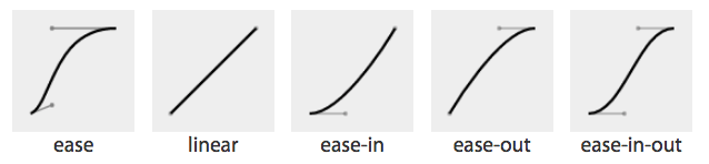
图 18-1: Cubic Bézier named functions
// T18-1
A handy tool to visualize Bézier curves and to create your own is Lea Verou’s cubic Bézier visualizer at cubic-bezier.com.
The default ease has a slow start, then speeds up, and ends slowly. This function is similar to ease-in-out, which has a greater acceleration at the beginning. linear, as the name describes, creates an animation that animates at a constant speed. ease-in creates an animation that is slow to start, gains speed, and then stops abruptly. The opposite ease-out timing function starts at full speed, then slows progressively as it reaches the conclusion of the animation iteration.
If none of these work for you, you can create your own Bézier curve timing function by passing four values, such as:
animation-timing-function: cubic-bezier(0.2, 0.4, 0.6, 0.8);Bézier curves are mathematically defined parametric curves used in two-dimensional graphic applications. See Appendix A for examples of curves you can define yourself in CSS.
The Bézier curve takes four values, defining the originating position of the two handles. In CSS, the anchors are at 0, 0 and 1, 1. The first two values define the x and y of the first point or handle of the curve, and the last two are the x and y of the second handle of the curve. The x values must be between 0 and 1, or the Bézier curve is invalid. The y coordinate is not constrained. When creating your own Bézier curve, remember: the steeper the curve, the faster the motion. The flatter the curve, the slower the motion.1
While the x values must be between 0 and 1, by using values for y that are greater than 1 or less than 0, you can create a bouncing effect, making the animation bounce up and down between values, rather than going consistently in a single direction. Consider the following timing function, whose rather outlandish Bézier curve is (partly) illustrated in Figure 18-2:
.snake {
  animation-name: shrink;
  animation-duration: 10s;
  animation-timing-function: cubic-bezier(0, 4, 1, -4);
  animation-fill-mode: both;
}
@keyframes shrink {
  0% {
    width: 500px;
  }
  100% {
    width: 100px;
  }
}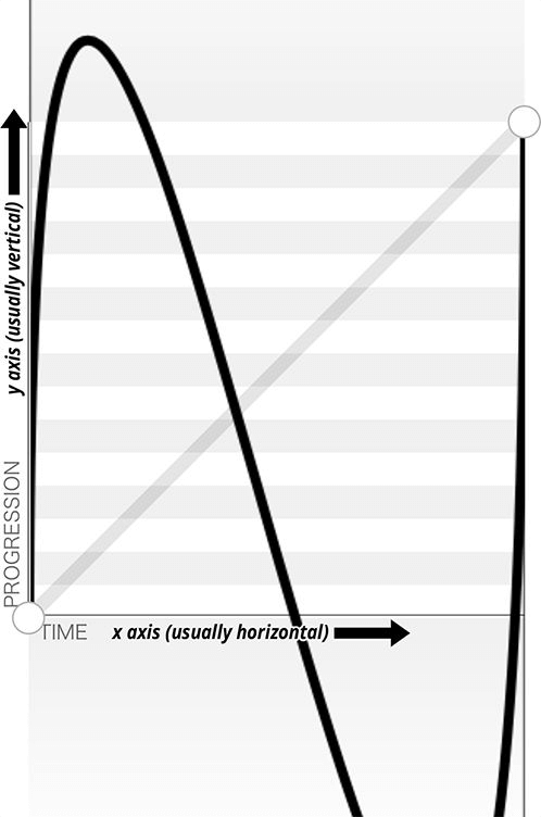
图 18-2: An outlandish Bézier curve
This animation-timing-function curve makes the animated property’s values go outside the boundaries of the values set in the 0% and 100% keyframes. In this example, we are shrinking an element from 500px to 100px. However, because of the cubic-bezier values, the element we’re shrinking will actually grow to be wider than the 500px width defined in the 0% keyframe and narrower than the 100px width defined in the 100% keyframe, as shown in Figure 18-3.
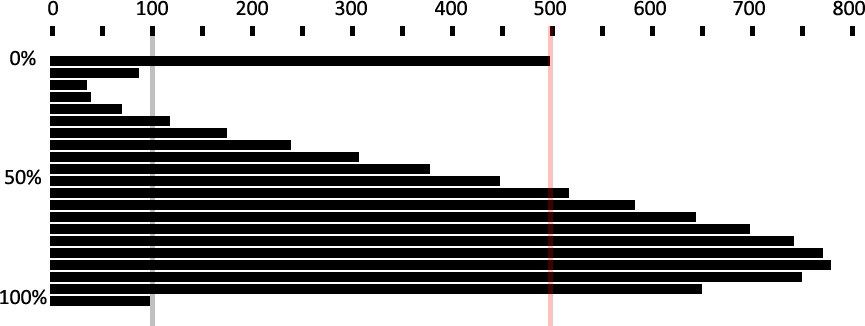
图 18-3: Effect of outlandish Bézier curve
In this scenario, the element starts with a width of 500px, defined in the 0% keyframe. It then quickly shrinks down to a width of about 40px, which is narrower than width: 100px defined in the 100% keyframe. From there, it slowly expands to about 750px wide, which is larger than the original width of 500px. It then quickly shrinks back down to width: 100px, ending the animation iteration.
You may have realized that the curve created by our animation is the same curve as the Bézier curve. Just as the S-curve goes outside the normal bounding box, the width of the animated element goes narrower than the smaller width we set of 100px, and wider than the larger width we set of 500px.
The Bézier curve has the appearance of a snake because one y coordinate is positive, and the other negative. If both are positive values greater than 1 or both are negative values less than -1, the Bézier curve is arc-shaped, going above or below one of the values set, but not bouncing out of bounds on both ends like the S-curve.
Any timing function declared with animation-timing-function sets the timing for the normal animation direction, when the animation is progressing from the 0% key‐frame to the 100% keyframe. When the animation is running in the reverse direction, from the 100% keyframe to the 0% keyframe, the animation timing function is reversed.
Remember the bouncing-ball example? The bouncing wasn’t very realistic, because the original example defaulted to ease for its timing function. With animationtiming-function, we can apply ease-in to the animation so that when the ball is dropping, it gets faster as it nears its nadir at the 100% keyframe. When it is bouncing upward, it animates in the reverse direction, from 100% to 0%, so the animatingtiming-function is reversed as well—in this case to ease-out—slowing down as it reaches the apex:
.ball {
  animation-name: bounce;
  animation-duration: 1s;
  animation-iteration-count: infinite;
  animation-timing-function: ease-in;
  animation-direction: alternate;
}
@keyframes bounce {
  0% {
    transform: translateY(0);
  }
  100% {
    transform: translateY(500px);
  }
}
Step timing functions
The step timing functions, step-start, step-end, and steps(), aren’t Bézier curves. They’re not really curves at all. Rather, they’re tweening definitions. The steps() function is most useful when it comes to character or sprite animation. The steps() timing function divides the animation into a series of equal-length steps. steps() takes two parameters: the number of steps, and the change point (more on that in a moment).
The number of steps is the first parameter; its value must be a positive integer. The animation length will be divided equally into the number of steps provided. For example, if the animation duration is 1 second and the number of steps is 5, the animation will be divided into five 200-millisecond steps, with the element being redrawn to the page five times, at 200-millisecond intervals, moving 20% through the animation at each interval.
To understand how this works, think of a flip book. Each page in a flip book contains a single drawing or picture that changes slightly from one page to the next, like one frame from a movie reel stamped onto each page. When the pages of a flip book are rapidly flipped through (hence the name), the pictures appear as an animated motion. You can create similar animations with CSS using an image sprite, the background-position property, and the steps() timing function.
Figure 18-4 shows an image sprite containing several images that change just slightly, like the drawings on the individual pages of a flip book.

图 18-4: Sprite of dancing
We put all of our slightly differing images into a single image called a sprite. Each image in our sprite is a frame in the single animated image we’re creating.
We then create a container element that is the size of a single image of our sprite, and attach the sprite as the container element’s background image. We then animate the background-position, using the steps() timing function so we only see a single instance of the changing image of our sprite at a time. The number of steps in our steps() timing function is the number of occurrences of the image in our sprite. The number of steps defines how many stops our background image makes to complete a single animation.
The sprite in Figure 18-4 has 22 images, each 56 × 100 pixels. The total size of our sprite is 1,232 × 100 pixels. We set our container to the individual image size: 56 × 100 pixels. We set our sprite as our background image: the initial or default value of background-position is top left, which is the same as 0 0. Our image will appear at 0 0, which is a good default: older browsers that don’t support CSS animation will simply display the first image from our sprite:
.dancer {
  height: 100px;
  width: 56px;
  background-image: url(../images/dancer.png);
  ....;
}
The trick is to use steps() to change the background-position value so that each frame is a view of a separate image within the sprite. Instead of sliding in the background image from the left, the steps() timing function will pop in the background image in the number of steps we declared.
So we create an animation that simple changes the left-right value of the backgroundposition. The image is 1,232 pixels wide, so we move the background image from 0 0, which is the left top, to 0 -1232px, putting the sprite fully outside of our 56 × 100 pixel div viewport.
The values of -1232px 0 will move the image completely to the left, outside of our containing block viewport. It will no longer show up as a background image in our 100 × 56 pixel div at the 100% mark unless background-repeat is set to repeat along the x-axis. We don’t want that to happen!
This is what we want:
@keyframes dance_in_place {
  from {
    background-position: 0 0;
  }
  to {
    background-position: -1232px 0;
  }
}
.dancer {
  .... background-image: url(../images/dancer.png);
  animation-name: dance_in_place;
  animation-duration: 4s;
  animation-timing-function: steps(22, end);
  animation-iteration-count: infinite;
}
What may have seemed like a complex animation is very simple: just like a flip book, we see one frame of the sprite at a time. Our keyframe animation simply moves the background.
So that covers the first parameter, the number of steps. The second parameter takes one of two values: either start or end. What this specifies whether the change for the first step’s interval takes place at the beginning of that interval, or at the end of the interval. With the default value, end, the change take place at the end of the first step. In other words, given 200 ms step lengths, the first change in the animation will not occur until 200 ms into the animation’s overall duration. With start, the first change will take place at the beginning of the first step’s interval; that is to say, the instant the animation begins. Figure 18-5 provides a timeline diagram of how the two values work, based on the following styles:
@keyframes grayfade {
  from {
    background-color: #bbb;
  }
  to {
    background-color: #333;
  }
}
.quickfader {
  animation: grayfade 1s steps(5, start) forwards;
}
.slowfader {
  animation: grayfade 1s steps(5, end) forwards;
}
图 18-5: Visualizing start and end change points
The boxes embedded into each timeline represent the background color during that step interval. Notice that in the end timeline, the first interval is the same as the background before the animation started. This is because the animation waits until the end of the first frame to make the color change for the first step (the color between “Step 1” and “Step 2”).
In the start timeline, on the other hand, the first interval makes that color change at the start of the interval, instantly switching from the starting background color to the color between “Step 1” and “Step 2”. This is sort of like jumping ahead one interval, an impression reinforced by the fact that the background color in “Step 2” of the end timeline is the same as that in “Step 1” of the start timeline.
A similar effect can be seen at the end of each animation, where the background in the fifth step of the start timeline is the same as the ending background color. In the end timeline, it’s the color at the point between “Step 4” and “Step 5”, and doesn’t switch to the ending background color until the end of “Step 5,” when the animation is finished.
The change parameter can be hard to keep straight. If it helps, think of it this way: in a normal animation direction, the start value “skips” the 0% keyframe, because it makes the first change as soon as the animation starts, and the end value “skips” the 100% keyframe.
Preserving the ending background color in this case, rather than having it reset to the starting color after the animation finishes, required the presences of the forwards keyword. We’ll cover that in “Animation Fill Modes” on page 933, later in the chapter.
The step-start value is equal to steps(1, start), with only a single step displaying the 100% keyframe. The step-end value is equal to steps(1, end), which displays only the 0% keyframe.
Adding a second animation
Let’s go back to the sprite animation, which shows our tiny dancer dancing in place. Most dancers move around when they dance. We can add a little left-and-right and back-and-forth motion by adding a second animation:
@keyframes move_around {
  0%,
  100% {
    transform: translate(0, -40px) scale(0.9);
  }
  25% {
    transform: translate(40px, 0) scale(1);
  }
  50% {
    transform: translate(0, 40px) scale(1.1);
  }
  75% {
    transform: translate(-40px, 0) scale(1);
  }
}
Here, we create a second keyframe animation called move_around and attach it to our dancer element as a second animation with comma-separated animation property declarations:
.dancer {
  .... background-image: url(../images/dancer.png);
  animation-name: dance_in_place, move_around;
  animation-duration: 4s, 16s;
  animation-timing-function: steps(22, end), steps(5, end);
  animation-iteration-count: infinite;
}
Note that each animation property has two comma-separated values except animation-iteration-count. If you recall, if an animation property doesn’t have enough comma-separated values to match the number of animations declared by the animation-name property, the values present will be repeated until there are enough. We want both animations to continue indefinitely. As the value of infinite is for all the attached animations, we only need a single value for that property. The browser will repeat the list of animation-iteration-count values—in this case, just the single value of infinite—until it has matched an animation-iteration-count value for each animation declared.
Animating the timing function
The animation-timing-function is not an animatable property, but it can be included in keyframes to alter the current timing of the animation.
Unlike animatable properties, the animation-timing-function values aren’t interpolated over time. When included in a keyframe within the @keyframes definition, the timing function for the properties declared within that same keyframe will change to the new animation-timing-function value when that keyframe is reached, as shown in Figure 18-6:
@keyframes width {
  0% {
    width: 200px;
    animation-timing-function: linear;
  }
  50% {
    width: 350px;
    animation-timing-function: ease-in;
  }
  100% {
    width: 500px;
  }
}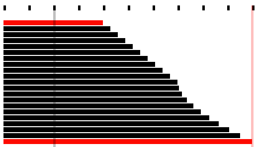
图 18-6: Changing the animation timing function mid-animation
In the preceding example, as shown in Figure 18-6, halfway through the animation, we switch from a linear animation progression for the width property to one that eases in. The ease-in timing starts from the keyframe in which the timing function changes.
Specifying the animation-timing-function within the to or 100% keyframe will have no effect on the animation. When included in any other keyframe, the animation will follow the animation-timing-function specified in that keyframe definition until it reaches the next keyframe, overriding the element’s default or declared animationtiming-function.
If the animation-timing-function property is included in a keyframe, only the properties also included in that keyframe block will have their timing function impacted. The new timing function will be in play on that property until the next keyframe containing that property is reached, at which point it will change to the timing function declared within that block, or revert back to the original timing function assigned to that element. If we take our W animation as an example:
@keyframes W {
  from {
    left: 0;
    top: 0;
  }
  25%,
  75% {
    top: 100%;
  }
  50% {
    top: 50%;
  }
  to {
    left: 100%;
    top: 0;
  }
}
This follows the idea that conceptually, when an animation is set on an element or pseudo-element, it is as if a set of keyframes is created for each property that is present in any of the keyframes, as if an animation is run independently for each property that is being animated. It’s as if the W animation were made up of two animations that run simultaneously—W_part1 and W_part2:
@keyframes W_part1 {
  from,
  to {
    top: 0;
  }
  25%,
  75% {
    top: 100%;
  }
  50% {
    top: 50%;
  }
}
@keyframes W_part2 {
  from {
    left: 0;
  }
  to {
    left: 100%;
  }
}
The animation-timing-function that is set on any of the keyframes is added to the progression of only the properties that are defined at that keyframe:
@keyframes W {
  from {
    left: 0;
    top: 0;
  }
  25%,
  75% {
    top: 100%;
  }
  50% {
    animation-timing-function: ease-in;
    top: 50%;
  }
  to {
    left: 100%;
    top: 0;
  }
}
The preceding code will change the animation-timing-function to ease-in for the top property only, not the left property, impacting only the W_part1 section of our W animation, and only from the middle of the animation to the 75% mark.
However, with the following animation, the animation-timing-function will have no effect, because it’s been placed in a keyframe block that has no property/value declarations:
@keyframes W {
  from {
    left: 0;
    top: 0;
  }
  25%,
  75% {
    top: 100%;
  }
  50% {
    animation-timing-function: ease-in;
  }
  50% {
    top: 50%;
  }
  to {
    left: 100%;
    top: 0;
  }
}
How is it useful to change the timing function mid-animation? In the bounce animation, we had a frictionless environment: the ball bounced forever, never losing momentum. The ball sped up as it dropped and slowed as it rose, because the timing function was inverted from ease-in to ease-out by default as the animation proceeded from the normal to reverse direction every other iteration.
In reality, friction exists; momentum is lost. Balls will not continue to bounce indefinitely. If we want our bouncing ball to look natural, we have to make it bounce less high as it loses energy with each impact. To do this, we need a single animation that bounces multiple times, losing momentum on each bounce, while switching between ease-in and ease-out at each apex and nadir:
@keyframes bounce {
  0% {
    transform: translateY(0);
    animation-timing-function: ease-in;
  }
  30% {
    transform: translateY(100px);
    animation-timing-function: ease-in;
  }
  58% {
    transform: translateY(200px);
    animation-timing-function: ease-in;
  }
  80% {
    transform: translateY(300px);
    animation-timing-function: ease-in;
  }
  95% {
    transform: translateY(360px);
    animation-timing-function: ease-in;
  }
  15%,
  45%,
  71%,
  89%,
  100% {
    transform: translateY(380px);
    animation-timing-function: ease-out;
  }
}
This animation loses height after a few bounces, eventually stopping.
Since this new animation uses a single iteration, we can’t rely on the animationdirection to change our timing function. We need to ensure that while each bounce causes the ball to lose momentum, it still speeds up with gravity and slows down as it reaches its apex. Because we will have only a single iteration, we control the timing by including animation-timing-function within our keyframes. At every apex, we switch to ease-in, and at every nadir, or bounce, we switch to ease-out.
18.4.8 Setting the Animation Play State
If you need to pause and resume animations, the animation-play-state property defines whether the animation is running or paused.
When set to the default running, the animation proceeds as normal. If set to paused, the animation will be paused. When paused, the animation is still applied to the element, halted at the progress it had made before being paused. If stopped mid itera‐ tion, the properties that were in the process of animating stay at their mid-iteration values. When set back to running or returned to the default of running, it restarts from where it left off, as if the “clock” that controls the animation had stopped and started again.
If the property is set to animation-play-state: paused during the delay phase of the animation, the delay clock is also paused and resumes expiring as soon as animation-play-state is set back to running.
18.4.9 Animation Fill Modes
The animation-fill-mode property enables us to define whether or not an element’s property values continue to be applied by the animation outside of the animation execution.
This property is useful because by default, the changes in an animation only apply during the animation itself. Once the animation is done, the values will all revert to their pre-animation values. Thus, if you animate the background from red to blue, the background will (by default) revert to red once the animation finishes.
Similarly, an animation will not affect the property values of the element immediately if there is a positive animation-delay applied. Rather, animation property values are applied when the animation-delay expires, when the animationstart event is fired.
With animation-fill-mode, we can define how the animation impacts the element on which it is set before the animationstart and after the animationend events are fired. Property values set in the 0% keyframe can be applied to the element during the expiration of any animation delay, and property values can continue to persist after the animationend event is fired.
The default value for animation-fill-mode is none, which means the animation has no effect when it is not executing: the animation’s 0% keyframe (or the 100% keyframe in a reverse animation) block property values are not applied to the animated element until the animation-delay has expired, when the animationstart event is fired.
When the value is set to backwards, the property values from the 0% or from keyframe (if there is one) will be applied to the element as soon as the animation is applied to the element. The 0% keyframe property values are applied immediately (or 100% key‐frame, if the value of the animation-direction property is reversed or reversedalternate), without waiting for the animation-delay time to expire.
The value of forwards means when the animation is done executing—that is, has concluded the last part of the last iteration as defined by the animation-iterationcount value, and the animationend event has fired—it continues to apply the values of the properties as they were when the animationend event occurred. If the iteration-count has an integer value, this will be either the 100% keyframe, or, if the last iteration was in the reverse direction, the 0% keyframe.
The value of both applies both the backwards effect of applying the property values as soon as the animation is attached to the element, and the forwards value of persisting the property values past the animationend event.
If the animation-iteration-count is a float value, and not an integer, the last iteration will not end on the 0% or 100% keyframe: the animation will instead end its execution partway through an animation cycle. If the animation-fill-mode is set forwards or both, the element maintains the property values it had when the anima tionend event occurred. For example, if the animation-iteration-count is 6.5, and the animation-timing-function is linear, the animationend event fires and the values of the properties at the 50% mark (whether or not a 50% keyframe is explicitly declared) will stick, as if the animation-play-state had been set to pause at that point.
For example, if we take the following code:
@keyframes move_me {
  0% {
    transform: translateX(0);
  }
  100% {
    transform: translateX(1000px);
  }
}
.moved {
  transform: translateX(0);
  animation-name: move_me;
  animation-duration: 10s;
  animation-timing-function: linear;
  animation-iteration-count: 0.6;
  animation-fill-mode: forwards;
}
The animation will only go through 0.6 iterations. Being a linear 10-second animation, it will stop at the 60% mark, 6 seconds into the animation, when the element is translated 600 pixels to the right. With animation-fill-mode set to forwards or both, the animation will stop animating when it is translated 600 pixels to the right, holding the moved element 600 pixels to the right of its original position. This will keep it translated indefinitely, or at least until the animation is detached from the element. Without the animation-fill-mode: forwards, the element with class moved will pop back to it’s original transform: translateX(0), as defined in the moved selector code block.

In Safari 9 and earlier, forwards and both will set the values from the 100% keyframe onto the element, no matter the direction of the last iteration or whether the animation otherwise ended on the 100% keyframe or elsewhere in the animation. In the preceding example, in Safari 9, the .moved element jumps from being translated by 400 pixels to the right to be 1,000 pixels to the right of where it normally would have been, and stays there. In Safari 9 and earlier, it doesn’t matter whether the last iteration was normal or reverse, or whether the animation ended 25% or 75% of the way through an animation cycle; animation-fill-mode: forwards causes the animation to jump to the 100% frame and stay there. This follows an older version of the specification, but we expect it will be updated to match the updated specification and all other evergreen browsers.
18.5 Bringing It All Together
The animation shorthand property allows you to use one line, instead of eight, to define all the animation parameters for an element. The animation property value is a list of space-separated values for the various longhand animation properties. If you are setting multiple animations on an element or pseudo-element, you can use a comma-separated list of animations.
The animation shorthand takes as its value all the other preceding animation properties, including animation-duration, animation-timing-function, animationdelay, animation-iteration-count, animation-direction, animation-fill-mode, animation-play-state, and animation-name. For example, the following two rules are precisely equivalent:
#animated {
  animation: 200ms ease-in 50ms 1 normal running forwards slidedown;
}
#animated {
  animation-name: slidedown;
  animation-duration: 200ms;
  animation-timing-function: ease-in;
  animation-delay: 50ms;
  animation-iteration-count: 1;
  animation-fill-mode: forwards;
  animation-direction: normal;
  animation-play-state: running;
}
We didn’t have to declare all of the values in the animation shorthand; any values that aren’t declared are set to the default or initial values. The first shorthand line was long and three of the properties were set to default, so were not necessary.
It’s important to remember that if you don’t declare all eight values in your shorthand declaration, the ones you don’t declare will get the initial value for that property. The initial or default values are:
animation-name: none;
animation-duration: 0s;
animation-timing-function: ease;
animation-delay: 0;
animation-iteration-count: 1;
animation-fill-mode: none;
animation-direction: normal;
animation-play-state: running;
The order of the shorthand is important in two very specific ways. First, there are two time properties permitted, for <animation-duration> and <animation-delay>. When two are listed, the first is always the duration. The second, if present, is interpreted as the delay.
Second, the placement of the animation-name is also important. If you use an animation property value as your animation identifier—which you shouldn’t, but say that you do—then the animation-name should be placed as the last property value in the animation shorthand. The first occurrence of a keyword that is a valid value for any of the other animation properties, such as ease or running, is assumed to be part of the shorthand of the animation property the keyword is associated with, rather than the animation-name. Note that none is basically the only word that is not a valid animation name:
#failedAnimation {
  animation: paused 2s;
}
This is the equivalent to:
#failedAnimation {
  animation-name: none;
  animation-duration: 2s;
  animation-delay: 0;
  animation-timing-function: ease;
  animation-iteration-count: 1;
  animation-fill-mode: none;
  animation-direction: normal;
  animation-play-state: paused;
}
paused is a valid animation name. While it may seem that the animation named paused with a duration of 2s is being attached to the element, that is not what is happening in the above shorthand. Because words within the shorthand animation are first checked against possible valid values of all animation properties other than animation-name first, paused is being set as the value of the animation-play-state property:
#anotherFailedAnimation {
  animation: running 2s ease-in-out forwards;
}
The preceding code snippet is the equivalent to:
#anotherFailedAnimation {
  animation-name: none;
  animation-duration: 2s;
  animation-delay: 0s;
  animation-timing-function: ease-in-out;
  animation-iteration-count: 1;
  animation-fill-mode: forwards;
  animation-direction: normal;
  animation-play-state: running;
}
The developer probably has a keyframe animation called running. The browser, however, sees the term and assigns it to the animation-play-state property rather than the animation-name property. With no animation-name declared, there is no animation attached to the element. The way to get around this would be:
#aSuccessfulIfInadvisableAnimation {
  animation: running 2s ease-in-out forwards running;
}
This will apply the first running to animation-play-state, and the second running to animation-name. Again: this is not advised. The potential for confusion and error is too great.
In light of all this, animation: 2s 3s 4s; may seem valid, as if the following were being set:
#invalidName {
  animation-name: 4s;
  animation-duration: 2s;
  animation-delay: 3s;
}
But as was mentioned in “Setting Up Keyframe Animations” on page 893, 4s is not a valid identifier. Identifiers cannot start with a digit unless escaped. For this animation to be valid, it would have to be written as animation: 2s 3s \4s; To attach multiple animations to a single element or pseudo-element, commaseparate the animations:
.snowflake {
  animation: 3s ease-in 200ms 32 forwards falling, 1.5s linear 200ms 64 spinning;
}
The snowflake will fall while spinning for 96 seconds, spinning twice during each 3-second fall. At the end of the last animation cycle, the snowflake will stay fixed on the 100% keyframe of the falling animation. We declared six of the eight animation properties for the falling animation and five for the spinning animation, separating the two animations with a comma.
While you’ll most often see the animation name as the first value—it’s easier to read that way, because of the issue with animation property keywords being valid keyframe identifiers—it is not a best practice. That is why we put the animation name at the end.
To sum up: it is a fine idea to use the animation shorthand. Just remember that the placements of the duration, delay, and name within that shorthand are important, and omitted values will be set to their default values. Also, it is a good idea to not use any animation keywords as your identifier.
18.6 Animation, Specificity, and Precedence Order
In terms of specificity, the cascade, and which property values get applied to an element, animations (as of late 2017) incorrectly supersede all other values in the cascade.
18.6.1 Specificity and !important
In general, the weight of a property attached with an ID selector 1-0-0 should take precedence over a property applied by an element selector 0-0-1. However, if that property value was changed via a keyframe animation, it will be applied as if that property/value pair were added as an inline style.
The current behavior in all browsers that support animation is as if the property values set by keyframes were declared inline with an added !important—as if they were something like <div style="keyframe-property: value !important">. This is wrong, according to the specifications. The animation specification states “animations override all normal rules, but are overridden by !important rules.” This is a bug in the late 2017 implementations and should be resolved eventually. Or, perhaps, the specification will change.
That being said, don’t include !important within your animation declaration block; this use is invalid, and the property/value combination upon which it is declared will be ignored.
18.6.2 Animation Order
If there are multiple animations specifying values for the same property, the property value from the last animation applied will override the previous animations:
#colorchange {
  animation-name: red, green, blue;
  animation-duration: 11s, 9s, 6s;
}
In this code example, if red, green, and blue are all keyframe animations that change the color property to their respective names, once the animation-name and animation-duration properties are applied to #colorchange, for the first six seconds, the property values in blue will take precedence, then green for three seconds, then red for two seconds, before returning to default property values. In this scenario, if the blue @keyframe animation does not include the color property in the 0% keyframe, the color will be taken from the animation named green, the animation named red, or the element’s currentColor value, in that order. The same is true for an omitted 100% keyframe.
The default properties of an element are not impacted before the animation starts, and the properties return to their original values after the animation ends unless an animation-fill-mode value other than the default none has been set. If animationfill-mode: both were added to the mix, the color would always be blue, as the last animation, or blue, overrides the previous green animation, which overrides the red first animation.
18.6.3 Animation Iteration and display: none;
If the display property is set to none on an element, any animation iterating on that element or its descendants will cease, as if the animation were detached from the element. Updating the display property back to a visible value will reattach all the animation properties, restarting the animation from scratch:
.snowflake {
  animation: spin 2s linear 5s 20;
}
In this case, the snowflake will spin 20 times; each spin takes 2 seconds, with the first spin starting after 5 seconds. If the snowflake element’s display property gets set to none after 15 seconds, it would have completed 5 spins before disappearing (after getting through the 5-second delay, then executing 5 spins at 2 seconds each). If the snowflake display property changes back to anything other than none, the animation starts from scratch: a 5-second delay will elapse again before it starts spinning 20 times. It makes no difference how many animation cycles iterated before it disappeared from view the first time.
18.6.4 Animation and the UI Thread
CSS animations have the lowest priority on the user interface (UI) thread. If you attach multiple animations on page load with positive values for animation-delay, the delays expire as specified, but the animations may not begin until the UI thread is available to animate.
Assume the following:
- The animations all require the UI thread (that is, they aren’t on the GPU as described in “Animation chaining” on page 912).
- You have 20 animations with the animation-delay property set to 1s, 2s, 3s, 4s, and so on in order to start each subsequent animation one second after the previous animation.
- The document or application takes a long time to load, with 11 seconds between the time the animated elements were drawn to the page and the time the JavaScript finished being downloaded, parsed, and executed.
Given all that, the delays of the first 11 animations will have expired once the UI thread is available, and those first 11 animations will all commence simultaneously. The remaining animations will each then begin animating at one-second intervals.
18.7 Seizure and Vestibular Disorders
While you can use animations to create ever-changing content, dynamically changing content can lead to seizures in some users. Always keep this in mind, and ensure the accessibility of your website to people with epilepsy and other seizure disorders.
We don’t usually start a section with a warning, but in this case, it’s warranted. Visual change, especially rapid visual change, can trigger medical emergencies in users who are prone to seizures. They can also cause severe unease in users who are prone to vestibular disorder (motion sickness).
As this book was going to press in late 2017, a new media query was being deployed in browsers: prefers-reduced-motion. This allows authors to apply styles when the user has a “Reduce motion” or similar preference set for their browser or device. Strongly consider an approach such as this:
@media (prefers-reduced-motion) {
  * {
    animation: none !important;
    transition: none !important;
  }
}
This disables all animations and transitions, assuming no other !important animations are specified (and they shouldn’t be). This is not a nuanced or perfect solution, but it’s a first step. You can invert this approach by segregating all of your animations and transitions in a media block for those who do not have motion reduction enabled, like this:
@media not (prefers-reduced-motion) {
  /* all animations and transitions */
}
Not all animations are dangerous or disorienting, and it may be necessary to have at least some animations for all users. In such cases, use prefers-reduced-motion to tone down animations that are essential to understanding of the UI, and to switch off those that are essentially decorative.
18.8 Animation Events and Prefixing
Let’s recap animation-related events we can access with DOM event listeners, and what prefixing may be required when using them.
18.8.1 animationstart
The animationstart event occurs at the start of the animation. If there is an animation-delay, this event will fire once the delay period has expired. If there is no delay, the animationstart event occurs when the animation is applied to the element. Even if there are no iterations, the animationstart event still occurs. If there are multiple animations attached to an element, an animationstart event will occur for each of the applied valid keyframe animations: generally, one animationstart for each valid animation-name identifier present:
#colorchange {
  animation: red, green, blue;
}
In this example, as long as the red, green, and blue keyframe animations are valid, while the animations will not be perceptible (as the default duration of 0s is set on each), there will be three animationstart events thrown: one for each animation name.
If the browser requires the -webkit- prefix for the animation properties—basically, Safari 8 and earlier and Android 4.4.4 and older—the event is written as webkitAnima tionStart instead of animationstart. Note the -webkit- prefix and the camelCasing. It is best to default to the unprefixed syntax and fall back to the prefixed version only when the unprefixed is unavailable.
18.8.2 animationend
The animationend event occurs at the conclusion of the last animation. It only occurs once per applied animation: if an element has three animations applied to it, like in the earlier #colorchange example, the animationend event will occur three times, at the end of the animation. In the example, there was no duration for any of the animations; however, the animationend event timing is usually equivalent to the result of the following equation:
animation - duration * animation - iteration - count + animation - delay = time;Even if there are no iterations, the animationend event still occurs once for each animation applied. If the animation-iteration-count is set to infinite, the animationend event never occurs.
If the browser requires the -webkit- prefix for the animation properties, the event is written as webkitAnimationEnd instead of animationend.
18.8.3 animationiteration
The animationiteration event occurs at the end of each iteration of an animation, before the start of the next iteration. If there are no iterations, or the iteration count is less than or equal to one, the animationiteration event never occurs. If the iteration count is infinite, the animationiteration event occurs ad infinitum, unless there is no duration set or the duration is 0s.
Unlike the animationstart and animationend events, which each occur once for each animation name, the animationiteration event can occur multiple times or no times per animation name, depending on how many iterations occur. Note that the event happens between animation cycles and will not occur at the same time as an animationend event. In other words, if the animation-iteration-count is an integer, the number of animationiteration events that occur is generally one less that the value of the animation-iteration-count property, as long as the absolute value of any negative delay is less than the duration.
18.9 Printing Animations
While not actually “animating” on a printed piece of paper, when an animated element is printed, the relevant property values will be printed. You can’t see the element animating on a piece of paper, but if the animation caused an element to have a border-radius of 50%, the printed element will have a border-radius of 50%.