第 14 章 CSS 中的表格布局 Table Layout in CSS
第 14 章 CSS 中的表格布局 Table Layout in CSS
You may have glanced at that title and wondered, “Table layout? Isn’t that exactly what we’re trying to avoid doing?” Indeed so, but this chapter is not about using tables for layout. Instead, it’s about the ways that tables themselves are laid out by CSS, which is a far more complicated affair than it might first appear.
您可能已经瞥了一眼这个标题,并想知道,“表布局?这难道不是我们试图“避免”做的事情吗?“确实如此,但本章不是关于使用表格'为'布局。相反,它是关于表本身由 CSS 安排的方式,这是一个比它最初看起来要复杂得多的事情。
Tables are unusual, compared to the rest of document layout. Until flexbox and grid came along, tables alone possessed the unique ability to associate element sizes with other elements—for example, all the cells in a row have the same height, no matter how much or how little content each individual cell might contain. The same is true for the widths of cells that share a column. Cells that adjoin can share a border, even if the two cells have very different border styles. As we’ll see, these abilities are purchased at the expense of a great many behaviors and rules—many of them rooted deep in the past—that apply to tables, and only tables.
与其他文档布局相比,表是不常见的。在 flexbox 和 grid 出现之前,表本身就具有将元素大小与其他元素相关联的独特能力——例如,一行中的所有单元都具有相同的高度,不管每个单元可能包含多少内容。对于共享列的单元格宽度也是如此。相邻的单元格可以共享一个边框,即使两个单元格具有非常不同的边框样式。我们将看到,这些能力是以牺牲大量的行为和规则为代价来购买的——其中许多深深扎根于过去——它们适用于表,而且只适用于表。
14.1 Table Formatting
Before we can start to worry about how cell borders are drawn and tables sized, we need to delve into the fundamental ways in which tables are assembled, and the ways that elements within a table are related. This is referred to as table formatting, and it is quite distinct from table layout: the layout is possible only after the formatting has been completed.
在开始考虑如何绘制单元格边界和表的大小之前,我们需要深入研究表组装的基本方法,以及表中的元素之间的关系。这称为表格式化,它与表布局非常不同:只有在格式化完成后才能进行布局。
14.1.1 Visually Arranging a Table
The first thing to understand is how CSS defines the arrangement of tables. While this knowledge may seem a bit basic, it’s key to understanding how best to style tables.
首先要理解的是 CSS 如何定义表的排列。虽然这些知识看起来有点基础,但它是理解如何最好地设计表的关键。
CSS draws a distinction between table elements and internal table elements. In CSS, internal table elements generate rectangular boxes that have content, padding, and borders, but not margins. Therefore, it is not possible to define the separation between table cells by giving them margins. A CSS-conformant browser will ignore any attempts to apply margins to cells, rows, or any other internal table element (with the exception of captions, which are discussed in the “Captions” on page 744).
CSS 区分了表元素和内部表元素。在 CSS 中,内部表元素生成有内容、填充和边框,但没有空白的矩形框。因此,通过给表单元格提供边距来定义它们之间的分隔是“不可能”的。符合 css 的浏览器将忽略任何将页边距应用到单元格、行或任何其他内部表元素的尝试(标题除外,在第 744 页的“标题”中讨论了标题)。
There are six basic rules for arranging tables. The basis of these rules is a grid cell, which is one area between the grid lines on which a table is drawn. Consider Figure 14-1, in which two tables are shown: their grid cells are indicated by the dashed lines drawn over the tables.
摆桌子有六条基本规则。这些规则的基础是一个网格单元,它是绘制表格的网格线之间的一个区域。考虑图 14-1,其中显示了两个表:它们的网格单元格由在表上绘制的虚线表示。

图 14-1: Grid cells form the basis of table layout
In a simple 2 × 2 table, such as the lefthand table shown in Figure 14-1, the grid cells correspond to the actual table cells. In a more complicated table, like the righthand table in Figure 14-1, some table cells will span multiple grid cells—but note that every table cell’s edges are placed along a grid-cell edge.
在一个简单的 2×2 表格中,如图 14-1 所示的左边表格中,网格单元对应于实际的表格单元。在更复杂的表(如图 14-1 中的右侧表)中,一些表格单元格将跨越多个网格单元格—但是请注意,每个表格单元格的边缘都是沿着网格单元格边缘放置的。
These grid cells are largely theoretical constructs, and they cannot be styled or even accessed through the Document Object Model (DOM). They just serve as a way to describe how tables are assembled for styling.
这些网格单元主要是理论结构,不能通过文档对象模型(Document Object Model, DOM)设置样式甚至访问它们。它们只是用来描述如何将表组装成样式。
Table arrangement rules
- Each
row boxencompasses a single row of grid cells. All the row boxes in a table fill the table from top to bottom in the order they occur in the source document (with the exception of any table-header or table-footer row boxes, which come at he beginning and end of the table, respectively). Thus, a table contains as many grid rows as there are row elements (e.g.,trelements). - A
row group’s box encompasses the same grid cells as the row boxes it contains. - A
column boxencompasses one or more columns of grid cells. All the column boxes are placed next to one another in the order they occur. The first column box is on the left for left-to-right languages, and on the right for right-to-left languages. - A
column group’s box encompasses the same grid cells as the column boxes it contains. - Although cells may span several rows or columns, CSS does not define how this happens. It is instead left to the document language to define spanning. Each spanned cell is a rectangular box one or more grid cells wide and high. The top row of this spanning rectangle is in the row that is parent to the spanned grid cell. The cell’s rectangle must be as far to the left as possible in left-to-right languages, but it may not overlap any other cell box. It must also be to the right of all cells in the same row that are earlier in the source document (in a left-to-right language). In right-to-left languages, a spanned cell must be as far to the
rightas possible without overlapping other cells, and must be to theleftof all cells in the same row that follow it in the document source. - A cell’s box
cannotextend beyond the last row box of a table or row group. If the table structure would cause this condition, the cell must be shortened until it fits within the table or row group that encloses it.
- 每个“行框”包含一行网格单元格。表中的所有行框按照它们在源文档中出现的顺序从上到下填充表(除了表头行框和表脚行框,它们分别位于表的开头和结尾)。因此,一个表包含的网格行与行元素(例如‘tr’元素)一样多。
- “行组”框包含与其包含的行框相同的网格单元格。
- “列框”包含一个或多个网格单元格列。所有的列框都按它们出现的顺序排列在一起。第一个列框位于左侧,表示从左到右的语言,右侧表示从右到左的语言。
- “列组”的框包含与其包含的列框相同的网格单元。
- 虽然单元格可能跨越几行或几列,但 CSS 没有定义这是如何发生的。而是让文档语言来定义生成。每个网格单元是一个矩形的盒子,一个或多个网格单元又宽又高。这个生成矩形的第一行位于已生成的网格单元格的父行中。在从左到右的语言中,单元格的矩形必须尽可能地向左,但它不能与任何其他单元格框重叠。它还必须位于源文档(以从左到右的语言)中同一行的所有单元格的右侧。在从右到左的语言中,一个扩展的单元格必须尽可能地位于“右边”而不与其他单元格重叠,并且必须位于文档源中跟随它的同一行的所有单元格的“左边”。
- 单元格的框“不能”扩展到表或行组的最后一行框之外。如果表结构会导致这种情况,则必须缩短单元格,直到它适合包围它的表或行组。

The CSS specification discourages, but does not prohibit, the positioning of table cells and other internal table elements. Positioning a row that contains row-spanning cells, for example, could dramatically alter the layout of the table by removing the row from the table entirely, thus removing the spanned cells from consideration in the layout of other rows. Nevertheless, it is quite possible to apply positioning to table elements in current browsers.
By definition, grid cells are rectangular, but they do not all have to be the same size. All the grid cells in a given grid column will be the same width, and all the grid cells in a grid row will be the same height, but the height of one grid row may be different than that of another grid row. Similarly, grid columns may be of different widths.
根据定义,网格单元是矩形的,但它们的大小不一定相同。一个给定的网格列中的所有网格单元都具有相同的宽度,一个网格行中的所有网格单元都具有相同的高度,但是一个网格行中的高度可能与另一个网格行中的高度不同。类似地,网格列可能具有不同的宽度。
With those basic rules in mind, a question may arise: how, exactly, do you know which elements are cells and which are not?
有了这些基本规则,可能会出现一个问题:您如何确切地知道哪些元素是单元格,哪些不是?
14.1.2 Table Display Values
In HTML, it’s easy to know which elements are parts of tables because the handling of elements like tr and td is built into browsers. In XML, on the other hand, there is no way to intrinsically know which elements might be part of a table. This is where a whole collection of values for display come into play.
在 HTML 中,很容易知道哪些元素是表的一部分,因为浏览器内置了对“tr”和“td”等元素的处理。另一方面,在 XML 中,无法从本质上知道哪些元素可能是表的一部分。这就是“display”的整个值集合发挥作用的地方。
In this chapter, we’ll stick to the table-related values, as the others are all beyond the scope of tables. The table-related values can be summarized as follows:
在本章中,我们将坚持使用与表相关的值,因为其他值都超出了表的范围。表相关的值可以总结如下:
table
This value specifies that an element defines a block-level table. Thus, it defines a rectangular block that generates a block box. The corresponding HTML element is, not surprisingly, table.
此值指定元素定义块级表。因此,它定义了一个生成块框的矩形块。毫不奇怪,对应的 HTML 元素是' table '。
inline-table
This value specifies that an element defines an inline-level table. This means the element defines a rectangular block that generates an inline box. The closest non-table analogue is the value inline-block. The closest HTML element is table, although, by default, HTML tables are not inline.
此值指定元素定义内联级表。这意味着元素定义了一个生成内联框的矩形块。最接近的非表类似物是值“内联块”。最接近的 HTML 元素是' table ',尽管在默认情况下,HTML 表不是内联的。
table-row
This value specifies that an element is a row of table cells. The corresponding HTML element is the tr element.
此值指定元素是表单元格的行。对应的 HTML 元素是' tr '元素。
table-row-group
This value specifies that an element groups one or more table rows. The corresponding HTML value is tbody.
此值指定元素对一个或多个表行进行分组。对应的 HTML 值是' tbody '。
table-header-group
This value is very much like table-row-group, except that for visual formatting, the header row group is always displayed before all other rows and row groups, and after any top captions. In print, if a table requires multiple pages to print, a user agent may repeat header rows at the top of each page (Firefox does this, for example). The specification does not define what happens if you assign table-header-group to multiple elements. A header group can contain multiple rows. The HTML equivalent is thead.
这个值与‘table-row-group’非常相似,除了对于可视格式,标题行组总是显示在所有其他行和行组之前,以及任何顶部标题之后。在打印中,如果一个表需要打印多个页面,用户代理可能会在每个页面的顶部重复标题行(例如,Firefox 会这样做)。规范没有定义如果将' table-header-group '分配给多个元素会发生什么。标题组可以包含多行。与之对应的是“thead”。
table-footer-group
This value is very much like table-header-group, except that the footer row group is always displayed after all other rows and row groups, and before any bottom captions. In print, if a table requires multiple pages to print, a user agent may repeat footer rows at the bottom of each page. The specification does not define what happens if you assign table-footer-group to multiple elements. This is equivalent to the HTML element tfoot.
这个值与‘table-header-group’非常相似,不同之处在于页脚行组总是显示在所有其他行和行组之后,以及任何底部标题之前。在打印中,如果一个表需要打印多个页面,用户代理可以在每个页面的底部重复页脚行。规范没有定义如果将' table-footer-group '分配给多个元素会发生什么。这相当于 HTML 元素“tfoot”。
table-column
This value declares that an element describes a column of table cells. In CSS terms, elements with this display value are not visually rendered, as if they had the value none. Their existence is largely for the purposes of helping to define the presentation of cells within the column. The HTML equivalent is the col element.
此值声明元素描述表单元格的列。在 CSS 术语中,具有这个“display”值的元素不会被可视化呈现,就像它们具有“none”值一样。它们的存在主要是为了帮助定义列中单元格的表示形式。与之对应的 HTML 是“col”元素。
table-column-group
This value declares that an element groups one or more columns. Like table-column elements, table-column-group elements are not rendered, but the value is useful for defining presentation for elements within the column group. The HTML equivalent is the colgroup element.
此值声明元素对一个或多个列进行分组。与' table-column '元素类似,' table-column-group '元素不会被呈现,但是该值对于定义列组内元素的表示方式很有用。对应的 HTML 是“colgroup”元素。
table-cell
This value specifies that an element represents a single cell in a table. The HTML elements th and td are both examples of table-cell elements.
此值指定元素表示表中的单个单元格。HTML 元素' th '和' td '都是' table-cell '元素的例子。
table-caption
This value defines a table’s caption. CSS does not define what should happen if multiple elements have the value caption, but it does explicitly warn, “authors should not put more than one element with display: caption inside a table or inline-table element.”
此值定义表的标题。CSS 没有定义如果多个元素有值“标题”会发生什么,但它明确警告,“作者不应该把一个以上的元素与“显示:标题”在一个表或内联表元素。”
You can get a quick summary of the general effects of these values by taking an excerpt from the example HTML 4.0 stylesheet given in Appendix D of the CSS 2.1 specification:
从 CSS 2.1 规范的附录 D 中给出的 HTML 4.0 样式表示例中,您可以快速总结这些值的一般效果:
table {
  display: table;
}
tr {
  display: table-row;
}
thead {
  display: table-header-group;
}
tbody {
  display: table-row-group;
}
tfoot {
  display: table-footer-group;
}
col {
  display: table-column;
}
colgroup {
  display: table-column-group;
}
td,
th {
  display: table-cell;
}
caption {
  display: table-caption;
}
In XML, where elements will not have display semantics by default, these values become quite useful. Consider the following markup:
在 XML 中,默认情况下元素没有显示语义,这些值非常有用。考虑以下标记:
<scores>
  <headers>
    <label>Team</label>
    <label>Score</label>
  </headers>
  <game sport="MLB" league="NL">
    <team>
      <name>Reds</name>
      <score>8</score>
    </team>
    <team>
      <name>Cubs</name>
      <score>5</score>
    </team>
  </game>
</scores>
This could be formatted in a tabular fashion using the following styles:
可以使用以下样式以表格形式进行格式化:
scores {
  display: table;
}
headers {
  display: table-header-group;
}
game {
  display: table-row-group;
}
team {
  display: table-row;
}
label,
name,
score {
  display: table-cell;
}
The various cells could then be styled as necessary—for example, boldfacing the label elements and right-aligning the scores.
然后可以根据需要对各种单元格进行样式化——例如,粗体显示“label”元素并右对齐“scores”。
Row primacy
CSS defines its table model as “row primacy.” In other words, the model assumes that authors will create markup languages where rows are explicitly declared. Columns, on the other hand, are derived from the layout of the rows of cells. Thus, the first column is made up of the first cells in each row; the second column is made up of the second cells, and so forth.
CSS 将其表模型定义为“row primacy”。换句话说,该模型假设作者将创建明确声明行的标记语言。另一方面,列是从单元格行的布局派生出来的。因此,第一列由每行中的第一个单元格组成;第二列由第二单元格组成,以此类推。
Row primacy is not a major issue in HTML, where the markup language is already row-oriented. In XML, it has more of an impact because it constrains the way in which authors can define table markup. Because of the row-oriented nature of the CSS table model, a markup language in which columns are the basis of table layout is not really possible (assuming that the intent is to use CSS to present such documents).
在 HTML 中,行首性不是主要问题,因为标记语言已经是面向行的。在 XML 中,它的影响更大,因为它限制了作者定义表标记的方式。由于 CSS 表模型的面向行特性,以列作为表布局基础的标记语言实际上是不可能的(假设意图是使用 CSS 来表示此类文档)。
Columns
Although the CSS table model is row-oriented, columns do still play a part in layout. A cell can belong to both contexts (row and column), even though it is descended from row elements in the document source. In CSS, however, columns and column groups can accept only four nontable properties: border, background, width, and visibility.
虽然 CSS 表模型是面向行的,但列仍然在布局中发挥作用。一个单元格可以属于两个上下文(行和列),即使它是文档源中的行元素的后代。然而,在 CSS 中,列和列组只能接受四个非表属性:“border”、“background”、“width”和“visibility”。
In addition, each of these four properties has special rules that apply only in the columnar context:
此外,这四个属性都有只适用于列上下文的特殊规则:
border
Borders can be set for columns and column groups only if the property border-collapse has the value collapse. In such circumstances, column and column-group borders participate in the collapsing algorithm that sets the border styles at each cell edge. (See “Collapsing Cell Borders” on page 749.)
只有在“border-collapse”属性的值为“collapse”时,才能为列和列组设置边框。在这种情况下,列和列组边界参与了在每个单元格边缘设置边界样式的折叠算法。(参见 749 页“折叠单元格边框”。)
background
The background of a column or column group will be visible only in cells where both the cell and its row have transparent backgrounds. (See “Table Layers” on page 742.)
列或列组的背景将仅在单元格中可见,其中单元格及其行都具有透明的背景。(参见 742 页的“表层”。)
width
The width property defines the minimum width of the column or column group. The content of cells within the column (or group) may force the column to become wider.
“宽度”属性定义列或列组的“最小”宽度。列(或组)中的单元格内容可能会迫使列变得更宽。
visibility
If the value of visibility for a column or column group is collapse, then none of the cells in the column (or group) are rendered. Cells that span from the collapsed column into other columns are clipped, as are cells that span from other columns into the hidden column. Furthermore, the overall width of the table is reduced by the width the column would have taken up. A declaration of any visibility value other than hidden is ignored for a column or column group.
如果列或列组的“可见性”的值为“折叠”,则列(或列组)中的任何单元格都不会呈现。从折叠列跨越到其他列的单元格被剪切,从其他列跨越到隐藏列的单元格也被剪切。此外,表的总宽度被列占用的宽度所减少。对于列或列组,除了“隐藏”之外的任何“可见性”值的声明都将被忽略。
14.1.3 Anonymous Table Objects
There is the possibility that a markup language might not contain enough elements to fully represent tables as they are defined in CSS, or that an author will forget to include all the necessary elements. For example, consider this HTML:
在 CSS 中定义表时,标记语言可能不包含足够的元素来完全表示表,或者作者可能会忘记包含所有必要的元素。例如,考虑这个 HTML:
<table>
  <td>Name:</td>
  <td><input type="text" /></td>
</table>
You might glance at this markup and assume that it defines a two-cell table of a single row, but structurally, there is no element defining a row (because the tr is missing).
您可能会扫一眼这个标记,并假设它定义了一个单行的双单元表,但是在结构上,没有元素定义行(因为缺少“tr”)。
To cover such possibilities, CSS defines a mechanism for inserting “missing” table components as anonymous objects. For a basic example of how this works, let’s revisit our missing-row HTML example. In CSS terms, what effectively happens is that an anonymous table-row object is inserted between the table element and its descendant table cells:
为了涵盖这些可能性,CSS 定义了一种将“缺少的”表组件插入为匿名对象的机制。作为它如何工作的一个基本示例,让我们重新查看我们的缺失行 HTML 示例。在 CSS 术语中,一个匿名的表行对象被插入到“table”元素和它的子表单元格之间:
<table>
  <!--anonymous table-row object begins-->
  <td>Name:</td>
  <td><input type="text" /></td>
  <!--anonymous table-row object ends-->
</table>
A visual representation of this process is given in Figure 14-2, where the dotted line represents the inserted anonymous table row.
图 14-2 给出了这个过程的可视化表示,虚线表示插入的匿名表行。

图 14-2: Anonymous-object generation in table formatting
Seven different kinds of anonymous-object insertions can occur in the CSS table model. These seven rules are, like inheritance and specificity, an example of a mechanism that attempts to impose intuitive sense on the way CSS behaves.
在 CSS 表模型中可以出现七种不同的匿名对象插入。这 7 条规则与继承和特殊性一样,是一种试图将直觉强加于 CSS 行为方式的机制的例子。
Object insertion rules
- If a
table-cellelement’s parent is not atable-rowelement, then an anonymoustable-rowobject is inserted between thetable-cellelement and its parent. The inserted object will include all consecutive siblings of thetable-cellelement. Consider the following styles and markup:
- 如果' table-cell '元素的父元素不是' table-row '元素,则在' table-cell '元素与其父元素之间插入一个匿名' table-row '对象。插入的对象将包括' table-cell '元素的所有连续兄弟元素。考虑以下样式和标记:
system {
  display: table;
}
name,
moons {
  display: table-cell;
}<system>
<name>Mercury</name>
<moons>0</moons>
</system>The anonymous table-row object is inserted between the cell elements and the system element, and it encloses both the name and moons elements.
匿名的' table-row '对象被插入到 cell 元素和' system '元素之间,它同时包含' name '和' moon '元素。
The same holds true even if the parent element is a table-row-group. To extend the example, assume that the following applies:
即使父元素是' table-row-group '也是如此。为了扩展这个例子,假设以下内容适用:
system {
  display: table;
}
planet {
  display: table-row-group;
}
name,
moons {
  display: table-cell;
}<system>
<planet>
<name>Mercury</name>
<moons>0</moons>
</planet>
<planet>
<name>Venus</name>
<moons>0</moons>
</planet>
</system>In this example, both sets of cells will be enclosed in an anonymous table-row object that is inserted between them and the planet elements.
在本例中,这两组单元格都包含在一个匿名的“table-row”对象中,该对象插入到它们与“planet”元素之间。
- If a
table-rowelement’s parent is not atable,inline-table, ortable-row-groupelement, then an anonymoustableelement is inserted between thetable-rowelement and its parent. The inserted object will include all consecutive siblings of thetable-rowelement. Consider the following styles and markup:
- 如果' table-row '元素的父元素不是' table '、' inline-table '或' table-row-group '元素,则在' table-row '元素与其父元素之间插入一个匿名' table '元素。插入的对象将包括' table-row '元素的所有连续兄弟元素。考虑以下样式和标记:
docbody {
  display: block;
}
planet {
  display: table-row;
}<docbody>
<planet>
<name>Mercury</name>
<moons>0</moons>
</planet>
<planet>
<name>Venus</name>
<moons>0</moons>
</planet>
</docbody>Because the display value of the planet elements’ parent is block, the anonymous table object is inserted between the planet elements and the docbody element. This anonymous table object will enclose both planet elements, since they are consecutive siblings.
因为“planet”元素的父元素的“display”值是“block”,所以匿名的“table”对象被插入到“planet”元素和“docbody”元素之间。这个匿名“表”对象将包含两个“planet”元素,因为它们是连续的兄弟元素。
- If a
table-columnelement’s parent is not atable,inline-table, ortable-column-groupelement, then an anonymoustableelement is inserted between thetable-columnelement and its parent. This is much the same as thetable-rowrule just discussed, except for its column-oriented nature.
- 如果' table-column '元素的父元素不是' table '、' inline-table '或' table-column-group '元素,则在' table-column '元素与其父元素之间插入一个匿名' table '元素。这与刚才讨论的“表-行”规则非常相似,除了它面向列的性质。
- If the parent element of a
table-row-group,table-header-group,table-footer-group,table-column-group, ortable-captionelement is not atableelement, then an anonymoustableobject is inserted between the element and its parent.
- 如果' table-row-group '、' table-header-group '、' table-footer-group '、' table-column-group '或' table-字幕'元素的父元素不是' table '元素,则在元素与其父元素之间插入一个匿名' table '对象。
- If a child element of a
tableorinline-tableelement is not atable-row-group,table-header-group,table-footer-group,table-row, ortable-captionelement, then an anonymoustable-rowobject is inserted between thetableelement and its child element. This anonymous object spans all of the consecutive siblings of the child element that are nottable-row-group,table-headergroup,table-footer-group,table-row, ortable-captionelements. Consider the following markup and styles:
- 如果' table '或' inline-table '元素的子元素不是' table- rowgroup '、' table-header-group '、' table-footer-group '、' table-row '或' table-字幕'元素,则在' table '元素及其子元素之间插入一个匿名' table-row '对象。这个匿名对象跨越了子元素的所有连续兄弟元素,它们不是' table-row-group '、' table-headergroup '、' table-footer-group '、' table-row '或' table- title '元素。考虑以下标记和样式:
system {
  display: table;
}
planet {
  display: table-row;
}
name,
moons {
  display: table-cell;
}<system>
<planet>
<name>Mercury</name>
<moons>0</moons>
</planet>
<name>Venus</name>
<moons>0</moons>
</system>Here, a single anonymous table-row object will be inserted between the system element and the second set of name and moons elements. The planet element is not enclosed by the anonymous object because its display is table-row.
在这里,一个匿名的“table-row”对象将被插入到“system”元素和第二组“name”和“moon”元素之间。“planet”元素没有被匿名对象包围,因为它的“display”是“table-row”。
- If a child element of a
table-row-group,table-header-group, ortable-footer-groupelement is not atable-rowelement, then an anonymoustable-rowobject is inserted between the element and its child element. This anonymous object spans all of the consecutive siblings of the child element that are nottable-rowobjects themselves. Consider the following markup and styles:
- 如果' table-row-group '、' table-header-group '或' table-footer-group '元素的子元素不是' table-row '元素,则在元素及其子元素之间插入一个匿名' table-row '对象。这个匿名对象跨越子元素的所有连续兄弟元素,它们本身不是“表行”对象。考虑以下标记和样式:
system {
  display: table;
}
planet {
  display: table-row-group;
}
name,
moons {
  display: table-cell;
}<system>
<planet>
<name>Mercury</name>
<moons>0</moons>
</planet>
<name>Venus</name>
<moons>0</moons>
</system>In this case, each set of name and moons elements will be enclosed in an anonymous table-row element. For the second set, the insertion happens in accord with rule 5. For the first set, the anonymous object is inserted between the planet element and its children because the planet element is a table-row-group element.
在这种情况下,每一组' name '和' '元素将被包含在一个匿名的' table-row '元素中。对于第二个集合,插入按照规则 5 进行。对于第一个集合,匿名对象被插入到' planet '元素及其子元素之间,因为' planet '元素是一个' table-row-group '元素。
- If a child element of a
table-rowelement is not atable-cellelement, then an anonymoustable-cellobject is inserted between the element and its child ele ment. This anonymous object encloses all consecutive siblings of the child ele ment that are nottable-cellelements themselves. Consider the following markup and styles:
- 如果' table-row '元素的子元素不是' table-cell '元素,则在元素及其子元素之间插入一个匿名' table-cell '对象。这个匿名对象包含了所有非“表格-单元格”元素的子元素的连续兄弟元素。考虑以下标记和样式:
system {
  display: table;
}
planet {
  display: table-row;
}
name,
moons {
  display: table-cell;
}<system>
<planet>
<name>Mercury</name>
<num>0</num>
</planet>
</system>Because the element num does not have a table-related display value, an anonymous table-cell object is inserted between the planet element and the num element.
因为元素' num '没有与表相关的' display '值,所以在' planet '元素和' num '元素之间插入了一个匿名' table-cell '对象。
This behavior also extends to the encapsulation of anonymous inline boxes. Suppose that the num element was not included:
这种行为还扩展到匿名内联框的封装。假设没有包含 num 元素:
<system>
  <planet>
    <name>Mercury</name>
    0
  </planet>
</system>
The 0 would still be enclosed in an anonymous table-cell object. To further illustrate this point, here is an example adapted from the CSS specification:
“0”仍然包含在一个匿名的“表格-单元格”对象中。为了进一步说明这一点,这里有一个例子改编自 CSS 规范:
example {
  display: table-cell;
}
row {
  display: table-row;
}
hey {
  font-weight: 900;
}<example>
<row>This is the <hey>top</hey> row.</row>
<row>This is the <hey>bottom</hey> row.</row>
</example>Within each row element, the text fragments and hey element are enclosed in anonymous table-cell objects.
在每个' row '元素中,文本片段和' hey '元素都包含在匿名' table-cell '对象中。
14.1.4 Table Layers
For the assembly of a table’s presentation, CSS defines six individual “layers” on which the various aspects of a table are placed. Figure 14-3 shows these layers.
对于表的表示形式的组装,CSS 定义了六个单独的“层”,表的各个方面都放在这些“层”上。图 14-3 显示了这些层。
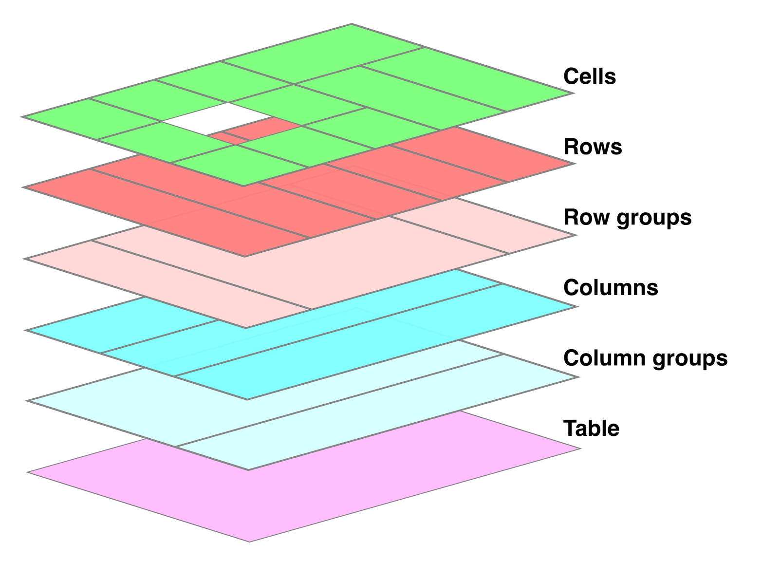
图 14-3: The formatting layers used in table presentation
Basically, the styles for each aspect of the table are drawn on their individual layers. Thus, if the table element has a green background and a one-pixel black border, then those styles are drawn on the lowest layer. Any styles for the column groups are drawn on the next layer up, the columns themselves on the layer above that, and so on. The top layer, which corresponds to the table cells, is drawn last.
基本上,“表”的每个方面的样式都绘制在它们各自的层上。因此,如果表格元素有绿色背景和一个像素的黑色边框,那么这些样式将绘制在最低层。列组的任何样式都在上一层绘制,列本身在上一层绘制,以此类推。最后绘制与表格单元格对应的顶层。
For the most part, this is a logical process; after all, if you declare a background color for table cells, you would want that drawn over the background for the table element. The most important point revealed by Figure 14-3 is that column styles come below row styles, so a row’s background will overwrite a column’s background.
在很大程度上,这是一个逻辑过程;毕竟,如果您为表格单元格声明了一个背景颜色,那么您会希望为表格元素绘制一个背景颜色。图 14-3 揭示的最重要的一点是,列样式位于行样式之下,因此行背景将覆盖列背景。
It is important to remember that by default, all elements have transparent backgrounds. Thus, in the following markup, the table element’s background will be visible “through” cells, rows, columns, and so forth that do not have a background of their own, as illustrated in Figure 14-4:
重要的是要记住,默认情况下,所有元素都有透明的背景。因此,在下面的标记中,表格元素的背景将“通过”不具有自身背景的单元格、行、列等可见,如图 14-4 所示:
<table style="background: #B84;">
  <tr>
    <td>hey</td>
    <td style="background: #ABC;">there</td>
  </tr>
  <tr>
    <td>what’s</td>
    <td>up?</td>
  </tr>
  <tr style="background: #CBA;">
    <td>not</td>
    <td style="background: #ECC;">much</td>
  </tr>
</table>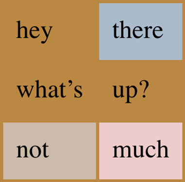
图 14-4: Seeing the background of table-formatting layers through other layers
14.1.5 Captions
A table caption is about what you’d expect: a short bit of text that describes the nature of the table’s contents. A chart of stock quotes for the fourth quarter of 2016, therefore, might have a caption element whose contents read “Q4 2016 Stock Performance.” With the property caption-side, you can place this element either above or below the table, regardless of where the caption appears in the table’s structure. (In HTML5, the caption element can appear only as the first child of a table element, but other languages may have different rules.)
表标题是您所期望的:一小段描述表内容性质的文本。因此,2016 年第四季度的股票报价图表可能有一个标题元素,其内容为“2016 年第四季度股票表现”。使用属性“标题端”,您可以将此元素置于表的上方或下方,而不管标题在表的结构中出现在何处。(在 HTML5 中,“标题”元素只能作为“表格”元素的第一个子元素出现,但其他语言可能有不同的规则。)
Captions are a bit odd, at least in visual terms. The CSS specification states that a caption is formatted as if it were a block box placed immediately before (or after) the table’s box, with one exception: the caption can still inherit values from the table.
标题有点奇怪,至少在视觉上是这样。CSS 规范规定了标题的格式,就好像它是一个块框,放在表框的前面(或后面),但有一个例外:标题仍然可以从表中继承值。
A simple example should suffice to illustrate most of the important aspects of caption presentation. Consider the following, illustrated in Figure 14-5:
一个简单的例子应该足以说明标题表示的大部分重要方面。考虑如下图 14-5 所示:
caption {
  background: #b84;
  margin: 1em 0;
  caption-side: top;
}
table {
  color: white;
  background: #840;
  margin: 0.5em 0;
}
The text in the caption element inherits the color value white from the table, while the caption gets its own background. The separation between the table’s outer border edge and the caption’s outer margin edge is 1 em, as the top margin of the table and bottom margin of the caption have collapsed. Finally, the width of the caption is based on the content width of the table element, which is considered to be the containing block of the caption.
“标题”元素中的文本继承了表中的“颜色”值“白色”,而标题有自己的背景。表的外边框边缘和标题的外边框边缘之间的距离为 1 em,因为表的顶部边缘和标题的底部边缘已经折叠。最后,标题的宽度基于“table”元素的内容宽度,它被认为是标题的包含块。
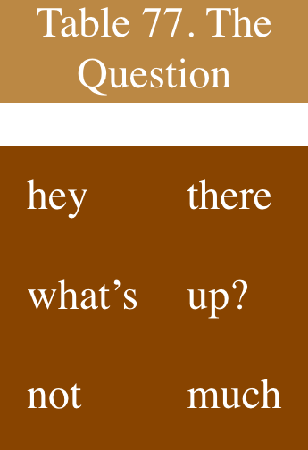
图 14-5: Styling captions and tables
These same results would occur if we change the value of caption-side to bottom, except that the caption would be placed after the table’s box, and collapsing would occur between the top margin of the caption and the bottom margin of the table.
如果我们将“标题侧”的值更改为“底部”,则会出现相同的结果,只不过“标题”将放置在表的框之后,并且会在标题的顶部边缘和表的底部边缘之间发生塌缩。
For the most part, captions are styled just like any block-level element: they can be padded, have borders, be given backgrounds, and so on. For example, if we need to change the horizontal alignment of text within the caption, we use the property text-align. Thus, to right-align the caption in the previous example, we would write:
在大多数情况下,标题的样式与任何块级元素一样:它们可以被填充、有边框、有背景等等。例如,如果需要更改标题内文本的水平对齐方式,可以使用属性“text-align”。因此,要右对齐前面例子中的标题,我们可以这样写:
caption {
  background: gray;
  margin: 1em 0;
  caption-side: top;
  text-align: right;
}
14.2 Table Cell Borders
There are two quite distinct border models in CSS. The separated border model takes effect when cells are separated from each other in layout terms. The other option is the collapsed border model, in which there is no visual separation between cells, and cell borders merge, or collapse into one another. The former is the default model, although in an earlier version of CSS the latter was the default.
在 CSS 中有两种截然不同的边界模型。当单元在布局中彼此分离时,分离的边界模型生效。另一个选项是“折叠边界模型”,在这个模型中,单元格之间没有可见的分离,单元格边界合并或折叠到另一个单元格中。前者是默认的模型,尽管在早期的 CSS 版本中,后者是默认的。
An author can choose between the two models with the property border-collapse.
作者可以在属性为“border-collapse”的两个模型之间进行选择。
The whole point of this property is to offer a way to determine which border model the user agent will employ. If the value collapse is in effect, then the collapsing borders model is used. If the value is separate, then the separated borders model is used. We’ll look at the former model first, since it’s much easier to describe, and it’s the default value.
此属性的目的是提供一种方法来确定用户代理将使用哪个边界模型。如果值“崩溃”生效,则使用崩溃边界模型。如果值是“separate”,则使用分隔的边框模型。我们将首先查看前一个模型,因为它更容易描述,而且是默认值。
14.2.1 Separated Cell Borders
In this model, every cell in the table is separated from the other cells by some distance, and the borders of cells do not collapse into one another. Thus, given the following styles and markup, you would see the result shown in Figure 14-6:
在这个模型中,表中的每个单元格与其他单元格之间有一定的距离,单元格的边界不会相互折叠。因此,给定以下样式和标记,您将看到图 14-6 所示的结果:
table {
  border-collapse: separate;
}
td {
  border: 3px double black;
  padding: 3px;
}
tr:nth-child(2) td:nth-child(2) {
  border-color: gray;
}<table cellspacing="0">
<tr>
<td>cell one</td>
<td>cell two</td>
</tr>
<tr>
<td>cell three</td>
<td>cell four</td>
</tr>
</table>Note that the cell borders touch but remain distinct from one another. The three lines between cells are actually the two double borders sitting right next to each other; the gray border around the fourth cell helps make this more clear.
请注意,单元格边界相互接触,但彼此保持不同。单元格之间的三行实际上是两个相邻的双边框;第四个细胞周围的灰色边框有助于使这一点更清楚。
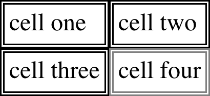
图 14-6: Separated (and thus separate) cell borders
The HTML attribute cellspacing was included in the preceding example to make sure the cells had no separation between them, but its presence is likely a bit troubling. After all, if you can define that borders be separate, then there ought to be a way to use CSS to alter the spacing between cells. Fortunately, there is.
前面的示例中包含了 HTML 属性“cellspace”,以确保单元格之间没有分隔,但是它的存在可能会带来一些麻烦。毕竟,如果您可以将边框定义为独立的,那么应该有一种方法使用 CSS 来更改单元格之间的间距。幸运的是,有。
Border spacing
Once you’ve separated the table cell borders, there may be situations where you want those borders to be separated by some distance. This can be easily accomplished with the property border-spacing, which provides a more powerful replacement for the HTML attribute cellspacing.
一旦将表单元格边界分隔开,可能会出现希望将这些边界分隔一定距离的情况。这可以通过属性“border- space”轻松实现,它为 HTML 属性“cellspace”提供了更强大的替代。
Either one or two lengths can be given for the value of this property. If you want all your cells separated by a single pixel, then border-spacing: 1px; will suffice. If, on the other hand, you want cells to be separated by one pixel horizontally and five pixels vertically, write border-spacing: 1px 5px;. If two lengths are supplied, the first is always the horizontal separation, and the second is always the vertical.
可以为该属性的值指定一个或两个长度。如果你想让所有的单元格都用一个像素来分隔,那么“border-间距:1px;”就足够了。另一方面,如果你想让单元格水平距离为 1 像素,垂直距离为 5 像素,写上“border-间距:1px 5px;”如果提供两个长度,第一个总是水平间隔,第二个总是垂直间隔。
The spacing values are also applied between the borders of cells along the outside of a table and the padding on the table element itself. Given the following styles, you would get the result shown in Figure 14-7:
间距值也应用于表格外围的单元格边界和' table '元素本身的填充之间。给定以下样式,您将得到如图 14-7 所示的结果:
table {
  border-collapse: separate;
  border-spacing: 5px 8px;
  padding: 12px;
  border: 2px solid black;
}
td {
  border: 1px solid gray;
}
td#squeeze {
  border-width: 5px;
}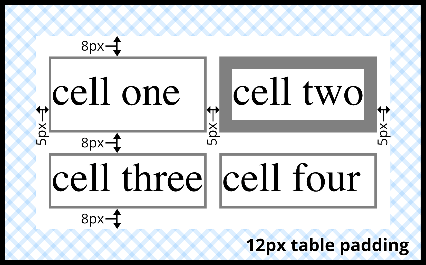
图 14-7: Border spacing effects between cells and their enclosing table
In Figure 14-7, there is a space 5 pixels wide between the borders of any two horizon tally adjacent cells, and there are 17 pixels of space between the borders of the rightand left-most cells and the right and left borders of the table element. Similarly, the borders of vertically adjacent cells are 8 pixels apart, and the borders of the cells in the top and bottom rows are 20 pixels from the top and bottom borders of the table, respectively. The separation between cell borders is constant throughout the table, regardless of the border widths of the cells themselves.
在图 14-7 中,任何两个水平层的相邻单元格的边界之间都有一个 5 像素宽的空间,而在最左边和最右边的单元格的边界与' table '元素的左右边界之间有 17 个像素的空间。类似地,垂直相邻单元格的边框之间相隔 8 个像素,顶部和底部行的单元格的边框分别距表的顶部和底部边框 20 个像素。无论单元格本身的边框宽度如何,整个表中单元格边框之间的分隔都是恒定的。
Note also that if you’re going to declare a border-spacing value, it’s done on the table itself, not on the individual cells. If border-spacing had been declared for the td elements in the previous example, it would have been ignored.
还要注意,如果您要声明一个“border-间距”值,那么它是在表本身上完成的,而不是在单个单元格上。如果在前面的例子中为' td '元素声明了' border-间距',那么它将被忽略。
In the separated-border model, borders cannot be set for rows, row groups, columns, and column groups. Any border properties declared for such elements must be ignored by a CSS-conformant user agent.
在分离边界模型中,不能为行、行组、列和列组设置边界。符合 css 的用户代理必须忽略为此类元素声明的任何边界属性。
Handling empty cells
Because every cell is, in a visual sense, distinct from all the other cells in the table, what do you do with cells that are empty (i.e., have no content)? You have two choices, which are reflected in the values of the empty-cells property.
因为从视觉上看,每个单元格都与表中的其他单元格不同,所以如何处理空单元格(即空单元格)?,没有内容)?您有两个选择,它们反映在“空单元格”属性的值中。
If empty-cells is set to show, then the borders and background of an empty cell will be drawn, just as with table cells that have content. If the value is hide, then no part of the cell is drawn, just as if the cell were set to visibility: hidden.
如果将“empty-cells”设置为“show”,则会绘制空单元格的边框和背景,就像有内容的表格单元格一样。如果值是' hide ',则不会绘制单元格的任何部分,就像将单元格设置为' visibility: hidden '一样。
If a cell contains any content, it cannot be considered empty. “Content,” in this case, includes not only text, images, form elements, and so on, but also the nonbreaking space entity ( ) and any other whitespace except the CR (carriage return), LF (line feed), tab, and space characters. If all the cells in a row are empty, and all have an empty-cells value of hide, then the entire row is treated as if the row element were set to display: none.
如果一个单元格包含任何内容,则不能认为它是空的。在本例中,“Content”不仅包括文本、图像、表单元素等,还包括不间断空格实体(' ')和除 CR(回车)、LF(换行)、制表符和空格字符之外的任何其他空白。如果一行中的所有单元格都是空的,并且所有的“空单元格”值都是“隐藏”,那么整个行就会被视为 row 元素被设置为“display: none”。
14.2.2 Collapsing Cell Borders
While the collapsing cell model largely describes how HTML tables have always been laid out when they don’t have any cell spacing, it is quite a bit more complicated than the separated borders model. There are also some rules that set collapsing cell borders apart from the separated borders model:
虽然折叠单元格模型主要描述了 HTML 表在没有任何单元格间距时的布局方式,但它比分隔的边框模型要复杂得多。也有一些规则,设置崩溃的细胞边界除了分离的边界模型:
- Elements with a
displayoftableorinline-tablecannot have any padding whenborder-collapseiscollapse, although they can have margins. Thus, there is never separation between the border around the outside of the table and the edges of its outermost cells in the collapsed borders model. - Borders can be applied to cells, rows, row groups, columns, and column groups. A table itself can, as always, have a border.
- There is never any separation between cell borders in the collapsed borders model. In fact, borders collapse into each other where they adjoin, so that only one of the collapsing borders is actually drawn. This is somewhat akin to margin collapsing, where the largest margin wins. When cell borders collapse, the “most interesting” border wins.
- Once they are collapsed, the borders between cells are centered on the hypothetical grid lines between the cells. We’ll explore the last two points in more detail in the next two sections.
- “显示”为“table”或“内联表”的元素在“border-collapse”为“collapse”时不能有任何内边距,但可以有边距。因此,在折叠边框模型中,表格外围的边框与最外层单元格的边框之间永远不会分离。
- 边框可以应用到单元格、行、行组、列和列组。与往常一样,表本身也可以有边框。
- 在折叠边框模型中,单元边框之间没有任何分离。实际上,边界在它们邻接的地方相互折叠,因此实际上只绘制了一个折叠的边界。这在某种程度上类似于保证金崩盘,即保证金最大的一方获胜。当单元格边界崩溃时,“最有趣的”边界获胜。
- 折叠后,单元格之间的边界以单元格之间的假想网格线为中心。在接下来的两部分中,我们将更详细地讨论最后两点。
Collapsing border layout
In order to better understand how the collapsing borders model works, let’s look at the layout of a single table row, as shown in Figure 14-8.
为了更好地理解折叠边界模型是如何工作的,让我们看看单个表行的布局,如图 14-8 所示。
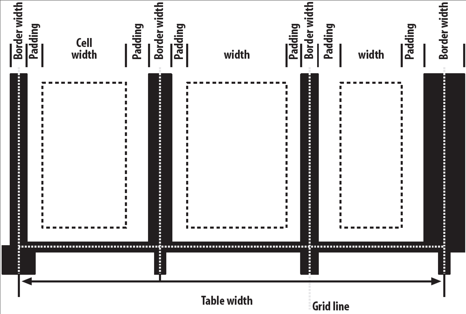
图 14-8: The layout of a table row using the collapsing borders model
For each cell, the padding and content width of the cell is inside the borders, as expected. For the borders between cells, half of the border is to one side of the grid line between two cells, and the other half is to the other side. In each case, only a single border is drawn along each cell edge. You might think that half of each cell’s border is drawn to each side of the grid line, but that’s not what happens.
对于每个单元格,单元格的填充和内容宽度都在边框内,这是预期的。对于单元格之间的边界,边界的一半位于两个单元格之间网格线的一侧,另一半位于网格线的另一侧。在每种情况下,每个单元格边缘只绘制一个边框。您可能认为每个单元格的边界的一半被绘制到网格线的每一边,但实际情况并非如此。
For example, assume that the solid borders on the middle cell are green and the solid borders on the outer two cells are red. The borders on the right and left sides of the middle cell (which collapse with the adjacent borders of the outer cells) will be all green, or all red, depending on which border wins out. We’ll discuss how to tell which one wins in the next section.
例如,假设中间单元格的实线是绿色的,而外面两个单元格的实线是红色的。中间单元格左右两边的边框(与外部单元格的相邻边框一起折叠)将全部为绿色,或全部为红色,这取决于哪个边框胜出。我们将在下一节讨论如何判断哪一个胜出。
You may have noticed that the outer borders protrude past the table’s width. This is because in this model, half the table’s borders are included in the width. The other half sticks out beyond that distance, sitting in the margin itself. This might seem a bit weird, but that’s how the model is defined to work.
您可能已经注意到,外部边框突出了桌子的宽度。这是因为在这个模型中,表的“一半”边框包含在宽度中。另一半则突出在距离之外,位于边缘处。这可能看起来有点奇怪,但这就是模型的工作方式。
The specification includes a layout formula that I’ll reproduce here for the benefit of those who enjoy such things:
该规范包括一个布局公式,我将在这里复制,以方便那些喜欢这样的事情:
row width = (0.5 * border-width-0) + padding-left-1 + width-1 + padding-right-1
+ border-width-1 + padding-left-2 +...+ padding-right-n + (0.5 * border-width-n)
Each border-width-n refers to the border between cell n and the next cell; thus, border-width-3 refers to the border between the third and fourth cells. The value n stands for the total number of cells in the row.
每个“border-width-n”表示单元格“n”与下一个单元格之间的边界;因此,“border-width”-3 表示第三和第四个单元格之间的边界。值“n”表示行中的单元格总数。
There is a slight exception to this mechanism. When beginning the layout of a collapsed-border table, the user agent computes an initial left and right border for the table itself. It does this by examining the left border of the first cell in the first row of the table and by taking half of that border’s width as the table’s initial left border width. The user agent then examines the right border of the last cell in the first row and uses half that width to set the table’s initial right-border width. For any row after the first, if the left or right border is wider than the initial border widths, it sticks out into the margin area of the table.
这个机制有一个细微的例外。在开始折叠边界表的布局时,用户代理为表本身计算初始的左右边界。它通过检查表的第一行的第一个单元格的左边框,并将该边框宽度的一半作为表的初始左边框宽度来做到这一点。然后用户代理检查第一行最后一个单元格的右边框,并使用该宽度的一半来设置表的初始右边框宽度。对于第一行之后的任何一行,如果左边框或右边框宽度大于初始边框宽度,则它会突出到表的边缘区域。
In cases where a border is an odd number of display elements (pixels, printer dots, etc.) wide, the user agent is left to decide what to do about centering the border on the grid line. It might shift the border so that it is slightly off-center, round up or down to an even number of display elements, use anti-aliasing, or adjust anything else that seems reasonable.
如果边框是奇数个宽的显示元素(像素、打印机点等),用户代理将决定如何将边框居中到网格线上。它可能会移动边框,使其稍微偏离中心,向上或向下舍入显示元素的偶数,使用反走样,或调整任何看起来合理的东西。
Border collapsing
When two or more borders are adjacent, they collapse into each other. In fact, they don’t collapse so much as fight it out to see which of them will gain supremacy over the others. There are some strict rules governing which borders will win and which will not:
当两个或多个边界相邻时,它们会相互折叠。事实上,他们并没有崩溃,而是通过争斗来决定哪一方会取得优势。有一些严格的规则来决定哪些国家会赢,哪些不会:
- If one of the collapsing borders has a
border-styleofhidden, it takes precedence over all other collapsing borders. All borders at this location are hidden. - If all the borders are visible, then wider borders take precedence over narrower ones. Thus, if a two-pixel dotted border and a five-pixel double border collapse, the border at that location will be a five-pixel double border.
- If all collapsing borders have the same width but different border styles, then the border style is taken in the following order, from most to least preferred:
double,solid,dashed,dotted,ridge,outset,groove,inset,none. Thus, if two borders with the same width are collapsing, and one is dashed while the other is outset, the border at that location will be dashed. - If collapsing borders have the same style and width, but differ in color, then the color used is taken from an element in the following list, from most preferred to least: cell, row, row group, column, column group, table. Thus, if the borders of a cell and a column (identical in every way except color) collapse, then the cell’s border color (and style and width) will be used. If the collapsing borders come from the same type of element, such as two row borders with the same style and width but different colors, then the color is taken from borders that are further to the top and left (in left-to-right languages; otherwise, further to the top and right).
- 如果其中一个崩溃的边界有一个“边界样式”的“隐藏”,它优先于所有其他崩溃的边界。这个位置的所有边界都是隐藏的。
- 如果所有的边界都是可见的,那么宽的边界优先于窄的边界。因此,如果一个 2 像素的虚线边框和一个 5 像素的双边框崩溃,那么该位置的边框将是一个 5 像素的双边框。
- 如果所有折叠边框的宽度相同,但边框样式不同,则边框样式按以下顺序排列,从最喜欢到最不喜欢:“double”、“solid”、“虚线”、“虚线”、“ridge”、“”、“groove”、“inset”、“none”。因此,如果两个宽度相同的边界正在崩溃,一个是虚线而另一个是开始,则该位置的边界将被虚线。
- 如果折叠边框具有相同的样式和宽度,但颜色不同,那么使用的颜色取自以下列表中的一个元素,从最喜欢的到最不喜欢的:单元格、行、行组、列、列组、表。因此,如果单元格和列的边框(除了颜色外,其他方面都相同)折叠,那么将使用单元格的边框颜色(以及样式和宽度)。如果折叠的边框来自同一类型的元素,例如具有相同样式和宽度但不同颜色的两个行边框,则颜色取自更靠近顶部和左侧的边框(在从左到右的语言中;否则,再往右上方)。
The following styles and markup, presented in Figure 14-9, help illustrate each of the four rules:
下面的样式和标记,如图 14-9 所示,有助于说明这四条规则中的每一条:
table {
  border-collapse: collapse;
  border: 3px outset gray;
}
td {
  border: 1px solid gray;
  padding: 0.5em;
}
#r2c1,
#r2c2 {
  border-style: hidden;
}
#r1c1,
#r1c4 {
  border-width: 5px;
}
#r2c4 {
  border-style: double;
  border-width: 3px;
}
#r3c4 {
  border-style: dotted;
  border-width: 2px;
}
#r4c1 {
  border-bottom-style: hidden;
}
#r4c3 {
  border-top: 13px solid silver;
}<table>
<tr>
<td id="r1c1">1-1</td>
<td id="r1c2">1-2</td>
<td id="r1c3">1-3</td>
<td id="r1c4">1-4</td>
</tr>
<tr>
<td id="r2c1">2-1</td>
<td id="r2c2">2-2</td>
<td id="r2c3">2-3</td>
<td id="r2c4">2-4</td>
</tr>
<tr>
<td id="r3c1">3-1</td>
<td id="r3c2">3-2</td>
<td id="r3c3">3-3</td>
<td id="r3c4">3-4</td>
</tr>
<tr>
<td id="r4c1">4-1</td>
<td id="r4c2">4-2</td>
<td id="r4c3">4-3</td>
<td id="r4c4">4-4</td>
</tr>
</table>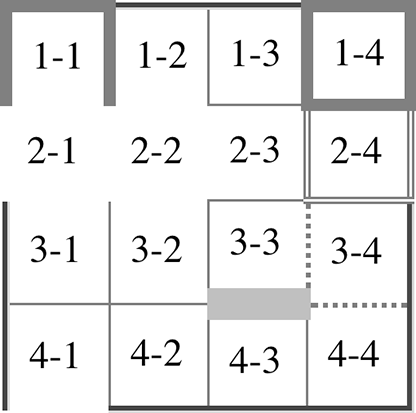
图 14-9: Manipulating border widths, styles, and colors leads to some unusual results
Let’s consider what happened for each of the cells, in turn:
让我们依次考虑每个细胞发生了什么:
- For cells 1-1 and 1-4, the five-pixel borders were wider than any of their adjacent borders, so they won out not only over adjoining cell borders, but over the border of the table itself. The only exception is the bottom of cell 1-1, which was suppressed.
- The bottom border on cell 1-1 was suppressed because cells 2-1 and 2-2, with their explicitly hidden borders, completely remove any borders from the edge of the cells. Again, the table’s border lost out (on the left edge of cell 2-1) to a cell’s border. The bottom border of cell 4-1 was also hidden, and so it prevented any border from appearing below the cell.
- The three-pixel double border of cell 2-4 was overridden on top by the five-pixel solid border of cell 1-4. Cell 2-4’s border, in turn, overrode the border between itself and cell 2-3 because it was both wider and “more interesting.” Cell 2-4 also overrode the border between itself and cell 3-4, even though both are the same width, because 2-4’s double style is defined to be “more interesting” than 3-4’s dotted border.
- The 13-pixel bottom silver border of cell 3-3 not only overrode the top border of cell 4-3, but it also affected the layout of content within both cells
andthe rows that contain both cells. - For cells along the outer edge of the table that aren’t specially styled, their onepixel solid borders are overridden by the three-pixel outset border on the table element itself.
- 对于单元格 1-1 和 1-4,5 像素的边框比它们的任何相邻边框都宽,因此它们不仅战胜了相邻的单元格边框,而且战胜了表本身的边框。唯一的例外是 1-1 单元格的底部,它被抑制了。
- 单元格 1-1 的底部边框被抑制,因为单元格 2-1 和 2-2 具有显式隐藏的边框,完全删除了单元格边缘的所有边框。同样,表格的边框(在单元格 2-1 的左侧边缘)也丢失了,丢失的是单元格的边框。细胞 4-1 的底部边界也被隐藏,因此它阻止了任何边界出现在细胞下面。
- 单元 2-4 的 3 像素双边框被单元 1-4 的 5 像素实边框覆盖。细胞 2-4 的边界反过来又覆盖了它自己和细胞 2-3 之间的边界,因为它既宽又“更有趣”。单元格 2-4 也覆盖了它自己和单元格 3-4 之间的边界,即使它们的宽度相同,因为 2-4 的双重样式被定义为比 3-4 的虚线边框“更有趣”。
- 单元格 3-3 的 13 像素底部银色边框不仅覆盖了单元格 4-3 的顶部边框,而且还影响了两个单元格和包含两个单元格的行的内容布局。
- 对于没有特殊样式的表的外边缘单元格,它们的 onepixel 实线被表元素本身的 3 像素起始边界覆盖。
This is, in fact, about as complicated as it sounds, although the behaviors are largely intuitive and make a little more sense with practice. It’s worth noting, though, that the basic Netscape 1.1-era table presentation can be captured with a fairly simple set of rules, described here and illustrated by Figure 14-10:
事实上,这和听起来一样复杂,尽管这些行为在很大程度上是直觉的,并且在实践中更有意义。不过,值得注意的是,Netscape 1.1 时代的基本表表示可以通过一组相当简单的规则来捕获,在这里进行了描述,如图 14-10 所示:
table {
  border-collapse: collapse;
  border: 2px outset gray;
}
td {
  border: 1px inset gray;
}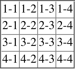
图 14-10: Reproducing old-school table presentation
14.3 Table Sizing
Now that we’ve dug into the guts of table formatting and cell border appearance, we have the pieces we need to understand the sizing of tables and their internal elements. When it comes to determining table width, there are two different approaches: fixed-width layout and automatic-width layout. Heights are calculated automatically, no matter what width algorithms are used.
现在,我们已经深入了解了表格式化和单元格边框外观的核心内容,了解了需要了解表的大小及其内部元素的各个部分。在确定表宽度时,有两种不同的方法:“固定宽度”布局和“自动宽度”布局。无论使用何种宽度算法,高度都是自动计算的。
14.3.1 Width
Since there are two different ways to figure out the width of a table, it’s only logical that there be a way to declare which should be used for a given table. Authors can use the property table-layout to select between the two kinds of table width calculation.
由于有两种不同的方法来计算表的宽度,所以只有一种方法来声明哪个应该用于给定的表才是合乎逻辑的。作者可以使用属性“表格布局”在两种表格宽度计算之间进行选择。
While the two models can have different results in laying out a given table, the fundamental difference between the two is that of speed. With a fixed-width table layout, the user agent can calculate the layout of the table more quickly than is possible in the automatic-width model.
虽然这两个模型在给定表的布局上可能会有不同的结果,但它们之间的根本区别在于速度。使用固定宽度的表布局,用户代理可以比自动宽度模型更快地计算表的布局。
Fixed layout
The main reason the fixed-layout model is so fast is that its layout does not depend on the contents of table cells. Instead, it’s driven by the width values of the table, columns, and cells within that table.
固定布局模型如此快速的主要原因是它的布局不依赖于表单元格的内容。相反,它是由表、列和该表中的单元格的宽度值驱动的。
The fixed-layout model works in the following steps:
固定布局模型的工作步骤如下:
- Any column element whose
widthproperty has a value other thanautosets the width for that entire column.
- 如果列元素的“宽度”属性的值不是“auto”,则为整个列设置宽度。
a. If a column has an auto width, but the cell in the first row of the table within that column has a width other than auto, then the cell sets the width for that entire column. If the cell spans multiple columns, then the width is divided between the columns.
b. Any columns that are still auto-sized are sized so that their widths are as equal as possible.
a. 如果一个列的宽度为“auto”,但是该列中表格第一行的单元格宽度为“width”,而不是“auto”,那么单元格将设置整个列的宽度。如果单元格跨越多个列,则在列之间划分宽度。
b. 任何仍然自动调整大小的列都要调整大小,使它们的宽度尽可能相等。
At that point, the width of the table is set to be either the value of width for the table or the sum of the column widths, whichever is greater. If the table turns out to be wider than its columns, then the difference is divided by the number of columns and the result is added to each of them.
此时,表的宽度被设置为表的“宽度”的值或列宽度的总和(以较大的值为准)。如果这个表比它的列更宽,那么这个差值除以列的数量,结果被添加到每个列上。
This approach is fast because all of the column widths are defined by the first row of the table. The cells in any rows that come after the first are sized according to the column widths that were defined by the first row. The cells in those following rows do not—indeed, cannot—change column widths, which means that any width value assigned to those cells will be ignored. In cases where a cell’s content does not fit into its cell, the overflow value for the cell determines whether the cell contents are clipped, visible, or generate a scrollbar.
这种方法速度快,因为所有列的宽度都是由表的第一行定义的。第一行之后的任何行中的单元格都是根据第一行定义的列宽进行大小调整的。下面这些行中的单元格不会——实际上不能——更改列宽度,这意味着分配给这些单元格的任何“宽度”值都将被忽略。在单元格的内容不适合其单元格的情况下,单元格的“overflow”值决定单元格内容是否被剪切、可见或生成滚动条。
Let’s consider the following styles and markup, which are illustrated in Figure 14-11:
让我们考虑一下下面的样式和标记,如图 14-11 所示:
table {
  table-layout: fixed;
  width: 400px;
  border-collapse: collapse;
}
td {
  border: 1px solid;
}
col#c1 {
  width: 200px;
}
#r1c2 {
  width: 75px;
}
#r2c3 {
  width: 500px;
}<table>
<colgroup>
<col id="c1" />
<col id="c2" />
<col id="c3" />
<col id="c4" />
</colgroup>
<tr>
<td id="r1c1">1-1</td>
<td id="r1c2">1-2</td>
<td id="r1c3">1-3</td>
<td id="r1c4">1-4</td>
</tr>
<tr>
<td id="r2c1">2-1</td>
<td id="r2c2">2-2</td>
<td id="r2c3">2-3</td>
<td id="r2c4">2-4</td>
</tr>
<tr>
<td id="r3c1">3-1</td>
<td id="r3c2">3-2</td>
<td id="r3c3">3-3</td>
<td id="r3c4">3-4</td>
</tr>
<tr>
<td id="r4c1">4-1</td>
<td id="r4c2">4-2</td>
<td id="r4c3">4-3</td>
<td id="r4c4">4-4</td>
</tr>
</table>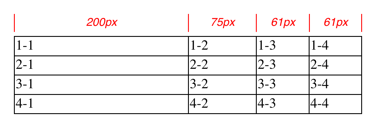
图 14-11: Fixed-width table layout
As you can see in Figure 14-11, the first column is 200 pixels wide, which happens to be half the 400-pixel width of the table. The second column is 75 pixels wide, because the first-row cell within that column has been assigned an explicit width. The third and fourth columns are each 61 pixels wide. Why? Because the sum of the column widths for the first and second columns (275 pixels), plus the various borders between columns (3 pixels), equals 278 pixels. 400 minus 278 is 122, and that divided in half is 61, so that’s how many pixels wide the third and fourth columns will be. What about the 500-pixel width for #r2c3? It’s ignored because that cell isn’t in the first row of the table.
正如您在图 14-11 中所看到的,第一列是 200 像素宽,刚好是表的 400 像素宽的一半。第二列宽 75 像素,因为该列中的第一行单元格被分配了显式宽度。第三列和第四列各 61 像素宽。为什么?因为第一列和第二列的列宽之和(275 像素),加上列之间的各种边界(3 像素),等于 278 像素。400 减去 278 等于 122,再除以 1 / 2 等于 61,这就是第三列和第四列的像素宽度。那么“#r2c3”的 500 像素宽度呢?它被忽略,因为那个单元格不在表的第一行。
Note that it is not absolutely necessary that the table have an explicit width value to make use of the fixed-width layout model, although it definitely helps. For example, given the following, a user agent could calculate a width for the table that is 50 pixels narrower than the parent element’s width. It would then use that calculated width in the fixed-layout algorithm:
请注意,虽然表格有一个显式的“宽度”值来利用固定宽度布局模型是绝对必要的,但它确实有帮助。例如,给定以下内容,用户代理可以计算比父元素宽度窄 50 像素的表宽度。然后在固定布局算法中使用计算出的宽度:
table {
  table-layout: fixed;
  margin: 0 25px;
  width: auto;
}
This is not required, however. User agents are also permitted to lay out any table with an auto value for width using the automatic-width layout model.
但是,这不是必需的。用户代理还可以使用 automaticwidth 布局模型布置具有“auto”值的“width”表。
Automatic layout
The automatic-width layout model, while not as fast as fixed layout, is probably much more familiar to you because it’s substantially the same model that HTML tables have used for years. In most current user agents, use of this model will be triggered by a table having a width of auto, regardless of the value of table-layout, although this is not assured.
自动宽度布局模型虽然没有固定布局那么快,但您可能更熟悉它,因为它基本上与 HTML 表使用多年的模型相同。在大多数当前的用户代理中,这个模型的使用将由一个“宽度”为“auto”的表触发,而不考虑“表布局”的值,尽管这并不能保证。
The reason automatic layout is slower is that the table cannot be laid out until the user agent has looked at all of the content in the table. That is, it requires that the user agent lay out the entire table in a fashion that takes the contents and styles of every cell into account. This generally requires the user agent to perform some calculations and then go back through the table to perform a second set of calculations.
自动布局较慢的原因是,在用户代理查看了表中的所有内容之后,才能对表进行布局。也就是说,它要求用户代理以考虑每个单元格的内容和样式的方式布局整个表。这通常需要用户代理执行一些计算,然后通过表执行第二组计算。
The content has to be fully examined because, as with HTML tables, the table’s layout is dependent on the content in all the cells. If there is a 400-pixel-wide image in a cell in the last row, then it will force all of the cells above it (those in the same column) to be at least 400 pixels wide. Thus, the width of every cell has to be calculated, and adjustments must be made (possibly triggering another round of content-width calculations) before the table can be laid out.
必须全面检查内容,因为与 HTML 表一样,表的布局依赖于所有单元格中的内容。如果最后一行的单元格中有一个 400 像素宽的图像,那么它将强制它上面的所有单元格(同一列中的单元格)宽至少为 400 像素。因此,必须计算每个单元格的宽度,并进行调整(可能会触发另一轮内容宽度计算),然后才能布置表。
The details of the model can be expressed in the following steps:
模型的细节可以通过以下步骤来表达:
- For each cell in a column, calculate both the minimum and maximum cell width.
- 对于列中的每个单元格,计算最小单元格宽度和最大单元格宽度。
a. Determine the minimum width required to display the content. In determining this minimum content width, the content can flow to any number of lines, but it may not stick out of the cell’s box. If the cell has a width value that is larger than the minimum possible width, then the minimum cell width is set to the value of width. If the cell’s width value is auto, then the minimum cell width is set to the minimum content width.
a.确定显示内容所需的最小宽度。在确定这个最小内容宽度时,内容可以流到任意数量的行,但它可能不会离开单元格的框。如果单元格的“宽度”值大于可能的最小宽度,则将最小单元格宽度设置为“宽度”。如果单元格的“宽度”值为“auto”,则将单元格的最小宽度设置为内容的最小宽度。
b. For the maximum width, determine the width required to display the content without any line breaking other than that forced by explicit line breaking (e.g., the <br> element). That value is the maximum cell width.
b.对于最大宽度,确定显示内容所需的宽度,除了显式断行(例如
<br>元素)之外,不需要任何断行。该值是单元格的最大宽度。
- For each column, calculate both the minimum and maximum column width.
- 对于每个列,计算最小和最大列宽。
a. The column’s minimum width is determined by the largest minimum cell width of the cells within the column. If the column has been given an explicit width value that is larger than any of the minimum cell widths within the column, then the minimum column width is set to the value of width.
a.列的最小宽度由列中单元格的最大最小单元格宽度决定。如果列被赋予了一个显式的“宽度”值,该值大于列中任何最小单元格宽度,则将最小列宽度设置为“宽度”。
b. For the maximum width, take the largest maximum cell width of the cells within the column. If the column has been given an explicit width value that is larger than any of the maximum cell widths within the column, then the maximum column width is set to the value of width. These two behaviors recreate the traditional HTML table behavior of forcibly expanding any column to be as wide as its widest cell.
b.对于最大宽度,取列中单元格的最大最大单元格宽度。如果列有一个显式的“宽度”值,该值大于列中任何一个最大单元格宽度,则将最大列宽度设置为“宽度”。这两个行为重新创建了传统的 HTML 表行为,强制展开任何列,使之与最宽的单元格一样宽。
- In cases where a cell spans more than one column, then the sum of the minimum column widths must be equal to the minimum cell width for the spanning cell. Similarly, the sum of the maximum column widths has to equal the spanning cell’s maximum width. User agents should divide any changes in column widths equally among the spanned columns.
- 在一个单元跨越多个列的情况下,那么最小列宽度的总和必须等于生成单元的最小单元宽度。类似地,最大列宽的和必须等于生成单元格的最大宽度。用户代理应该在跨越的列之间平均分配列宽的任何更改。
In addition, the user agent must take into account that when a column width has a percentage value for its width, the percentage is calculated in relation to the width of the table—even though it doesn’t yet know what that will be! It instead has to hang on to the percentage value and use it in the next part of the algorithm. At this point, the user agent will have figured how wide or narrow each column can be. With that information in hand, it can then proceed to actually figuring out the width of the table. This happens as follows:
此外,用户代理必须考虑到,当列宽度有一个百分比值时,这个百分比是根据表的宽度计算的——尽管它还不知道这是什么!相反,它必须保留百分比值,并在算法的下一部分中使用它。此时,用户代理将计算出每个列的宽度或宽度。有了这些信息,它就可以实际计算出表的宽度。具体如下:
- If the computed width of the table is not
auto, then the computed table width is compared to the sum of all the column widths plus any borders and cell spacing. (Columns with percentage widths are likely calculated at this time.) The larger of the two is the final width of the table. If the table’s computed width islargerthan the sum of the column widths, borders, and cell spacing, then the difference is divided by the number of columns and the result is added to each of them. - If the computed width of the table is
auto, then the final width of the table is determined by adding up the column widths, borders, and cell spacing. This means that the table will be only as wide as needed to display its content, just as with traditional HTML tables. Any columns with percentage widths use that percentage as a constraint—but one that a user agent does not have to satisfy.
- 如果表的计算宽度不是“auto”,则将计算的表宽度与所有列宽度加上任何边框和单元格间距的总和进行比较。(此时可能计算具有百分比宽度的列。)两者中较大的一个是表的最终宽度。如果表的计算宽度“大于”列宽度、边框和单元格间距的总和,则差额除以列数并将结果添加到每个列中。
- 如果表的计算宽度为“auto”,则通过将列宽度、边框和单元格间距相加来确定表的最终宽度。这意味着该表的宽度将与显示其内容所需的宽度相同,就像传统的 HTML 表一样。任何具有百分比宽度的列都使用该百分比作为约束—但是用户代理不必满足该约束。
Once the last step is completed, then—and only then—can the user agent actually lay out the table.
完成最后一步后,用户代理才能实际布置表。
The following styles and markup, presented in Figure 14-12, help illustrate how this process works:
下面的样式和标记,如图 14-12 所示,有助于说明这个过程是如何工作的:
table {
  table-layout: auto;
  width: auto;
  border-collapse: collapse;
}
td {
  border: 1px solid;
  padding: 0;
}
col#c3 {
  width: 25%;
}
#r1c2 {
  width: 40%;
}
#r2c2 {
  width: 50px;
}
#r2c3 {
  width: 35px;
}
#r4c1 {
  width: 100px;
}
#r4c4 {
  width: 1px;
}<table>
<colgroup>
<col id="c1" />
<col id="c2" />
<col id="c3" />
<col id="c4" />
</colgroup>
<tr>
<td id="r1c1">1-1</td>
<td id="r1c2">1-2</td>
<td id="r1c3">1-3</td>
<td id="r1c4">1-4</td>
</tr>
<tr>
<td id="r2c1">2-1</td>
<td id="r2c2">2-2</td>
<td id="r2c3">2-3</td>
<td id="r2c4">2-4</td>
</tr>
<tr>
<td id="r3c1">3-1</td>
<td id="r3c2">3-2</td>
<td id="r3c3">3-3</td>
<td id="r3c4">3-4</td>
</tr>
<tr>
<td id="r4c1">4-1</td>
<td id="r4c2">4-2</td>
<td id="r4c3">4-3</td>
<td id="r4c4">4-4</td>
</tr>
</table>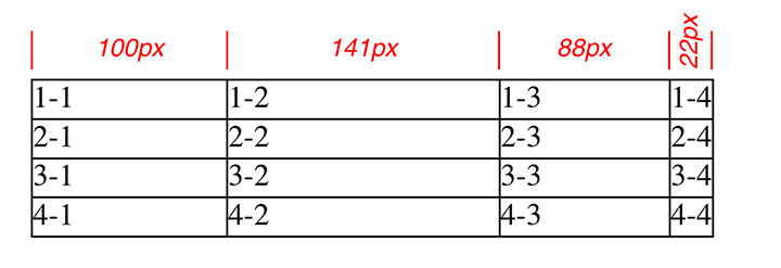
图 14-12: Automatic table layout
Let’s consider what happened for each of the columns, in turn:
让我们依次考虑每一列发生了什么:
- For the first column, the only explicit cell or column width is that of cell 4-1, which was given a width of
100px. Because the content is so short, both the minimum and maximum column widths are set to100px. (If there were a cell in the column with several sentences of text, it would have increased the maximum column width to whatever width necessary to display all of the text without line breaking.) - For the second column, two
widths were declared: cell 1-2 was given a width of40%, and cell 2-2 was given a width of50px. The minimum width of this column is50px, and the maximum width is40%of the final table width. - For the third column, only cell 3-3 had an explicit width (
35px), but the column itself was given awidthof25%. Therefore, the minimum column width is 35 pixels, and the maximum width is 25% of the final table width. - For the fourth column, only cell 4-4 was given an explicit width (
1px). This is smaller than the minimum content width, so both the minimum and maximum column widths are equal to the minimum content width of the cells. This turns out to be a computed 22 pixels, so the minimum and maximum widths are both 22 pixels.
- 对于第一列,唯一的显式单元格或列宽度是单元格 4-1,它的宽度为“100px”。因为内容很短,所以最小和最大列宽都设置为' 100px '。(如果列中有一个单元格,其中包含几句文本,那么它会将最大列宽增加到显示所有文本而不断行所需的宽度。)
- 对于第二列,声明了两个' width ':单元格 1-2 的宽度为' 40% ',单元格 2-2 的宽度为' 50px '。该列的最小宽度为' 50px ',最大宽度为最终表宽度的' 40% '。
- 对于第三列,只有单元格 3-3 具有明确的宽度(' 35px '),但该列本身的'宽度'为' 25% '。因此,最小列宽为 35 像素,最大宽度为最终表宽的 25%。
- 对于第四列,只有单元格 4-4 具有显式宽度(' 1px ')。这小于最小内容宽度,因此最小和最大列宽度都等于单元格的最小内容宽度。这是一个计算出来的 22 像素,所以最小宽度和最大宽度都是 22 像素。
The user agent now knows that the four columns have minimum and maximum widths as follows:
用户代理现在知道四列的最小宽度和最大宽度如下:
- Minimum 100 px, maximum 100 px
— Minimum 50 px, maximum 40%
— Minimum 35 px, maximum 25%
— Minimum 25 px, maximum 22 px
Thus, the table’s minimum width is the sum of all the column minimums, plus the borders collapsed between the columns, which totals 215 pixels. The table’s maximum width is 123px + 65%, where the 123px comes from the first and last columns and their shares of the collapsed borders. This maximum works out to be 351.42857142857143 pixels (given that 123px represents 35% of the overall table width). With this number in hand, the second column will be 140.5 pixels wide, and the third column will be 87.8 pixels wide. These may be rounded by the user agent to whole numbers such as 141px and 88px, or not, depending on the exact rendering method used. (These are the numbers used in Figure 14-12.)
因此,表的最小宽度是所有列最小值的总和,加上列之间折叠的边框,总共 215 个像素。该表的最大宽度为' 123px + 65% ',其中' 123px '来自第一列和最后一列以及它们所占的折叠边框。这个最大值是' 351.42857142857143 '像素(考虑到' 123px '代表整个表宽度的 35%)。有了这个数字,第二列将是 140.5 像素宽,第三列将是 87.8 像素宽。用户代理可以将它们四舍五入为整数,如“141px”和“88px”,也可以不取整数,这取决于使用的具体呈现方法。(这些是图 14-12 中使用的数字。)
Note that it is not required that user agents actually use the maximum value; they may choose another course of action.
注意,并不要求用户代理实际使用最大值;他们可以选择另一种行动方式。
This was (although it may not seem like it) a comparatively simple and straightforward example: all of the content was basically the same width, and most of the declared widths were pixel lengths. In a situation where a table contains images, paragraphs of text, form elements, and so forth, the process of figuring out the table’s layout is likely to be a great deal more complicated.
这是一个相对简单和直接的例子(尽管看起来可能不像):所有的内容基本上都是相同的宽度,大多数声明的宽度是像素长度。在表格包含图像、文本段落、表单元素等等的情况下,确定表格布局的过程可能要复杂得多。
14.3.2 Height
After all of the effort that was expended in figuring out the width of the table, you might well wonder how much more complicated height calculation will be. Actually, in CSS terms, it’s pretty simple, although browser developers probably don’t think so.
在花费了所有的精力来计算表的宽度之后,您可能很想知道复杂的高度计算到底要复杂多少。实际上,在 CSS 术语中,它非常简单,尽管浏览器开发人员可能不这么认为。
The easiest situation to describe is one in which the table height is explicitly set via the height property. In such cases, the height of the table is defined by the value of height. This means that a table may be taller or shorter than the sum of its row heights. Note that height is treated much more like min-height for tables, so if you define a height value that’s smaller than the sum total of the row heights, it may appear to be ignored.
最容易描述的情况是通过' height '属性显式设置表高度。在这种情况下,表的高度由' height '的值定义。这意味着一个表可能比它的行高和更高或更短。注意,对于表来说,' height '更像是' min-height ',所以如果您定义了一个' height '值,该值小于行高度的总和,那么它可能会被忽略。
By contrast, if the height value of a table is greater than the total of its row heights, the specification explicitly refuses to define what should happen, instead noting that the issue may be resolved in future versions of CSS. A user agent could expand the table’s rows to fill out its height, or leave blank space inside the table’s box, or something completely different. It’s up to each user agent to decide.
相反,如果表的“height”值大于其行高的总和,则规范明确拒绝定义应该发生什么,而是指出这个问题可以在未来的 CSS 版本中解决。用户代理可以扩展表的行来填充其高度,或者在表的框中留下空白,或者其他完全不同的操作。这取决于每个用户代理。

As of late 2017, the most common behavior of user agents was to increase the heights of the rows in a table to fill out its overall height. This was accomplished by taking the difference between the table height and the sum of the row heights, dividing it by the number of rows, and applying the resulting amount to each row.
If the height of the table is auto, then its height is the sum of the heights of all the rows within the table, plus any borders and cell spacing. To determine the height of each row, the user agent goes through a process similar to that used to find the widths of columns. It calculates a minimum and maximum height for the contents of each cell and then uses these to derive a minimum and maximum height for the row. After having done this for all the rows, the user agent figures out what each row’s height should be, stacks them all on top of one another, and uses the total to determine the table’s height. It’s a lot like inline layout, only with less certainty in how things should be done.
如果表的“height”是“auto”,那么它的高度就是表中所有行的高度加上边框和单元格间距的总和。要确定每行的高度,用户代理需要执行一个类似于查找列宽的过程。它计算每个单元格内容的最小高度和最大高度,然后使用这些计算结果来获得行的最小高度和最大高度。完成所有行之后,用户代理将计算出每行的高度,将它们堆叠在一起,并使用总和来确定表的高度。它很像内联布局,只是不太确定应该如何完成。
In addition to what to do about tables with explicit heights and how to treat row heights within them, you can add the following to the list of things CSS does not define:
除了如何处理具有显式高度的表以及如何处理其中的行高度之外,您还可以将以下内容添加到 CSS 没有定义的内容列表中:
- The effect of a percentage height for table cells.
- The effect of a percentage height for table rows and row groups.
- How a row-spanning cell affects the heights of the rows that are spanned, except that the rows have to contain the spanning cell.
- 表格单元格的百分比高度的效果。
- 表行和行组的高度百分比的效果。
- 除了行必须包含生成单元之外,行生成单元如何影响所张成的行的高度。
As you can see, height calculations in tables are largely left up to user agents to figure out. Historical evidence would suggest that this will lead to each user agent doing something different, so you should probably avoid setting table heights as much as possible.
正如您所看到的,表中的高度计算主要由用户代理来完成。历史证据表明,这将导致每个用户代理执行不同的操作,因此您应该尽可能避免设置表高度。
14.3.3 Alignment
In a rather interesting turn of events, alignment of content within cells is a lot better defined than cell and row heights. This is true even for vertical alignment, which can quite easily affect the height of a row.
在一个相当有趣的事件中,单元格内的内容对齐比单元格和行高定义得好得多。即使对于垂直对齐也是如此,因为垂直对齐很容易影响一行的高度。
Horizontal alignment is the simplest. To align content within a cell, you use the text-align property. In effect, the cell is treated as a block-level box, and all of the content within it is aligned as per the text-align value.
水平对齐是最简单的。要对齐单元格内的内容,可以使用“文本对齐”属性。实际上,单元格被视为块级别的框,其中的所有内容都按照“文本对齐”值进行对齐。
To vertically align content in a table cell, vertical-align is the relevant property. It uses many of the same values that are used for vertically aligning inline content, but the meanings of those values change when applied to a table cell. To summarize the three simplest cases:
要垂直对齐表单元格中的内容,“垂直对齐”是相关属性。它使用许多与垂直对齐内联内容相同的值,但是当应用到表单元格时,这些值的含义会发生变化。总结三个最简单的例子:
top
The top of the cell’s content is aligned with the top of its row; in the case of rowspanning cells, the top of the cell’s content is aligned with the top of the first row it spans.
单元格内容的顶部与该行的顶部对齐;对于行生成单元格,单元格内容的顶部与它跨越的第一行的顶部对齐。
bottom
The bottom of the cell’s content is aligned with the bottom of its row; in the case of row-spanning cells, the bottom of the cell’s content is aligned with the bottom of the last row it spans.
单元格内容的底部与该行的底部对齐;对于行生成单元格,单元格内容的底部与它跨越的最后一行的底部对齐。
middle
The middle of the cell’s content is aligned with the middle of its row; in the case of row-spanning cells, the middle of the cell’s content is aligned with the middle of all the rows it spans.
单元格内容的中间与该行的中间对齐;在行生成单元格的情况下,单元格内容的中间与它跨越的所有行的中间对齐。
These are illustrated in Figure 14-13, which uses the following styles and markup:
这些在图 14-13 中进行了说明,它使用了以下样式和标记:
table {
  table-layout: auto;
  width: 20em;
  border-collapse: separate;
  border-spacing: 3px;
}
td {
  border: 1px solid;
  background: silver;
  padding: 0;
}
div {
  border: 1px dashed gray;
  background: white;
}
#r1c1 {
  vertical-align: top;
  height: 10em;
}
#r1c2 {
  vertical-align: middle;
}
#r1c3 {
  vertical-align: bottom;
}<table>
<tr>
<td id="r1c1">
<div>
The contents of this cell are top-aligned.
</div>
</td>
<td id="r1c2">
<div>
The contents of this cell are middle-aligned.
</div>
</td>
<td id="r1c3">
<div>
The contents of this cell are bottom-aligned.
</div>
</td>
</tr>
</table>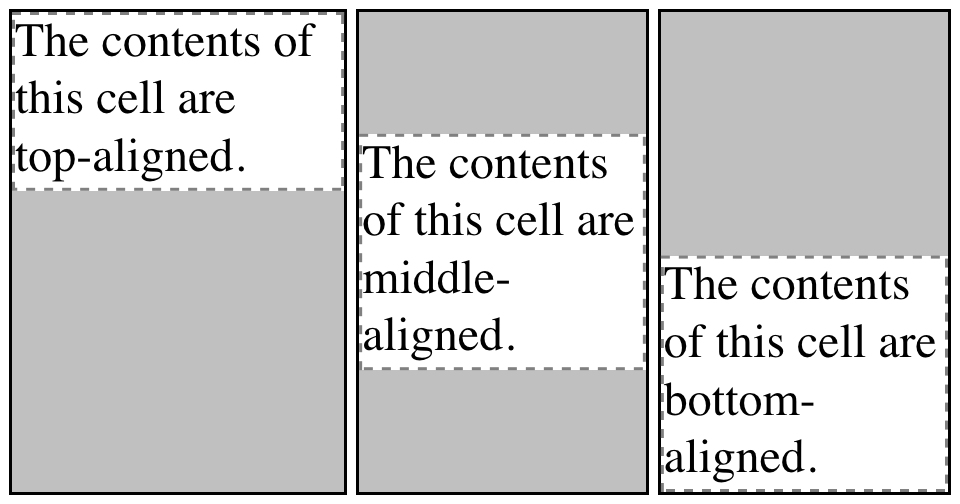
图 14-13: Vertical alignment of cell contents
In each case, the alignment is carried out by automatically increasing the padding of the cell itself to achieve the desired effect. In the first cell in Figure 14-13, the bottom padding of the cell has been changed to equal the difference between the height of the cell’s box and the height of the content within the cell. For the second cell, the top and bottom padding of the cell have been reset to be equal, thus vertically centering the content of the cell. In the last cell, the cell’s top padding has been altered.
在每种情况下,对齐都是通过自动增加单元格本身的填充来实现所需的效果。在图 14-13 中的第一个单元格中,单元格的底部填充被更改为等于单元格框的高度与单元格内内容的高度之间的差值。对于第二个单元格,单元格的顶部和底部填充被重置为相等,从而使单元格的内容垂直居中。在最后一个单元格中,单元格的顶部填充被更改。
The fourth possible value alignment is baseline, and it’s a little more complicated that the first three:
第四个可能的值对齐是“基线”,它比前三个稍微复杂一些:
baseline
The baseline of the cell is aligned with the baseline of its row; in the case of rowspanning cells, the baseline of the cell is aligned with the baseline of the first row it spans.
该单元的基线与该行的基线对齐;在行生成单元格的情况下,单元格的基线与它跨越的第一行的基线对齐。
It’s easiest to provide an illustration (Figure 14-14) and then discuss what’s happening.
最简单的方法是提供一个插图(图 14-14),然后讨论发生了什么。
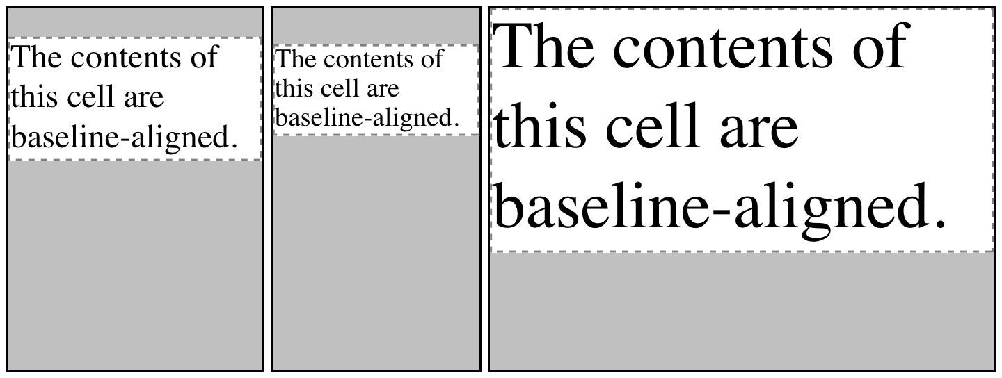
图 14-14: Baseline alignment of cell contents
A row’s baseline is defined by the lowest initial cell baseline (that is, the baseline of the first line of text) out of all its cells. Thus, in Figure 14-14, the row’s baseline was defined by the third cell, which has the lowest initial baseline. The first two cells then have the baseline of their first line of text aligned with the row’s baseline.
行基线由所有单元格中最低的初始单元格基线(即第一行文本的基线)定义。因此,在图 14-14 中,行基线由第三个单元格定义,该单元格具有最低的初始基线。然后,前两个单元格的第一行文本的基线与行基线对齐。
As with top, middle, and bottom alignment, the placement of baseline-aligned cell content is accomplished by altering the top and bottom padding of the cells. In cases where none of the cells in a row are baseline-aligned, the row does not even have a baseline—it doesn’t really need one.
与顶部、中部和底部对齐一样,与基线对齐的单元内容的放置是通过改变单元的顶部和底部填充来完成的。如果一行中没有一个细胞是碱基对齐的,那么这一行甚至都没有碱基——它实际上并不需要碱基。
The detailed process for aligning cell contents within a row is as follows:
将单元格内容对齐到一行的具体过程如下:
- If any of the cells are baseline-aligned, then the row’s baseline is determined and the content of the baseline-aligned cells is placed.
- 如果其中任何一个细胞是基线对齐的,则确定行基线并放置基线对齐的细胞的内容。
a. Any top-aligned cell has its content placed. The row now has a provisional height, which is defined by the lowest cell bottom of the cells that have already had their content placed.
任何顶部对齐的单元格都有它的内容。行现在有一个临时高度,它由已经放置了内容的单元格的最低单元格底部定义。
b. If any remaining cells are middle- or bottom-aligned, and the content height is taller than the provisional row height, the height of the row is increased to enclose the tallest of those cells.
b. 如果任何剩余的单元格是中间或底部对齐的,且内容高度高于临时行高度,则行高度将增加,以包围这些单元格中最高的单元格。
c. All remaining cells have their content placed. In any cell whose contents are shorter than the row height, the cell’s padding is increased in order to match the height of the row.
c. 所有剩余的单元格都放置了它们的内容。在任何内容小于行高度的单元格中,将增加单元格的填充以匹配行高度。
The vertical-align values sub, super, text-top, and text-bottom are supposed to be ignored when applied to table cells. Instead, they seem to all treated as if they are baseline, or possibly top.
“垂直对齐”值“sub”、“super”、“text-top”和“text-bottom”应用于表格单元格时应该被忽略。相反,他们似乎都被视为“底线”,或者可能是“顶端”。
14.4 Summary
Even if you’re quite familiar with table layout from years of table-and-spacer design, it turns out that the mechanisms driving such layout are rather complicated. Thanks to the legacy of HTML table construction, the CSS table model is row-centric, but it does, thankfully, accommodate columns and limited column styling. Thanks to new abilities to affect cell alignment and table width, you now have even more tools for presenting tables in a pleasing way.
即使您在多年的表格和分隔符设计中对表格布局非常熟悉,但事实证明,驱动这种布局的机制相当复杂。由于 HTML 表构造的遗留问题,CSS 表模型是以行为中心的,但幸运的是,它适应了列和有限的列样式。由于有了影响单元格对齐和表宽的新功能,现在可以使用更多的工具以令人满意的方式表示表。
The ability to apply table-related display values to arbitrary elements opens the door to creating table-like layouts using HTML elements such as div and section, or in XML languages where any element could be used to describe table components.
将表相关的显示值应用于任意元素的能力为使用“div”和“section”等 HTML 元素创建类似于表的布局打开了大门,在 XML 语言中,任何元素都可以用来描述表组件。